Showing posts with label PWDP Assignment 3. Show all posts

Sunday, 27 April 2014

Assignment Three A photographic commission reworked

As mentioned before in my feedback post on the whole I received very positive feedback. I had completed the supporting document in a rush as I left it until the very last minute before sending it off, a mix of not feeling confident in the images and putting my head in the sand as the deadline approached and feeling generally ughhhh about doing anything constructive anywhere in my life. This feeling continues on and off so here I am rushing to make sure everything is ready to post off very soon! Things have been completed but left hanging so am now tying them up so they aren't.

Having used Thomas Struth and Candida Hofer as influences, both photographing historical architecture, their large interiors and using tripods and digital cameras I didn't note any of this down. This has now been amended within my feedback post here  http://janfairburnoca.blogspot.co.uk/2013/08/assignment-three-feedback.html

I also completed much research not noted , slaps wrists, but this has also been updated. See,I do the work but then don't prove it....

I think you can see the influences of both within some of my shots, however I did want to try and take a few more without people in, even though they were taken deliberately with them to give an idea of perspective and scale. Bearing this is mind I attended another open day, getting there at the very end so most people had already left. Decision was made to become a friend of Crossness, which gives you access time outside of open days, as I think it will be a brilliant place to document as the improvements and alterations are gradually made.


These were the images I chose from the shoot as being first selects, I then had to decided if they would integrate into my original layout. Whilst I thought some of them were better images I wasn't sure if they would help tell the narrative or were too similar to shots already included. So for better or for worse I have decided to replace this image ........................................................with this.......


This was one of the harder choices to make. The reasons for the decision though are as follows:
  • it is more in keeping with having no people in the shot
  • it gives a better idea of the space and scale of the building
  • it contains a lot of detail the more you look at it, the vents in the floors, the open iron work upper floor, the colourful screens in the distance, columns, stairs and the restoration work as an ongoing process
  • you can see the contrast between the old and the new tantalisingly peeking out in the distance
  • although I was really pleased with the long exposure effect of the original I am not convinced it is something you would find within a magazine article
  • the different lighting conditions on the final shoot gave a colder feel and I think it contrasts well against the larger image it is placed against on the spread, warmer tones full of people, colder tones for an empty industrial space.
reasons for keeping the original of personally liking it, well that isn't good enough when thinking about a clients needs, it is the only shot I have showing an image from a high perspective, it does effectively show the ornate screens but then some of the other images I have also show the decorative paint work. Therefore it was a done deal.

then I decided to replace this


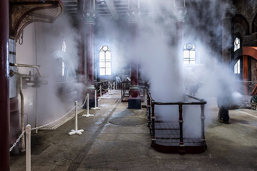
with this


At first I had anticipated re-shooting the original shot without people but sadly on the day this was impossible as the Trust had set up huge 6ft tall visitor information boards across the space, Proving you have to be flexible in this business! Although I loved the symmetry of the columns and the contrast you can see between the new and the old, the blurry people are too distracting. I thought this at the time but didn't have that many shots to choose from when completing the original assignment. However the bonus of attending the open day at the closing stages was that I got to see them venting the steam from the engines, other images show the columns and the ironwork but none have the movement of the steam and eerie spectral  atmosphere it provided. This is was Crossness is all about, the steam engines, so as part of a narrative it had to be used.

Looking at the other shots I don't think any of them should be replaced, I think I have a better mix of people/non people shots, including them to show perspective and the heritage site as a magnet for interested tourists and other photographers documenting this historical building. I did however decide that the large image on the final spread would change to it's original colour. I think the brown sepia tones give it as much of a historical feel as does the black and white and it means it is in keeping with the rest of the article.

PS spread with gridlines and showing text/images groups

So my final spreads look like this 


Before altering the final images I did quickly print off some A3 prints at work, not a photographic printer with a calibrated monitor so the colours and brightness are all totally awry but it gave me an idea of how the layout worked and I was happy with it in print.

Conclusion

I welcomed the positive constructive criticisms and questions raised. They made me look again at my work and consider how I could alter it to improve the final assignment. Hopefully I have addressed each issue, and justified my decisions where changes were made or not. Attending the last open day ensured I could obtain some different images which still told the narrative of the place. I am pleased with the final result and you have to stop tweaking bits eventually.....


Thursday, 15 August 2013

Assignment Three Feedback

:o) I was really pleased with my feedback, lots of positives, and any suggestions were put forward politely and spot on. Being new to each other there were some useful reminders; especially helpful as I had such a long gap between thought processes and actually doing any projects!

General overview was a demonstration of "clear, methodical and professional approach...prepared well and did research prior to arrival...consideration to equipment required...good that I re-visited to take outside shots...final layout worked well...a wide selection of shots"

Was reminded that I should reference my work, yes I should, Thomas Struth and Candida Hofer were photographers who I had in mind before shooting but me being me and in a rush to get things underway forgot to mention this ;oD Both hoot architectural history, large interiors and use different vantage points, Hofer especially used upper levels to great effect when shooting her library series.

Born in 1954, Struth initially studied painting at the Düsseldorf academy under the German artist Gerhard Richter, before turning to photography. His "mastery of formal composition, colour and detail have made him one of the pre-eminent European art photographers of our time" Struth is best known for his large-scale cityscapes and his series of family portraits. He does shoot some work on digital, preferring to use 8x10mm plate cameras on tripods.


Thomas Struth Pantheon

Thomas Struth San Zaccaria
I liked the approach of Struth showing the large spaces, including people for scale and the columns of the buildings interiors.

Hofer’s also takes large-format photographs, with deeply saturated color and extraordinary detail. Born in 1944, she photographs buildings without people, often without any visible signs of human presence at all. For more than 30 years she has been compiling her deadpan inventory of public spaces, a social catalogue of architectural history.

From the website http://www.thamesandhudson.com/Candida_Hofer/9780500543146

Candida Höfer's photographs of libraries are sober and restrained – the atmosphere is disturbed by neither visitors nor users, especially as she forgoes any staging of the locations. The emptiness is imbued with substance by a subtle attention to colour, and the prevailing silence instilled with a metaphysical quality that gives voice to the objects, over and above the eloquence of the furnishings or the pathos of the architecture.

Candida Hofer Beautiful Libraries - Napoli
Candida Hofer Queluz Palace Portugal
https://www.youtube.com/watch?v=gfAmjCyPcZw

Great to see how she researches, books, internet, people who live there. Once there she walks around to take in the place first until she decides which perspective to shoot from. She likes using digital due to the versatility. Hofer thinks using a tripod makes the image look more static...interesting thought to ponder over..her last thought was be persistent!

A query as to why I had used a monochrome image and nowhere did I justify this, again true; there were a few reasons why I chose the monochrome version, firstly I thought an awful lot of my images looked "brown/rusty" in tone and wanted to have a contrast within the series. Also the bust of Bazalgette is very monochrome and was trying to tie the images together in that respect. Finally there was the association of the historical context but as the original image is actually very sepia-ish in its own right I possibly didn't need to do this? I'll create the spread again with the original and see what difference it makes. I had also been looking at some magazine spreads from Kew Gardens and they had a few mixed spreads so thought I would experiment.

Image below not monochrome.


Suggested reading/viewing

Londei, J.2007 Shutting Up Shop: The Decline of The Traditional Small Shop

I’m really pleased this was recommended.The publication reveals the scope of his project photographing “traditional small shops” for a seventeen year period starting in 1972. His project was not based on a specific community with the many shops featured  scattered across the county. The premises are shown devoid of people bar the owners.

With every shot there is an explanation about the history of the shop and  the people who ran them. Frequently he was capturing scenes that would soon be gone,with many of the shopkeepers being elderly; the last of their family keeping the business going. In some ways this reminded me of the Non-Conformists by Martin Parr, looking at a disappearing part of our heritage. Although Londei took the images in the 70s and 80s, the book was not published until 2007, by which time he returned to see what had happened in the ensuing years. Sadly, as to be expected, the majority are no longer trading with only seven of the original sixty shops featured remaining in business.

Interesting and useful project to review, a long term project and how to approach looking at something that will provide historical interest later on, finding out personal details that add to the images and how to hang each image together as a narrative.


Germain, J.2005 For Every Minute You Are Angry You Lose Sixty Seconds of Happiness

I must admit to only looking at this online and not getting hold of the book but it again looks to be a fascinating documentary project following the day to day happenings of an elderly man. It's a simple portrait of an elderly man's life.

Germain became friends with Charles Snelling in the early nineties, was interested in his life, and began photographing him. With visits instigated by companionship rather than than the idea of taking photographs Germain said "Photography was undoubtedly part of it because I always took my camera, but it was a relatively small part with no end product in mind, no deadline and no pressure to 'succeed'." Nevertheless, Germain produced a series of quality photos, enough to fill roughly two thirds of the book.

The remainder is filled with Snelling's own scrapbook albums, woven seamlessly into the material with Germain's own photographs. The albums are presented as true facsimiles with yellowed pages, dog-eared covers.Through these we gets a sense of Snelling's life before he met Germain. We are introduced to his deceased wife Betty,via a series of holiday photos and everyday snapshots.

The experience of thumbing Snelling's old scrapbooks has been described as "rich and cinematic, and the photos have an authenticity that no outside photographer can match. Indeed, this is one of the project's central paradoxes. Germain's photographs of Snelling -- artfully composed with shallow depth of field -- are wonderful. But they look like, well, fine art photographs."  He not only throws scrapbooks into the mix, but gives them the same respect as his own photos. This echoed for me the work of John Stezaker and Joachim Schmid's use of found photographs.


To summarise another brilliant technique to show a social documentary using a mix of older and current images and putting them together to tell a pertinent story.

Wood, T.1998.All Zones Off Peak


All Zones Off Peak is an epic fifteen-year bus journey through the streets of Irish-born Tom Wood’s adopted home, Liverpool. A body of work that documents a photographer’s (and a city’s) daily transit, All Zones Off Peak is a celebration of the ‘ordinary’ and an affectionate ode to Merseyside, narrated by its own inhabitants.
Those who share Tom Wood’s passage through the city are mostly unaware of the camera’s presence– often commuters lost in a pensive trance, as the monotony of the daily commute unfolds. Those who acknowledge their fellow traveler and his lens stare, blankly cocooned in their own private isolation. The pained reality of a city blighted by political neglect, poverty, and social disenchantment is depicted as the bus passes the littered and graffiti strewn urban streets. But in the passing of time and the turning of the page – a more confident city emerges and a more complex, layered portrait of a place and its people is depicted.
All Zones Off Peak begins as a gritty monochrome journey, but within the two decades and three thousand rolls of film, a city saturated in color emerges through the bus’ windows. In his accompanying essay, Mark Holborn describes the work: “On this repetitious route through the Liverpool streets the focus dissolves as the journey unwinds. The pictures move gradually through the sequence toward abstraction. The window becomes a screen, not a barrier, and the window frames form skeletons for the images in correspondence to the frames of the film itself.”
Affectionately named by locals the “Photie Man”, Tom Wood is a photographer anchored to place, a documentarian of home. Through his lens the anonymous, mundane, and everyday becomes strangely engaging and the rhythm of his Liverpool intimately compelling.
Its really great that you can review books online sometimes brief notes - a mix of black and white and colour images, spreads different sizes, framing not always square on. if the main subject is in shot he does not worry about cropping out others, with arms legs and feet dangling into view.

These last few books are a sage reminder than it is not always good to have to rush a project....these have taken years to compile...if I want to do something interesting I ought to start now!!
Soth, A.2008. Sleeping By The Mississippi
http://www.aaronschuman.com/sothinterview.html

snipped on photography

"I went to school to be a painter, but I soon realized I wasn’t very good... attended a lecture by the photographer, Joel Sternfeld...realized that was what I wanted to do...fell in love with the process of taking pictures, with wandering around finding things....a kind of performance.  The picture is a document of that performance. What really frustrates is that photography is not very good at telling stories.  Stories are so satisfying.  Novels and movies satisfy, but photographs often leave me feel like something is missing."

on fragments

"...photographs can succeed in telling stories when they are collectively put into a narrative sequence... it seems to me that, in Sleeping by the Mississippi, you are trying to get away from overt sequencing, away from a clear narrative....you provide the viewer with a scattered assortment of fragments, which they can try to make sense of afterwards...question...would you prefer that the viewer regarded each image in Sleeping by the Mississippi individually, like a book of collected poems, or would you prefer that the entire body of work were considered a single unified whole, as in a film, a novel, or even a lengthy dream?"

answer " Definitely the unified whole..lesson learned that great pictures are all about luck...anyone can take a great picture...very few people can put together a great collection of pictures.  It is incredibly difficult to put these fragments together in a meaningful way...this is my goal."

on why photography Minnesota?
"This is a terrific question.  The obvious reason that I’ve photographed the Midwest is that I live there; in Minnesota.  So I have a feeling for the place..  The Midwest isn’t exotic.  And photographers (myself included) are attracted to the exotic.  Middle sometimes means bland. Of course, when you get involved in the Midwest, there are a lot of interesting nuances.  But it isn’t obvious. The Midwest doesn’t have the grandeur of the West or the exoticism of the South.  This was one of my favorite things about working along the Mississippi."

on social documentary..
" I understand that you never intended Sleeping by the Mississippi to be a social document. But grouped together, these images inevitably comment on the people, communities, and environments that you photographed.... Also, could you possibly discuss your reaction to being nominated to Magnum; how do you feel that you fit in with the agency’s history and its current output, and has this changed your work in any way?"

answer "I’m not entirely comfortable with this project being described as a social document.  This is why it is titled “Sleeping by…”... trying to suggest that this was more internal and dream-like.  Of course, as you say, the pictures do indeed comment on the people and places I photographed.  And thus it is a kind of document.  But there are just so many gaps.  I was shaping my own river.  This is what photographers usually do, right?  They create their own vision."
 
fascinating interview...I liked his comment on it NOT being social documentary..but it kind of is....


So...amendments to make, tasks to do and the next assignment...

*update re-working Here

Thursday, 18 July 2013

Assignment Three: A Photographic Commission

Research into Crossness

http://www.crossness.org.uk/

The Crossness Pumping Station was built by Sir Joseph Bazalgette as part of Victorian London's urgently needed main sewerage system. It was officially opened by the Prince of Wales in April 1865.

The Beam Engine House is a Grade 1 Listed Industrial Building constructed in the Romanesque style and features some of the most spectacular ornamental Victorian cast ironwork to be found today. It also contains the four original pumping engines (although the cylinders were upgraded in 1901), which are possibly the largest remaining rotative beam engines in the world, with 52 ton flywheels and 47 ton beams. Although modern diesel engines were subsequently introduced, the old beam engines remained in service until work on a new sewerage treatment plant commenced in 1956. Following abandonment in the mid 1950's, the engine house and engines were systematically vandalised and left to decay, which greatly impeded the Trust's restoration/conservation programme.

The Crossness Engines Trust, a registered charity, was set up in 1987 to restore the installation which represents a unique part of Britain's industrial heritage and an outstanding example of Victorian engineering. A large part of the restoration work so far carried out has been done entirely by an unpaid volunteer workforce

http://www.bexley.gov.uk/index.aspx?articleid=3209

https://www.youtube.com/watch?v=1ORy9JAMTlI

http://www.vediator.com/watch-latszJCxCSg

http://en.wikipedia.org/wiki/Crossness_Pumping_Station

http://www.bbc.co.uk/london/content/articles/2008/11/12/great_stink_feature.shtml

https://en-gb.facebook.com/TheCrossnessEnginesTrust?ref=stream&viewer_id=0&filter=1

http://www.bbc.co.uk/history/historic_figures/bazalgette_joseph.shtml

I also have a copy of their guidebook which helps.

Yes...this is where I am at and have photos, just need to do the layout.......

Update 23/7/2013

I really must admit to struggling with this whole module, some in part to personal stuff, some in part to feedback I was getting from my tutor making feel like I wanted to just throw everything out of the window and could I be doing so many things wrong after trying so hard? Added to what was going on with my Mum I couldn't face it so downed tools as commented on in previous posts.

Then the usual doubts set in, looking at everything photographed , even personal projects, going to Cologne last year with my daughter, Paris at half term, jaunt into London, there seemed to be nothing original or of good quality, my camera itself seemed alien and everything I had learnt vanished. Picking up again and looking at other OCA student blogs it has reassured me that others feel the same. Only thing is I look at their shots and think why are they worrying, when I look at mine again I still don't feel re-assured!

Trying to choose a photographic commission, a subject that interested me, that would provide photographs to support an editorial feature, stumped me. I couldn't think of anything that interested me at all. I received notification of a new tutor, introduced myself, got a reply and then still had block....confidence at rock bottom. Eventually after exchanging a few emails with a very patient Keith, I chose to photograph Crossness Pumping Station, about which you will hopefully discover more through my photo-story.

Possibly I bit off more than I could chew because the Pumping Station is only open 4 times this year. It does usually have limited opening but due to major renovations is only open four times this year, which curtailed my ability to go back and re-shoot if I decided I didn't have the images I wanted. I think that has been the case but I can always re-visit after feedback. If I become a member for £14.99 p.a. I can visit when the volunteers are there, in the evening, during the week. Also there is another open day in Sept, I am away for the next one at the end of July.

Having previously visited I knew that I would need to take a tripod, due to low lighting, and for the first time used a gorilla pod with a ball head as well as my standard tripod. This proved really useful. Day trip completed, again I had placed myself under pressure with the time frame as my son had been away camping with his Explorer group so I had to leave before closing time to go and collect him. My life at the moment seems to be filled with other deadlines to meet and places to be all impacting on everything!

Proofed my shots, disgusted by lack of variety (in my opinion) I sat on them....email chasing from Keith...but very gently...my reply of OMG I still hate everything I am shooting.....his response, don't worry just send me what you have and we will deal with it, that is what I am here for, to give you feedback and help you sort out what is going wrong....(or words to that effect)

So here goes....my first attempt at Assignment 3

The brief for this assignment does not call for you to actually create the editorial feature but I thought it would help me to order which images could be used for the opening, main body and closing of the article. Also assist with deciding which images to cull/keep not because they are necessarily the best images but because they work to tell the narrative. However, we are encouraged to think about what kind of layout we would use, there is no limit given on the number of page spreads and we are reminded that usually the photographer would not have control of said layout. I eventually ended up with 4 double page spreads. Due to a layout not being produced Per Se, information that would have been printed as a caption had to be entered on the metadata. This metadata should include, as a bare minimum, the creator, headline and description in the IPTC fields. I usually have a basic template set up and upload images via Bridge. Recently a new PC and newer version of CS6 meant setting up a new one so this wasn't an issue, anything not added at the time of upload can be included later.

Three shoots were done eventually, the initial one for inside the building, a second in London to capture the statue of Sir Joseph Bazalgette and the third when the weather was better, to shoot the outside of the building. Fortunately the day I had set aside for the outside shoot dawned bright and sunny, even luckier when I went along workmen were in the grounds repairing a brick wall, a brief conversation with the foreman saw me gain access to the site so I did not have to shoot through the iron railings.

Approximately 150 images were taken in the first shoot, Adobe Bridge was used to upload, add metadata and select pictures - using the star ratings/filtering system. The out of focus, poorly framed, duplicates, and images I thought would not convey anything, were excluded. The initial select whittled my options to 18; images selected were then examined more closely and edited, for chromatic aberration, white balance, clarity etc in RAW. 4 were chosen from the final 2 shoots giving me a final choice of 22 to choose from for the assignment. I re-calibrated my monitor, being a new PC I needed to make sure it was done. The profile once loaded looks very blue but am trusting it. If there is a problem I expect I'll be informed.Having done these edits I realised there weren't as many portrait shots as I would have liked, some of those taken were out of focus or not really ideal for the opening images. This has emphasised even more that I should have taken a check list with me when I went to do the shoots. My head wasn't where it should have been still and I wasn't taking the correct approach for an editorial still. Hopefully if feedback suggests the images need working on I can go back and re-shoot at some point.

More editing was completed in Photoshop, checking for dust spots,  adding a curves layer cropping or cloning out distracting elements and finally sharpening. I was then ready to choose the final set of images based on size, shape and the ability to narrate the editorial. Research was completed to fill out the gaps in my knowledge with regards to the pumping station for the article and captions.

The brief calls for images for an editorial feature, not just a photo story so I've included text on a few of the pages. I think the rhythm and flow of the images work.  I experimented with aperture and time values, size and shapes, wide angle and close up framing. Feedback will again suggest alternatives that work better.

An A3 layout was used in Photoshop to create the double page spreads, guides and grid-lines were used for positioning.

Assignment Three
A Photographic Commission
The brief 

The concept was to take enough images to support an editorial feature concerning the Crossness Pumping Station and its restoration. The images should show a variety of size, shape, focal length and contrast, capturing the atmosphere of the Pumping Station whilst providing an interesting visual narrative.
Equipment taken/used:

Canon 400D
17-55 f2.8 IS USM lens 70-300 IS ISM lens
Compact Flash memory cards
Tripod
Gorilla pod with ball head
Shutter release cable

Preparation

I liaised with my tutor to decide upon a suitable topic to cover. The conceptual approach was to show the continued restoration of a Grade 1 listed building and its contents; the world’s largest existing beam engines and to present it in the style of a magazine layout.

Technical specification and delivery method were to be via email, file sizes no larger than .5MB with a word document PDF.

Had this been an actual commission for a real client there are a variety of ways the images could have been sent; larger jpeg or original/tif files could be posted on a disc, images could be uploaded to a website, with a password if there were privacy concerns. Suggested magazine layouts could also be submitted as PDF files either by email or website.  Dropbox could be used but the uploading process can be slow.

Research

A local landmark previously visited I knew that the lighting was poor and I would need to take a tripod. I had been given a Gorilla pod with a swivel head and I took this along as I thought I would use it upstairs where there is an open ironwork floor and setting a standard tripod can be difficult. Also due to visitor numbers increasing during the day I did not want to cause trip hazards. I looked at the website for up and coming open days and for historical information about the site, I noted things I wanted to shoot: the unrestored and restored engines, the outside architecture, close up images of rusted/vandalised items, detail of the ironwork different angles, focal lengths and aperture values.


The shoot
The weather was inclement so I was unable to take the outside shots I needed. Inside shots were taken to the total of approximately 150. I thought I had sufficient portrait style images but this proved to be incorrect when selecting and editing shots. Both tripods were used along with the shutter release cable. Tripods were required due to low level lighting and I prefer not to use a flash. I used my 17-55 f2.8 is usm lens for several reasons. Firstly as it is fairly new and I wanted to get the feel of it, at f2.8 I could obtain more light if needed and also experiment with shallow depth of field. Where possible I used lower ISO as I prefer not to have grain, where necessary I used a tripod.
The time spent on location was shortened by having to collect my son but I know there are 2 more open days this year plus if you ring and speak nicely to the volunteers they occasionally allow people to come along in the evenings when they are working on site. This is more likely to happen if you become a member, which is not expensive and probably worthwhile.
I returned for a second shoot on a better day to obtain the outside architectural shoots and was able to access the grounds.
A third shoot took place on Victoria Embankment to capture the memorial for Sir Joseph Bazalgette. The sun was in the wrong place and was creating harsh angled shadows, I tried using a fill in flash which didn’t work so I waited for a while until the sun moved around and was lower in the sky to obtain the shot I wanted.

Selection and editing
Images were uploaded and selected using Adobe Bridge.


Proof sheets were created using filters 


 This was done for all three shoots  


Metadata and descriptions were added to all images either via template on upload or additional information added later via Photoshop File>file information 


Final images chosen
Opening images –


 18mm f8 ISO 100 1/160 - handheld


 24mm f14 ISO 200 3.2 secs - tripod


28mm f11 ISO 400 0.5secs – gorilla pod

Main body of images -
Spread 2


21mm f11 ISO 200  0.4 secs -  gorilla pod


 17mm f8 ISO 100 6.00 secs -  gorilla pod


 31mm f5 ISO 400 1/25 - handheld


 21mm f2.8 ISO 400 1/25 - handheld 


 23mm f2.8 ISO 200 1/50 - handheld
  
Main body of images – spread 3


 43mm f2.8 ISO 800 1/80 - tripod 


 55mm f2.8 ISO 400 1/40 - handheld


 42mm f8 ISO 200 2.5 secs - tripod


 46mm f5 ISO 400 1/25 - handheld


 28mm f3.2 ISO 400 1/40 - handheld


 20mm f11 ISO 200 0.8 secs – gorilla pod

Closing images – spread 4


 17mm f5.6 ISO 200 1/5 - tripod


140mm f8 ISO 400 1/50 - handheld


17mm f5 ISO 400 1/13 – gorilla pod

Manipulation

With the final set of images there was a little manipulation with some, cloning out distracting elements, cropping, converting to black and white and on the outside shots 2 exposures were taken and layers were used to get the correct exposure/colour of the sky. My 17-55mm is new and as yet I haven’t bought a polarizing filter for it.
However for the image below I used several shots to achieve the final result.

I deliberately used a slow shutter speed to get the ghosting effect however it took several attempts to get the desired effect of people going down the stair. Unfortunately I also had distracting “ghosts” to the side therefore I combined several images and used layers/layer masks to hide/remove them.

Conclusion

In conclusion I don’t think I did as badly as I felt I had.  On reflection there were enough images to complete the assignment although I do believe I could have had more portrait style. In the end there were enough shots with contrast and variety of size, shape, colour, depth of field and focal length to provide interest and complete 4 double-page spreads for an editorial feature. I know I took far too long in completing this assignment and had it been a real commission I would have missed the deadline! A mixture of other demands on my time and mainly lacking in confidence were to blame.


If I were to do this shoot again I would make sure I had a check list of not only images I wanted to shoot but as a reminder to take more portrait shots. I’d remember to set my camera to take 3 shots using exposure compensation to help with getting the correct exposure rather than having to complete adjustments in Photoshop after, although using the in-built camera meter worked most of the time. This new lens seems to suffer less with chromatic aberration than the standard kit lens but on a very bright day there was still a little so I need to re-do the exercise to discover at what point it starts to appear.

Below are the final double page spreads.

Spread 1


Spread 2


Spread 3


Spread 4


Now finished I am happier with the images than I was at the start. I still think I need a decent portrait shot for a possible opening shot because if an image was required for the front page of a booklet or magazine I don't have one.

*update feedback Here
*update reworking Here