Apart from haaaaaaaaaaaaaaaaaaaa I got here!
I think this has been one of the hardest assignments in the end. Probably say that about each one, but this I have struggled with. Was it due to the brief being as loose as it was? Who knows. Contemplating the issue, part of the problem could be that I don't really connect to where I live. Originally from Surrey I moved to Kent when I married, worked and commuted for a lot of the early years and didn't get imbued with the area, kids came along so I got to know the parks, the schools, the swimming pool. Nothing that I became deeply emotionally attached to and I do think my images are better when there is a personal connection.
Feedback from my original submission was honest, even though I think in some areas too blunt, however no-one likes being told their work isn't up to scratch so maybe it wasn't... The course was brand new when I came to it, neither my tutor nor I had seen it before, the version my tutor was sent was slightly more up to date than the version I had, which also caused confusion. Mine said I could send prints, his said nothing about this, so when I sent prints he disregarded them. "Progressing with the digital side was the important factor" so nothing was to be printed out at all...... I was asked to send original unedited files, I did and was asked why had I sent images with dust spots on, such a basic beginners error? But surely that was sending original unedited unmanipulated files? <scratches head> Added to this I sent a disc with descriptive documentation on, possibly not as in-depth as they should have been but my tutor said it was not in the package received. It never turned up in my house so who knows where that went, but something else mentioned that I had failed to do which I am 100% sure I did.<shrugs>
Some of my comments were "bland and generic" which looking back I think they were and hopefully now I expand upon each decision made, why they were made and which practitioner informed my choices and why. During the period of time I had to shoot we had dull overcast weather, day in day out, being at work I was also limited to set times, therefore the quality of light suffered, I mentioned this briefly but not in enough depth and was told therefore all I had was "a series of poor photos" oddly the final summary said it was a "reasonable assignment" which seemed at odds with the amount of negative sounding constructive criticism. Re-working was put on hold due to consistently poor weather and I pushed on with the other assignments, then my mother fell ill. Her subsequent diagnosis of bowel cancer, operation, decline and eventual death impacted on completing the entire course and my attitude to what was important in life. Now everything else is eventually completed and gearing up for July assessment the demon had to be faced, deciding I hated everything about the original I scrapped it and started again!
My Own Neighbourhood - Welling, Kent
A bit of background information...
Welling - often thought to be corruption of 'Well end', so called after the safe arrival there having passed the dreaded Shooters Hill (a dirt track running through ancient woodland and full of highwaymen) but more likely from Old English "Wella" or "Welwyn" meaning the place of a well or spring - is in the London Borough of Bexley.
It originally formed part of the ancient manor of East Wickham mentioned in the Domesday Book (1086). East Wickham was included as part of the return for Plumstead. Much of the history of this area is tied up with the manor of Danson, now shrunk to Danson Park which still incorporates Danson House, recently refurbished by English Heritage.
Formerly known as the Dover Road the A2 is a major road in southern England, connecting London with the English Channel port of Dover in Kent. This route has always been of importance as a connection between the British capital of London and sea trade routes to Continental Europe. Starting at Borough in Central London, at this point is named Great Dover Street, the A2 heads along Old Kent Road towards New Cross continuing east through Deptford and Blackheath until it arrives at Shooter's Hill. A modern dual carriageway by-passes the towns now, but the original road continues to run in a straight line, changing it's name to Bellegrove Road, Welling High Street, Crook Log, Bexleyheath Broadway and finally Watling Street.The growth of the area was linked to Watling Street, the Roman road from London to Dover, and the trade that could be had from the travellers who used it. Although some of it now forms part of the modern A2 most has been replaced by dual carriageway.
Nowadays Welling is predominantly a residential suburb, with vast areas of 1930's housing but Bexley is one of the greenest boroughs in London. Oxleas Wood (which is mainly in Greenwich but crosses into Bexley) is one of the few remaining areas of ancient deciduous forest in southeast London. Some parts date back over 8,000 years to the last Ice Age. It is part of a larger continuous area of woodland and parkland on the south side of Shooter's Hill. In the early 1990's there was threat to this woodland from the East London River crossing when there was a proposal to destroy parts of it to make way for approach roads, campaigns to prevent this were successful. This river crossing, had it been built, would have caused much heavier traffic to flow through my immediate vicinity.
Oxleas Threat
Bearing all of this is mind I had to decide what to photograph, what did I want to show and how to produce a small portfolio that expressed the character of this neighbourhood whilst showing human presence, directly or implicitly?
http://en.wikipedia.org/wiki/Welling
http://www.ideal-homes.org.uk/bexley/assets/histories/welling
http://www.bexley.gov.uk/index.aspx?articleid=2327
http://www.bexley.gov.uk/index.aspx?articleid=2327
Approach
Some of the failures with my original set were not showing contrast, not using different perspectives, or shooting at different times of day, not experimenting with light, movement...the list is quite long...therefore I wanted to address as many of these issues as possible.
It has become apparent to me that when shooting I favour landscape orientation over portrait. This is no doubt due to the fact that we humans have binocular vision - in which both eyes are used together giving a wider field of view and depth perception. Apparently humans have a maximum horizontal field of view of approximately 190 degrees with two eyes. The first hurdle to overcome was to shoot more portrait. This set me thinking along the lines of contrasting images, some portrait some landscape, then contrast in general. I mind-mapped some of the areas and items of interest within Welling and the contrasts within photography: seasons, light/dark, suburbs/green spaces, portrait/landscape, straight/abstract, sharp images/motion blur, wide angle/close up, high/low perspectives, tranquil/busy and negative space/positive space. This mind-map can be found in my learning log.
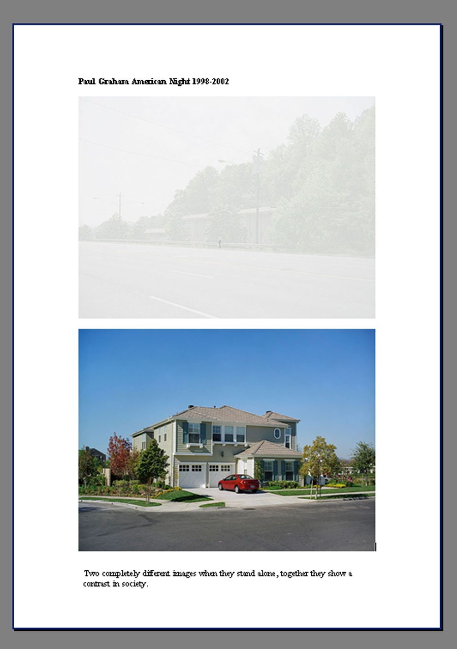
Referencing Paul Graham as an influence previously, due to his vast body of work and the variation of his imagery, I chose to have another, closer look. Paul Graham is a photographer who uses contrasts in his work. In American Night he places images which are bright, bold, tack sharp and colourful alongside highly over exposed images. In A Shimmer of Possibilities he shows a man industriously mowing the lawn, a large green expanse, interspersed with images of shelves stacked with food; the images are of different sizes. Paintings has close up shots of graffitied walls. A1- The Great North Road seems to cover everything! Portraits of people, landscape shots, interiors and exteriors of buildings, taken day and night. Some of the shots were a mix of garish colours whilst others were muted and monotone. it has been compared to "the great literary journeys to discover Britain, made by J.B. Priestley and George Orwell and ultimately Celia Fiennes." He in turn drew inspiration from Robert Frank, William Eggleston and Stephen Shore whose work in colour was revolutionary at that time. I hoped to make the inclusion of colour part of the factor within my portfolio, either linking images visually, as a contrast or to suggest a certain mood. Graham examined the social landscape and this was my intention.
FT
http://www.paulgrahamarchive.com/
http://vimeo.com/41306675
During the research into Welling and my mind-mapping, ideas began to form and link to Graham's A1 project. Just as the A1 became a crucial industrial link between central London and Edinburgh, the A2 was an important link from London to Dover - the shops in Welling sprang up along the High Street which led onto Shooter's Hill and beyond. I wondered if I could challenge myself to complete the project within a 4 mile straight road, from Danson Park to Shooters Hill? I also wanted to see if I could convey a sense of place which is made significant by the people who dwell in it by showing traces of them rather than their actual presence.
Shooting the Ideas
Pre-shoot check list
3 camera batteries fully charged,
Memory card in camera plus spares formatted and packed in bag
Canon 400D Camera, sensor clear from dust
Lens clean and free from dust/grease spots
Lens selection adequate for needs - final choice was for my EF-S 17-55mm f/2.8 IS USM. It has a constant f/2.8 aperture throughout the zoom range and a 3-stop Image Stabilizer, ideal for a good performance and framing flexibility in low light conditions.
Rainsleeve
Lens Hood
Tripod/Monopod for long exposure night shooting
Shutter release cable
Shot list
Pen and paper
With the idea of one straight road and contrasts in my head I ventured out, camera in hand shooting different locations as I went, I was looking for contrasting ideas, anything that would spark my creativity. Hopefully! I photographed on and off over a very long period of time, starting, stopping, as I reworked other assignments or life took over, sons GCSE's, then AS's, daughter's degree, settling my mum's estate, her will was contested...honestly it would fill a book!
Processing/workflow
Although quite a few of the shoots were exploratory I still followed the initial processing workflow.
Although not in Welling I took a day trip into London and experimented with reflections and abstract shots as part of the GCSE art group's theme of Order and Disorder.
The above are just a snapshot of some of the explorations undertaken. I compared houses, footpaths, streets, ways of remembering people, shops, different light, times of day, seasons, abstracts, ways people used the local facilities, you name it I think I did it...then enough was enough! The final decision had to be made.
As the shoots progressed I realized although it probably was possible to complete my initial challenge of remaining along the same route, some images didn't quite fit this criteria, even if the majority did. Those that didn't however, do fall within the same small area, with just a little deviation. Some shots I was happy with but struggled to find a successful comparison. Others although a comparison, had no real impact - a house is a house, a park bench is a park bench, unless you can attach some emotional meaning or extra narrative to it. Take for example Ethronvi Road, one of my test shots. The builder of the then new estate, named the road after his three children, Ethel, Ronald and Violet. Sadly it isn't a terribly exciting road to photograph and nothing of interest occurred whilst I was there, so it was dismissed. I have indicated which images were taken along the old A2.
For the final selection:
Some of the failures with my original set were not showing contrast, not using different perspectives, or shooting at different times of day, not experimenting with light, movement...the list is quite long...therefore I wanted to address as many of these issues as possible.
It has become apparent to me that when shooting I favour landscape orientation over portrait. This is no doubt due to the fact that we humans have binocular vision - in which both eyes are used together giving a wider field of view and depth perception. Apparently humans have a maximum horizontal field of view of approximately 190 degrees with two eyes. The first hurdle to overcome was to shoot more portrait. This set me thinking along the lines of contrasting images, some portrait some landscape, then contrast in general. I mind-mapped some of the areas and items of interest within Welling and the contrasts within photography: seasons, light/dark, suburbs/green spaces, portrait/landscape, straight/abstract, sharp images/motion blur, wide angle/close up, high/low perspectives, tranquil/busy and negative space/positive space. This mind-map can be found in my learning log.
Referencing Paul Graham as an influence previously, due to his vast body of work and the variation of his imagery, I chose to have another, closer look. Paul Graham is a photographer who uses contrasts in his work. In American Night he places images which are bright, bold, tack sharp and colourful alongside highly over exposed images. In A Shimmer of Possibilities he shows a man industriously mowing the lawn, a large green expanse, interspersed with images of shelves stacked with food; the images are of different sizes. Paintings has close up shots of graffitied walls. A1- The Great North Road seems to cover everything! Portraits of people, landscape shots, interiors and exteriors of buildings, taken day and night. Some of the shots were a mix of garish colours whilst others were muted and monotone. it has been compared to "the great literary journeys to discover Britain, made by J.B. Priestley and George Orwell and ultimately Celia Fiennes." He in turn drew inspiration from Robert Frank, William Eggleston and Stephen Shore whose work in colour was revolutionary at that time. I hoped to make the inclusion of colour part of the factor within my portfolio, either linking images visually, as a contrast or to suggest a certain mood. Graham examined the social landscape and this was my intention.
FT
http://www.paulgrahamarchive.com/
http://vimeo.com/41306675
During the research into Welling and my mind-mapping, ideas began to form and link to Graham's A1 project. Just as the A1 became a crucial industrial link between central London and Edinburgh, the A2 was an important link from London to Dover - the shops in Welling sprang up along the High Street which led onto Shooter's Hill and beyond. I wondered if I could challenge myself to complete the project within a 4 mile straight road, from Danson Park to Shooters Hill? I also wanted to see if I could convey a sense of place which is made significant by the people who dwell in it by showing traces of them rather than their actual presence.
Shooting the Ideas
Pre-shoot check list
3 camera batteries fully charged,
Memory card in camera plus spares formatted and packed in bag
Canon 400D Camera, sensor clear from dust
Lens clean and free from dust/grease spots
Lens selection adequate for needs - final choice was for my EF-S 17-55mm f/2.8 IS USM. It has a constant f/2.8 aperture throughout the zoom range and a 3-stop Image Stabilizer, ideal for a good performance and framing flexibility in low light conditions.
Rainsleeve
Lens Hood
Tripod/Monopod for long exposure night shooting
Shutter release cable
Shot list
Pen and paper
Processing/workflow
Although quite a few of the shoots were exploratory I still followed the initial processing workflow.
Calibrate monitor with Spyder3 calibration tool and software
Upload with Adobe Bridge - apply metadata template
Discard obvious rejects
Name/Date images
Archive to hard-drive and portable disc drive
Choose first and second selects using filtering
 |
| Danson Park Summer 2013 |
 |
| Danson Park Autumn 2013 |
 |
| Abstracts |
 |
| Exploring Ideas Winter 2014 |
 |
| Developing Ideas |
 |
| Rainy Day Exploration |
 |
| Further Explorations |
 |
| High Street and view of the City at dusk |
 |
| Some new ideas others revisited |
 |
| More ideas |
The above are just a snapshot of some of the explorations undertaken. I compared houses, footpaths, streets, ways of remembering people, shops, different light, times of day, seasons, abstracts, ways people used the local facilities, you name it I think I did it...then enough was enough! The final decision had to be made.
As the shoots progressed I realized although it probably was possible to complete my initial challenge of remaining along the same route, some images didn't quite fit this criteria, even if the majority did. Those that didn't however, do fall within the same small area, with just a little deviation. Some shots I was happy with but struggled to find a successful comparison. Others although a comparison, had no real impact - a house is a house, a park bench is a park bench, unless you can attach some emotional meaning or extra narrative to it. Take for example Ethronvi Road, one of my test shots. The builder of the then new estate, named the road after his three children, Ethel, Ronald and Violet. Sadly it isn't a terribly exciting road to photograph and nothing of interest occurred whilst I was there, so it was dismissed. I have indicated which images were taken along the old A2.
For the final selection:
Caption/add information as required embedded in the IPTC
data - Metadata and descriptions were added to all images either via template
on upload or additional information added later via Photoshop File>file
information
Process selects in Raw adjusting exposure, dust spots, clarity,
chromatic aberration, white balance if necessary
 |
| Colour Space Adobe RGB 8bit 300 ppi |
Process in Adobe Photoshop, cropping, cloning out small
distractions using an adjustment layer, any further tweaks using adjustment layers.
Final Images
The course guidelines stipulated a portfolio of between 10-15 images. Through a process of elimination and due to the way I wished to effectively promote the completed body of work, I made a final selection of 12 images. The reasons for this amount and their inclusion are detailed below.
Image 1 - Paul
Image 2 - Plumstead Cemetery
In contrast to the street memorial I have included Plumstead Cemetery, a more traditional way of remembering friends and family who have passed. Research found Welling was originally formed part of the ancient manor of East Wickham, mentioned in the Domesday Book (1086) and East Wickham was included as part of the return for Plumstead.
Opened in 1890 and located on a hill which runs along the bottom of my road, the cemetery has gorgeous vistas across London. It contains many interesting graves and memorials, including two former Mayors of Woolwich and two recipients of the Victoria Cross; Private Thomas Flawn and Gunner Alfred Smith. There is also a memorial to victims of enemy action during WW2, especially those killed whilst working at Woolwich Arsenal. Death affects us all at some point, and recent events have brought this home, this image communicates both a personal and shared experience. Other contrasts to the previous image are a greater depth of field, a sense of stillness and tranquility, and a limited colour palette.The psychology of Green which is pale and muted by tinting or toning with White or Gray, usually creates a very relaxing environment. Ordinarily I would not choose to place an object so obviously mid-frame but I think this helps convey the stillness of the cemetery. The branches and their shadows frame the scene providing leading lines into the image whilst the serried ranks of the other grave stones lead diagonally away from the main centre stone. There is interest in the foreground lighter mid and background tones.
Image 3 - Jenton Avenue
Jenton Avenue could be considered a typical road in Welling, a mix of houses and bungalows built in about 1930 before people became 2/3 car families. Now front gardens and pathways are becoming driveways and those with side garden access are having garages built across them. What caught my eye was the personalization of the garage with the bright red moped mural which, on closer inspection seems to be a large print poster. I loved the way the gravelly concrete drive seems to continue into the poster and the red of the car on the driveway was echoed in the red moped, the European countryside vista a juxtaposition to the obvious concrete, geometric shapes of the real urban surroundings and the vibrant reds standing out against the bland magnolia wall paint. Shooting from a low perspective the wheel arch was incorporated to pick out the red in the poster and show curved lines to soften the straight lines of the building, providing interest in the fore, mid and background. Taken very early in the morning with ambient light still low.
Image 4 - Oxleas Woods
Oxleas Wood, as mentioned above, is one of the few remaining areas of ancient deciduous forest in southeast London with some areas dating back 8,000 years. It is part of a larger continuous area of woodland and parkland on the south side of Shooter's Hill. Oxleas Woods has its own website, the paths are well trodden being part of the south east London Green Chain walk. Hidden within you can find Severndroog castle (a rich man's folly built in 1784) and a terraced garden in Jack Wood. There is also a cafe, definitely a place for shared experiences.
I chose this image as the meandering woodland path is in direct contrast the straight concrete path and illustration of trees in the previous photograph. It compares the suburban to the green open spaces only a few miles away. The sharp clear lines of the driveway and buildings are opposite to the natural forms of the woodland and the early morning mists help shroud any straight lines. The subtle green palette of the trees and shrubs, complementary to the red of the car and moped, another dissimilitude. Whilst the vehicles suggest transport, and movement - a link to the A2, M25 and the constant threat of urban sprawl to our local environment the woodlands suggest a slower more peaceful pace which gives no indication of the perils it once faced.
The patch of light on the bungalow echoed by the patch of early morning light on the trees does visually link the two.
Taken early in the morning I used a tripod, slow shutter speed with a shutter release cable.
Along the A2
Image 5 - Supertramp Ladies Fashions
Supertramp ladies fashions became a victim to the current economic climate. Having closed down several months ago the lease has not as yet been picked up by anyone else. This is a story told in many towns across the country, with large retail outlets and large supermarkets squeezing out the smaller businessman from the local High Street. I have previously purchased items from this store so it was sad to see it go. Looking in, what caught my eye at first were the pools of light coming from the open doorway and reflected from the mirrors in the open changing rooms. The closer I looked the more detail I saw, the reflections of the busy street outside a juxtaposition the the stillness of the shop, and the only splash of colour in an otherwise monotone image. The geometric patterns of the ceiling tiles, the tiled pillar, the abstract patterns of the light fittings and the forlorn way the changing room curtains seemed to hang straight down. The lines of the ceiling tiles lead your eye into the frame where you take in the details at the back of the shop and the pools of light lead the eye back out into the vacant, negative, space of the shop. In the meaning of colours, gray is boring, drab and too much of it creates sadness and depression, a tendency to loneliness and isolation which I think this image represents.
Along the A2
Image 6 - Morrisons
Back in 2008/2009 Welling town centre was left like a ghost town. The Welling High Street supermarket, formerly owned by the Co-op, closed after being bought by the Morrisons chain. They planned to alter and refurbish the store before reopening later the next year. Unfortunately the closure coincided with the redevelopment of Embassy Court, directly opposite the Co-op, where the second High Street supermarket Tesco, also shut. Shoppers had to desert Welling to spend elsewhere. Both stores have now been rebuilt, even though it seems odd to have two superstores directly opposite each other.
This image in direct contrast the the one above as it portrays two large successful stores in the same High Street. I love the distorted, abstract reflections of Tesco in Morrisons windows (a juxtaposition to the geometric repeat pattern of the pavement) It is unclear as to what is real and what is reflection.
Along the A2
Image 7 - Danson Park
Image 8 - Okehampton Crescent
A roundabout in the middle of a fairly large crossroads about five minutes away from my home. Again an early morning, but this time pre-dawn shot, this urban image - the street furniture with geometric shapes - is in contrast to that of Danson Park. The arrows commanding your direction as opposed to letting you ramble at will. Having said that there are several strong visual links; the shadows of the trees and street furniture lead your eye into the frame, the trees and first lamppost an implied triangle just like the tree silhouettes, and these also provide frames within a frame. The starburst of the street light echoes the starburst of the sun coming through the trees. The light trails indicate a presence of people and suggest movement. The arrows on the roundabout lead your eye across the frame to the left whilst the light trails lead the viewer's gaze to the right. The perspective of the street lights take your eye right to the vanishing point. There is interest in the fore, mid and background.
The next four images were not produced as contrasting images. Taking advantage of the remit to explore and experiment I chose to photograph stand alone images that would still come together within one body of work and the exploration of my local neighbourhood. I planned to explore the abstract within photographs, leading to completely abstract images.
Image 9 - Love-in-a-mist (Nigella)

On first inspection this image is purely an image of a flower but for me it sums up personal and shared experiences. Even for me it is polysemic. The single flower signifies the individuals that make up the community as a whole but I also think it represents me. The two smaller flowers to the left are my children. The one in the background slightly out of focus signifies my daughter who is at University in Salford, graduating in July, and although still an important part of her life I am no longer central to it. The other my teenage son, approaching 17 and my influence is fading fast!
My front garden is deliberately uncultivated for two reasons, firstly to attract as much wildlife as possible - I allow wildflowers to grow and self seed (although I pull out dandelions) with thistles, nigella, aquilegia and poppies running wild. I enjoy the riot of colours, as do the insects and passersby. Secondly due to the demands on my time. A single parent, I juggle work, studies, home and children. I have now lived in this property as a single parent for as long as I did as in a marriage. The common name Love-in-a-mist and the flowers delicate form conjures up the imagery of the ephemeral nature of love.The blue colour symbolizes the down moments whilst the sunny day characterizes my optimism.
Several people have knocked on my door and asked for seed-heads and I have no problems with sharing. On one occasion a rather drunk man asked if he could pick some as a peace offering to his long standing partner ;oD This therefore does sum up many shared experiences, although the audience may have to write their own narratives. I deliberately chose a shallow depth of field as I wanted to portray the mystery behind the obvious, no-one knows what goes on behind closed doors, and explore the abstract patterns created by the foliage in the background. (Only I know the dark blob in the background is my large recycling bin)
Image 10 - Puddles

Handheld 55mm f2.8 1/25 ISO400
Over the past few winters the level of rainfall has been excessive with many drains overflowing, pot holes and sink holes appearing across the borough. Several areas have suffered with local flooding, a common shared experience. My roof began to leak during one of the heavy storms so I feel very strongly about the rain we had this winter. To me this image portrays people's stoicism, how they carry on regardless, wading through despite the constant deluges. The reflections and ripples exploring abstract patterns whilst the ripples also represent the impact we have on each other. The motion blur and foot mid air help suggest movement as do the increasing ripples.
Along the A2
Image 11 - Bus

Handheld 46mm f5.6 1/30 ISO200
Still focusing on the bad weather and the impact it had on my ability to photograph the scenes I wanted, as well as the community of Welling as a whole, I took some images from the safety of my car, concentrating on capturing the abstract. As a driver I feel sorry for those standing at bus stops in inclement weather and on the odd occasion I have to catch the bus I stare at the drivers in their warm cars listening to their radios with envy. Something I am sure we all experience at some stage.The random patterns of the rivulets and focusing on the glass has distorted the passing bus. The bright red a contrast the the bus' darker interior, the coloured blobs suggesting the outline of the passengers. The geometric shapes of the windows, wheel and bus livery a contrast to the organic shapes of the raindrops.
Along the A2
Image 12 - Abstract

Tripod 55mm f3.2 1/13 ISO100
The final image within the set is total abstraction, taken in the pre-dawn light I deliberately took several out of focus images of the traffic to produce bokeh, the headlights and tail lights merging; Welling is very close to the A2 and the M25 with many of its residents having the shared experience of commuting to work. The photograph seems to contain all the hues contained in the other shots within the set tying them together, it has light and dark tones, vibrant colours and more subtle subdued shades. The circles link and overlap, suggesting how we in society link and overlap yet still keep parts of ourselves hidden, just as the abstraction hides the exact subject matter of this photograph. It also suggests that no matter how much we explore our surroundings there will always be more to discover.
Along the A2
What happens next?
The other assignments within this module are produced for a specific purpose, a book cover, a magazine spread, and photojournalistic images to cover an event. This first assignment is the only one that has the freedom to be totally of my own choice, as subjective as I wish and without a specific target audience/medium. The brief advises us to look at several genres and allows for the final portfolio to be a mixture of photographic styles should we so wish.
I have been to several exhibitions during the completion of this course and studied many practitioners and the different ways they display their work. Taking all of this into consideration I decided to approach this project as if an exhibition was it's final outcome. The intention would be to display the images in pairs, one portrait and one landscape, showing the contrasts within my local environment, these contrasts would therefore be physical as well as visual.
Photographers' work is curated in many ways, invariably in high-ceilinged rooms, natural light flooding in, or under spot lights, with the majority of the walls being white, cream, or grey. Very few were of darker tones and none I visited were vibrantly coloured. Images were not framed at all and unceremoniously stuck to the wall with blu-tack, others mounted on block boards. Some framed but not behind glass, some framed but with no passe-partout. On the whole frames are either black or white although I have seen brown and in some instances the frames were coloured to match the imagery on display. The choice of framing is obviously a very conscious one, with the impact the frames having upon the images being an important visual decision. At the recent Sony WPA for example, photographer Salvatore Esposito entered two categories. One body of work The Power of Silence, was framed in white, while What is Missing was framed in black. Both shot in black and white The Power of Silence told a positive narrative about the love of parents and family unity which kept a family with autistic twins together. What is Missing focused mainly "on young criminals affiliated with the Camorra, on drug dealers, robbers and others living illegally." Elad Lassry, nominated for the Deutsche Borse photography prize in 2011 had colourful frames matching the colourful subject matter of his photographs.
http://worldphoto.org/about-the-sony-world-photography-awards/pro/salvatore-esposito
Passe-partouts also come in a variety of shades and colours and oddly white, which I thought would be the first choice, can actually appear quite jarring when against certain images and an off-white/cream makes for a subtler presentation. Having said that I think the cream chosen for my framed examples is a too dark! The images themselves, framed or otherwise, were either uniform size and displayed in neat rows or lines but some had montages of images of various sizes and crops placed all over the wall, even at floor level like Jim Goldberg's Open See.
In this instance I have theoretically chosen to have the images printed A3, as I like the idea of the audience getting close to the work to examine it, this way they would be more intimate with the work, not able to stand away; the closer they get the more of an effort they would have to make to engage with it. Experimenting I think a cream passe-partout works better with the majority of the images and is not detrimental to those where white was not an issue. The frame would be thin black and anti glare glass used. I have noted that in many exhibitions the light reflecting on the glass has been a problem, as well as the glass not being cleaned properly with residual smears left behind. Surprisingly, this was most notable at the recent Steve McCurry exhibition I attended at the Beetles and Hoxton Gallery in Swallow Street this weekend.
In view of the fact that I can be slightly more experimental with this assignment I have chosen to have eight images displayed as pairs and the final four, more abstract photos printed at larger than average postcard size @ 9x6 and displayed as a vertical quadriptych.
The order of the display I would suggest to be as follows:
The strong geometric shapes and vertical lines of both of the above images connect to the vertical lines of the buildings in the next pair, the red of the Tesco signs echoed in the red of the car and moped, the road surface to the driveway, the yellow lines on the road linking to the splash of yellow in the poster.
The image of Oxleas Woods lead naturally to the trees of Danson Park and the early morning light in the final pair within the portfolio.
The quadriptych would hang at the very end, an exploration of abstraction, indicating no matter how much we think we know our neighbourhood certain elements will always remain hidden, the abstraction building slowly from the first image within the set to the last, with the presence of people implicit rather than direct.
Whilst at the seminar Sharing Photography and Photographs – Photography in a Connected Age at the Royal Photographic Society and University of Westminster, I heard James Evans speak and present a slideshow about his work.What I found fascinating about his approach was his willingness to allow the viewing public to handle his art, although he regretted it when they stole it!
Venturing into the realms of installation pieces I would like to construct two 8 inch cubes, (I'd have to experiment to discover the actual size) each face would be made from an eight inch square section from each photograph in the series. The faces of the cubes showing the different facets of Welling. The cubes would be supported, on its vertex, in an acrylic slender almost "egg cup" like holder, 12 inches above a cracked mirrored surface on a plinth. The mirror would reflect the faces, making abstract patterns and showing the fragility of the interdependence we share. The cubes can be moved, changing which face is uppermost therefore altering the kaleidoscopic patterns. These cubes would ideally be placed at either end of the photographic display.

I'd like to be able to offer a selection of postcards from the exhibition for visitors to take home and, if going the whole hog with multimedia presentation I could even have an audio file sound recording of Welling High Street playing on a loop, like Mishka Henna's No Man's Land,making the exhibition a complete visual/ audio and kinesthetic experience.
Portfolios can also be published on a photographers website. I currently have a free Weebly site which needs some work doing to it to bring it up to scratch - a job for next week perchance....
http://jfocaphotography.weebly.com/
What have I learnt?
Responding to feedback from assignment five when re-working this assignment I thought about the advice given:
PLAN – RESEARCH – EQUIPMENT – CAPTURE – 1ST EDIT – 2ND EDIT – PRINT and hope I have provided enough evidence that I have carried out each stage and have realised the importance of each one.
Thinking before capturing, all the stages before picking up my camera, as well as when I had the scene in front of me, had an impact on trying to link the work rather than randomly shooting and hoping for the best when I got home. I recognise that it is important to adapt your ideas, be able to develop them as the series continues, to not be blinkered, sticking too rigidly to original thoughts. Carrying out research assisted greatly on pinning down aspects where I wanted to concentrate my focus
I learnt rain does not have to stop play, to use colour effectively, to use contrast, juxtaposition different perspectives in one body of work.
Images selected, I gave serious thought about how they could be made into tangible objects in a variety of ways, these ideas could be extended, made into business cards, key-rings, mouse-mats, the list in endless if you can afford to create them and people actually want to buy them!
In some of the images I got closer to the main subject and tried to be mindful of background when making compositions. I endeavored to make sure every element in the images was there for a reason, that everything added to the narrative/context, that the backgrounds were in keeping with the main subject.
Oddly what I learnt most wasn't photographic. In my effort to show others our interdependence, our common experiences, the impact we have on each other and whilst imbuing objects with life and emotional resonance, I realized I am more connected to my neighbourhood than originally thought.
Conclusion
Looking back at the original failures and my intention to address them I think I have been successful, showed contrast, used different perspectives, shot at different times of day, experimented with light and movement. I have taken more, or been able to crop images, with portrait orientation. The final set shows obvious contrasts of portrait and landscape, seasons, light/dark, suburbs/green spaces,straight/abstract, sharp images/motion blur, wide angle/close up, high/low perspectives, tranquil/busy and negative/positive space.
Referencing Paul Graham was useful especially A1- The Great North Road , this encouraged me to not focus on one aspect but to explore different styles and perspectives, to capture architecture as well as landscape, experiment with light and colour, linking images visually, as a contrast or to suggest a certain mood. Graham examined the social landscape and so have I. Although I did not stick rigidly to the route of the A2 I did not stray much beyond its area of influence. I think I met my other challenge which was to show the traces of people implicitly, using reflection, abstraction, silhouettes and inference.
I am pleased with my decision to scrap the original assignment, taking on-board the constructive criticism I received. Although it has taken me a long time to complete the re-working it gave me the opportunity to look at other practitioners, visit more exhibitions and be more considered about my own work. The final set does convey a sense of place, places made significant by the people who dwell here, shows human activity and traces of people.
Feedback
Although a re-worked assignment I asked Keith if he would take a look at it for me seeing as he was not my tutor for the first attempt. Although extremely busy he agreed to have a peek. I was really pleased with is positive feedback, especially when he said he actually quite liked the first one too!
I have had a quick look at the assignment one re-submission and thought these were a very interesting and diverse set of images shot over a variety of locations, at a variety of different times, covering many issues both personal and local to you etc. (I particularly liked the first shot of the flowers and bus and also the bus through rainy window and the last shot of the abstract colours) I think I only took over as your tutor during assignment three, so didn't feedback on the first set .... But I've had a quick look at these as well and quite liked them also.
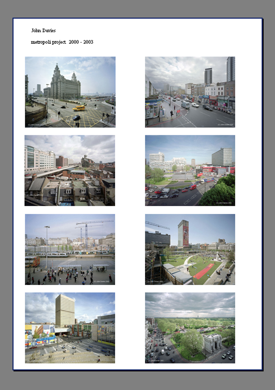
The main things as discussed is that you have responded very positively to the feedback offered and re-visited the work etc. I liked the research you conducted into Paul Graham / John Davies .... which is all very relevant as far as I am concerned.
So many thanks again to Keith who has been a brilliantly supportive and instructive tutor.
 |
| example of working layers image saved as tiff |
Final Images
The course guidelines stipulated a portfolio of between 10-15 images. Through a process of elimination and due to the way I wished to effectively promote the completed body of work, I made a final selection of 12 images. The reasons for this amount and their inclusion are detailed below.
Image 1 - Paul
 |
| Tripod 24mm f11 1/20 ISO200 |
On 29th November 2002 19-year-old Paul Powell was involved in an accident on Shooters Hill. He and his best friend, Sam Turner, had escorted a female friend onto a bus. As they re-crossed the road Paul was stuck by a car overtaking the stationary bus. His sister still places flowers on a nearby lamppost in his memory. The colours are strong primary colours which catch your attention. Yellow is now strongly associated with remembering people; the yellow ribbon has long been a symbol of support for absent or missing loved ones. A fairly busy image with no negative space it communicates a personal experience of place and how it has been made significant by one particular family. What made this event more tragic is the pedestrian bridge yards away from where the accident took place. This image was selected because it helped tell the narrative, the flowers commemorating his life, the bus which was a significant part of the accident, and the overhead bridge in the background. Wanting to capture movement within the image I chose to shoot at a slow shutter speed of 1/20 and used a tripod and shutter release cable. Shot on ISO200 due to a slightly overcast day the lighting was superb to capture the flowers without shadows or deep contrasts and I think the lighting adds to the sombre subject. The diagonals of the rose stems lead your eye into the frame and the composition of the deep yellow roses divide the frame in half diagonally leaving the other half to tell the narrative. There is interest in the fore, mid and background, the interaction between the different planes making the image dynamic.The shallow depth of field provides a blurred background which includes the elements relating to the story but allows the audience to tell their own.
Along the A2
Image 2 - Plumstead Cemetery
 |
| Handheld 17mm 1/40 f11 ISO100 |
Opened in 1890 and located on a hill which runs along the bottom of my road, the cemetery has gorgeous vistas across London. It contains many interesting graves and memorials, including two former Mayors of Woolwich and two recipients of the Victoria Cross; Private Thomas Flawn and Gunner Alfred Smith. There is also a memorial to victims of enemy action during WW2, especially those killed whilst working at Woolwich Arsenal. Death affects us all at some point, and recent events have brought this home, this image communicates both a personal and shared experience. Other contrasts to the previous image are a greater depth of field, a sense of stillness and tranquility, and a limited colour palette.The psychology of Green which is pale and muted by tinting or toning with White or Gray, usually creates a very relaxing environment. Ordinarily I would not choose to place an object so obviously mid-frame but I think this helps convey the stillness of the cemetery. The branches and their shadows frame the scene providing leading lines into the image whilst the serried ranks of the other grave stones lead diagonally away from the main centre stone. There is interest in the foreground lighter mid and background tones.
Image 3 - Jenton Avenue
 |
| Handheld 33mm f8 1/250 ISO400 |
Jenton Avenue could be considered a typical road in Welling, a mix of houses and bungalows built in about 1930 before people became 2/3 car families. Now front gardens and pathways are becoming driveways and those with side garden access are having garages built across them. What caught my eye was the personalization of the garage with the bright red moped mural which, on closer inspection seems to be a large print poster. I loved the way the gravelly concrete drive seems to continue into the poster and the red of the car on the driveway was echoed in the red moped, the European countryside vista a juxtaposition to the obvious concrete, geometric shapes of the real urban surroundings and the vibrant reds standing out against the bland magnolia wall paint. Shooting from a low perspective the wheel arch was incorporated to pick out the red in the poster and show curved lines to soften the straight lines of the building, providing interest in the fore, mid and background. Taken very early in the morning with ambient light still low.
Image 4 - Oxleas Woods
 |
| Tripod 44mm f8 1/10 ISO100 |
I chose this image as the meandering woodland path is in direct contrast the straight concrete path and illustration of trees in the previous photograph. It compares the suburban to the green open spaces only a few miles away. The sharp clear lines of the driveway and buildings are opposite to the natural forms of the woodland and the early morning mists help shroud any straight lines. The subtle green palette of the trees and shrubs, complementary to the red of the car and moped, another dissimilitude. Whilst the vehicles suggest transport, and movement - a link to the A2, M25 and the constant threat of urban sprawl to our local environment the woodlands suggest a slower more peaceful pace which gives no indication of the perils it once faced.
The patch of light on the bungalow echoed by the patch of early morning light on the trees does visually link the two.
Taken early in the morning I used a tripod, slow shutter speed with a shutter release cable.
Along the A2
Image 5 - Supertramp Ladies Fashions
 |
| Handheld 17mm f3.5 1/250 ISO400 |
Supertramp ladies fashions became a victim to the current economic climate. Having closed down several months ago the lease has not as yet been picked up by anyone else. This is a story told in many towns across the country, with large retail outlets and large supermarkets squeezing out the smaller businessman from the local High Street. I have previously purchased items from this store so it was sad to see it go. Looking in, what caught my eye at first were the pools of light coming from the open doorway and reflected from the mirrors in the open changing rooms. The closer I looked the more detail I saw, the reflections of the busy street outside a juxtaposition the the stillness of the shop, and the only splash of colour in an otherwise monotone image. The geometric patterns of the ceiling tiles, the tiled pillar, the abstract patterns of the light fittings and the forlorn way the changing room curtains seemed to hang straight down. The lines of the ceiling tiles lead your eye into the frame where you take in the details at the back of the shop and the pools of light lead the eye back out into the vacant, negative, space of the shop. In the meaning of colours, gray is boring, drab and too much of it creates sadness and depression, a tendency to loneliness and isolation which I think this image represents.
Along the A2
Image 6 - Morrisons
 |
| Handheld 55mm f2.8 1/320 ISO200 |
This image in direct contrast the the one above as it portrays two large successful stores in the same High Street. I love the distorted, abstract reflections of Tesco in Morrisons windows (a juxtaposition to the geometric repeat pattern of the pavement) It is unclear as to what is real and what is reflection.
Along the A2
Image 7 - Danson Park
 |
| Handheld 39mm f11 1/80 ISO200 |
Danson estate, which probably existed since before the 13th Century, is now run as a public park by Bexley Council. A popular venue, it provides a large number of facilities for both active recreation or just enjoying the scenery, with a full programme of annual events including summer concerts and the annual Fireworks Display in November.
Danson Park is designated Grade II on the English Heritage register of parks and gardens of special historical interest, occupying more than 180 acres of land. The park, including the gardens of Danson House, benefited from Heritage Lottery Fund support for a programme of renovation and restoration. This was completed in 2006. Many local residents constantly use and enjoy the events and facilities provided by Danson Park. During the summers when my children were growing up we would spend a lot of time here. It was very local, we would pack a picnic, bread for the ducks, skates, bikes etc arrive first thing in the morning and leave last thing at night. At one point I worked opposite the park and would walk here every lunch time to clear my head.
This image also represents some of the green spaces easily accessible in my neighbourhood. Taken early one October morning, I loved the quality of the light, the low lying mist and the starburst coming through the trees. The soft Autumnal colour palette provides a calm relaxing atmosphere, summing up the serene experiences that can be had. The shadows of the trees help lead your eye into the frame where the strong outlines of the silhouetted trees frame the goal posts, and the silhouettes of the dog walkers indicate two of the activities people enjoy here. There is interest in the fore, mid and background. The foreground being dark-toned, the middle distance mid-toned, and the background lighter in tone. The branches and autumn leaves providing an abstract pattern and organic shapes.
Along the A2
Image 8 - Okehampton Crescent
 |
| Tripod 23mm f8 10 |
The next four images were not produced as contrasting images. Taking advantage of the remit to explore and experiment I chose to photograph stand alone images that would still come together within one body of work and the exploration of my local neighbourhood. I planned to explore the abstract within photographs, leading to completely abstract images.
Image 9 - Love-in-a-mist (Nigella)
Handheld 33mm f2.8 1/1600 ISO100
My front garden is deliberately uncultivated for two reasons, firstly to attract as much wildlife as possible - I allow wildflowers to grow and self seed (although I pull out dandelions) with thistles, nigella, aquilegia and poppies running wild. I enjoy the riot of colours, as do the insects and passersby. Secondly due to the demands on my time. A single parent, I juggle work, studies, home and children. I have now lived in this property as a single parent for as long as I did as in a marriage. The common name Love-in-a-mist and the flowers delicate form conjures up the imagery of the ephemeral nature of love.The blue colour symbolizes the down moments whilst the sunny day characterizes my optimism.
Several people have knocked on my door and asked for seed-heads and I have no problems with sharing. On one occasion a rather drunk man asked if he could pick some as a peace offering to his long standing partner ;oD This therefore does sum up many shared experiences, although the audience may have to write their own narratives. I deliberately chose a shallow depth of field as I wanted to portray the mystery behind the obvious, no-one knows what goes on behind closed doors, and explore the abstract patterns created by the foliage in the background. (Only I know the dark blob in the background is my large recycling bin)
Image 10 - Puddles
Handheld 55mm f2.8 1/25 ISO400
Over the past few winters the level of rainfall has been excessive with many drains overflowing, pot holes and sink holes appearing across the borough. Several areas have suffered with local flooding, a common shared experience. My roof began to leak during one of the heavy storms so I feel very strongly about the rain we had this winter. To me this image portrays people's stoicism, how they carry on regardless, wading through despite the constant deluges. The reflections and ripples exploring abstract patterns whilst the ripples also represent the impact we have on each other. The motion blur and foot mid air help suggest movement as do the increasing ripples.
Along the A2
Image 11 - Bus
Handheld 46mm f5.6 1/30 ISO200
Still focusing on the bad weather and the impact it had on my ability to photograph the scenes I wanted, as well as the community of Welling as a whole, I took some images from the safety of my car, concentrating on capturing the abstract. As a driver I feel sorry for those standing at bus stops in inclement weather and on the odd occasion I have to catch the bus I stare at the drivers in their warm cars listening to their radios with envy. Something I am sure we all experience at some stage.The random patterns of the rivulets and focusing on the glass has distorted the passing bus. The bright red a contrast the the bus' darker interior, the coloured blobs suggesting the outline of the passengers. The geometric shapes of the windows, wheel and bus livery a contrast to the organic shapes of the raindrops.
Along the A2
Image 12 - Abstract
Tripod 55mm f3.2 1/13 ISO100
The final image within the set is total abstraction, taken in the pre-dawn light I deliberately took several out of focus images of the traffic to produce bokeh, the headlights and tail lights merging; Welling is very close to the A2 and the M25 with many of its residents having the shared experience of commuting to work. The photograph seems to contain all the hues contained in the other shots within the set tying them together, it has light and dark tones, vibrant colours and more subtle subdued shades. The circles link and overlap, suggesting how we in society link and overlap yet still keep parts of ourselves hidden, just as the abstraction hides the exact subject matter of this photograph. It also suggests that no matter how much we explore our surroundings there will always be more to discover.
Along the A2
What happens next?
The other assignments within this module are produced for a specific purpose, a book cover, a magazine spread, and photojournalistic images to cover an event. This first assignment is the only one that has the freedom to be totally of my own choice, as subjective as I wish and without a specific target audience/medium. The brief advises us to look at several genres and allows for the final portfolio to be a mixture of photographic styles should we so wish.
I have been to several exhibitions during the completion of this course and studied many practitioners and the different ways they display their work. Taking all of this into consideration I decided to approach this project as if an exhibition was it's final outcome. The intention would be to display the images in pairs, one portrait and one landscape, showing the contrasts within my local environment, these contrasts would therefore be physical as well as visual.
 |
| Example of images displayed |
Photographers' work is curated in many ways, invariably in high-ceilinged rooms, natural light flooding in, or under spot lights, with the majority of the walls being white, cream, or grey. Very few were of darker tones and none I visited were vibrantly coloured. Images were not framed at all and unceremoniously stuck to the wall with blu-tack, others mounted on block boards. Some framed but not behind glass, some framed but with no passe-partout. On the whole frames are either black or white although I have seen brown and in some instances the frames were coloured to match the imagery on display. The choice of framing is obviously a very conscious one, with the impact the frames having upon the images being an important visual decision. At the recent Sony WPA for example, photographer Salvatore Esposito entered two categories. One body of work The Power of Silence, was framed in white, while What is Missing was framed in black. Both shot in black and white The Power of Silence told a positive narrative about the love of parents and family unity which kept a family with autistic twins together. What is Missing focused mainly "on young criminals affiliated with the Camorra, on drug dealers, robbers and others living illegally." Elad Lassry, nominated for the Deutsche Borse photography prize in 2011 had colourful frames matching the colourful subject matter of his photographs.
 | ||
Russian Blue, 2012 Elad Lassry
Passe-partouts also come in a variety of shades and colours and oddly white, which I thought would be the first choice, can actually appear quite jarring when against certain images and an off-white/cream makes for a subtler presentation. Having said that I think the cream chosen for my framed examples is a too dark! The images themselves, framed or otherwise, were either uniform size and displayed in neat rows or lines but some had montages of images of various sizes and crops placed all over the wall, even at floor level like Jim Goldberg's Open See.
In this instance I have theoretically chosen to have the images printed A3, as I like the idea of the audience getting close to the work to examine it, this way they would be more intimate with the work, not able to stand away; the closer they get the more of an effort they would have to make to engage with it. Experimenting I think a cream passe-partout works better with the majority of the images and is not detrimental to those where white was not an issue. The frame would be thin black and anti glare glass used. I have noted that in many exhibitions the light reflecting on the glass has been a problem, as well as the glass not being cleaned properly with residual smears left behind. Surprisingly, this was most notable at the recent Steve McCurry exhibition I attended at the Beetles and Hoxton Gallery in Swallow Street this weekend.
In view of the fact that I can be slightly more experimental with this assignment I have chosen to have eight images displayed as pairs and the final four, more abstract photos printed at larger than average postcard size @ 9x6 and displayed as a vertical quadriptych.
The order of the display I would suggest to be as follows:
 |
| one |
I think it would be good to begin with a brightly coloured image which catches the attention; the theme of death and the ending of something lead nicely into the empty shop premises. The shadows of the trees and branches leading the eye into the frame just as the floorboards and ceiling tiles of the shop do. The mirrors and the windows creating frames within frames
 |
| two |
 |
| three |
 |
| four |
The quadriptych would hang at the very end, an exploration of abstraction, indicating no matter how much we think we know our neighbourhood certain elements will always remain hidden, the abstraction building slowly from the first image within the set to the last, with the presence of people implicit rather than direct.
 |
| five |
Venturing into the realms of installation pieces I would like to construct two 8 inch cubes, (I'd have to experiment to discover the actual size) each face would be made from an eight inch square section from each photograph in the series. The faces of the cubes showing the different facets of Welling. The cubes would be supported, on its vertex, in an acrylic slender almost "egg cup" like holder, 12 inches above a cracked mirrored surface on a plinth. The mirror would reflect the faces, making abstract patterns and showing the fragility of the interdependence we share. The cubes can be moved, changing which face is uppermost therefore altering the kaleidoscopic patterns. These cubes would ideally be placed at either end of the photographic display.
 |
| something a bit like this....... |
I'd like to be able to offer a selection of postcards from the exhibition for visitors to take home and, if going the whole hog with multimedia presentation I could even have an audio file sound recording of Welling High Street playing on a loop, like Mishka Henna's No Man's Land,making the exhibition a complete visual/ audio and kinesthetic experience.
Portfolios can also be published on a photographers website. I currently have a free Weebly site which needs some work doing to it to bring it up to scratch - a job for next week perchance....
http://jfocaphotography.weebly.com/
What have I learnt?
Responding to feedback from assignment five when re-working this assignment I thought about the advice given:
PLAN – RESEARCH – EQUIPMENT – CAPTURE – 1ST EDIT – 2ND EDIT – PRINT and hope I have provided enough evidence that I have carried out each stage and have realised the importance of each one.
Thinking before capturing, all the stages before picking up my camera, as well as when I had the scene in front of me, had an impact on trying to link the work rather than randomly shooting and hoping for the best when I got home. I recognise that it is important to adapt your ideas, be able to develop them as the series continues, to not be blinkered, sticking too rigidly to original thoughts. Carrying out research assisted greatly on pinning down aspects where I wanted to concentrate my focus
I learnt rain does not have to stop play, to use colour effectively, to use contrast, juxtaposition different perspectives in one body of work.
Images selected, I gave serious thought about how they could be made into tangible objects in a variety of ways, these ideas could be extended, made into business cards, key-rings, mouse-mats, the list in endless if you can afford to create them and people actually want to buy them!
In some of the images I got closer to the main subject and tried to be mindful of background when making compositions. I endeavored to make sure every element in the images was there for a reason, that everything added to the narrative/context, that the backgrounds were in keeping with the main subject.
Oddly what I learnt most wasn't photographic. In my effort to show others our interdependence, our common experiences, the impact we have on each other and whilst imbuing objects with life and emotional resonance, I realized I am more connected to my neighbourhood than originally thought.
Conclusion
Looking back at the original failures and my intention to address them I think I have been successful, showed contrast, used different perspectives, shot at different times of day, experimented with light and movement. I have taken more, or been able to crop images, with portrait orientation. The final set shows obvious contrasts of portrait and landscape, seasons, light/dark, suburbs/green spaces,straight/abstract, sharp images/motion blur, wide angle/close up, high/low perspectives, tranquil/busy and negative/positive space.
Referencing Paul Graham was useful especially A1- The Great North Road , this encouraged me to not focus on one aspect but to explore different styles and perspectives, to capture architecture as well as landscape, experiment with light and colour, linking images visually, as a contrast or to suggest a certain mood. Graham examined the social landscape and so have I. Although I did not stick rigidly to the route of the A2 I did not stray much beyond its area of influence. I think I met my other challenge which was to show the traces of people implicitly, using reflection, abstraction, silhouettes and inference.
I am pleased with my decision to scrap the original assignment, taking on-board the constructive criticism I received. Although it has taken me a long time to complete the re-working it gave me the opportunity to look at other practitioners, visit more exhibitions and be more considered about my own work. The final set does convey a sense of place, places made significant by the people who dwell here, shows human activity and traces of people.
Feedback
Although a re-worked assignment I asked Keith if he would take a look at it for me seeing as he was not my tutor for the first attempt. Although extremely busy he agreed to have a peek. I was really pleased with is positive feedback, especially when he said he actually quite liked the first one too!
I have had a quick look at the assignment one re-submission and thought these were a very interesting and diverse set of images shot over a variety of locations, at a variety of different times, covering many issues both personal and local to you etc. (I particularly liked the first shot of the flowers and bus and also the bus through rainy window and the last shot of the abstract colours) I think I only took over as your tutor during assignment three, so didn't feedback on the first set .... But I've had a quick look at these as well and quite liked them also.
The main things as discussed is that you have responded very positively to the feedback offered and re-visited the work etc. I liked the research you conducted into Paul Graham / John Davies .... which is all very relevant as far as I am concerned.
So many thanks again to Keith who has been a brilliantly supportive and instructive tutor.