Showing posts with label PWDP Projects. Show all posts

Thursday, 29 May 2014

PWDP Part Six - preparing for assessment

Project Revise and rework

Exercise:Review your work


Having confirmed that I am going to have my work formally assessed the final task was reviewing and reworking previous assignments and preparing for assessment. Those of you following my blog know that where necessary I have overhauled and reworked troublesome assignments! So much so I don't really want to look at them anymore :oP Hopefully I have responded to all feedback given and reflected about the processes on this blog and in my learning log.

So just how am I going to put together my assessment portfolio?

For assessment I need to send the reworked versions of all five assignments together with the original Assignments Two-Five. Glad about that as Assignment One original feedback was pretty pants! My tutor reports and learning log (s) also need to be included. Previously I had to send all tutor correspondence but this module doesn't seem to ask for that. However as some of my alterations and learning came about through this correspondence I shall also include a folder which can be looked at or disregarded as the assessors see fit. Link to my Blog will be sent as well as my learning logs, sample prints from each assignment, mock-up book, folders with documentation to support the assignments, flash drive with all assignment jpegs and anything else I think needs to be sent as a digital file.

A pre-assessment review

I spoke to my tutor for a while to clarify some points, we discussed the importance of labelling everything, packaging it well, inclusion of sample prints, importance of communication, anything in my learning log should be annotated as to why it was included, what did I like, how did it influence me? What did I learn from it? Ensure labels were on Blog posts, that my Blog was easy to navigate etc. I asked Keith if he would review my reworked assignment one seeing as it was a completely different project from the first rather than a tweaking to feedback, He kindly agreed and feedback has been added to the relevant blog posts and tutor feedback page, but in summary I was a happy bunny. Thank you Keith :o)

That all done and sorted, hopefully, the time has come (The Walrus said) to print things out, label it up, post it off and suffer until the results come out.....

Printing


  • Calibrate monitor


  • Process images - size, sharpen
  • Soft proof images


https://files.support.epson.com/docid/cpd3/cpd39134.pdf
http://www.epson.co.uk/gb/en/viewcon/corporatesite/products/mainunits/faq/11350/1104

handy links :o)


  • Open Photoshop
  • Edit>colour settings


  • Set to Adobe RGB (1998)
  • Select File>Print
  • Select your printer from the Printer List 


  • Select Photoshop Manages Colours
  • Assign ICC/ paper and print quality
  • Rendering Intent select Relative Colorimetric
  • Select the Black Point Compensation check box


  • Turn off High Speed and Edge Smoothing
  • Select ICM and OFF (no colour management) click OK
  • Print
Sounds quite simple! However in practice it doesn't always run as smoothly or as quickly as you anticipate. Some of my prints I had no issue with at all. I accept that what you see on screen will not be precisely what comes out but the majority of mine did. Soft proofing also seemed different from image to image. Some the colours/density did alter, other changed totally. I noticed this particularly with the Abstract Bokeh and the Nigella, even though I compensated for this, both were quite flat, the images were dark and the colours a bit off. Luckily I was only printing these on A4 so experimented with brightness/vibrance and printed a few off until they were more representative. The blue especially in the Nigella was profoundly purple, even now it isn't spot on colour wise but is the best I can do with my set up and printing budget :o/

The other issue I had was printing full bleed/ borderless. My assignment 3, a photographic commission -  the magazine spread - was designed to be printed full bleed but when printing some of the spread was outside of the printing area, I expected this to occur slightly, and although I printed a few draft versions I could not get the sizing right. Ordinarily I guess it would not have been as noticeable if a few mm were off at the edge but on the third spread I had 3 square photographs next to each other and it was very obvious that the end one was badly cropped. I eventually had to settle for printing with a border. A slight compromise but I have at least learnt that either my printer will not satisfactorily produce full bleed or I need to find out how to do it. Most obvious choice would appear to be buying larger paper, for example A3 Plus, and trim. (awaiting A3 Plus paper to arrive, if it comes in time I shall re-print and trim. Should I wish to print full bleed at any time in the future I'd probably approach a commercial printer.

*Update

I bought some larger A3 Plus paper and trimmed to size. The bonus is that you can see how it was designed to look, the downside is that in trimming the excess there isn't a border to hold for viewing, as in leaving one meant it would not fit into my Seawhite box. If I had thought about this in advance I could have bought an A3 plus archival box, which would have allowed for crop marks/ cutting lines to be left in and provide a border.

Below are 3 incarnations of the prints, the first set was a draft on ordinary paper, just to check the layout worked, and before I altered all  the final images, the middle set were prints on A3 paper, with a small white margin, and the final set on A3 plus and trimmed.


Investigating other avenues to present work came across Moo http://uk.moo.com/ and I am thinking about printing some postcards if I can understand how to use the website ;oD


Moo guidelines

If you are uploading photography or non-vector artwork (e.g. JPEGs), please make sure they are no less than 96dpi (ideally at 300dpi). If your designs are a mix of photography and design, make sure the embedded photographs used are above the recommended pixel sizes.

Remember large, high-quality JPEGs will produce the best results for photography. See the table below with the minimum and recommended pixel dimensions, for each product.
ProductMinimum (96dpi)Recommended (300dpi)
MiniCards280 x 121 pixels874 x 378 pixels
Business Cards333 x 223 pixels1039 x 697 pixels
Postcards and Greeting Cards575 x 412 pixels1795 x 1287 pixels
StickerBooks and Mini Labels138 x 138 pixels283 x 283 pixels
Round Stickers and Labels151 x 151 pixels472 x 472 pixels
Rectangular Stickers and Labels, Mailing Labels325 x 215 pixels1016 x 673 pixels
A4 Letterheads809 x 1138 pixels2528 x 3555 pixels

MOO’s printers use a 4 colour ink process (CMYK). Please be aware that screen colours (RGB) may appear duller or lacking in contrast when printed.

Always preview your work in CMYK where possible.

We use public ICC profiles, so if you preview and save your files the 'Coated FOGRA39' colourspace, they will not be altered by our back end processes.

Presentation Box


Seawhite A3 archival presentation box.

Folders of Work/Prints/Learning Logs/Extras


So here it all is after all those hours of work....if I haven't done it now only a few days to tweak before I need to parcel it up and post!

*update

I ordered some postcards from Moo


Several points to make. Their service is fantastic. Helpful on the phone when I wasn't sure what I was doing and very prompt delivery. The standard of card and finish is excellent. As they point out colours are not always 100% accurate but as a first attempt at this I was fairly pleased with the results. What would I alter? The most obvious thing I would do is definitely sharpen the images more prior to uploading. What looked fine when I previewed them has actually come out on the soft side. I'd also lighten them just a tad and make the colours more punchy. Having said that I was really pleased to hold something physically in my hand that I had made....does that sound daft?

Sunday, 22 December 2013

Assignment 5 Project Shooting and processing

As you can see I have done a fair bit of research into choosing an event and then researching the event itself and exploring avenues to market my work, developing a publishing plan. Next in line is the shooting and processing. I carefully considered the equipment I would need or might need, purchased an extra battery, lens hood and a wet weather cover so I covered all the eventualities with regards to the weather. I made a flash "card" to bounce light and soften it if needed and quickly read up a little information about shooting at night with a flash but this if anything has highlighted the need for more exploration of lighting techniques.

So check list was :


  • 3 camera batteries fully charged and shirt with pockets so they kept warm and didn't lose charge.
  • Memory card in camera plus spares formatted and packed in bag
  • Camera sensor clear from dust
  • Lens clean and free from dust/grease spots
  • Lens selection adequate for needs - final choice was for my  EF-S 17-55mm f/2.8 IS USM. It has a constant f/2.8 aperture throughout the zoom range and a 3-stop Image Stabilizer, making ideal for a good performance and framing flexibility in low light conditions.
  • Bounce Card
  • Wet weather cover
  • Lens Hood
  • Tripod/Monopod if needed
  • memorise shot list - take it with me as a reminder

I have a set workflow and it was my intention to follow the same procedures that I always have :

  • shoot event
  • upload using Adobe Bridge and custom template
  • name images with event name and date use auto numbering from 1
  • archive onto external drive working copies on hard drive final selects to be written to disc
  • use Adobe Bridge star rating system for first and second selects
  • process selects - double check select choices
  • caption images - complete metadata
  • prepare marketable package - upload to website for download or burn hi-res to disc for mailing
  • prepare lo-res for display

Everything researched, equipment primed I was ready to go....

Tuesday, 17 December 2013

Assignment 5 Project: Marketing your work ....... Exercise: Develop a publishing plan

This for me felt quite alien. I don't sell my images, I don't promote my images and this was never the reason behind undertaking a photography course. What I wanted and still want to do, is improve my photography, understand a little more about the history, how to analyse certain areas and all the other practical, theoretical and educational aspects of working towards a degree. Making this a career move or attempting to make money out of it has never been a goal. That may alter but until now I had never considered how to market work or how to price it. Research into current prices and charges can be found here on a previous post.

Exercise: Develop a publishing plan.

First of all I had to identify my market, I considered the following:

  • tourist information websites
  • tourist information leaflets
  • individual group websites
  • Local newspapers
  • Medway Council


Areas if potential clients identified I undertook research to make sure they would possibly be interested in my work.

http://events.kentonline.co.uk/events does carry images of places to visit/upcoming events they would possibly not actually require images until next year but a potential lead to enquire how they obtain images and what they pay.


http://www.rochesterdickensfestival.org.uk/ appear to have their own photographer and get sent links to flickr sets so unlikely to want to pay for images

Other groups, I may come into contact with on the day.

Local newspapers tend to have their own in-house/freelance photographers.

http://www.medway.gov.uk/leisureandculture/events.aspx produce webpages and brochures to promote the event so another potential lead. Looking into this lead further I discovered the correct department to speak to was the Marketing/Communications team.

http://www.medway.gov.uk/councilanddemocracy/communications.aspx

On ringing the number on the website I spoke to a very helpful person who provided me with some basic information. The council does hire photographers for their publications and depending on the type of work they want carried out will influence the price they pay. Starting rates tend to begin at £75 for half a day for maybe a few shots for the local newspaper to up to £500 for half a day for more specific posed/artistic/creative shots although they confided that this sum of money hadn't been paid out for a long time and historically once, maybe twice, a year.

The council likes the highest resolution images possible but when I asked what this would be I didn't get a specific reply but was advised I could send the highest res I had on a disc or if I had an online gallery they could download from this would also be acceptable and if they wanted a higher res image they would contact me to send. I explained my situation, being a student and this being part of my coursework and that I had never sold my work before. Despite this the gentleman was still interested for me to send him copies of my work and gave me his contact details saying that they did occasionally use "ad hoc" images and would credit the originator in these instances. This was interesting to discover and the fact that he was so helpful and open to viewing my photographs has given me more confidence to possibly approach other potential clients should I cover an event again.

This has opened up my internal debate as to whether or note I should have a basic website set up to showcase some of my imagery as my flickr has "everything" on there so does not present a coherent picture of the type of photographer I want to be, or want to present to potential clients. Something to consider.

I created this web gallery as part of DPP so it may get updated to fit my purpose

http://jfocaphotography.weebly.com/index.html

PWDP Assignment Five - Project Planning Coverage of an An Event

For this assignment I sweated blood. Racking my brains as to what I could photograph in the first place, would it be possible, would it be interesting, would anyone want the images in a commercial capacity? I looked in local newspapers, tourist information places and also online at "what's on" sites.

http://www.kentonline.co.uk/kentonline/whats_on.aspx
http://www.visitkent.co.uk/whats-on
http://www.whatsoninkentlocal.com/all/search/
http://www.tripadvisor.co.uk/Attractions-g186310-Activities-Kent_England.html
http://www.visitmedway.org/events/dickensian-christmas

these gave me a flavour of what was on when and where and were also brilliant for seeing the sort of photographs used to advertise up and coming events and the type of stock images used.

As seen in previous posts I did undertake a few practice runs, some more successful than others but all good learning curves which pointed out failings, or better ways of working or just re-acquainted me with my camera.

I finally decided to cover the festive build up in Rochester Kent. It is an area fairly local to me, familiar enough that I felt comfortable in knowing the area slightly but not overly familiar that I would be complacent with what I was shooting. It has a rich history and is heavily associated with Dickens and their Christmas festivities culminate in the Dickens Christmas Festival early in December.

http://www.historyextra.com/visit/historic-rochester

Within Rochester you'll find a wonderful blend of ancient and modern in the heart of the "garden of England". It is a city steeped in history, dominated by a fine Norman Castle and Cathedral, bounded by the maritime traditions and spirit of past British naval dominance on the River Medway. It has many festivals throughout the year for example the Dickens Summer and Christmas festivals and the Sweeps festival. The whole area is linked to Dickens with the landscape and many buildings taken as inspiration for settings in his books.

http://www.dailymail.co.uk/travel/holidaytypeshub/article-615221/Great-Expectations-Dickens-Kent.html
http://www.thevoid.plus.com/bozrochester.htm
http://www.theguardian.com/books/audio/2011/oct/31/charles-dickens-audio-tours-rochester-walk

Another brilliant place to look at what was coming up was the Rochester Dickens Festival website.

http://www.rochesterdickensfestival.org.uk/ and later on Medway council provide a link to a downloadable PDF of the program of events which also gave me a wonderful idea of what to expect and images they published.

http://www.medway.gov.uk/leisureandculture/events/dickensianchristmas.aspx

http://www.kentonline.co.uk/kentonline/whats_on/2011/november/28/dickens_christmas_market.aspx

Youtube was a handy place to look...


...for the parade itself and other activities that occur over the weekend.

Having completed all this research I decided this was a suitable event, physically accessible being fairly local to me and possible to complete within the given time frame. There would be a lot of events/ entertainment occurring but being over several weekends of build up and the actual festival being held over 2 days I anticipated being able to capture most of the activities/atmosphere.

I spoke to several of the organisers involved in the run up to the Dickensian Festival and all were quite happy for me to capture their event, I was given email addresses and contact details for a few of them plus future events planned for next year.

Rochester High Street and Castle Grounds are places previously visited but to make sure I knew exactly what I was up against I took the opportunity to check out parking and lighting conditions at various points during the day.

From looking at the online galleries and the Dickensian Festival Brochure I made a provisional shot list and drew up a written plan. All that was left to do (all she laughs) was consider a publishing plan, marketing my work and think about shooting and processing and finally shot the event!


Monday, 28 October 2013

Project The photographic slideshow

Project: The photographic slideshow.

"Slideshows, in whatever form, are linear presentations, and enjoy both the benefits and drawbacks of one image following another." Benefits for the person setting it up is that you control the sequencing and manipulation to create associations. eg using similar shapes can link images that have nothing else in common.

The slideshow can be automated or not. How each image moves onto the next impacts upon the experience of the viewer, whether or not images dissolve into each other, fade in or out or just jump to the next shot. Drawbacks can be that viewers have no knowledge or preview of what is coming next. Depending on the topic matter music and effects can be added.

Exercise: Research and analyse web slideshows.

Bearing the above in mind I had to research the websites of magazines and newspapers, examine at least six and select two examples that I consider to be effective presentations. As a starting point the notes gave us some sites to consider.

http://www.guardian.co.uk
http://www.nytimes.com
http://www.timesonline.co.uk
http://www.parismatch.com
http://www.stern.de
http://www.telegraph.co.uk

On looking at these sites initial responses are:

The Guardian:
http://www.theguardian.com/artanddesign/audioslideshow/2013/oct/04/month-in-photography-tim-hetherington

I quite liked this one as you could either watch it as an automated slideshow or manually click the "next arrow". As an automated slideshow it did play music which wasn't apt for all of the images and I couldn't find a mute button. However I guess that is what your speaker button is for! The images faded into each other with both options and captions could be seen or hidden. When switched on they appeared at the bottom and partially obscured the image. The option was also available to view in full screen. 22 images were included in this slideshow and thumbnail previews could be look at.


New York Times
http://www.nytimes.com/slideshow/2013/07/15/fashion/07152013scenecity.html

This did not have an automated option you had to manually click. On doing so the screen seemed to "flick" white for a nano second before the next image appeared and this did so scrolling jumpily down from the top to the bottom. There was no option to view full screen however the captions were set to the right hand side and a link to the related news story. I didn't follow the links to discover how easy it was to navigate back as I was only interested in the slideshow itself, 13 images were available to view and as far as I could see no preview was on offer once at the end of the show it did not loop back to the beginning which was annoying.


Times
http://www.thetimes.co.uk/tto/news/

Again this was not automated. 16 images had to be navigated by manual "next" arrow. The captions and arrows appeared obscuring the bottom of the image when you hovered over the photograph; without hovering the mouse you would not realise at first this was a slideshow. There was no option to view full screen. Images did not fade jumped straight away to the next image.


Paris Match
http://www.parismatch.com/Actu/International/En-images/La-tempete-534720

At first I found this one a bit difficult to navigate mainly as I wasn't sure about the translations to navigate to the slideshow! There is a link on their front page "en images" which yes I got lol, and when you click on it there isn't any indication that this is a slideshow with no obvious buttons. I rolled my mouse over the image but it wasn't until I got to the far right hand or left hand side that the arrows appeared.  These again obscure the image on display but you do get a small thumbnail preview of the next image. Not automated the images faded in and out.The captions are permanently displayed at the bottom, the photographs are large so don't need the option of full screen. Once finished the page automatically refreshes to give you the option of other slideshows to review.


Stern
http://www.stern.de/lifestyle/leute/erste-bilder-von-der-taufe-einfach-suess-der-kleine-george-2066545.html

Not automated, once you click a link to the selected story the navigation is obvious and straightforward, numbers below indicate how many images are in the set and you can jump ahead if you so wish. When you navigate forward a new page loads with information above and below this means the images do not fade into each other and there is a slight jump between pages. The images filling the page means a full screen option is not required.


The Telegraph
http://www.telegraph.co.uk/earth/earthpicturegalleries/10409293/In-pictures-Natures-beasts.html?frame=2716111

Following the initial link opens a large page which makes it obvious this is a slideshow. Once again it is not automated, you can navigate by either using the arrows or the numbered page links above. Large clear images mean a full screen option is not required. When moving forward the images do not fade just appear, I don't know if it is a regular occurrence or my internet connection but there was a slight delay between each image during which I got the Telegraph logo appear. This was only for a split second and didn't really impact too much on the viewing experience. Once at the end if you click the next button a new page opens to give you options to view other slideshows.


Just for fun and looking at a site dedicated to photography I investigated the Magnum site. As expected everything is really clear and easy to navigate and once on the photographers link I chose to have a peek at the work of Steve McCurry. On his page you have a selection of his work to review via a slide show. The images slide from right to left with a small selection of the last and previous images darkened at either side. These sections resize dependent on the image displayed being landscape or portrait.

Links are provided to read photo information and the images can be viewed full screen. Back to the main artists page, links to photo essays are given below. On opening a photo essay there are options to share the image via various social media, change the viewing background from light to dark and view further information. The arrows navigate backwards and forwards on either side. All in all a most satisfying experience as you would hope from Magnum.

Having looked at these sites I can see that there are many similarities as well as differences. In response to the questions I had to ask:

Do the different websites present slideshows in essentially the same way, or are there subtle or substantial differences between them? I think the question itself could be rewritten as I take essentially the same way and having subtle differences to mean the same thing? Essentially they all present their slide shows as a series of still images within a news story or as part of a feature about photographs ie Photograph of the month, Nature Photographs etc. but not one was the same. They varied in position on the page, size of images, navigation control, audio soundtrack, how they transitioned from one image to the next, social media options and colour of background.

Are there any features that all the slideshows have in common? Again no two slideshows were the same but they did have common features such as navigation arrows in whichever form they chose, crediting the photographer and having captions.

How do the slideshows differ in the amount of choice that they offer the viewer for playing them? Is the viewer choice a good thing? Here there was quite a bit of variety depending on whether the slideshow was part of a news story/ photo essay or a roundup of non related images. On the technical side I am guessing it depends on where you live and what browser you use impacts upon a viewer's experience. Taking it as read that there is no issue upon accessing the web pages there is a difference in options offered. None apart from Magnum gave the option to alter the viewing background. On the whole most sites seemed to have black or grey, others such as The Times and Stern De had white, The Times mainly as the slideshow was embedded in the news page. Other options available on some but not others were the ability to view full screen, view thumbnails of the next images and being able too advance by skipping images (via the numbered links) or having to progress one at a time. Some ran on a loop whereas some did not. Is viewer choice a good thing? Everybody has their own preferences on how they wish to view their news or how they like to have images presented. In that respect I think it is good to offer some option of choice. If you only want to view one particular image within a set thumbnails are handy, being able to leapfrog ahead when doing reseach can save time. I understand fully that having too many options makes the programming more complicated and would possibly make for a messier webpage and these are constraints that web builders have to work on but I can see that if you don't enjoy the online experience you may decide to use different websites for information.

What are the most obvious failings, in your opinion, of these slideshows? The most obvious failings that I would pick up on are the transitions. Some work seamlessly, such as The Guardian but others are jerky or too quick, such as the NY Times or Stern De. Not obviously appearing to be a slideshow seems a ridiculous issue but one encountered a few times. Information partially covering the images to a lesser or greater degree was also an irritation. How they were positioned within a page seemed to be an issue as well, for example with Paris Match the proximity to advertising links meant I inadvertently rolled my mouse over other links which would then open up over the images; I hate it when that happens. I think it is a shame that you could not alter the background or resize in some instances.

If you were constructing a slideshow for one of these sites, list the features you would include, based on your experience so far? Based on my research and the experience of the websites I have looked at there are a few basic features that I would include:

Obvious yet unobtrusive navigation arrows
The option to alter background colour
The choice for an automated slideshow or manual navigation
Thumbnail previews
Captions/credits/information which did not cover the image
Large images to begin with or if not possible due to the webpage setting an option to view large screen
The choice of skipping ahead, eg numbered page links and an indication of how many images are contained within that slideshow
Smooth transition from one image to the next, fade seems to work really well.
Ease of navigation away from and back to the slideshow and other linked pages
Links to share via social media

What features set your two chosen sites apart from the rest? From the 6 news paper/ magazine sites looked at I think that the two I would choose as particularly effective are The Guardian and Paris Match. I liked The Guardian due to the array of options it offered: either to watch it as an automated slideshow or manually click the "next arrow". The fade transition was smooth and effective and captions could be hidden. I thought that the thumbnail previews were also a good idea. The initial images were of a good size but there was an option to view full screen. When viewed full screen the captions appear below the image and don't partially obscure it as when viewed within the news page. It was a close choice between Paris Match and The Telegraph but the transition of the Telegraph, for me, let it down. There were some niggles with both of my top two but this was more to do with the background colour for the Guardian and the red links on Paris Match. However the exercise was to do with the efficiency of the slideshow rather than its environs. For Paris Match the images were large and clear so you did not need a large screen option, the navigation to the next image was easy once found, and despite partially covering the image, which isn't that important if you have finished and navigating away, a small thumbnail for the next image was given. The information was below the image. Both webpages had good clear links to share via social media.

Having said all of the above I think Magnum wins hands down over all!

As with most things research and analysis always takes longer than anticipated. I can't believe the amount of hours I have just spent looking at navigation buttons! A really interesting exercise which has opened my eyes to the variation of these slideshows. I know that when investigating photographers I inwardly groan at some of their webpages and can't believe how complicated some make them. If I ever make one for me (highly unlikely) I now know what pitfalls to avoid when including a slideshow. Technically I don't know how to do any of it but know what I don't want to find out about!

Thursday, 18 July 2013

Project: A Story in Pictures

This section deals with how although we tend to be concerned about a single image, pictures are more often than not used editorially in combination to tell a story. The course material again has a useful quote, this time from Harold Evans of The Times and Sunday Times, "The picture story is the ultimate expression in photojournalism. It documents as well as dramatises. It can be looked at gain and again and when its message impresses it is passed on to other people."

To do this successfully you need to have visual variety Evans also wrote you need "changes of scale, sequence, proportion, perspective...different lenses..viewpoints...shapes...."

A balance needs to be struck between similarity and contrast. The course material asks you to look through your archive again, take between 5 and ten images on a single subject or theme and turn them into a picture story.

I need to choose layouts either from examples given or layouts seen and admired in other publications, as starting points. There should be a heading, short introductory text and a caption for each image. I felt this was going to be tricky as when taking images historically I tended (and still do tend) towards thinking about individual shots, not a variety to make up a photo story/editorial. Several hours were spent trawling about looking for good examples. Again emphasis on pre-planning a variety of shots and maybe having a check list of what you are after would be a plan!

However I finally decided upon a set of images taken in Kew Gardens back in 2009 of the wicker Seed Walk made by sculptor Tom Hare. Some of the images may not have been as technically brilliant nor were there that many variations of depth of field of lens changing or close up images. However this was partly why I chose it. Also there were enough images that would hang together on one theme. As initially thought it really did show up my failings for taking a variety of shots within a set!

Then came the layouts, I had a look at many in books and magazines and found the most helpful in this instance to be a Kew magazine- it helps to be a member sometimes! They had a recent article on David Nash (I missed his exhibition on wood carvings and - am so gutted - I had initially thought to do my assignment 3 based on that but life gets in the way eh?)

Start with a blank A3 sheet, grids and guide lines were set marking margins and gutters, I read a lot about leaving extra mm's for bleed and printing on various websites but as most of that went WOOSH so I just stuck to plain A3. Fonts were chosen,simple and to a minimum. For the title page I used Times New Roman, both standard and italic, photography credit was Calibri. For the article text I stuck with sans serif as this seems to be the industry standard and personally it is easier to read, an odd size of 15.75 pt as it fitted the text box and page layout I wanted, until printed who knows if it truly works but things can always be juggled and adjusted. The captions were also Calibri 10 pt and placed in hopefully a logical place, next to or close to the actual image. Information was kept short and hopefully added extra interesting information. Another reason for choosing these shots was because amazingly I did note what they were at the time and had tagged some of them on my flickr page. The first page I took advantage of the grass to overlay the text. White was chosen as it it complements the temple whilst standing out against the grass, however as it was not that dark, in order to help the writing stand out a little more I created another layer below with an autumnal colour. I also used a slight Gaussian blur in the selected area.

The photography credit is fairly subtle but that was my intention, it is important that the photographer is credited but the article is not about me.

I noted that with many articles the initial letter in larger and sometimes coloured, I followed this idea and the "T" is the same colour as the heading "shadow" not sure that it is totally obvious so a different tone/shade of the same colour may have been a better idea. On the final page some weblinks are given and to make them stand out I used green. I felt this tied in with the tones and colours of the images and the overall garden/nature theme.

The Kew magazine was a good starting point but an odd size it didn't reflect the A3 layout I was working on so it wasn't strictly adhered to, which to be honest wasn't the aim of this task anyway. Juggling the images and the captions wasn't as easy as I thought it would be and took many hours, very annoying when you suddenly realise you have been lining all the images and text boxes against the wrong guide LOLOL!

Here are the final drafts for this exercise. Pleased with them as they stand I am sure things could be altered or added I need to walk away and possibly come back with fresh eyes, other feedback would be handy. I have a random B&W image on page 4. Not sure it works but wanted to do something with a contrast, did try both smaller images B&W but the second didn't look so good in monochrome. A total of 8 images were used over four pages.


Project Picture Captions

From the course material - "The purpose of a caption in a picture story is two-fold: to explain what is not obvious from the image itself, and to provide a link between images - a sequence of captions is other words."

Hints and tips:
  • Captions should be right next to the image
  • In one story keep the captions the same length
  • best kept short - about two or three lines
  • Explain what needs explaining
  • Who,What,Where,When,Why
  • Be succinct
  • Avoid too much detail, don't spell out the obvious.
Suggested research from The Washington Post, New York Times, Guardian, Smithsonian Magazine.

Looking at 3 of the publications they all seem to follow the above rules these were some of my observations:


  • Caption content invariably include most but not all tends to be some but not all of the 5 W's.
  • Caption length, between 1 and 3 lines.
  • Position online tends to be text tends to be underneath the image.
  • Justification varies being left or right hardly ever centre. Captions tends to be left justified with credits sometimes a continuation sometimes justified to the right.
  • Credits seem to be for the photographers and/or agencies.
  • Majority of typeface, tends to be a sans-serif.

The Guardian


New York Times


The Washington Post


Exercise: Practise writing captions.

Research done as mentioned all seem to follow the tips and hints given. Looking through Art & Music the Saatchi gallery magazine it was fascinating to note that many of the images were not captioned at all, but then if a picture of a book or film poster I guess the information was all there. Some paintings just had the artists name but no date or titles. In printed publications there seems to be more variety as to where the caption is placed, sometimes above or to the side of the image.

For this exercise I have to choose 6 images, extend the canvas (in white) and place the caption underneath. Thinking of the audience I need to give them more information without being too literal of what the images are about. A fine black border has been added only so that the edges are clear on my blog.

For the first two images I chose to justify to the left for the caption keeping the copyright to the right. The text I kept sans serif and used Calibri.


Next, justify right.


Then I chose a more generic image to caption and changed copyright to a credit for the photograph.


Followed by a still life piece.


I didn't find this exercise as hard as anticipated. I think this was made easier by the fact that on looking at my archived images I knew where most of them were taken and why. The 5 W's were on the whole covered. However it has made me aware that when out shooting an event it is probably going to be a good idea to take a pen and paper with me to jot down locations, or items, names or fine details that might be needed for caption information. Also if taking images for an editorial you need to know who the audience will be, will the information be expected to be technical, amusing, general or specific. All things needing thinking about if wanting to publish professionally in papers or magazines I guess.

On having experimented with the different justify left or right I am still not decided which I prefer. I started off not liking the justify right at all, and in some publications it looks messy. However I do think it depends on the amount of text, sentence length and how the sentence is split.

Having asked for opinions most came back favourable, the captions were informative without stating the obvious and people were split over the justify option. That seems to be down to personal tatse and the preferences of editors!

Research links

http://www.washingtonpost.com/
http://www.nytimes.com/
http://www.guardian.co.uk/
http://www.smithsonianmag.com/

Project Page Layout

Leading up to assignment three it is really important to complete these exercises:

Exercise: Research published layouts

The aim of this exercise is familiarise myself with the differing layouts and approaches to publishing a photo-story. The course materials point out how online versions differ from physical publications and how online magazines are uploaded as web pages. My own research proved this to be correct, especially when looking at free "magazines". Not in a financial position to subscribe to as many of the supplements as I would have wished I did make an effort to flick through magazines and newspapers where available.
F11 magazine was interesting although their style of layout wasn't really suited to what I had in mind.

http://www.f11magazine.com/site/

Digital Photography School had a few good tips and hints

http://digital-photography-school.com/telling-stories-with-photos

and some online blogs were informative too

http://zinio.wordpress.com/2011/04/05/the-things-that-matter-in-telling-a-story-that-matters/

http://talent.adweek.com/gallery/Newspaper-photo-essays-and-layouts/3848853

http://www.tpub.com/journalist/75.htm

Other research has been done, I got a few books out of the library and one featured photographers and how they set out there books. I also looked at Kew magazine which features several photo stories, one was of David Nash at Kew which I found very useful. These have been stuck into my learning log and I will upload images at a later date.

Exercise: Two images on the same page

Playing about with the book cover design and the page layouts it became obvious that a great deal needs to be taken into consideration when placing images on a page, not only size and shape but how the images interact with each other and the message they send. The aim of this exercise is to select 2 images from my archive and experiment with placing them on the same horizontal page.

Initial page size I chose was A4 with a white background and I set guides to give me a 1cm border. I think the most problems I had with this exercise wasn't choosing positions on the page but which images to select that told a narrative and complimented each other; look like they should be on the same page. Although the task does not call for text I found it helped me think about how and where images should be placed especially when using different sizes.

Layout 1


The second column of text is probably too close to the picture on the left-hand side but as this is experimentation I am not being too fussy with the layout of text versus image, just getting the feel of what would possibly work. I haven't worried about captions but this would obviously impact on spacing and arrangement. I've also found that although I did lots of work in PS ages ago due to not using it it is all VERY rusty!

This layout works ok, I deliberately chose landscape and portrait with the differing sizes, there is a contrast in the bright colours of the red coat and the monotone bronze of the statue. The red poppy ties the images together as does the subject matter. It could possibly work better another way round with the landscape image on the left-hand side with the little girl looking down from the right. This seems to help with taking your eye across the page and down to the text (if I had included it second time around)


Layout 2


If being created for a large feature spread this layout also seems to work, the grey sky enables you to place text in the negative space in the image. One being of the landscape and the other of flora found in one of the hot houses the images would tell a narrative and the positioning on the page leads the readers eye across the article. Again the image orientation being landscape and other portrait gels on the page.

Layout 3


Although both portraits, the feel of the images is different, the main photograph has the subject full frame with a direct gaze, engaging the audience while the smaller image is of an intimate moment where we feel like onlookers. The colours are similar in both so while there is no contrast in shape or tones the different sizes of the images makes me feel this layout works. Being across a double page spread and using guides I think the fold line would not interfere with the main image but this is something that would have to be test printed to make sure. With practice I guess you'd have a better feel for that. This layout proves that the images do not have to be different shapes to work together.

Layout 4


For layout four I chose to not have text, just captions and have 2 large images. This exercise has made me realise that when taking photographs for an editorial not only have you got to think about creating a decent single image you really need to think about how the set will work as whole. Going through my archives of this shoot of the band I had loads where everyone was looking to the left but not many to the right. Having both subjects facing in provides a much better balance than when facing in the same direction. The images are similar in subject matter and orientation but I don't think that it makes for a less interesting layout. I may change my mind on reflection but for an initial idea it seems ok.

Layout 5


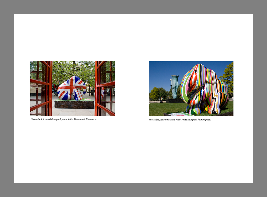
This time I chose to use images of the same size and shape but explore negative space on the page. The images are from the London Elephant Parade 2010 and I felt that the captions explain all you need to know.When placing the images on the page at first they were dead centre but for my liking I preferred there to be more negative space at the bottom. It is only a slight margin but for me was more aesthetically pleasing.

Layout 6


Chosen with the sole reason of experimenting with different subjects, colour, size, shape, time of day etc. this also appears to work. The images show a different face of Milton Keynes so link together which if at first not obvious from the images would be from reading the captions. This has helped me realise the importance of the next exercise of working with picture captions.

Conclusion

In conclusion I decided that you could experiment with layouts and combinations until the cows come home. Whilst there seems to be no obvious rules as to which images can go together in respect of size and shape, there positioning on the page and the content of each picture will have a huge impact on if the layout works or not.

Asked to rank them in order as to how they work.....initial thoughts are :


  1. Layout 3 
  2. Layout 4
  3. Layout 6
  4. Layout 2
  5. Layout 5
  6. Layout 1 V2
This may change on reflection. Interesting exercise to do and I have learnt that different shapes and sizes make for a more dynamic layout, that the images don't have to be radically different to work, contrasting pictures do work, same size images have their place but most of all that the direction/content of the final image will have a huge impact on if the spread works or not.

found this which could come in handy for reference
http://inspirationhut.net/inspiration/42-excellent-examples-of-magazine-layout-design-for-your-inspiration/

http://www.magazinedesigning.com/magazine-spreads-good-bad-practices/

This is good example of text flow. Text and images have their own place and importance. Flow is natural and reader will have no problem following it.

Gray areas represent the most visible areas of the spread. Darker shaded area is more visible than the lighter shades. Readers eye is drawn to the upper parts that’s why those areas have the most impact.

Monday, 29 August 2011

Project: Photographic book covers / Exercise Choosing your Imagery

This next section of the course looks really fascinating, wondering how and why books get the covers they do. As an avid reader I shall look through my own books as well as following the recommendation of the module to visit the local library and bookshops, thinking about the decision making behind producing the imagery.

Exercise: Choosing your imagery

To complete this exercise I need to find an example of book covers featuring five different types of photographs. For each category 100 words need to be written describing why I believe the publishers chose the direction, images and design for each book. The different types are: -

  • an out-of-focus photograph
  • an inverted photograph
  • an historical archival photograph, but not depicting the subject precisely
  • a still-life close-up
  • a minimalist landscape or outdoor scene with a large area of sky
Popping into the local library some of the categories had a wealth of examples to choose from whilst others were a little thin, especially the inverted photograph. Quite a few publications choose to use illustrations rather than photography and after getting home, on closer inspection one of the books chosen was an illustration. Also the historical, archival image depicted the subject too precisely so back to the drawing board with those two...

Books chosen after first library visit


Out Of Focus Photograph


Brother & Sister Joanna Trollope (publisher Black Swan 2005)
As these exercises lead up to Assignment Two: A photographic book cover, where you have to consider all aspects of the cover design elements: image, typeface, title, authors name, strap line, spine and blurb, not only did I look at the photographic choices but also the dimensions and layout of the book as a whole.


Approximate dimensions and layout 'sketched' in Publisher
 

Other Joanna Trollope titles were researched to see if this had a bearing on the design choice for Brother & Sister, from the titles below you can see there is coherence to the publications. The quotes, author's name, and titles are all in the same place and use the same typeface and font size. All the images are out of focus suggesting hidden facets of the characters lives and some mystery.

Other Trollope titles with the same layout

Joanna Trollope is a well known author and emphasis has been placed on her name rather than the title. This implies that the publisher recognises Trollope has a following which seeks out her name regardless of subject matter. Readers can instantly spot a title by the 'corporate identity' approach.

Brother & Sister (2004), is a novel exploring the themes of adoption and the nature of identity. The image on the front depicts a blurry male and female character, the male in the distance. The out of focus image alludes to the uncertainty of their own identity. The female at the front represents Nathalie as the main driving force to the plot line, whilst David (her adopted brother) is in the background, showing he is possibly more reluctant to follow her decision to trace their birth parents. A smaller version of the image is also shown on the spine of the book allowing for this information to be shown when the book is placed on a shelf. The colour of the photograph fades into the upper section of the book providing a clean space for the author's name. The light background continues on the back where the blurb, in a dark font is easily read.The image selected successfully expresses the element of the unknown and an awkward relationship.

Minimalist landscape/outdoor scene with a large area of sky

Assegai Wilbur Smith (Pan Books 2010)

Approximate dimensions and layout 'sketched' in Publisher


As with Joanna Trollope, other Wilbur Smith titles were researched to see if this had a bearing on the design choice for Assegai. From the titles below you can see there is coherence. The quotes, author's name, and titles are all in the same place and use the same typeface and font size. All the images are of an African landscape, sunset and with crossed weapons. Born in Africa, Smith has an abiding interest for the peoples and wildlife of his birth country; this is reflected in the majority of his work and the imagery on the examples given here.

Other Smith titles with the same layout

Wilbur Smith is another author considered a ‘brand,’ with emphasis placed on his name rather than the title of the book, recognition by the publisher that Smith has a loyal fan base.

Set in the Masai tribal territories, the minimalist landscape and lone figure instantly inform the reader of the African location. The large expanse of sky has left enough space for the strap line and authors name while the dark silhouetted foreground provides the perfect foil for the title. The generous area of sky left remaining has allowed for the inclusion of the Assegai weapons which suggest that conflict is a theme contained within the novel. The darker background allows the lighter text on both the back and front of the book to stand out. The simple landscape combined with the spears convey the location and possible story content well.


Still life close up


The Hollow Nora Roberts (publisher Piatkus Books 2008)


Approximate dimensions and layout 'sketched' in Publisher

Nora Roberts is widely recognised as a writer associated with the supernatural. Her trilogy  Sign of Seven concerns three main characters over a period of many decades who at the age of 10 took a blood oath at a pagan stone, unleashing a 300 year old curse. The first book has a stone embellished with an Ankh, the Ancient Egyptian symbol of life and in Wiccan/Neopagan traditions, it is often used as a symbol of immortality. This symbolism alludes to the theme of ritualism and paganism.

The Hollow is the second book in Nora Roberts Sign of Seven trilogy, the first being Blood Brothers and the last The Pagan Stone. It follows that the design of the covers would have a similar look, however from the novel Dance of the Gods and many other titles it can be seen that the publishers currently favour this layout for all of her books.
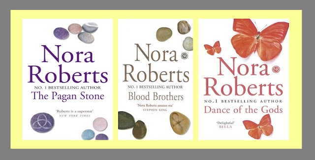
Nora Robert's novels with the same design

Being the second book in a trilogy, The Hollow uses similar imagery; a few loose stones appear scattered at the top and bottom of the design with one of the stones adorned with a pagan symbol. This symbol alludes to beginnings and endings, being a version of the Celtic Trinity Knot (or the Triquetra from Latin, meaning "three-cornered.") all clues to the mystical content of the novel and the three main characters from the previous story. Reading into the stone analagy further, the main character numbers swell to six, as the boys are joined by three girls, with the main character Fox finding he is becoming increasingly interested in Layla... possibly the two stones in the foreground. The choice of the plain white background allows the stones to immediately catch the eye. The authors name is the most prominent text with a quote from Stephen King placed next to the symbol.This adds weight to Roberts as an author and hints at the genre. The same image is used on the spine, with the white background continuing onto the back for the blurb. Simple still life has been used very well to convey a very complex plot.


Conclusions so far...

Having researched three design covers so far, although each one has a completely different photographic image, they do have similar features with images representing aspects of the novel. The main images have been echoed on the spine.There has been some degree of manipulation with each; with Brother & Sister the photograph has been extended to allow for the strap line and authors names to be added, the landscape on Assegai has been inverted on the back cover and spears have been superimposed, on The Hollow  it is impossible to say if the group of stones were shot together or separately and merged, but the different direction of the shadows imply that they were shot as individual items. It was also interesting to note the grouping of the stones did not follow the rule of three associated with still life images, but as mentioned, that could be due to the stones representing the number of characters in the book and their relationships.

With each cover, the authors' name was more prominent than the title, a minimum number of fonts and colours have been used. It was interesting to note that in each case the authors' names were printed in an embossed metallic or metallic effect font. Joanna Trollope's novel Brother & Sister has more font styles and colours therefore for me, this is the least successful design even though the image works well to convey the contents of the book.

The designs also incorporate quotes/strap lines to catch the readers attention, the publishers logo and cover design information, a barcode and price.

Having read an awful lot of novels I had never previously taken much notice on how the blurb was styled. The word count for each was between 120-150 words, all were centred and used fonts which were a contrast to the background.

The size of the paperbacks were very similar approximately 200mm high 120 mm wide. The thickness varied with the number of pages in the book.

The most pertinent point that comes across is that the designer/artistic director had intimate knowledge of the plot line and characters choosing the elements accordingly and even with looking as just three novels there is an indication that specific genres seem to prefer a certain style of imagery.

Notes on book covers for learning log
second and third library visits

Historical archival photograph

  • an historical archival photograph, but not depicting the subject precisely -
finding an image to fulfil this remit was a little trickier, my first problem was with the interpretation of the task. Did 'not depicting the subject precisely' mean not depicting the physical subject within the photograph or not depicting the subject/theme of the novel? I decided that it could mean either and to trust my judgement when an historical archival photograph was eventually found . On my trip to the main library in the borough, I discovered that it was really difficult to find exactly what I needed!

Some of the images appeared to be archival but could have been modern day constructed images, others were illustrations and the rest were very obvious depictions of both the storyline and the object photographed. Eventually I came across The Dig by John Preston, publisher Penguin Books 2008. The image is credited to Fox Photos/Hulton Archives/Getty images. Hulton Archive deal specifically with historic stock images and editorial shots. Inside the archive The plot concerns an archaeological dig set in 1939 and the image does not depict the theme even if it does the era.


The Dig John Preston (publisher Penguin Books 2008)


Approximate dimensions and layout 'sketched' in Publisher

The Dig is John Preston’s fourth novel but there is no pattern to the layout of previous covers. Unlike the designs examined so far, The Dig has its image at the top of the cover and has been extended down to make space for the text. The cream colour of the front is continues on the spine and back cover. The title is below the image in large red lettering, with the authors name below in a slightly smaller black font.This provides more evidence to the theory that when an author is more prolific/well known, emphasis is given to their name rather than the title of the book. There are two quotations on the front by well known writers; Ian McEwan and Robert Harris adding weight to Preston as an author.

Other titles by John Preston
The Dig is a fictional account of the discovery and subsequent archaeological dig of the Viking longboat burial mound at Sutton Hoo, in 1939. The archival image hints at the historical content of the story, sets the period and alludes to the wealth of the main character, yet it gives no clues to the dig itself. This adds intrigue, as the audience will wonder what ‘the dig’ refers to and encourages them to read the blurb on the back. On the back there are four further quotes promoting the book, which in turn persuades the reader to pick it up. I'm not quite sure if this is a completely successful image to have chosen. Although the image does portray the historical element, I am not convinced it raises enough curiosity to catch the imagination.


Inverted photograph

I still have as yet to track one down...watch this space...

*update

As with the historical image, to find a cover with an inverted photograph to suit my purpose proved very difficult. I had to visit the main library, WH Smith, Waterstones and my local library twice before finding a book cover with an inverted image.

An inverted image could mean could mean upside down, mirror images, inverted colours and/or tonalities... there are a few examples given in the module but both were upside down, maybe I should have stuck with my gut feeling that anything within the definitions given above would have been ok, but feeling unsure I emailed my tutor to check if any would be within the remit to write up on, the answer was 'well what do you think?'

TBH I think any would be ok, but it is handy to get confirmation you are headed along the right lines... eventually decided to see what I could find and go from there. Hoping to get a different example to the inverted idea of upside down idea to show research had been completed rather than just blindly following the module, it was disappointing not to be able to find anything at all.


Definition: (1) ~ image: one that shows the subject upside down when projected or seen. * Also an image whose tonalities and colours are reversed. (2) ~ telephoto: design of lens with strongly negative groups in front and positive groups behind for short-focal lengths such that the distance from the rear vertex to focal plane is greater than the focal length. * Also known as reversed telephoto, retro-focus. (3) ~ selection: process in image or graphics manipulation by which all the objects not at first selected become selected, thus reversing or inverting the original selection. (4) ~ microscope: made to look at under-side of objects which cannot be turned over e.g. Petri dishes, so the objective points vertically upwards.

Using the The Book Cover Archive link I found the following book designs :-


Not many at all, given the number of covers that must be on the site, and of the examples found most were upside down rather than colour adjusted or horizontally reversed. Added to the fact I found it difficult to physically track one down shows it is not a popular design concept. Having had physical examples of the previous categories emphasised how important it is to actually get hold of the books. You can measure the dimensions, discover how effective embossed text is, colours are truer than on screen, find out more of the plot than the blurb offers to work out why different photographic elements were chosen. It also helped with looking at the overall layout, spine and back cover. I am left wondering why inverse images as not as popular? Do the designers themselves shy away from the ideas? Do the publishing houses reject them? Has it been found that the same novel but with a different jacket sells less copies with an inversed image? I may have to email a few publishing houses to find out....

On my second trip to the local library to look at designs in general, which genres used which imagery, did any cross over, which used more photographs than illustration (notes on a different post) I eventually found an inverted photograph. It is an upside down reflection rather than a reversed/inverted image but I made the decision to run with it.

Ordinary Thunderstorms William Boyd (Publisher Bloomsbury Publishing 2009)


Approximate dimensions and layout 'sketched' in Publisher
The dimensions on this are larger because it is hardback.

Looking at Boyd's other novels some have been published by Penguin Books; these had a different artistic approach. Having said that I have found two different versions of Brazzaville beach by Penguin, one of which follows a similar creative pattern to Ordinary Thunderstorms. I am now intrigued with Brazzaville Beach as the imagery is so different....a brief scout about shows that a different thread of the story has been chosen to illustrate the contents of the book Brazzaville Beach - Wikipedia, the free encyclopedia


In Ordinary thunderstorms the main character, Adam Kindred, a young climatologist, has his world turned upside down. The photograph chosen for this novel cleverly picks up on many of the themes. A puddle not only alludes to the clouds Kindred studies but also provides an ideal device to project reflections. The London Eye highlights the location and the upside down character suggests the topsy- turvey events which occur throughout the book.  The grainy, hidden portrayal of the figure is a mechanism many thrillers employ. The black and white image works well with the choice of sans serif red and white type. I felt this book cover was a very successful design.


Notes on book covers for learning log
Summing Up
Having looked closely at all five categories the general design route for the majority of books is influenced by previous publications, if the book is part of a series and the idea of the author as a brand. The photographic images are then chosen taking into consideration the contents of the book and the genre. Having said that some devices such as out of focus images are used by many genres to suggest the unknown or mystery and still life can be successfully applied to any genre.
Quotes and strap lines are used to promote the book, publisher logos and barcodes are also applied as standard. Typefaces very slightly but apart from romantic sagas which employ more decorative fonts, they are large and clear, very readable. I did not discover a preference over using serif or sans serif.
Without reading the blurb it was possible to deduce something about these novels, either the genre, location or era. In this respect I think these designs all work well.

A very general observation

  • illustrations are used by most genres although true life stores/biographies and information books tend to use photographs.
  • out-of-focus photographs are associated with several genres but are used to convey a sense of mystery,intrigue, memories and, depending on the treatment, menance.
  • inverted photographs are used to allude to worlds turned upside down, or situations not really as they would normally be viewed.
  • historical archival photographs are used on fictional as well as factual publications to represent a particular era
  • Still life close up images are used across the board, again with both fact and fiction. The images can obviously represent the theme or use allusion and allegory.
  • Minimalist landscape photographs are also used across them with fact and fiction. These are used to show a set location, depending on the time of day and treatment can create atmosphere and if combined with figures hint at other themes within the book.

Research

Images from :

http://www.amazon.co.uk/  [Accessed 29 August 2011]
[Accessed 1 September 2011]
http://bookcoverarchive.com/19 [Accessed 1 September 2011]
http://www.bookdepository.co.uk/ [Accessed 29 August 2011]
http://en.wikipedia.org/ [Accessed 4 Spetember 2011]

General Information
http://www.gettyimages.co.uk/ [Accessed 29 August 2011]
http://www.idigitalphoto.com/dictionary [Accessed 28 August 2011]