Tuesday, 10 May 2011

Project 3: a variety of lighting conditions

A similar exercise was required at the beginning of DPP and I was surprised when images I thought were going to produce a low-key image actually appeared to be flat, meaning the shadows were not as dark as I had anticipated. Also some I considered to be low-contrast resulted in full scaled images so it will be interesting to see if my judging by eye has improved. A decision was taken to try and be more adventurous with my shots, previously (mainly due to the horrible weather) objects/areas in my back garden were used just so the exercise could be completed without much thought into the artistic composition. Project 3 has been designed to familiarise you with histograms. The aim was to shoot 5 different images under different lighting conditions which would produce the expected histograms to meet the criteria of full range, high contrast, low contrast, high key and low key. The resulting histograms were then annotated to show why they looked as they did.

Being the beginning of Spring I thought I would try and theme the images to a walk in my local bluebell woods (did cheat with the aquilega - that was in my garden) rather than stage manage setting I knew would meet the instructions. Find below the resulting images.

High Contrast

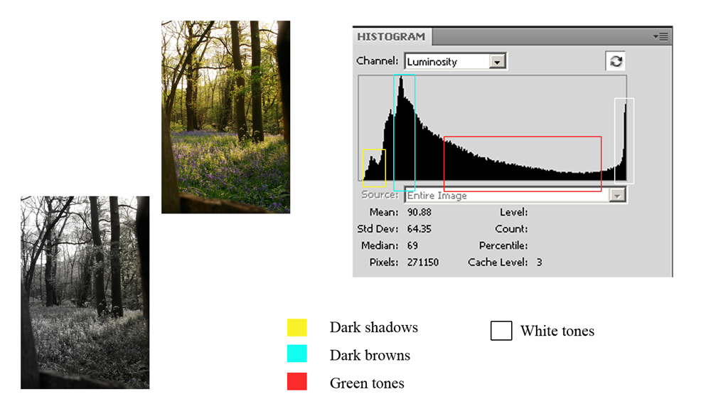
The scene below was chosen due to the bright sky, which I hoped would provide the high contrast of white tones and the shadows/trees for the darker tones. Again I was anticipating the darker end of the scale to be slightly closer to the end but am guessing this is due to the image not being under-exposed at all. It is still a fairly good representation of a high contrast image with pixels peaking at either end of the scale with the other tonal ranges there but fairly low.


Low Contrast/Flat

This was a little trickier to shoot due to the lighting conditions in the wood providing very dark shade for close-up shot and getting too much "black". Persistence paid off and I found a clump of bluebells in dappled shade, the peak could have been more towards the middle of the scale but with no areas of black or white and no clipping this image is of low contrast.


Full Range

I gauged by eye that this scene should deliver a full range histogram, the shadows were not too deep and the direction of the sun meant the bright sky was not blown. The mid tones in the photograph provide the gradual slope which would possibly be more ideal towards the middle of the chart. However the tones do run from end to end and this is a fair example of a full range image.


High Key

I was not sure if this shot would tonally represent a high key image due to the green in the background. However there is a large number of bright tones indicated by the pixels "climbing" the right hand side of the graph and the majority of the other tones are on the right hand side. Dark tones are there but they are minimal.


Low Key

Whilst out in the local woods I was lucky enough with the weather conditions and the timing to obtain this sunset shot complete with young girl climbing the old mulberry tree. I thought that the histogram values would be more towards the left and the darker tones higher than they were but the black tones are squashed to the left and the rest of the tones are towards the left hand side.


Conclusion

This exercise proves that although at first we assume or are sometimes taught, that the full range histogram is what we expect from a "perfect" image depending on the colours or rather tones in the photograph this isn't always going to happen.The histogram will alter its shape it due to the nature of the scene. Problems only occur when you have anything more than the thinnest of lines line butting up to the extreme left or right sides; indicating excessive black or white. If there is a peak near either side, it just means there’s lots of dark or light tones – which is not a problem.

Although this exercise was using the "luminosity" histogram, my camera is set to use the RGB histogram. This is due to the luminosity histogram not always telling the whole story, it shows an average for the three channels and if a particular colour is clipping (for example the sky) this maybe missed and the exposure not altered to compensate. I found this webpage which helps simplify and gives examples of the RGB histogram and breaks it down.

Sunday, 8 May 2011

Measuring the image qualities/ Project 2: understanding the histogram

I touched upon histograms in DPP and learnt how useful they are when measuring the contrast of an image but this project made me look more closely at  how they can teach me what to expect from a scene. Tones squashed to the left indicate loss of shadow detail, squashed to the right-loss of detail in white/bright areas and if there are empty spaces at left/right the image would appear flat.

It was really intriguing to look at the images of Tibet in the materials folder and note which peak corresponded with certain tones.

Mount Kailash correctly exposed property of Open College of Arts © 2004

matching histogram for Mount Kailash property of Open College of Arts © 2004


Obvious areas identified property of Open College of Arts © 2004


Mount Kailash Underexposed property of Open College of Arts © 2004


corresponding histogram for under exposed image property of Open College of Arts © 2004


Project 2: understanding the histogram

This project introduced me to the CD for the first time, my task was to match six images to six histograms about which I felt fairly confident, having covered histograms previously and using them all the time in my photography.

I went for the most obvious first (well to me they were) the Oil jpeg was glass against a white background so I looked for a histogram with the graph where tones bunched mainly to the right. Histogram 5 matched this profile.


Oil Flask histogram
The white background and body of the glass oil jug is represented by the two peaks on the right on the histogram graph; the white background would be the peak furthest to the right showing that it is pure white with no detail at all. The table and light greys would be the smaller bump in the centre, with the dark part of the flask at the neck the smaller values running to the left hand side indicating darker tones were present but not to a great extent.


Carmen histogram

This image was also fairly straight forward to match with it's histogram, with a lot of black and white I was looking for a histogram with values peaking at both ends of the graph. I opted for histogram 2. Because the values touch at both ends it indicates that there is very slight clipping in the light and dark areas, but not overly so because the values are not that high, when you zoom into the image you can still see detail in the dress which is why the values on the right hand side is not high. Also whilst the background is very dark there is still detail in the man's suit. The mid grey tones are represented in the centre of the graph fairly evenly because the tonal match is very similar.


Pyramid histogram
For the pyramid image I was looking for a histogram with tones across the graph due to the deep blacks and white highlight in the doorway, however because the image has very little true black but a large tonal range of dark grey there should be a large group bunching towards the left. This was number 4. The sky/clouds and mid to light greys are there but to a much smaller extent so the graph is very low towards the right. 


Bluebell histogram


Next I decided to take a closer look at the bluebell shot. Straight away I could see no discernible pure blacks or whites. The background was fairly uniform and there was little contrast between the stems and the background. This was a rather flat image so I was looking for the histogram with information missing at both ends of the graph. Histogram 3 fitted the bill perfectly. The mid range tones of the image are represented by the pixels in the middle of the graph and as there are a large number the graph reaches the very top of the chart. The gentle sloping to either side indicates there are other ones represented but they are minimal.

Magnolia histogram

With only two images left it didn't really matter which one I opted for next and chose the white magnolia. On close inspection I could find no black or dark shadows whilst, to my eyes, the magnolia was pure white in places. The sky had no cloud detail and appeared to have uniform tones. This meant I was looking for a histogram that had tone details missing on the left where black would have been, with a high representation of pixels at the far right indicating the pure white detail. The sky would show as a tall fairly wide group of pixels in the middle of the x axis. Histogram 6 was the match with the other tones being shown by the gentle bumps either side of the mid tone peak.


Japanese girl histogram

More by accident than design I was left with the shot of the Japanese girl last. Looking at the image I was expecting the tones to fall off the edge of the graph but although they fill the entire length of the axis they peak just before the very end. This means although the image has a very dark background it is not pure black and will contain some detail still. There is very little clipping in the bright areas and the mid tones are represented consistently across the middle of the graph. I think I would have chosen this histogram for this image had I opted to match this first but would have had to check the other choices before committing because as I say I was expecting the peak to be at the very edge.

On checking the answers I was pleased to have got them all correct. I thought I had, but you never know. Completing this exercise has emphasised how much information you can glean from the on-camera histogram and how important a tool it can be for gaining correct contrast when shooting.

All images shown in this post for information and project purposes are the sole property of Open College of Arts © 2004 http://www.oca-uk.com/

Project 1: dynamic range

Camera manufacturers don't like to divulge the dynamic range of their cameras therefore I must endevour to discover it for myself. Dynamic range of the sensor is the difference between the darkest shadows and the brightest highlights that it can capture in one scene without losing detail. If detail is lost this is known as clipping. Within RGB solid black measures 0,0,0 and solid white 255,255,255.

Handy table to remember the f-stop increments...am going to print this out and take it with me!

Shutter
speed
1/8
1/15
1/30
1/60
1/125
1/250
1/500
Aperture
F2.8
F4
F5.6
f.8
F11
F16
F22


Sometimes I think the written instructions are actually more confusing than the task itself...as an LSA and having to write or make information very basic I do double take and think why didn't it just say X? Calculating the DR in DPP was the task I put off for ages, now realising it wasn't that hard to do I wasn't so fussed about this one.
To start- I had a plain white piece of card in daylight. ISO set at its lowest,image size smallest.Used Custom WB and Manual exposure.Filled the frame with the card, adjusted shutter speed for average exposure.Noted the setting. Next I calculated a setting that was 6 f-stops darker by altering the aperture, however due to the lens I was using I found I couldn't change enough stops so increased/decreased exposure by using shutter speed instead. I also had a minor problem with the lighting, being a cloudy day I had to wait for the sun to come back out from behind the clouds to continue enabling me to have consistent lighting conditions. Then it was windy and my card kept falling over!

Apart from that this was fairly straight forward to complete; the mid point metered to F8 @ 250 however, even adjusting my shutter speed I couldn't change down more than 4 stops;  progression was f8 @ 1/500, 1/1000/ 1/2000 and finally 1/4000. In the opposite direction I had no difficulty in the shutter speed f8 @ 1/125, 1/60, 1/30, 1/15,1/8,1/4.

The images were then opened in Photoshop and out of curiosity I took RGB values before converting to greyscale. The black point read (8.8.8) the mid range (110,114,125) which suggests the metering wasn't spot on as mid grey should be as near to (128,128,128) as possible, and the white point did hit (255,255,255)

The ascending scale was the created and here is the resulting chart.

Dynamic Range Canon 400D

Histogram showing tonal peaks


The image was cropped to stop at the black and white points. Once converted the (8,8,8) read as (3,3,3) which I though was quite strange? The mid point (115,115,115) which seems to have averaged out the original readings, and the white point remained the same (255,255,255)

Counting the steps including the cut off points (9,9,9) and (255,255.255) - I didn't count the (3,3,3) due to the fact anything below (5,5,5) would be black with no viewable detail, it would appear that my camera has an 8 stop range which is quite normal. The histogram also appears to reflect this. When testing the dynamic range of my camera for DPP the scene results gave a dynamic range of 7. This test is a little more complex and gives a range of 8. However due to the fact that the lowest point shifted when converted, it may possibly fall between 8/9 and the following website found that the 400D produced a consistent dynamic range of 8.4 with ISO 100-800 and 7.8 at ISO1600.

http://www.dpreview.com/reviews/canoneos400d/page19.asp

This reassures me that I carried out this task correctly (even if my metering was a bit off) and my camera is acting in the way it should. It was also good to note that my mid-point is midway on the chart so should avoid burnt-out highlights and blocked-up shadows. Armed with this information I should be able to judge how much information I can caputure in a given scene, especially one with high contrast.

1: Full colour control

This first section has 8 projects and Assignment 1. The projects are:

Project 1: dynamic range
Project 2: understanding the histogram
Project 3: a variety of lighting conditions
Project 4: your camera's colour performance
Project 5: a personal range of colours
Project 6: measuring colour
Project 7: altering colour with levels
Project 8: altering colour with hue/saturation.

Assignment 1: seasonal colour changes.

It is interesting to note that digital photography gives more control over the colour in a photograph than film. In this first section I am being asked to take into consideration brightness and contrast, using both the camera settings and the full range of editing tools when enhancing and altering.

Dynamic range was covered in DPP but this first project looks at it in more depth, it helps to know the relationship between brightness and f-stops, the normal sequence on cameras is as follows f2, f2.8, f4, f5.6, f8, f11, f16, f22. Using the camera's inbuilt light meter you can measure the brightness of different areas of a scene. I know that doubling or halving makes a difference of 1 stop but it still confuses me when I have to put it into practice, it is something I have to think about rather than it coming naturally! Hopefully with more practical work this will sink in!  A suggestion is to try and work out if you can judge by eye the mid tone in a scene....

experiment to be done...

Progressing With Digital Photography Overview

Progressing With Digital Photography consists of five areas of study, five assignments and 30 projects. The five topic areas are; Full colour control, Image combination, Photo-realistic retouching, Degrees of alteration and New world images. For some of the projects a CD of images are provided to help me complete the tasks set. Looking at the project and tutorial plan it will be interesting to note if on average they take the amount of recommended time. With the last course I probably spent the required amount of time to complete the course but some of the tasks took longer than anticipated with others taking less. I dare say that will also be the case with PwDP.

Time management has never really been an issue for me, the problems only occur when the weather interferes with images I want to shoot outside or people pull out of planned sessions due to unforeseen circumstances. I normally build in some kind of contingency plan for this. Keeping a logbook was also not a problem, instead of writing my entries up after the exercises I found it practical and easier to do both at the same time, I'd write up what I had to do, complete the exercise upload my results to my log along with any random thoughts I had along the way. Sticking things into my physical log was also done asap so I didn't lose all the bits of paper. Jotting the notes sometimes were done afterwards. What I have noticed along the way is that I don't always remember to add labels to my posts and that was a pain going back over them making sure they had the labels I wanted! *Note to self* REMEMBER LABELS! and possibly with level 2 requiring a higher level of critical thinking referencing my notes will be a must.

I am looking forward to thinking about the "check box" of criteria when commencing each assignment and am hoping that by thinking about creativity I don't actually "kill" the creative process. Am having quite an interesting conversation with a fellow flickr user with regards to art/creativity/study and he mentioned Jiddu Krishnamurti so I had a look at the website he quoted from. Several of the quotes I felt I could relate to straight away; Krishnamurti stated:
  • Creativeness comes into being when there is constant awareness of the ways of the mind, and of the hindrances it has built for itself.
  • It is only when the mind does not seek stimuli in any form, whether outward or inward, that it can be completely quiet, free, and only in that freedom is there creation.
  • When there is creativeness, when we have that creative feeling, there is no struggle, there is absence of struggle, which means that the self, the 'me', with all its prejudices, its conditioning, is not there. In that state when the self is not, there is creativeness; and that creative feeling, that creative state, we try to express in action - through music, painting, or what you will. Then the struggle begins - the desire for recognition, and so on.
Interesting ideas....

When Joe makes contact I need to establish how he likes student work to be submitted and make sure I have everything I need to proceed with the course i.e. ink, paper, folders, DVD's etc and set up some new pages/labels for PwDP. One question I think I'll be asking straight away is about the portfolio...would this online blog be sufficient as the final portfolio of work or does physical one have to kept? Am guessing it could be a mixture of the two? All images produced for assignments to be printed but project work can be uploaded? Some of the materials folders don't seem to reflect the change in the move towards accepting electronic submission? Will find out in due course.

Progressing With Digital Photography Aims

DPP completed now waiting for the submission date to open. Spent the last few days making sure everything is as I want, and hopefully what the assessors want to see!

I confirmed my intent to continue studying and my desire to continue with PwDP, materials finally arrived after a delay due to all the bank holidays, have introduced myself to my new tutor "waves to Joe" and had a quick skim read of the exercises and assignments. As with DPP there have been a mix of emotions, ranging from "oh sheesh that looks fiddly" to "ok shouldn't be a problem" and finally "that looks FUN!"

Decision has been made to continue using this blog rather than starting a new one. Mainly as I think it will help show my progression by keeping everything in one place and also if I want to use prior research I'll know exactly where it is. Not too much of a problem at the moment but if I had several blogs/courses completed or on the go that could be an issue of remembering exactly where things were electronically filed.

Having gone through the folder and relevant paperwork one of the first things I had to do was think about what I wanted to gain from this course so here is my initial list :o)

There are several things I would like to gain from this course :-

  • Build upon knowledge/skills gained in the previous course.
  • Understand the limits/image capabilities of my camera a little more
  • Push my own creative thinking/experimentation.
  • Expand my theoretical knowledge.
  • Be more open minded with my attitude towards some artists, exploring more than one area of their work.
  • Improve my study skills i.e. applying the Harvard method to research and essay writing.

Although these are my aims I anticipate learning much more along the way :o)

Let the learning begin.......

Results :o)

I passed phew! My tutor had indicated that there shouldn't be a problem but you always hold your breath! Second Class Upper Division which I think is fair and am pleased with :o) Having be given APEL for the two other level one modules I had to learn quite quickly what was the standard for the OCA submissions and how to show progression, learning and research as well as produce work of a suitable standard.

Assessor feedback concluded that my submission was well presented, and showed progress. The work demonstrated that I am articulate and self aware, my blog showed I appreciate the value of research. Have competent technical skill, can transmit ideas and emotions. My shoe series was described as evocative :o) Good use of colour and light. The main areas I could have gained more points on were invention and communication with my learning log described as not the easiest to navigate but was realistic, useful and of value to me. So areas to look at on the next level.