Showing posts with label Photographers. Show all posts

Friday, 22 November 2013

Only in England Martin Parr and Tony Ray-Jones Science Museum 2013

Only in England: Photographs by Tony Ray-Jones and Martin Parr
21 September 2013 - 16 March 2014

Fascinated by the eccentricities of English social customs, Tony Ray-Jones spent the latter half of the 1960s travelling across England, photographing what he saw as a disappearing way of life. Humorous yet melancholy, these works had a profound influence on photographer Martin Parr, who has now made a new selection including over 50 previously unseen works from the National Media Museum's Ray-Jones archive. Shown alongside The Non-Conformists, Parr's rarely seen work from the 1970s, this selection forms a major new exhibition which demonstrates the close relationships between the work of these two important photographers.

http://www.sciencemuseum.org.uk/visitmuseum/Plan_your_visit/exhibitions/only_in_england.aspx

http://www.sciencemuseum.org.uk/visitmuseum/plan_your_visit/events/media_space_events/martin_parr_in_conversation.aspx

Tuesday 19 November 2013, 19.45–21.15
IMAX Theatre

Martin Parr reflects on the profound influence Tony Ray-Jones’s practice has had on his work and their shared interest in documenting English social ritual and behaviour, with Kate Fox, social anthropologist and author of Watching the English, and Sean O’Hagan, writer on art, culture and photography for the Guardian and Observer.

Just recently I went along to the Only in England exhibition and this week attended the Martin Parr talk about the same. I decided in advance to combine both experiences within the same blog post.

Firstly the gallery space; it seems to be the "in thing" for London Museums to have photographic exhibitions, first the Natural History Museum and now the Science Museum, with its new Media Space. I guess this shows the growth in the popularity of photography and how financially lucrative it must be for these venues to run them. Although it seemed a bit weird to be jaunting off to the Science Museum the gallery was rather impressive. Apparently the 525 square metres of space make it "one of the biggest venues for photography in Britain" with the huge space cleverly divided by wooden framed walls running down the centre; a bit maze like but it does make for more wall space and was beautifully illuminated.

Photography: Kate Elliott

The exhibition itself is split into three distinctive areas, the first comprised of 60 prints from the archive of Tony Ray-Jones, secondly the early black-and-white work of Martin Parr, and lastly previously 56 unseen pictures from the archive of Ray-Jones, selected by Parr from contact sheets and negatives. It was brilliant to see these contact sheets on display and from them have an insight as to how he worked; snapping a subject then moving around to improve the composition, or waiting for the scene to develop waiting for more people to fill a space.  Apparently Ray-Jones’s preferred technique was to carry two cameras- Leica rangefinders, one @ 35mm lens and the other @ 50mm. One he would hold at eye level, pointing it at something in the distance, this meant that the chosen subject would either ignore him completely or turn to look at what he was pretending to photograph. The other he would hold at waist level, that would actually take the photo.

Parr commented on the spatial look and feel of his images, how different subjects would be looking in different directions;no-one really over lapped, this became more apparent as he went through the archive of negatives. It seems really masterful that such spontaneity resulted in the amazing compositions he captured; pictures that look busy, alive with activity and motion, and full of smaller details. I especially noted the way he grouped people together who are clearly unaware of each another at the moment the shutter clicked.Still, moving, blank-faced, excited, young, old, the whole gamut in one image. This is something I will look out for when shooting my event for assignment 5. Although not sure how successful I'll be I can but try!

It was reassuring to see the odd white or black square in his contact sheets where he hadn't quite gauged the exposure! Also dotted around were notebooks, layouts, letters and lists – in vitrines and on the walls.


Another piece of ephemera that I found fascinating was a cardboard shape of a bear he had used when employing dodge and burn on an image, copies of before and after shots and notes saying where and how he would apply it.

For those of you who are new to Tony Ray-Jones a brief biography would run something like :

His father died when he was only eight months old and after his father's death, Tony's mother took the family to Tonbridge in Kent, then and finally Hampstead in London. He was educated at Christ's Hospital (Horsham), which apparently he hated. Ray-Jones studied at the London School of Printing, where he concentrated on graphic design then in the early 1960s he obtained a scholarship that enabled him to join Yale University School of Art. In 1963 he was given assignments for the magazines Car and Driver and Saturday Evening Post.

Ray-Jones went to the Design Lab held by the art director Alexey Brodovitch in the Manhattan studio of Richard Avedon. There he got to know a number of New York "street photographers", in particular Joel Meyerowitz, Garry Winogrand, and Lee Friedlander who all influenced his later work. Snippet from the talk was that Joel Meyerowitz would often complain about his personal hygiene and make him shower when they worked in his studio!

Ray-Jones graduated from Yale in 1964 and photographed the United States until his return to Britain in late 1965.On his arrival the idea of a survey of the English at leisure gradually took shape, he wanted to document the way of life of the English "before it became too Americanised". His photographs of festivals and leisure activities are full of a surreal humour, influenced by photographers such as Henri Cartier-Bresson, Garry Winogrand, Homer Sykes and Sir Benjamin Stone. Part of this work was published posthumously in his book A Day Off (1974). There is a short video within the exhibition where Parr explains how some of the captions are wrong and they now know that certain places were not where they originally thought!

Described as eccentric and abrasive he once said to Peter Turner, the editor of Creative Camera, "Your magazine's shit".  He returned to the United States in January 1971 to work as a teacher but he disliked teaching, saying that the students were "self-centred and lazy." In late 1971, Ray-Jones suffering from exhaustion eventually sought advice, leukaemia was diagnosed, and he started chemotherapy. Medical treatment in the US was too expensive, so Ray-Jones flew to London on 10 March, was immediately admitted to the Royal Marsden Hospital where he sadly died on 13 March aged 31.

Back to the exhibition...

At a time of social change, Ray-Jones was determined to record anything that he saw as being particularly (or peculiarly) English before it disappeared forever. The street and the seaside were his main targets although he also captured the rituals of Eton boarding school and the Glyndebourne opera festival, as well as beauty contests and pop festivals. Kate Fox described both Ray-Jones and Parr as "social anthropologists with a camera" and Sean O'Hagan introduced both Ray-Jones and Parr as "capturing the spirit and mentality" of the English. Martin Parr commented while looking at TRJ's work that he was surprised by how English the English still are and how it is still possible to make work that can still be regarded as "terribly English." Ms Fox echoed this sentiment and said she can still see the English "tribe" today within the archival photographs.

It is wonderful how Ray-Jones managed to capture fine details in larger scenes, had the ability to snap the ordinary and make it interesting, the patience to stand and wait for something entertaining or quirky to occur and the skill to get close enough to a subject without them posing. His images have been described as "slices of life as seen through the lens."

Walking around the exhibition was appealing on many levels, as a slice of English history, of personal nostalgia and as a photographer seeing how he worked with and composed his images. Looking around taking notes I noticed a young man doing the same, obviously a student. I had to stop and ask him was he getting the same information/feelings from the images as me although we were from a different generation. I could remember things from my childhood in the 60's and 70's that struck chords. He said although he had no direct memories he could see things on the wall that were in his family albums at home and coming from the North the Blackpool shots and many of Martin Parr's early images were resonating.

Neither TRJ nor Parr (especially latterly) shied away from capturing the quirky or seediness of our seaside towns or events. His images of the festivals and people sitting on the marquees certainly show how Health and Safety has moved on!

Tony Ray-Jones Beauty Contest Southport, 1967

Tony Ray-Jones Blackpool, 1967

Tony Ray-Jones Glyndebourne, 1967

You then moved onto the work of Martin Parr. I have never really been a fan of his so it was enlightening to see his series, The Non-Conformists, made in and around Hebden Bridge, Yorkshire in 1975, just after he graduated from art school. The title comes from the Methodist and Baptist churches that dotted the region.

Parr gave his main influences as his grandfather initially, then Lee Friedlander and Robert Frank, he was also inspired by a talk given by Bill Jay who showed the work of Tony Ray-Jones while he was still at college.

The influence of Ray-Jones is really quite apparent in this early body of work although definitely not a direct imitation, Parr had his own perception of the world and photographer's "voice". His work also looks more considered and less spontaneous. One thing I must comment on about both bodies of work is how grainy they both were...I am always surprised by this but I guess it was part of the fashion at the time and part of the ethos that serious documentary was grainy black and white! Parr mentions again the use of gaps between the people being as important as the people themselves.

It was interesting to hear Parr say that to enable this body of work to be produced he immersed himself into the lifestyle of the people and became very involved with the community but realised that this in some ways was a mistake; some of  the elders of the village mistook his professional interest as a personal interest and expected him to stay and take over certain projects.

I have to admit to not being a huge fan of Parr, due in part to his use of flash and garish colour saturation in some of his imagery. I don't know an awful lot about his work so need to look at more before I can state outright "I don't like Parr." Some of his observations are spot on and is it his fault that capturing real life makes people look weird? We aren't all air brushed, we don't all live in ivory towers or holiday in exotic climes. This is what he shows, raw England. It was very telling however, that this first body of work is missing the undertone of mocking cynicism seen within The Last Resort. Instead The Non-Conformists portrays the community with sympathy, empathy and affection even whilst capturing the surreal humour of some of the situations. I enjoyed this body of work so much that I bought the book and queued up to get it signed by the man himself.

http://www.aperture.org/shop/the-non-conformists-martin-parr-books

from the Non Conformists Martin Parr

from the Non Conformists Martin Parr

The final gallery returns to Tony Ray-Jones and the selection carefully chosen by Parr, a tricky enough job choosing your own first selects let alone deciding for someone else. Parr acknowledged that there’s no way of knowing if Ray-Jones would have ultimately approved. Here all the background information and notes really come to the fore and help us understand  the working methods and motives behind the photographer.

An exhibition I would strongly recommend.

Moving onto the talk I have lots of quick jottings, comments made by both Kate Fox and Martin Parr, chaired by Sean O'Hagan. A very entertaining evening although not possibly for all the right reasons...I went along with a former tutor and two others who were his former students. We have all kept in contact and are good friends so was a chance to catch up and giggle at certain aspects that we really should have known better about! That aside, several pertinent comments were made during the evening; once we had established that Martin Parr had previously been a train spotter and Kate Fox, as a baby, had been strapped into an Indian cradleboard and propped up around the house by her father (get the impression the conversation strayed all over the place??).

Things like:

  • We are not a classless society.
  • Parr has discovered the joy of shooting films; whilst listening to the banter between people he realised he couldn't capture that, so in some ways a photograph cannot tell the whole story.
  • He was also inspired by Tony Hancock who succinctly caught and gently mocked the pomposity of the English and this was what he tried to do with his later bodies of work.
  • He saw similarities between himself and TRJ in the respect that both had lived outside of the UK for a while and on returning saw familiar things from a different point of view.
  • As a nation we endorse the stereotype, are attracted to clichés, that although we may sometimes buck against a stereotype they are truisms, used as a starting point and given a twist.
  • The French like Parr more than we do, they like to laugh at us! Also they like photography more.
  • Due to the brashness of the modern world the only way to capture it meant it had to be in colour.
  • Try to use the whole frame for the story, not just the main subject in the middle.
  • Documentary photographers actually are no good at capturing the everyday as they want nostalgia and the quirky. Something Parr admits to doing himself in the past.
He was quite disparaging about photography students relying on clichés and that he had a list of these on his blog, again admitting to using some of these himself and actually responding to imgery containing them. However he warns against adhering too closely to what is familiar as it can be "as restricting as it can be liberating."


Then followed the typical question and answer session which I found to be a little on the predictable side with people asking stuff they could probably have found the answers to by googling them! Why, when you have the man himself in front of you ask boring questions?

My friend Natalie asked how could students be bolder and try different things when at the moment there is a problem with accessing sites due to more and more restrictions, or the general public not liking their photo taken. Did he think that the clichés he was seeing was due to the problems of access? (The irony being in a world where more n more technology exists and more and more images being taken in some ways it is harder to achieve) His response? "No-one said it would be easy. Try Harder. Get out of London." Hmmm I had to laugh, when you hold down a full time job, have a family, and your photography doesn't pay its not that simple. Hey, I guess no-one said it would be easy. When Natalie bought a copy of The Last Resort she asked for the dedication to read "You must try harder!"

Hmmmmm I wonder how hard his daughter had to work to get him to agree to this
http://www.martinparr.com/blog/page/2/ I totally acknowledge that it was her hard work that has enabled her to pursue her career nor is she a student but would the public in general have such access to Mr Parr? How many photography students would have been able to give away full sets of postcards or have Mr Parr attend their event? Am I being too cynical?

Martin Parr in conversation with Kate Fox and Sean O'Hagan. Photograph Michael Wayne Plant

Microphone in hand I asked him about the funeral selfies, I had read the story a while ago and then saw it had been picked up in a weareoca blog post. http://www.weareoca.com/photography/the-selfie/

I was interested to discover if he found them disrespectful because I didn't? Although you had to wonder at the motives behind some of the more scantily clad young ladies talking about their sadness over departed grandad, I could fully empathise with the grinning young man who reported that if she was seeing his image "gran would have been grinning away" to know he was having fun and with her sense of humour she would have loved it. My mum had been the same. She didn't want sadness or people dressing in black at her funeral, we had fun, bright colours, non conventional music and pictures uploaded to facebook prompted queries from people as to "that looks fun were you at a party" errrrm no it was my mum's funeral....


Martin Parr thought along similar lines, he thought it was more our own straightlaced moral upbringing that made us feel it was wrong to photograph at funerals (if you're wondering I have shots of her coffin and the vegetables...yes vegetables...placed in a basket on top) He had in fact had the suggestion of a body of work along those lines rapidly dismissed when he had put it forward. I find it quite strange that we have no worries when pointing a camera at dignitaries and onlookers at state funerals but baulk at the thought of doing it closer to home? I am not suggesting photobombing or intruding upon a stranger's intimate moment but that's what the press do on a regular basis so why the issue when people do it on a personal level? Maybe this is my own eccentricity revealing itself lololol.

There the evening ended with the book signing and the train journey home....

Martin Parr book signing Natalies book, photography Michael Wayne Plant.
Thanks to Michael for sending the images, cropped out Natalie as she hates her photo being taken. Typical photographer who likes to be behind the camera not in front!


Thursday, 14 November 2013

Death in the Making - Photographs of War by Robert Capa - Atlas Gallery June 2013


What can I say? I was so lucky to be invited along by a friend to see this exhibition. As I said in an earlier exhibition review it isn't often you get the chance to see first hand images created and printed by icons of photography.To mark what would have been his100th birthday London’s ATLAS Gallery curated a diverse exhibition to celebrate his life and work. Not only were numerous rare prints on show but you could also have sight of his Leica camera. Robert Capa was co-founder of Magnum Photos, of which ATLAS Gallery is the official UK gallerist. Owner Ben Burdett said: “It is indeed a rare honour to host such an exhibition. Capa’s unique mixture of energy, devil-may-care bravery, humanitarian concern and enormous charisma has always been a massive inspiration to me.”

I went to see the eyewitness - Hungarian Photography exhibition and it was super to be able to see more of his work on display here. I had forgotten he was born was born Andrei Friedmann!

In 1954 Capa answered Life’s call for a photographer for the Indochina front. Having sworn he would never report from another theatre of war he was eventually persuaded to accompany a French regiment into action. On May 25, 1954, he was killed by a land-mine while covering their advance in the Red River Delta in Vietnam. The rest is history... More information and pictures of the gallery space can be found on Atlas' Facebook page here:

https://www.facebook.com/media/set/?set=a.634669619895029.1073741824.154633444565318&type=3

Most people are aware of Capa due to the 11 frenetic, splashy and blurred  D-Day landing shots he took, those and the infamous Loyalist Militiaman at the Moment of Death, Cerro Muriano, September 5, 1936, which is accused not only of being staged but also of being taken by another photographer; Gerda Taro - companion and professional partner of Capa. Indeed these photographs are on display and if you had deep pockets you could have bought one, varying in price from as low as £1500 for one printed in 2007 through to those priced at £11000.00, for example Mothers of Naples 1943 bearing the artists credit stamp, LIFE photo stamp and annotations on verso. Others were marked P.O.A so I dreaded to think what they were asking for those. Some were signed by Cornell Capa.

There was a mix of war imagery, political rhetoric -Trotsky Speaking in Copenhagen, 1932 - and those affected by the events happening around them - Tired Little Girl Amidst Refugees, 1936. Not all show despair as the laughing Two Republican Volunteers Resting, Barcelona, 1936 will testify.

With Remembrance Day just gone and next year being the 100th anniversary of WWI it is honestly, for the majority of us, really difficult to truly appreciate the horrors of war, or to have lived at a time when Western political leaders were so terrifyingly commanding. Capa’s photographs seem to succinctly capture what happened at the time, record what both soldiers and civilians went through and have subsequently become important historical and sociological documents, every human emotion seems to have been preserved for posterity within his work.

Also part of the exhibition were a number of images by Russian war photographer Dmitri Baltermants, who was operating on the Russian front at the same time as Capa was reporting from World War II.

Having never heard of him before I did a little research. Baltermants was born in Warsaw, Poland. His father served in the Imperial Russian Army and was apparently killed in WWI. Originally a maths teacher he became a photojournalist in 1939 at some point becoming an official Kremlin photographer. During the Second World War he covered the battle of Stalingrad, and the battles of the Red Army in Russia and Ukraine when he was twice wounded. Working for the Kremlin undoubtedly meant many of his images were censored but luckily they became public much later on during the 1960's.

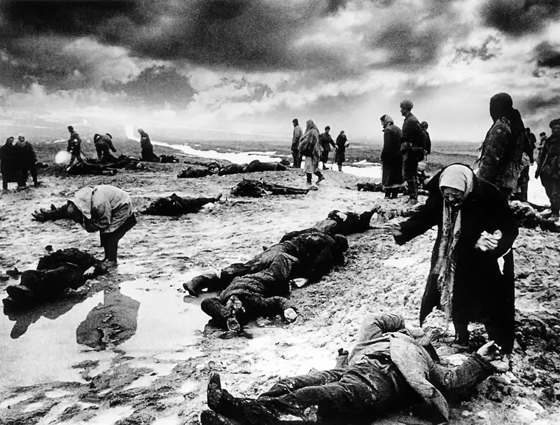
Dimitri Baltermants Grief 1942 
This is one of his more famous images, called "Grief", depicting a Nazi massacre of Jews. It shows the grief of village women as they search for the bodies of their loved ones. The sky was apparently burnt in during processing to add more drama. More info can be found on the website below but you need to hit translate!

http://baltermants.com/#/

Some of his images resemble closely those of Capa, but they would do given the subject matter, technology available and the conditions they were shooting in.

Dimitri Baltermants Attack 1941

Once more blurred, grainy and full of action, he captures the moment perfectly.

Dimitri Baltermants Crossing Oder River 1945
Dimitri Baltermants Playing Tchaikovsky 1945
Maybe it is only me that hasn't heard of him but the more I look at his work the more it draws me in, he too had a knack for telling a narrative, capturing raw emotion and energy. If it hadn't been for the Russian propaganda black out and the death of Capa maybe his name would also trip off the tongue when discussing great war photographers?

Saturday, 2 November 2013

Taylor Wessing Photographic Portrait Prize 2012

I came, I saw, it conquered. Out of the "historical" reviews this is my last, I have 2 personal visits that I undertook, a Robert Capa and just last week Only in England, still to do but my target for the week was to complete the OCA study days. YES, this one is IT!

Really, really briefly, for the past 3/4 years I have been to this exhibition, I always ask myself why, I don't like portraits, I don't want to take portraits, I can never understand how some get nominated and why the winners win. I always answer myself with, it's a day out, it's photographs, you can learn to appreciate portraits, discover why some leave you cold, why some are more interesting that others so that on the odd occasion when you need to take them you have a point of reference (sounds good in theory doesn't it!)

So in my opinion what makes a good portrait... something that is different from the norm, is insightful to the subjects character or occupation, possibly amusing, is possibly  part of a body of work that is telling a narrative but can stand on it's own merit.

Looking at the online reviews to jog my memory I thought ahhhhhhhhhh yes I remember that one, with added thoughts of I still don't know why it won/didn't win. Bored of portraits already ( I find I spend hours making attractive people look ugly) and bored of writing reviews I am not going to comment individually on any of them, I guess only the photographers and judges know why they chose to include the usual mix of children, pets, famous people, nudes (was it last year the woman was dressed in her dead horses gear?!?!?!) so for your delectation and delight I close with the following links:

http://www.taylorwessing.com/news-insights/details/shortlist-announced-taylor-wessing-photographic-portrait-prize-2012-2012-09-06.html

http://www.telegraph.co.uk/culture/culturepicturegalleries/9656485/Taylor-Wessing-Prize-2012-in-pictures.html

http://www.theguardian.com/artanddesign/2012/sep/07/taylor-wessing-photographic-portrait-prize

I note that the 2013 exhibition starts in November, maybe I need to get Robert to take me round and enthuse so I realise what I am missing.....

Perspectives on Collage Laura Letinsky et al at The Photographers Gallery

Do I have to keep playing Mum? I guess I do, this one may be brief, I thought some of the others would be but once I get going I like to have my say. Added to the work of Broomberg and Chanarin and John Stezaker I can see how all these fit in together in how various bodies of work are being made and moving forward. The Photographers’ Gallery certainly threw down the gauntlet when it decided to curate these three exhibitions to the medium: Perspectives on Collage and Laura Letinsky – Ill Form and Void Full, Geraldo de Barros – What Remains.While Perspectives in Collage is a group show, Laura Letinsky and Brazilian Geraldo de Barros’ work stood on their own.

Perspectives on collage

(side note I can't believe this stupid web page dictionary does not recognise the word collage?)

This was a group show featuring 8 differing approaches to photo collage to "broaden ideas around the practice into areas including sculpture and installation." Promising myself to not write too much I won't go into great detail, some I didn't like, some I did but as ever the premise of coming to an exhibition isn't to "like" everything you look at but to see if you can learn different ways to present your work or tell a narrative.

Work was on display from:

Jan Svoboda, Peggy Franck, Nicole Wermers (seen previously at Saatchi Out of Focus) Batia Suter,  Anna Parkina, C K Rajan, Roy Arden and Clunie Reid.

Very briefly and with thanks to the Photographers Gallery exhibition booklet for the words to paraphrase or just nick... :-

Jan Svoboda used torn up and folded remnants of his own work in simple arrangements. - I couldn't work out what message if anything he was trying to send?


Peggy Franck creates assemblages from everyday materials in her studio - interesting to look at but what is the underlying message? Is there one?


Nicole Wermers borrows motifs from the world of design, fashion advertising and architecture magazines and makes abstractions. I enjoyed these, liked her work previously. I can see how the ideas of seduction in advertising play out in her visually seductive pieces.


Batia Suter used a diverse selection of books in her floor piece Wave to "suggest poetic connections within encyclopaedic knowledge." Ok if you say so? Looks like a tidier version of my floor when doing research for my essays.....


Anna Parkina works in sculpture,painting,photography and performance. Apparently the Russian avant-garde echoes through her work. I can read into these how Russian society is altering, old statues and snippets of propaganda are there, society is as fragmented as her pieces. That may be her message it may not be, but at least I could read something into them and more effort had gone into creating it rather than  oh lets say, skimming thru a lot of books to find images of boats then plopping them on the floor?


C K Rajan overlays two contrasting newspaper or magazine images, surreal works responding..."tangentially to...economic modernisation...social and cultural contradictions." One of my favourites I think, images cleverly put together showing the contrasts of old and new, poverty and big business and the juxtaposition they have in developing countries.


Roy Arden works across media including painting, sculpture, photography and video. I wasn't quite sure with his, think I need to research more. Very bright, very busy, image below is Rich Tapestry of Life and I get that, but still not convinced.....


Clunie Reid used marker pen, slickers holographic paper and sticky tape, borrowed from advertising, the internet and the internet to "throw our image worlds into sharp critical light." Messy, childlike scribbles, too pink for my taste, random and jumbled but I guess that may be the message about what our visual world today  is? Overloaded, messy, poor quality with no coherence?


The exhibition aimed to "highlight the enduring relevance of collage across a range of creative practice" in that I think it was really successful. Am laughing to myself because at the time when walking around I was scratching my head for a lot of it thinking the usual "why is it here, what am I looking at, that is rubbish" but when you have the time to reflect, think about what the images are saying more than the image itself then you understand them more. A kind of light bulb moment, this is where I need to tie in what I am trying to achieve with what I do achieve. Sometimes its more about the message, the image does not need to be technically brilliant, although that would be nice as long as the message gets across you've done what you set out to do. Also successful as it starts to spark ideas of how you can present your own photography.

Laura Letinsky – Ill Form and Void Full

The first thing to comment upon is how this exhibit was curated, with Letinsky deliberately choosing not to place her work under glass. Quite ironic because of her statement below :

"Everything gets spoiled. Nothing remains pure, unsullied. The whites are always sullied, they're wrinkled, they’re stained, there’s marks on the wall, or else they're blindingly white so you almost can't look at them and you can't see anything in them. The white is sort of this play on our expectations or desire for perfection and the impossibility of that."

There was debate over one image that had dirty splats on, was it part of the image? A lot argued it was, however I asked one of the members of staff who told me nope, a visitor had splashed his drink and they were now being more conscious of telling the audience to step back, not get so close and don't touch ...so anyone wondering I've cleared that mystery up.

A really interesting video is here which makes so much sense, and isn't full of a photographer giving lots of what I term psychobabble, about why something was made or a deeper meaning behind an image. Robert Enoch was our tutor that day and he was full of enthusiasm for this work which made sure I looked at it deeply and didn't just dismiss it out of hand.

http://player.vimeo.com/video/57683797

http://www.5280.com/blogs/2013/03/14/meet-artist-laura-letinsky

http://www.aperture.org/blog/interview-with-laura-letinsky/

When I started to think about my critical essay these 3 exhibitions were in the back of my mind although none of the artists got mentioned in the end but the thought processing were there over is photography made or taken.

My initial response when looking at her work was to wonder how it was created, what shadows were real, what were part of the cut out. I noted that she likes working with natural light, so do I but in this country and with my rooms it isn't always easy or possible :o/ Then I started to try and "read" what was going on within the work. Without going into this too much, I could write reams, about the inclusion of tape, her exquisite sense of colour etc I found her work really interesting,  complex with a lot of underlying messages, the video and interview links will go into the detail I don't have time to comment on here. Well worth seeing.


 Geraldo de Barros – What Remains

A key figure in Brazilian art and design he at first experimented with multiple exposures, rotations, over-painting and scratching negatives. He put photography aside and revisited the medium late in life after having a series of strokes. In the last 2 years of his life he made Sobras - Remains. Over 250 collages which incorporated some of his Fotoformas series.The exhibition traced subtle connections across the two series. (blurb re-hashed from the exhibition leaflet)

To be honest I don't remember much about his work, but we had taken in two exhibitions this day (Light from the Middle East) and saw so much it doesn't surprise me. Googling his work I found quite a bit to enjoy and it showed another way of producing and using your work, changing direction out of necessity etc.

As I don't remember his work I don't feel qualified to review it from images online or just re-quoting secondhand information I'll paste a few links that sum his work up for those who want to know more.


http://www.dazeddigital.com/photography/article/15393/1/geraldo-de-barros-what-remains

http://centrefortheaestheticrevolution.blogspot.co.uk/2013/03/geraldo-de-barros-what-remains-curated.html


All in all a good day out and with lots to think about and possibly experiment with incorporating into my own work at some stage. Thanks once again to the OCA for organising these visits which are always worthwhile!

Friday, 1 November 2013

Sebastião Salgado: Genesis NHM 2013

::::Jumps up and down in excitement:::: I am getting there...at last I am getting there.. I have been putting this one on the backburner as I don't know where to start and what to say first. How can you love and hate an exhibition at the same time?

To paraphrase Shakespeare, Sebastião, Sebastião, where for art thou Sebastião?

He was there and yet again he wasn't.

Sighs, lets start at the beginning and work my way through my thoughts as best I can. I have read several reviews online and most vary from sycophantic dribbling which failed to recognise some of the obvious flaws of this body of work to others which are highly critical and don't seem to recognise any of its beauty or worth, quibbling over the use of words such as "unspoilt". I missed the OCA study visit and it would have been great to walk around with others to bounce my ideas off but never mind. It's odd that even months later I am still having difficulties in putting down what I want to.

Genesis is the culmination of 8 years work, journeying through 32 countries, capturing mountains, deserts and oceans, animals and people. The majority of photographers will throw their hat into the ring of one genre or another, Salgado does not. He captures landscape, wildlife, portraiture and mixes it altogether in the guise of the documentary.

Over 200 of Sebastião Salgado’s black-and-white documentary photographs were on show and although it was brilliant to go to an exhibition that had so much work from one artist I think this is the first failing I shall mention. There were too many of the same kind of shot, how many marching penguins can you look at when one just one or two stunning shots would have sufficed?

Sebastião Salgado Genesis - Penguins


The second issue which I'd bring up before I get onto discussing the photography itself is the sponsorship by an apparently dubious company, Vale Mining. I am sure there are others who can be more eloquent about the politics and the rights and wrongs of them putting up the funds so will not go there. Although I agree it may taint your opinion of the photographer's morals and in some instances it maybe that in some circumstances there might be political gerrymandering behind such funding I don't think this was the case here and should not impact on a critical review of the images on display.

http://www.vale.com/brasil/EN/aboutvale/news/Pages/sebastiao-salgado-inaugura-mostra-no-brasil.aspx

And there's the rub, to critically review the images...composition, drama, content, tonality, contrasts. While I loved some of that list OMG!! Sebastião , why didn't someone tell you to put down the dodge and burn and step away? With some of the images it was like walking through an HDR nightmare. What were you thinking? Who removed the word subtle from your lexicon? What had that poor sea-lion done to you? Are your assistants too enamoured of you to take you to one side and whisper "erm boss don't you think you've overcooked it a tad?"

Sebastião Salgado Genesis - Sea-lion

 Sebastião Salgado Genesis - Albatrosses 

Salgado wanted to show an untouched world, shame he didn't give his prints the same consideration! I'd love to see what the "real" images look like. Go on Seb, you know you want to, put down the contrast slider and show us what they're really made of.

All of which made me feel really sad, it was unnecessary and spoilt some truly remarkable photography. This leads onto another criticism aimed at his work, that he makes the world look beautiful, he romanticises it, makes it too aesthetically pleasing, something thrown at Burtynsky too but so what? There are enough people out there doing gritty realism it's a relief to just step back and look at some of the wonders of this planet. You don't hear many people yelling "stop making it all look lovely" at David Attenborough, do you? I have secret crushes on all 3 lol.

It is hard to strip away the overproduction and look just at the composition, depth of field and the detail in these images but when you do you can't help but realise this is a master at work even if you don't like the finished article. Not all are so contrasty, there is quality to the work on show and despite the obvious "ick" bits (can't you tell I am fed up with proper photography critique vocabulary) I really enjoyed most of this exhibition. which was a master class in the use of light, shapes and form.

 Sebastião Salgado Genesis - Elephant
 Sebastião Salgado Genesis - Zebras


 Sebastião Salgado Genesis - AYali man in the Jayawij
What did I take away from this exhibition? That I still like Salgado despite the wrong turn he may have taken with his digital manipulation, that while digital manipulation is acceptable to get the best out of your RAW image don't, just don't over do it! Some may say that he hasn't moved on, that his work is too old fashioned, I don't care. Some photographers try out new things and I prefer their older stuff. They can't win whatever they do. Am hoping that someone buys me his book for my birthday!


http://www.disphotic.lewisbush.com/2013/06/06/review-sebastiao-salgados-genesis-at-natural-history-museum/

http://www.weareoca.com/photography/cant-make-up-my-mind/

Deutsche Borse Photography Prize 2013 Photographers Gallery

I am slowly but surely catching up with my reviews, I must admit to feeling a bit reviewed out but it's something I need to do, want to do and seeing as I went to another exhibition yesterday and have another study day coming up soon, if I don't get a wriggle on I'll be back to where I started!

The Deutsche Börse Photography Prize is an exhibition that I have visited several times in the past and I'm always surprised at what gets included and why. What makes the judges think that the nominees have make a "significant contribution?" Most of the time I can see why the work is worthy of an exhibition but not always why it is thought to have "significantly" contributed. This time around I didn't have that problem, I may not have been in love with all of the work, or wondered about the level of appropriation but I could see why the bodies of work were being discussed, how they opened up new avenues of creativity and in that respect contributed to photography as a whole.

As ever the objectives of the study were to gain a personal perspective on the work of the short-listed photographers, reflect on the experience of seeing photography in a gallery and the nature of photography competitions and network with other OCA students.

The tutors accompanying us on the visit were Sharon Boothroyd and Simon Barber; both were enthusiastic and prompted us to think deeply about the work, how had the photographers set about achieving their goals, were they worthy of a place in the competition and had the boundaries of  competitions changed? As a photography prize did it matter that two of the entrants hadn't actually taken any of the images? How was the prize being interpreted?

So onto the four finalists with details from The Photographers Gallery webpage:

Adam Broomberg and Oliver Chanarin

Adam Broomberg (b. 1970, South Africa) and Oliver Chanarin (b. 1971, UK) are nominated for their publication War Primer 2 (MACK, 2012).

War Primer 2 is a limited edition book that physically inhabits the pages of Bertolt Brecht’s remarkable 1955 publication War Primer. Brecht’s photo-essay comprises 85 images, photographic fragments or collected newspaper clippings, that were placed next to a four-line poem, called ‘photo-epigrams’. Broomberg and Chanarin layered Google search results for the poems over Brecht’s originals.

Mishka Henner

Mishka Henner (b. 1976, UK) is nominated for his exhibition No Man’s Land at Fotografia Festival Internazionale di Roma, Museum of Contemporary Art, Rome (20 September – 28 October 2012).

No Man's Land represents isolated women occupying the margins of southern European environments. Shot entirely with Google Street View, Henner's method of online intelligence-gathering results in an unsettling reflection on surveillance, voyeurism and the contemporary landscape.

Chris Killip

Chris Killip (b. 1946, UK) is nominated for his exhibition What Happened – Great Britain 1970 –1990 at LE BAL, Paris (12 May – 19 August 2012).

British born Killip has been taking photographs for nearly five decades. What Happened – Great Britain comprises black and white images of working people in the north of England, taken by Killip in the 1970s and 1980s. After spending months immersed in several communities, Killip documented the disintegration of the industrial past with a poetic and highly personal point of view.

Cristina De Middel

Cristina De Middel (b.1975, Spain) is nominated for her publication The Afronauts (self-published, 2011).

In her first book, The Afronauts, De Middel engages with myths and truths, reality and fiction. In 1964, after gaining independence, Zambia started a space programme in order to send the first African astronaut to the moon.

De Middel sequences her beautiful colour photography with manipulated documents, drawings and reproductions of letters, presenting them as almost folkloric inlays alongside fashion illustrations and technical sketches.

What struck me straight away was the amount of research undertaken by each entrant, no matter how different the style or interpretation of contemporary documentary, the background research was amazing. All emphasising that if you want to document a topic KNOW IT! If you don't know it, do the research, if you do know it more research will never be a waste of time.

War Primer 2 - Adam Broomberg and Oliver Chanarin

First of all I have to admit to not knowing much about Bertolt Brecht, or even having heard of War Primer. If that makes me neanderthal so be it, therefore at first I was unsure of what I was looking at and the significance of the title, but it was a study day, we are here to learn so I had to read, listen, ask questions and gradually found out what it was all about. I won't repeat the information above but will add that when they say inhabit his book it is literally true. With a team of volunteer interns Broomberg and Chanarin carefully took apart 100 original copies of War Primer, found suitable "matching" imagery via Google, silkscreened them over the original newspaper clippings found by Brecht and re-assembled them.

However it didn't stop there, a "primer" is an educational book and Broomberg and Chanarin picked up this message of teaching and ran with it. They display each book open on a different page in separate glass vitrines the size and dimension of a small school desk. These cases were then laid out as if in a classroom environment. The information about each image on display was projected onto the wall, reminiscent of the type of smart boards found today in educational establishments.

The work is in the permanent collection of the Museum of Modern Art, available as a limited edition book, and a free download via an app.  There are advantages and disadvantages to all these means of communication; an eBook can reach a much wider non-specialised audience, a book has the physicality that a mobile device lacks, whilst the book is limited to the message on the page. However in this instance the book has the scope to spread beyond the frame, become an installation piece and press home the play on words of the book being a primer and the educational set up of the exhibition. With such a range of distribution Broomberg and Chanarin have rehabilitated/introduced Brecht to more spectators; as a body of work and installation piece War Primer 2 has been both taken and made.

In this day and age not everyone has the time or funds to jet around the world taking photographs of everything they want to document, other areas may be too risky or difficult to visit. Does this mean you should be unable to document it, have a say about how it is presented? I think Broomberg and Chanarin have come up with a novel approach to have their own say on the war on terror.

Despite the discomfort of some with regards to the use of borrowed images, which is a well-established technique in terms of fine art, and the almost complete appropriation of Brecht’s book, this is an extremely clever body of work which tells its narrative well, sets new boundaries for the displaying of photography and has opened a healthy debate on the direction that some areas of contemporary photography are headed. I loved it for that alone and thought it a worthy winner. It also helped me write my essay on contemporary photography for which it gets my eternal thanks.

No Man's Land - Mishka Henner

In some respects this is exactly what Mishka Henner has done. If you don't live in southern Europe but want to document "surveillance, voyeurism and the contemporary landscape" what do you do? Answer? Go online, delve into the seamier side of chat rooms and forums, discover where the sex workers are to be found - via satnav coordinates - and obtain your images via Google Street view.

However where I found B&C's work interesting this I found a bit bland and lazy, I can't tell if Henner has used the original downloaded image or if it has been cropped or manipulated to give a better composition. Not that this ultimately matters but compared to the research and physical work involved to produce WP2 this paled by comparison. There was a slight nod to mixed media with a soundtrack of birdsong to emulate the backdrop the images were set against and a video loop was running from the perspective of the GSV van, here I am going to be lazy because I can't be bothered to paraphrase this other reviewer who put into words some of what I felt, so a huge lump of copy paste...

Whether one accepts the documentary validity of the photo project (and Henner argues back), the most viscerally troubling, and technologically innovative, component for me was the video installation. Henner uses GSV to make what basically amounts to time-lapse videos of driving down these stretches of barren country road or crumbling industrial highway, but as the Google car approaches the woman, Henner starts to shift over to the side cameras and then to the back cameras. The effect for the audience is to inhabit the perspective of a driver who turns his head to look at the woman as he passes and then looks behind him as she recedes into the distance. Sometimes the woman as still, but in some cases, she bends over or turns. Basically, Henner inserts us into the point of view of the John cruising for sex—the only thing giving away the illusion is the occasional shadow of the GSV camera tower on top of the car and the blurring of the women’s faces. If Henner is exploiting the women by turning them into prostitutes, then he is equally exploiting his audience by making us complicit in the trade. Technology is a double-edge sword (or perhaps a two-way street?). And therein is the poignancy of the exhibition.

acknowledgement to Aaron Scott:

http://www.portlandmonthlymag.com/arts-and-entertainment/culturephile-portland-arts/articles/review-mishka-henners-blue-sky-may-2012

Again Henner is using appropriated images to tell a narrative, he is embracing new technologies and whether or not I actually liked the visuals on display I have to agree he has contributed to photography, or more to the idea of what you can achieve with photography, and deserved a place, but rightly, in my opinion, not to win.

What Happened – Great Britain 1970 –1990 - Chris Killip

Looking at these I felt that sense of  ahhhhhhhhhhhhh now this is what I call photography. A genuine photographer, excellent craftsman immersed himself into the community and took the photographs that mattered, that showed the reality, no fancy stuff just straight forward documentary records. As written in my post about Don McCullin he cites him as an influence for his Homecoming series. One of Killip's influences was Paul Strand, whose first teacher was Lewis Hine and mentor was Alfred Stieglitz. Talk about a who's who of photography.

They may look a little dated in their approach in comparison to the rest of this exhibition, but I don't think you can beat a bit of  powerful black and white documentary photography (Yesterday I went to see the Tony Ray Jones/ Martin Parr exhibition.... but more of that later) and much of the imagery resonated with me, I grew up (not in the North)during this time- a time of political unrest. I remember the 3 day week, power cuts, the IRA H blocks and hunger strikes, the breaking up of our infrastructure and state owned industries.

His exhibition may have been a retrospective but the pictures still have an eloquence, a narrative and a lesson on knowing your subject. It indicates another way of working is just as valid as the newer approaches being undertaken today and therefore definitely deserves to be here.

The Afronauts - Cristina de Middel

I first saw a selection of this work at the Sony World Photography Award and it went totally over my head, I didn't get it and the immense overload of imagery that you get at this type of exhibition meant I unfairly dismissed it. Another example of why it pays to keep an open mind and sometimes revisit new photographers or old bodies of work. You come from a different place, you may have learnt something new in the ensuing months or you just have time to study it more.

Part of the problem I think is that at the time there were only a few of her images on display and it really needs to be seen in it's entirety. Seeing it again I found it amusing, heartwarming, informative and mostly fun. Despite the light hearted approach there is a grain of truth behind the fabricated narrative and an underlying message. As a photojournalist she found that a lot of what she was taking on behalf of the papers was a lie. Whilst undertaking research she found a file listing the 10 craziest experiments in history. Topping this list was the Zambian space mission. Apparently, shortly after Zambia’s independence in 1964, Edward Makuka Nkoloso, the founder and sole member of Zambia’s National Academy of Science, Space Research and Philosophy, initiated a mission to send the first African astronauts to Mars. A secret HQ near Lusaka was set up, where he and his team "studied the stars through telescopes and underwent gravity training by rolling down hills in oil drums." Newspaper's  reported, Nkoloso claimed that Zambia’s first rocket would contain 'specially trained spacegirl Matha Mwamba, two cats and a missionary’.

Wondering if it could possibly be true, the story sparked De Middel's creativity. More research unearthed letters and other documentation, she made costumes, props,  found locations and even self-printed her book. The body of work includes letters, newspaper clippings, straight photography and manipulation/constructed imagery.

A story about the hopeless optimism of a country that we would never assume to have the ability to have a space program says much about our attitudes to third world countries, it is also a comment upon the truth of what we read in newspapers. The drawings, and documents that we saw purporting to be archival documents leave you in doubt. Are they genuine or part of her clever manipulations with reality? On the face of it a fun piece - poking gentle fun at Zambia's failed space mission- this work actually has complex layers of meaning, with more serious undertones and sends its message in a novel way; documentary fiction- itself an oxymoron- telling us a story to make us realise some truths.

I loved it, not only was her approach novel I liked the way she incorporated different elements of documentation and photography to get her point across. Yes, she deserved to be here.

A brilliant write up with a short interview here:
http://www.telegraph.co.uk/culture/photography/9943033/Final-frontier-the-photographs-of-Cristina-De-Middel.html

All in all I found this a fascinating exhibition and it has given me much to contemplate, especially if I choose to do Documentary as my next module. So in conclusion, had the final four made a significant contribution to photography? Yes. Did they deserve to be here? Yes. Did I think that all the imagery on display was quality photography? No. But that isn't what the prize is about is it.......?


http://thephotographersgallery.org.uk/deutsche-bo-rse-photography-prize-2013

http://www.portlandmonthlymag.com/arts-and-entertainment/culturephile-portland-arts/articles/review-mishka-henners-blue-sky-may-2012

http://www.telegraph.co.uk/culture/photography/9943033/Final-frontier-the-photographs-of-Cristina-De-Middel.html


Thursday, 31 October 2013

Ansel Adams Photography from the Mountains to the Sea NMM Greenwich 2013

I have been really lucky this year to see the work of so many respected and eminent photographers and, while it was still on at the National Maritime Museum, went to see Ansel Adams Photography from the Mountains to the Sea.

“The works in this exhibition explore water in all its forms, from turbulent views of rapids and waterfalls to contemplative scenes of rivers and pools.”
Phillip Prodger, guest curator, Peabody Essex Museum

Adams was one of the founder members of Group f-64 in 1932 (f-64 was then the smallest available aperture available on a photographic lens)

“Group f-64 limits its members … to those striving to define photography as an art form by simple and direct presentation through purely photographic methods … Pure photography is defined as possessing no qualities of technique, composition or idea, derivative of any other art form … The members of Group f-64 believe that photography, as an art form, must develop along lines defined by the actualities and limitations of the photographic medium, and must always remain independent of ideological conventions of art and aesthetics that are reminiscent of a period and culture antedating the growth of the medium itself.”

So there you go!

When it comes to reviewing the exhibition I don't really know where to start... I really hate to have to say this...it feels sacrilegious... but shhhhhhhhhhhhhh I don't feel inspired by his work that much....its not that I don't LIKE it so much as it doesn't make me feel, I like photographs to inspire some emotion, either from the imagery itself or the message/story it telling. Ansel Adams photographs while technically stunning, with amazing detail don't make me feel anything beyond those 2 observations. I have read so many reviews on other bodies of work that get mixed reviews but no-one anywhere seems to have a bad word to say about Adams? I was starting to think there was something wrong with me until I came across this...

http://www.telegraph.co.uk/culture/art/art-reviews/9656066/Ansel-Adams-National-Maritime-Museum-Greenwich-Cartier-Bresson-A-Question-of-Colour-Somerset-House-review.html

where Alastair Sooke states:

Why, then, did I find myself resisting the allure of his photography... let me come right out and say it: I find Adams’s aesthetic curiously off-putting.....Adams’s vision is at best detached, at worst cold and misanthropic..... As a result, though I greatly admire Adams’s artistry, I rarely warm to him.

Ok, so I have cut out the blurb in the middle but I felt Haaaaaaaaaaaaaaaaaaaaaa relief...I'm NOT the only one who feel this way then. Sooke mentions the lack of people in the images, maybe this is what I haven't be able to put my finger on.

Similar shots by Vittorio Sella speak more to me than Adams but the imagery is so similar, is this due to the inclusion of people giving perspective, a human touch, emphasising the harshness of the environment?

Panorama of the Baltoro Glacier with Mitre Peak, Mustagh Tower and K2 in the background 1909 Vittorio Sella
And I get cross that no-one ever mentions Carleton Watkins who was there before him, it was 30 images of his which captured the valley's ravines, "cascading waterfalls and monumental trees" that inspired Abraham Lincoln to sign the legislation needed to secure the wilderness "for public use, resort, and recreation". He even photographed the Golden Gate area before the bridge was built which everyone raves about with Adams.

http://www.theguardian.com/artanddesign/gallery/2011/dec/30/yosemite-photographs-carleton-watkins-in-pictures

Watkins photographed ravines, rivers, waterfalls and monumental trees to secure the grant that allowed this vast wilderness to be kept 'for public use, resort, and recreation' forever. Here is River View down Yosemite Valley (looking west-southwest toward Cathedral Rock)
Despite not being as pin sharp and a bit sepia in tone, these images of Watkins have a gentle grace about them, the contrast is not so great and I know Adams spent hours in his darkroom dodging and burning, but sometimes I feel to excess. I really, really don't want to diss Adams that much as he was a master at his craft and his images are amazing, I'm just not his number one fan I guess.

What about Charles Leander Weed and George Fiske? I wonder how many people don't know about them? I know I didn't until recently.

Mirror Lake and Reflections, Yosemite Valley, Mariposa County, California, 1865. Smithsonian American Art Museum Charles L Weed

Washington Column, Mirror Lake [Yosemite Valley]. 366. [Photograph by George Fiske.]


Back to the exhibition itself, over 100 photographs were displayed under separate headings:  Sea and Surf, Coastal, Monumental, Rivers, Waterfalls, Rapids, Surface and Texture, Snow and Ice, Geysers and finally Clouds and Reflections.The prints varied greatly in size: from tiny polaroid prints to supersize prints covering entire walls. On examining how the exhibition was curated it was interesting to note that the display of the work was varied; some collections were sectioned off with low lighting; large screens show large formatted pictures and, towards the end, a documentary of the photographer’s life and career was screened in a medium-sized room with seating. This led on to another section, making it maze-like.Sometimes the maze like way the exhibition was set out got overwhelming and you had to ask yourself have I looked at that bit yet?

Other useful/interesting features were maps placed around the space showing the locations where Adams took the photographs. Towards the end there is a small "washing line" notes pegged to it. A sign asked viewers to write down how this work has inspired them. I'm not sure what the gallery was going to do with them after but it made people feel part of the exhibition experience.

His timing and composition are fantastic, as said above I really can't find fault with this, he pioneered so many new techniques for example his huge oversized prints produced in the early 1950's for the American Trust Company, it is a shame modern technology caught up and took over and huge is all you invariably tend to see at exhibitions these days. I found it more interesting to look closely at his smaller pieces in this exhibition palm-sized prints so unbelievably sharp – masterfully developed to have such strength in contrast and tone.

Most of the photographs were printed by Adams himself (so at least you know that he intended to make some of the darkest areas THAT dark and it wasn't an overzealous reproduction) and were accompanied by a little bit of blurb to explain the photograph and its relation to water, which was good. One aspect the exhibition showed how Adams photographed and "played with the aesthetics of patterns and textures found within nature", this work was new to me and I could see how he and Edward Weston must have bounced ideas off each other.

What I took away from this exhibition most of all (apart from the fact that I had been lucky to see up close and personal the landscapes of the Ansel Adams, oh and 2 postcards) is that every single photograph in the exhibition had been manipulated. We heard from his son in the video above that he likened a photographic negative to a composer’s score, while the performance is the photographer/printer’s interpretation and reaction in the darkroom. Why is it that today's photographers get vilified for their manipulation yet Adams is revered for his?