Sunday, 15 May 2011

Project 5: a personal range of colours

This project gave me the opportunity to make a colour chart based upon my own preferences and experiences. Invariably photographers find themselves attracted to a certain tones of colour or a particular topic, some specific locations will also tend to have similar colours. Not sure if I do have a predilection towards certain hues it was fascinating to look at some examples of my work to find out. One of the benefits of this task was the creation of a colour reference point to match against and gain consistent future results.

The main aim was to familiarise myself with the analysis of colours and the identification of those to which I respond the most.

To choose the 20 colours for the grid I decided to look closely at the images produced for my final DPP assignment also some shots of Spring flowers recently taken. It was really interesting to discover that although I hadn't set out to include similar colours/hues throughout the set, when put together and sampled the same colours kept repeating. Is this due to my taste, subliminal or otherwise, or just what nature provided? Below is a montage of the final 10 images for DPP, these being reflected in the first two rows of my colour chart. I can see now how the image colours link, with blues, greens, reds, the creams and blacks. There seems to be a reasonable balance between hot and cold colours in the first two rows.

Colour chart squares 1-10

The bottom two rows are colours picked from photographs of spring flowers taken over the past few weeks. As anticipated most of these are subtle pastel shades; muted greens, yellows and lilacs. There were a few vibrant reds/yellows and  these were similar to the shades in my first set.

Colour chart squares 11-20

Personal colour chart
Printed out this chart will  help with obtain accurate colour capture/representation in future images.

Memory Colours

Colour is an important aspect in our lives, we make not realise it but people seem to remember and associate familiar objects by their colour – a red bus, a green apple, the blue sky.... It appears that colour images are more vivid and easier to remember. Colours and tones can be used to create a style or feel in an image, but some tones have to be "correct" for the audience to connect with it, for example  if a skin tone is not acceptable we will automatically query it, but skin tone is just one of many "memory colours". We know the sky is blue and grass green; simply put memory colours are colours which people find are inseparable from certain common objects or events.

Scientific experiments (Cambridge Research Systems - Research Topics) have shown that colour seems to help people process and store images as well as remembering them. This memory of colour probably harks back to human development when it importantly helped people to find food, such as ripe fruit and remember what is dangerous, such as poisonous berries and stinging insects.

The most familiar are the most important i.e. skin tone and neutrals followed by vegetation and sky tones, by eye we can usually say whether these are right or wrong.

The next part of this section made me look at the colours with more precision, measuring the colours of the charts and on some of my own photographs. If there is a colour cast the Black, White and Grey squares will not have RGB values which are identical, if they are all the same they are described as being "neutral" therefore this is a good way to check for colour cast. Cameras and monitors measure colour solely in RGB however, the human eye perceives colour also in terms of Hue, Saturation and Brightness. Hue being measured in degrees starting with Red at the top at 0°(I never knew that red was always at the top in a spectrum circle!) while Saturation and Brightness are measured in percentages. If I can improve my estimation of the HSB colours that I capture it will assist with my colour correction and colour accuracy of my final images. Practise makes perfect?

It was interesting to discover that my tastes are quite conservative, I don't have that many bold or brash colours and I do like the odd dash of red. That is my favourite colour! I have never heard of memory colours before but can fully appreciate how they work in the "real" world as well as photography and recognise even more how important it is to obtain correct colours. Not only due to the fact that as photographers we like to create true representations but also it could affect the way our audience perceives the images we make.

Project 4: your camera's colour performance

For this project I investigated the colour performance of my camera. Before completion I thought it achieved fairly accurate results and was intrigued to see if this assumption was correct. I had to take a photograph of the colour chart provided and compare it to the digital file on the OCA disk. The photograph was taken in daylight, white balance corrected and on auto metering.

When opening the photograph and comparing it to the digital file OCA_colourchart_as looks it looked awful!

Chart pre colour cast adjustment
Using the colour picker I measured and noted the values of first 5 squares comparing the two charts

Chart
1
2
3
OCA Chart
17,17,17
H 0,S 0, B 7%
52,52,52
H 0,S 0, B 20%
97,97,97
H 0,S 0, B 38%
400D Chart
1,3,1
H 120, S 67, B 1%
57,48,50
H 347, S 16, B 22%
144,140,140
H 0, S 3, B 56%

4
5

OCA Chart
161,161,161
H 0,S 0, B 63%
243,243,243
H 0,S 0, B 95%

400D Chart
216,217,222
H 230, S 3, B 87%
249,251.251
H 180, S 1, B 98%


Due to the colour cast it was recommended that Enhance was used to correct it. As I am using CS4 the menus and techniques are slightly different, I had to refer to the Adobe help website to find out how to do this.

adjusting cast using curves

Chart after cast adjustment
To the eye it looks much better although there is still a difference. Measuring was tricky as the colour was not uniform and varied across the coloured squares.

Chart
1
2
3
OCA Chart
17,17,17
H 0,S 0, B 7%
52,52,52
H 0,S 0, B 20%
97,97,97
H 0,S 0, B 38%
400D Chart
0,1,0
H 120, S 100, B 1%
49,52,53
H 195, S 8, B 21%
134,134,138
H 240, S 3, B 54%

4
5

OCA Chart
161,161,161
H 0,S 0, B 63%
243,243,243
H 0,S 0, B 95%

400D Chart
213,4, 85
H 230, S 3, B 87%
254,255,255
H 180, S 1, B 100%


The blacks were registering fairly close to the RGB levels of 0,0,0, that you would expect and the white close to 255,255,255 even at 134,134,138 the grey was not too far off 128,128,128. Not sure what was happening with the Hue,Saturation and Brightness readings though? Maybe I needed to zoom in a little closer due to the uneven tones of the boxes? I think completing this exercise has left me a little confused as to how to interpret the results. I have examined two colour boxes to see if I could figure out the numbers from there....but there didn't seem to be a correlation? There was not more red in them all or more blue....the green box indicated my camera had more R less G and less B which suggested a red cast but then the blue box measured less on all 3? My head hurts :o/ What I have concluded is that adjusting the mid-tones/BW points is something I should be doing as a matter of course even if I have set a custom white balance. I may not be able to fully understand the numbers I am seeing but there was certainly a colour cast to correct. The Saturation and brightness seem to be close but the hues are definately higher.

Working with colour

This section asks us to start taking into consideration the colour of the objects we photograph and the capability of our cameras to accurately capture these. Not thinking about the colour of light at present, but taking this aspect into account the camera should always be set to the correct white balance because the aim of the exercise is to reproduce a scene and its contents accurately. I must admit this was the first exercise that I looked at and groaned ;o) I can see the benefits of completing the tasks but it look so fiddly and time comsuming....sometimes I have to kick myself and remind myself that the mundane and basic experiments often provide the most interesting results and useful information. *KICKS SELF*

The PwDP manual sums it up quite simply (good because some of the scientific sites I looked at went whooshing over my head) reminding us that 'the colour that we see is partly the reflection of the light and partly the properties of the surface itself' and that some objects seem to have 'a different colour under different kinds of light'. This is known as metamerism (suckers for punishment can look here Metamerism if you want to wade through long confusing paragraphs!)

The first stage of checking how to deal with the colour of things is to compare a digital photgraph with the real thing. This is the bit where I laughed and wondered how many people actually unplugged their monitor and all the peripherals to move their pc next to a window? The reason this was suggested is due to the fact that the colour temperature of the window and a monitor should not be far off....luckily my PC isn't too far away from a window......a neutral object was photographed, on a window sill with an Auto white-balance setting. The image was then uploaded to the PC, printed and the colour compared between the real thing, the print and the monitor.


I chose this mug as it has fairly moderate to neutral colouring. The colour match wasn't too bad although the mug itself is a more creamy white than the monitor shows. When the image was printed out it was reasonably close to the monitor hues. I always calibrate my monitor and a few months ago spent quite a while ensuring my colour balance and screen brightness/contrast were as accurate as possible. The image below isn't ideal as I moved the mug from the sill and the print is in front of the monitor but it gives the idea of what the experiment was. The monitor wasn't as blue as this image suggests....


Variations can be caused by the camera, the colour space that the computer and Photoshop are working in and the calibration of the monitor. I make sure I regularly calibrate mine and a few weeks back spent a while making sure the brightness/contrast of my monitor was also set correctly as sometimes my prints were too dark. It is the aim of every photographer (unless into manipulation) that the final printed image is as close to the original scene as possible. However images are most often viewed away from the real object and we have no control over where the photographs will be eventually viewed/displayed. That is another argument altogether so it is a given that common sense should win out in the end otherwise with the alternative lies madness ;o) Seen apart all three are quite acceptable.

In the appendix is an OCA colour chart to study and note the tones, a digital file is also provided but this will differ due to the different range of contrast that paper has compared to a computer screen. You SHOULD be able to see from the two images uploaded here the differences you would expect to see between the monitor images and the printed page.... not sure on my current browser if I can...on my monitor there is a distinct difference....The printed image does not have such pure colours; the colours represent colours likely to be found in real scenes. Intense hues being fairly unusual in nature, these normally are found in advertising etc.

OCA Colour Chart image property of Open College of Arts © 2004 

OCA Colour Chart As Looks image property of Open College of Arts © 2004

The chart Colour Chart mid grey as RGB 128,128,128 zero Hue,zero Saturation and 50% Brightness. Colour charts can be purchased to check the way cameras record colour.

Thursday, 12 May 2011

Planning and Thinking Ahead

At the beginning of a new course there are the usual things to think about, time management, materials, learning curve etc but until you actually see what you need to produce there are some things that can't be planned too far in advance. I intended to keep a physical log as well as an online blog as I did for DPP and assumed that it would still be an A5 spiral pad. However looking at some of the research I may do, or as the Harvard referencing guide suggests printing out some of the webpages accessed, it might be better to make it A4...or even a ring binder... I think I'll start off with a ring binder. If this proves unwieldy I may change my mind...something to watch.

I've made contact with Joe and confirmed how he likes assignments to be written up/submitted; almost the same as before but he doesn't mind if jpegs are emailed for assessment rather than uploading to a web gallery. Not a problem :o)

Wednesday, 11 May 2011

Harvard Referencing System...

Knowing that I will have to write a critical essay and use this system the pdf was duly downloaded and for ease of reference printed out. Browsing through it most of the system makes common sense and I dare say it will be easier to follow and remember when put into practise. During DPP I made sure all websites and books used were acknowledged but realise this needs to be done properly when producing academic work. Some issues became apparent, such as books being a revised edition but not stating what edition, if I come across any of these in my research I need to check how to reference that properly. Some websites don't have published or copyright dates on and it takes me ages to check it isn't hidden anywhere on the site. I can see that noting the reference may take longer than typing out the essay!

To assist me with nailing the system I have been making sure I have a draft post which has all the sources used for research so far and think I shall publish a post at the end of each section.

Tuesday, 10 May 2011

Project 3: a variety of lighting conditions

A similar exercise was required at the beginning of DPP and I was surprised when images I thought were going to produce a low-key image actually appeared to be flat, meaning the shadows were not as dark as I had anticipated. Also some I considered to be low-contrast resulted in full scaled images so it will be interesting to see if my judging by eye has improved. A decision was taken to try and be more adventurous with my shots, previously (mainly due to the horrible weather) objects/areas in my back garden were used just so the exercise could be completed without much thought into the artistic composition. Project 3 has been designed to familiarise you with histograms. The aim was to shoot 5 different images under different lighting conditions which would produce the expected histograms to meet the criteria of full range, high contrast, low contrast, high key and low key. The resulting histograms were then annotated to show why they looked as they did.

Being the beginning of Spring I thought I would try and theme the images to a walk in my local bluebell woods (did cheat with the aquilega - that was in my garden) rather than stage manage setting I knew would meet the instructions. Find below the resulting images.

High Contrast

The scene below was chosen due to the bright sky, which I hoped would provide the high contrast of white tones and the shadows/trees for the darker tones. Again I was anticipating the darker end of the scale to be slightly closer to the end but am guessing this is due to the image not being under-exposed at all. It is still a fairly good representation of a high contrast image with pixels peaking at either end of the scale with the other tonal ranges there but fairly low.


Low Contrast/Flat

This was a little trickier to shoot due to the lighting conditions in the wood providing very dark shade for close-up shot and getting too much "black". Persistence paid off and I found a clump of bluebells in dappled shade, the peak could have been more towards the middle of the scale but with no areas of black or white and no clipping this image is of low contrast.


Full Range

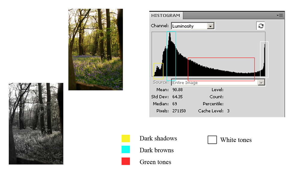
I gauged by eye that this scene should deliver a full range histogram, the shadows were not too deep and the direction of the sun meant the bright sky was not blown. The mid tones in the photograph provide the gradual slope which would possibly be more ideal towards the middle of the chart. However the tones do run from end to end and this is a fair example of a full range image.


High Key

I was not sure if this shot would tonally represent a high key image due to the green in the background. However there is a large number of bright tones indicated by the pixels "climbing" the right hand side of the graph and the majority of the other tones are on the right hand side. Dark tones are there but they are minimal.


Low Key

Whilst out in the local woods I was lucky enough with the weather conditions and the timing to obtain this sunset shot complete with young girl climbing the old mulberry tree. I thought that the histogram values would be more towards the left and the darker tones higher than they were but the black tones are squashed to the left and the rest of the tones are towards the left hand side.


Conclusion

This exercise proves that although at first we assume or are sometimes taught, that the full range histogram is what we expect from a "perfect" image depending on the colours or rather tones in the photograph this isn't always going to happen.The histogram will alter its shape it due to the nature of the scene. Problems only occur when you have anything more than the thinnest of lines line butting up to the extreme left or right sides; indicating excessive black or white. If there is a peak near either side, it just means there’s lots of dark or light tones – which is not a problem.

Although this exercise was using the "luminosity" histogram, my camera is set to use the RGB histogram. This is due to the luminosity histogram not always telling the whole story, it shows an average for the three channels and if a particular colour is clipping (for example the sky) this maybe missed and the exposure not altered to compensate. I found this webpage which helps simplify and gives examples of the RGB histogram and breaks it down.

Sunday, 8 May 2011

Measuring the image qualities/ Project 2: understanding the histogram

I touched upon histograms in DPP and learnt how useful they are when measuring the contrast of an image but this project made me look more closely at  how they can teach me what to expect from a scene. Tones squashed to the left indicate loss of shadow detail, squashed to the right-loss of detail in white/bright areas and if there are empty spaces at left/right the image would appear flat.

It was really intriguing to look at the images of Tibet in the materials folder and note which peak corresponded with certain tones.

Mount Kailash correctly exposed property of Open College of Arts © 2004

matching histogram for Mount Kailash property of Open College of Arts © 2004


Obvious areas identified property of Open College of Arts © 2004


Mount Kailash Underexposed property of Open College of Arts © 2004


corresponding histogram for under exposed image property of Open College of Arts © 2004


Project 2: understanding the histogram

This project introduced me to the CD for the first time, my task was to match six images to six histograms about which I felt fairly confident, having covered histograms previously and using them all the time in my photography.

I went for the most obvious first (well to me they were) the Oil jpeg was glass against a white background so I looked for a histogram with the graph where tones bunched mainly to the right. Histogram 5 matched this profile.


Oil Flask histogram
The white background and body of the glass oil jug is represented by the two peaks on the right on the histogram graph; the white background would be the peak furthest to the right showing that it is pure white with no detail at all. The table and light greys would be the smaller bump in the centre, with the dark part of the flask at the neck the smaller values running to the left hand side indicating darker tones were present but not to a great extent.


Carmen histogram

This image was also fairly straight forward to match with it's histogram, with a lot of black and white I was looking for a histogram with values peaking at both ends of the graph. I opted for histogram 2. Because the values touch at both ends it indicates that there is very slight clipping in the light and dark areas, but not overly so because the values are not that high, when you zoom into the image you can still see detail in the dress which is why the values on the right hand side is not high. Also whilst the background is very dark there is still detail in the man's suit. The mid grey tones are represented in the centre of the graph fairly evenly because the tonal match is very similar.


Pyramid histogram
For the pyramid image I was looking for a histogram with tones across the graph due to the deep blacks and white highlight in the doorway, however because the image has very little true black but a large tonal range of dark grey there should be a large group bunching towards the left. This was number 4. The sky/clouds and mid to light greys are there but to a much smaller extent so the graph is very low towards the right. 


Bluebell histogram


Next I decided to take a closer look at the bluebell shot. Straight away I could see no discernible pure blacks or whites. The background was fairly uniform and there was little contrast between the stems and the background. This was a rather flat image so I was looking for the histogram with information missing at both ends of the graph. Histogram 3 fitted the bill perfectly. The mid range tones of the image are represented by the pixels in the middle of the graph and as there are a large number the graph reaches the very top of the chart. The gentle sloping to either side indicates there are other ones represented but they are minimal.

Magnolia histogram

With only two images left it didn't really matter which one I opted for next and chose the white magnolia. On close inspection I could find no black or dark shadows whilst, to my eyes, the magnolia was pure white in places. The sky had no cloud detail and appeared to have uniform tones. This meant I was looking for a histogram that had tone details missing on the left where black would have been, with a high representation of pixels at the far right indicating the pure white detail. The sky would show as a tall fairly wide group of pixels in the middle of the x axis. Histogram 6 was the match with the other tones being shown by the gentle bumps either side of the mid tone peak.


Japanese girl histogram

More by accident than design I was left with the shot of the Japanese girl last. Looking at the image I was expecting the tones to fall off the edge of the graph but although they fill the entire length of the axis they peak just before the very end. This means although the image has a very dark background it is not pure black and will contain some detail still. There is very little clipping in the bright areas and the mid tones are represented consistently across the middle of the graph. I think I would have chosen this histogram for this image had I opted to match this first but would have had to check the other choices before committing because as I say I was expecting the peak to be at the very edge.

On checking the answers I was pleased to have got them all correct. I thought I had, but you never know. Completing this exercise has emphasised how much information you can glean from the on-camera histogram and how important a tool it can be for gaining correct contrast when shooting.

All images shown in this post for information and project purposes are the sole property of Open College of Arts © 2004 http://www.oca-uk.com/