Showing posts with label Planning. Show all posts

Sunday, 7 August 2011

PwDP Part Two: Photography in publishing I overview

Part two: Photography in publishing I contains three projects and five exercises:
  • Using type tools 
        Exercise: Getting started
        Exercise: Applying a drop shadow to type
  • Choosing Type
        Exercise: Experiment with layouts
        Exercise: Choosing your imagery
  • Photographic book covers 
        Exercise: Conceptual cover design

Project Using type tools

In assignment two I will need to create a book cover so it's important that I familiarise myself with the Photoshop type tools. This project and following exercises run through a lot of the basics and gives links to some online tutorials. There are lots more available so it is always worth researching to find tips, techniques and shorts cuts.

Exercise: Getting started

Create a blank A5 file and make a centralised heading with a bold typeface, investigate if necessary, the grid to help as a guide. Using the Type Toll click and drag to create another dialogue box. Text from word documents can be copy pasted into Photoshop. Experiment with alignment and typeface and size. The layered file needs to be saved for the next exercise.

Exercise: Applying drop shadow to type

Open the saved Photoshop file , duplicate the heading layer and create a drop shadow. Layers>Rasterize>Layer, Blur>Gaussian Blur. Use the move tool to move the layer down slightly. Experiment with fonts, size, colour, opacity and blur.

Project Choosing type

For Assignments Two and Three the only thing I will need to use is the type tool, however the choice of fonts will be of great importance. Without getting to involved in the aspects of typography it is necessary to know enough about fonts to know what will work. Some general considerations are
  • Choose fonts which are easy to read
  • Intended use ie Display Font (large font) for Headings and Titles for books 
  • Serif typefaces are generally considered as easier to read for large amounts of text as opposed to sans-serif. 
  • Use of contrasting fonts for different kinds of text.
  • If in doubt stick to familiar fonts such as Arial, Times New Roman, Verdana, Georgia. 
  • Use no more than two or three fonts in a single layout.
Exercise: Experiment with layouts

Taking a simple layout comprising a picture, heading , body text and caption. Following a few more provided links on typography and thinking about the previous exercises produce three different versions of the layout. Which one is best and why?

Project Photographic book covers

I need to visit my local library and bookshop and browse through the photographic book covers. Note the images and think about the thought processes behind each one. The image has to have an impact, gaining the readers attention, holding it and be relevant. The next exercises focuses on the reasons for success.


Exercise: Choosing your imagery

Find an example of books featuring certain characteristics, trying where possible, to have an actual copy of the book rather than viewing the image online. Look for:
  • an out of focus photograph
  • an inverted photograph
  • an historical archival photograph where the subject is slightly obscured
  • a still life close up
  • a minimalist landscape or outdoor scene with a large area of sky
For each example write approximately 100 words describing why the publishers adopted this design. Have a copy of the example in the answer.

Investigate book cover design as an overview, consider stock photography versus custom made images, also the role of concept.

Exercise: Conceptual cover design

Looking at the six book covers provided this exercise is an analysis of the possible thought processes of the art director/designer. To know how clever or successful the imagery is I need to get hold of the actual books and familiarise myself with the content. Note which were easy to produce while others needed location and props.

Contrast the six books with three more that have a differing approach. Ponder upon the problems of copyrighting a concept.

Accommodating type

A cover image has to have sufficient space for the title and authors name, as well as any other information that may need to be included. An added sophistication is the ability to build the typography into the image.

Assignment Two A photographic book cover

The brief is to design a book jacket which must wrap around, include the front cover, spine and back cover. This will be for a work of fiction using my own photography and the image used must have been shot specifically for this project.

Choosing a book title

Chose from

Perfume: The Story of a Murderer by Patrick Suskind
Choice by Renata Salecl
1984 by Geroge Orwell
Farenheit 451 by Ray Bradbury
The Outsider by Albert Camus
The Remains of the Day by Kazu Ishiguro
Far from the Madding Crowd by Thomas Hardy
The Dice Man by Luke Rhinehart.

So planning.....

Explore type tools in Photoshop
Experiment with layouts
Visit the library to get hold of specific books
Research links provided as a starting point
Further research re design layouts and photographic concept ideas
Once book/concept has been chosen plan photoshoot.

one .... two ... three .... go...

Thursday, 12 May 2011

Planning and Thinking Ahead

At the beginning of a new course there are the usual things to think about, time management, materials, learning curve etc but until you actually see what you need to produce there are some things that can't be planned too far in advance. I intended to keep a physical log as well as an online blog as I did for DPP and assumed that it would still be an A5 spiral pad. However looking at some of the research I may do, or as the Harvard referencing guide suggests printing out some of the webpages accessed, it might be better to make it A4...or even a ring binder... I think I'll start off with a ring binder. If this proves unwieldy I may change my mind...something to watch.

I've made contact with Joe and confirmed how he likes assignments to be written up/submitted; almost the same as before but he doesn't mind if jpegs are emailed for assessment rather than uploading to a web gallery. Not a problem :o)

Saturday, 26 March 2011

Prints

I sometimes do and sometimes don't. To be completely honest most of my images are electronically stored and hardly ever printed unless specifically for a portfolio, a gift or because I want to change what I have on my wall.

Part of the issue really is down to cost. When using film photographs were kept to a minimum and I'd wince over a bad shot, not only because it was bad but because I had paid someone good money to produce rubbish! There is much debate about printing and the physical form being the end result and I do agree. There is nothing better than holding a great image or seeing it displayed on a wall, but I haven't got the room for mountains of photos and at the moment I can't afford the ink and paper for catching up with a back log. This is why I quite like the fact this course can be completed electronically if you wish. Having said that I am contemplating printing off my final set when sending off my work for assessment. The form has been sent off and it's receipt acknowledged...now am awaiting feedback so any necessary amendments can be made, then organising can be sorted and the long wait until July......

Discussing this with Peter he said prints would only be of benefit if they were of good quality reminding me that it is good practice to use the same paper/inks as your printer manufacturer and the correct profiles...a handy point but one I always follow when not draft printing. I've submitted two portfolios previously using my Epson printer and had good results. Recently I noted slight gaps :o/ Have cleaned the print heads so think it might need re-aligning...love holding my prints, hate getting them right ;o) One of the issues I occasionally have is the prints appearing a little darker than expected so I was quite pleased to discover that this can be a common issue, and at first even more happy to discover a tutorial about it Why Are My Prints Too Dark on Luminous-Landscape.com, but having read it its possibly a little be clearer as to why there is a problem but not quite sure I know how to cure it :o/ *big shrugs* Previously I'd use a pre-set curves layer but this would sometimes throw out the lighter areas whilst correcting the dark.....I'm going to have to re-read this article and hope some of it sinks in...I need an idiots guide 'open this menu, click this tab, move this slider....' fiddle with luminance or rather the candela per metre squared (cd/m2) hmmmmmmmm second paragraph in and it's gone whooshy already....
"The correct value for luminance is one that produces a visual match. You can start at the so-called “recommended” value, which is often in the neighborhood of 120-140cd/m2. That value may need to be lower or higher. You will need to adjust the display luminance until you get that visual match."

Very interesting but where abouts would I find where it tells me this luminance figure? On my monitor I have brightness and contrast etc but only given as a percentage? I don't think on my monitor there would be this reading so rummaging about, as you do I came across this...."Brightness" and "Contrast" controls which may be useful...

"Step 1: Set CONTRAST to minimum

The first step in monitor adjustment is to set CONTRAST to its minimum setting. Some so-called "smart" television sets have automatic black level circuits that alter black level as a function of picture content. These circuits should be defeated if possible, both for monitor adjustment and for high-quality viewing.

Step 2: Display black

Display an image that is predominantly or totally black, perhaps by using a screen-saver. (In a well designed monitor, setting CONTRAST to its minimum will cause the visible raster to disappear.)

Television stations and networks fade to black between commercials. If you are adjusting a television receiver, you can use this "black" to set black level. Make it quick, though ! A television station never transmits black for more than a fraction of a second. If you find a colorbar test signal, its lower right corner contains true black. Black level should not vary from station to station.

Step 3: Adjust BRIGHTNESS

The third step in monitor adjustment is to adjust the BRIGHTNESS control to a balance point or threshold, low enough that a black area of the picture emits no light, but high enough that setting the control any higher would cause the area to become a dark gray.

Computer monitors are generally under scanned: the extreme margins of the screen have no picture content. A rough setting for black level can be found by making the under scanned margins as black as possible. However if your frame buffer has nonzero setup (or EIA-343-A levels) then this method is inaccurate. Using black picture content, instead of the margins, always assures an accurate setting.

When you set BRIGHTNESS to its minimum, your monitor may display a shade of dark gray instead of black. This indicates an internal maladjustment: Ask a service technician to make the necessary internal adjustment. When your monitor's BRIGHTNESS is set near its threshold, your monitor may display a dark color instead of a dark gray. This indicates that your monitor is mistracking: The internal screen or cutoff calibration of one or two of its guns is set incorrectly. Ask a service technician to repair this problem.

Step 4: Adjust CONTRAST

Once black level is set correctly, CONTRAST can be adjusted so that a white signal produces the appropriate level of luminance. In a television studio environment there are standards for absolute luminance. Outside that environment there is no "proper" setting of this control; it depends entirely upon your preference.
Resist the temptation to set your monitor too bright. Excessive brightness has a number of disadvantages. First, your sensitivity to flicker increases as brightness increases, so setting your monitor too bright is likely to increase your perception of flicker. Second, a number of phenomena act to scatter light onto the face of the screen, and the higher the brightness of bright areas of the picture, the more light is scattered into the dark areas. This scattered light reduces the contrast ratio - hence the perceived quality - of the picture. Third, operation at high brightness tends to defocus the electron beam of the CRT, resulting in poor sharpness.

Some poorly designed monitors exhibit variation in black level upon adjustment of CONTRAST. If your monitor suffers from interaction, after adjusting CONTRAST you may have to go back and tweak BRIGHTNESS. It may even be necessary to iterate between the two controls a few times in order to set the combination that both reproduces black correctly and reproduces white at the brightness you desire."

I've also downloaded a test image which I shall play with once my stock of paper and ink arrives. If you hear much screaming deriving from Kent you know I've screwed my settings and wasted the lot ;o)


http://www.luminous-landscape.com/tutorials/why_are_my_prints_too_dark.shtml

http://www.poynton.com/notes/brightness_and_contrast/

Wednesday, 9 March 2011

Test Shots

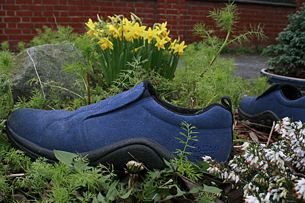
Here are some of my test shots where I have been exploring what I think I want to show....they have been investigating the locations, the time of day, the memories, depth of field I find most pleasing and the prominence of the subject. Needless to sat all of these were discarded for various reasons (main one being they are all rubbish lolol) but all helped build upon the final images I took.


I loved the silhouette idea, the memory is from Christmas 2004, the first Christmas after my husband left and I spent it on my own as our children were with him. I wandered down to the local park and took sunset shots of the lake from this spot. However the area here is very 'twiggy' and I just found there were too many distracting elements. A few days later I tried from the other side of the lake but with a different idea of not using the lake. The cloud cover remained and I got no sunset.....had to pencil in another return trip. Just as well the park is a 5 minute drive away!


I love gardening (or did when I had the time) and have spent a lot of time and effort transforming my front garden from a muddy pit into a colourful rockery, however there were too many distracting elements to try an avoid, and not enough was in flower to provide any kind of interest. I gave up on this idea totally.


A trip to the Church where I was married after school gave a lovely dusky sunset glow but the long shadows were a problem. I was in kinds of positions trying to make sure I didn't shade the shoes. Trying out ideas gleaned from Joy Gregory I didn't make the shoe the main subject...found I wasn't happy with that result.


I seemed to have lived down my local gym, the kids had swimming lessons and tumble tots and school galas, at one point before I returned to work I would swim or go to spin fit classes at least 3 times a week... again experimenting with showing more of the building than the shoes...another shot that convinced me I didn't like that idea.....


Crematorium. My father died when I was 18.

As a child every summer holidays we would visit Margate :o) As an adult I love to go back even though it is a bit shabby now.

From the mid 1980's until I left to go on maternity leave in late 1991 I worked in Princes Street, I'd walk London Bridge every day, lunch at St Paul's Churchyard in summer, and liquid lunch in the London Stone. Many years later I'd still meet with a friend for lunch in this great little pub, very Gothic and atmospheric. I had this great red "power suit" that I'd wear with my red shoes ;o) Ahhh those were the days.......


Having "played" narrowed down my ideas. Fairly shallow depth of field, probably f5.6 giving more focus to the shoes, background fading slightly like the memories, I still have the shoes but the memories are just that tad blurred by time. I prefer the images where the shoes are the focus and given prominence within the frame. Although the shoes are the main subject the background is just as important and thought will be given to composition and interest. I don't want them to be just 'record' shots.

Tuesday, 1 March 2011

Final Set Thoughts

Can't you tell I can't get out and get on with shooting? Am hitting the blog with words rather than images. I have also been keeping a physical blog with snippets of thoughts and images some of it crosses over, more so towards the end of the course. Possibly because the exercises on DPP although open to being creative were more to do with the technical post processing or capture of the images rather than the composition of them. I did look at other photographers and websites for ideas on how to approach the final assignments but for this final set I seem to be being more thoughtful, something touched on in my last rambling post ;o)

Looking in depth at the Joy Gregory set of images I was quite surprised by the inconsistency of her approach, the variation in the depth of field, the different focus of the shoes and the prominence of them within the frame, sometimes seeing all of the shoes, sometimes only a snippet.

My intention is to try and make the shoes the subject tying in the old saying "walk a mile in another man's shoes" and "you can tell a man by his shoes" with my life. Do my shoes tell the story of where and when and why? I will know the story behind each image, the final results should give an indication but also hopefully some will have a little mystery. Undoubtedly a few will  be give aways, the place obvious but only I will know the exact memory. With each new assignment I have challenged myself. This will possibly be the biggest one with such heavy reliance on the weather and the places being quite far flung :o/ Yet again I've chosen "me" as a central theme, exploring where I have been and how that has shaped me as a person. Will the images reflect that? Only the final set will tell. Will my audience feel they have walked a mile in my shoes and know me better? Or will they go.......oh shoes..............tatty shoes. I don't intend to especially clean them or repair them, they will be photographed as is, my shoes, my life, gritty realism at grovelling, muddy, floor level if they follow most of my test shots so far! :oD

As mentioned I shall attempt to make the shoes the main subject and prominent within the frame, but am open to the idea that for a better final image this may not work. This approach may mean an element not being included that helps make the final shot. I do know that I want to stick to using my 18-50mm lens and use it on the wide angle setting....I've taken test shots, have re-visited with some and improved, they may get included......let the experimentation continue :o)

Friday, 18 February 2011

Assignment 4: Real or Fake Ideas

The purpose of this assignment is to reflect on all the techniques and ethical choices explored in this part of the course and help to define my own stance on the ethics of manipulation in order to illustrate an imaginary book or magazine.


Bearing in mind the fact that the covers are there mainly to attract an audience, to promote sales and quite often designed/interpreted by photographers, art directors and illustrators.


The remit was quite open. I could make up the idea from scratch or take a book I already know and design an alternative photographic cover illustration taking photographs specifically for this purpose. I could also explore many areas of manipulation to complete a successful cover such as shading, combining two elements or extending areas.


Having thought about this for a while I eventually decided on a magazine front rather than a book. I completed some research on magazine design by looking at several different magazine covers and also looking at various websites which gave tips on how to complete this process. Some ideas I took on board others I dismissed as either not an essential "rule" as many professional publications did not follow them.
 

Magforum: The secrets of magazine cover design - part 1


items to possibly include are :


Masthead:(logo) The name of the magazine displayed in a specific typeface.

Dateline: Month and year of publication, often with the price. Most monthly publications hit the news-stands the month before the cover date.

Main image: Invariably a single image of a model or item being promoted by specialist magazines.

Coverlines: Some magazines use a lot of cover lines, which are distributed around the main image without detracting from it too much. A mistake often made with cover lines is that they run over an image that has a lot of colour changes, rendering the words invisible.

Main cover line: On the example given this is very large - taking up almost a quarter of the magazine cover.

Left third: This section of the magazine cover is very important for sales in shops where the vendors do not display the magazines full-frontage. The top fifth of the cover - usually dominated by the masthead - may be the vital part in supermarkets, where magazines are displayed differently.

Bar code: Standard bar code used by retailers.

Selling line: Short, sharp description of the title's main marketing point (for the example given: 'The world's No 1 magazine for young women') or perhaps setting out its editorial philosophy.


Six main aspects to consider are.
  • what is the purpose of a magazine cover/how to reach a target audience/genre?
  • the colours to use.
  • the main graphic
  • title/taglines/screamers
  • design
  • overall impression.
Design a Magazine Front Cover in Photoshop Video – 5min.com


Was interesting to watch.


Hopefully I will take on board all these ideas and create a successful magazine cover.


A very useful site with lots of ideas to take on board.

Wednesday, 22 December 2010

Thoughts on Assignment 3

Thinking about what I am going to do for the monochrome exercise has been very interesting with my mind jumping from one idea to another. Flicking once more through some of the B&W photography books borrowed has helped. Some have better images in than others, while the bulk of the books themselves seem to be more about the production of the images rather than choosing suitable topics. So many things can successfully be converted into black and white as long as they fulfil the main criteria of being a good image in the first place. Obviously the previous exercises have shown that when considering subjects for black and white conversion you disregard colour, can be aware that you can post process and “abuse” images more in B&W and consider more in the way of form, shape and even abstraction.

 In “Creative Black and White Photography Advanced Camera and Darkroom Techniques” © 2003 Bernhard J Suess Published by Allworth Press, it was interesting to note that “Among all photographers—professional and amateur—black and white accounts for less than 10 percent of the photos that are taken”

A question asked is “How do you know when the shapes and forms in your black and white composition will be effective?” and the answer given is “The best way to pre-visualize the impact of shapes on your photos is to practice separating form and function. In other words, try to forget about the subject matter of your photo as you abstract a composition from the shapes in front of you.......I try to invent humorous stories about the objects. If I can succeed in inventing plausible alternatives, then it is very likely that I can sit back and “cancel out” both this everyday world and my invented alternative.”

Important things to consider....

• The graphic content of the image is clearer without the distraction of colour.
• A great contrast is being presented between darks and lights.
• Shadows play a big role in the image.

Bearing these in mind I think I want to explore the use of light/shadows, reflections, maybe High and Low Key and try and incorporate humour or some kind of “recognition” within the image linking it to a well known phrase or saying. I have seen quite a few images where the comparisons have been texture or pattern and I would like to see if I can steer away from this and play with shadows and light. This is why I think I am leaning towards still life again, where I will have more control over the lighting conditions and composition.

Another book I found very interesting was “Mastering Digital Black and White, A Photographer’s Guide to High Quality Black-and-White Imaging and Printing” Amadou Diallo c 2007 Thomson Course Technology, which opens with a selection of the authors own images. Fine examples of black and white imagery concentrating of form texture,light, pattern and composition.

Within the book Diallo includes interviews with Chester Higgins (photographer) , Paul Roark (fine art photographer specialising in landscapes) Roy Harrington  (photographer and print maker),  Jean Miele (photographer) Alex Forman (photographer), Jeanne Greco (designer) and Philippe Dollo (photographer). I have had a quick look at all their websites and noted those that I think I shall investigate more, for example Chester Higgins has a wide variety of B&W images as does Paul Roark, Philippe Dollo's
New York, the Fragile City has very grainy images all suggesting movement.

His comments with regards to the final portfolio was also interesting; “At its core, the portfolio tells a story to your audience. Like all satisfying stories, this narrative should have an arc that compels the viewer to turn the page. Now that a selection of images has been made, it’s time to look at how they fit together to create a unified whole.” (p332)

Photographers I looked at for inspiration were.....

Carl Kleiner for his humour and different outlook on everyday objects. The way he combines elements and the composition.

Nils Jorgensen again for his humour and amazing timing. Although not still life and not always black and white the way he composes his images to take advantage of the humour is brilliant.

David Chow for simple composition, use of light and plain backgrounds.

and also

Robert Mapplethorpe  whilst most may immediately think of his nudes and controversial S&M imagery Mapplethorpe had a varied portfolio of flower and statuary studies as well as childrens portraiture. Once again his use of light, shadow and composition is amazing whatever his subject.

Thursday, 25 November 2010

Planning Assignment 2

I am still thinking along the lines of still life for Assignment Two. Always up for challenging myself nothing in photography is ever "easy" but I want to make myself think hard about what I am taking photographs of and the technical side of producing the images. Having read parts of On Being a Photographer and On Looking at Photographs (Jay and Hurn) I wanted to have a clear purpose behind the reason for taking each image, I wanted each image to be personal to me but to also illicit some kind of reaction/emotion/recognition from my audience, even if that audience did not share the same experiences they should be able to empathise with them and have their own interpretation/memories kindled.

Gauntlet thrown down to myself! I am hoping to find enough objects/scenarios that will translate into still life images that can encapsulate stages in my life/the end of things/moving on as the theme. Hopefully the images will speak for themselves and require no explanations.

I've had a quick squizz through Minimalist Lighting Techniques by Kirk Tuck Copyright 2009 published by Amherst Media Inc, and whilst a lot of it does not apply, as I don't have the lights, soft boxes or the room size there are some interesting pointers about how to set up for still life within a studio and some techniques that I can duplicate with everyday household items...bring on the sheets, kitchen foil and clothes pegs!


'The studio is all about “making” and not just “taking” a photograph. Out on the street, all you need to do is react to whatever transpires in front of you. The whole point of using a studio is to be able to control every aspect of your photography. In the studio, you decide what background to use, what kind of lights to use, the color and character of the light, and so much more. Of all the decisions you’ll make, the most important technical choices will concern the lighting—whether or not to use hard, chiseled light with deep black shadows or soft, effulgent light that wraps around your subject and provides soft transitions between highlights and shadows.' (p24)
Section 2, Light and Lighting Explained covers points such as fall off which I found quite relevant, and how the use of silver reflectors can flood areas with reflected light. A brilliant series of shots of an orange with different lighting techniques (p39-45) showed how to make an interesting shape whilst not creating harsh specular lights or deep shadows. A diffuser was made by using tracing paper and an old picture frame, fill light to the other side of the subject was a simple white T shirt on a hanger. Things to bear in mind when I set up my shoot.

Sunday, 17 October 2010

Assignment 1: Workflow

I need to devise a themed assignment on a topic that interests me and in a field of photography with which I feel comfortable. Then applying what I have learnt so far with regards to workflow I should produce final images that can either be printed or displayed in a web gallery.

Listing all the steps in my work flow comments need to be made against each step. How do I think my own work flow may differ to others and did I make any adaptations. The aim is to produce between 6 and 12 final images.

Selecting a Subject.

Near completing all the exercises for Project 1 (I just need to sort out my histogram shots for Ex3) my mind has turned to Assignment 1 and the need to devise a themed assignment.

It seems quite apt that this weekend I read a chapter from "On Being a Photographer: Bill Jay & David Hurn"
(Published by Lenswork Publishing. Third edition 2001) entitled 'Selecting a Subject'.
It makes interesting reading as to how and why we should photograph certain subjects. They start off by discussing what the main principal of taking a photograph is and come up with the statement that "The destination of photography is to reveal what something or somebody looked like, under a particular set of conditions, at a particular moment in time, and to transmit the result to others" (p29)

This statement is true up to a point as we all know and recognise, that given a subject to capture 5 people will produce images that are totaly different; some will be more appealling, more interesting than others. So they ask the question what is it that transforms simple records into photographs of "lasting merit"?

On reading the answer I find myself agreeing with them that the passion a photographer feels about their chosen subject reflects upon how they wish to present it and therefore how they shoot it.

"It comes down to the choice of subject. The photographer must have intense curiosity, not just a passing visual interest, in the theme of the pictures. This curiosity leads to intense examination, reading, talking, research and many many failed attempts over a long period of time." (p29)

A recommended course of action is to put your camera away and view the world without it. Think about what interests you most, write a list, what fascinates you enough that you want to capture it and share it with the world? This is important as the curiosity and fascination you feel for a subject can be communicated through the images you capture. Once you have made some choices the next important things to consider are is it visual? You maybe interested in the centre of the earth but is it possible to photograph it? Is it practical? The subject needs to be continually accessible. Do you know enough about it? If not research it first. Will it be interesting to others? This last question is a difficult balancing act, you may produce stunning images but if the topic is highly specialized you reduce the intended audience, on the otherhand as a photographer you wish to produce images that appeal to you and not pander to the mass market.

List whittled down and a subject chosen, planning ahead is really important, and this links in nicely to workflow. A comment made when reflecting upon the work of others is "many of the best photographers in the world........are enthusiastic and knowledgeable about their subject and they plan ahead of the actual shooting."(p32) Also it can be important to restrict your topic, preferred lens and discover your own way of working. "The narrower and more clearly defined the subject matter at the start the more quickly identified is 'the direction in which to aim the camera' as Steiner said, and the more pictures are taken." (p32)

So there you have it! Find what you like, research it, go photograph it...simple ;o) I wish that it was :oD. I agree with their summing up that "The best pictures, for me, are those which go straight into the heart and the blood, and take some time to reach the brain," (p36)

This is where getting to grips with the craft of photography is so important, once you have grasped all the technical aspects of producing a technically acceptable image and it becomes second nature, you can relax and let instinct take over, allowing the thought process to take a back seat to the emotional process.

Saturday, 16 October 2010

Exercise 2: Your own Workflow - 2

The aim of exercise 2 is similar to the first i.e devising a particular workflow for a specific shooting assignment however this nest assignment should be open-ended and unstructured. The key elements of this workflow are :

  • the number of images being unpredictable but high
  • it should last a sufficient amount of time that you would want to consider reviewing and possibly partially editing the images during the shoot.
I need to plan and write the workflow in advance and assess it later. I should consider how well I anticipated the needs of the various stages from capture to print. Did I reach any new conclusions about workflow?

The basic workflow remains the same but as I had chosen to take advantage of an outing organised to visit the Commercial Road for my assignment I needed to take into consideration travel arrangements and timings that also fit in with others. I travel lighter when doing street photography and H&S is different as you need to take into consideration members of the public and traffic.

Reviewing images after a period of time is always a good idea to ensure you have the correct exposure settings and are obtaining the images that you had in mind at the outset. However it is never a good idea to delete individual images from your memory card as this can corrupt the card.

[Choose genre and location
[Organise suitable transportation to location, check timetables etc
 
[Choose suitable equipment according to what you own and can carry
 
[Prepare equipment. Ensure battery and spare are fully charged. Batteries in flash charged. Memory cards formatted and spare cards available. Lens and sensor are clean
[Check weather conditions and dress accordingly. Take light refreshments.

[Ensure health and safety is taken into consideration

[Street/Documentary Photography means constant observation and watching the light, looking for opportunities

[Take photographs. If trying for a coherent style keep the focal length the same. If experimenting vary focal length/lens to discover your preferred way of working.

[Take photographs using  jpeg+RAW

[Upload to PC using Adobe Bridge

[Use Template to embed metadata and apply custom name

[View images, complete technical check deleting outright mistakes

[Choose final images for processing

[Open in Camera Raw

[Use Workspace ProPhoto 16bit 300dpi

[Adjust if necessary. Exposure reading first, temperature, tint and anything else as required

[Open in Photoshop
 
[Crop if required
 
[Create curves layer rename C&D (Colour and Density)

[Create other adjustment layers as required. Fine tune adjustment layers using black and white paintbrushes to remove/reapply layer mask. Adjust opacity, size hardness of brush to obtain required effect.

[Save Master file with layers intact. Save As Tiff file, LZW, ZIP compression then flatten Image, Save As TiffV2 for conversion to other file/image sizes.
 
[Sharpen at last stage before printing or final use in Books or Web. For internet use colour profile SRGB and resize. Adobe Photoshop CS4 has a useful "save for web" option. For personal printing use ProPhoto. If using printers establish which colour profiles they work with.

[ Set correct printer [ Paper Orientation [ Colour Management [Photoshop Manages Colour

[Printer/paper profile [Perceptual [ Black Point Compensation.
[Page Set Up [Best Photo [Advanced Tab
[Source Sheet [ Paper Type [ Photo RPM [ Paper Size [ Untick High Speed [ ICM  [ OK [ Print