Britain's best-selling photo magazine became Britain's best-selling educational magazine. The title of my publication is School Matters, a play on words because school does matter and the magazine obviously will be about matters relating to school.
Other relevant information included on the cover: barcode, date, price, issue number and publication web address, the location and size of the font are loosely based on the Digital Photo magazine.
Using a black background meant it was best to use bright fonts so as per my original plan I kept to red, white and yellow to make certain aspects stand out. Taking on board the left third rule the contents of the issue were listed on the left. For added interest a round "button" advertising a resources DVD was included. Layer styles with drop shadow and outer glow were used sparingly for effect on both the button and some of the fonts. I experimented to see which titles/taglines suited these effects most.
 |
| Applying Drop Shadow |
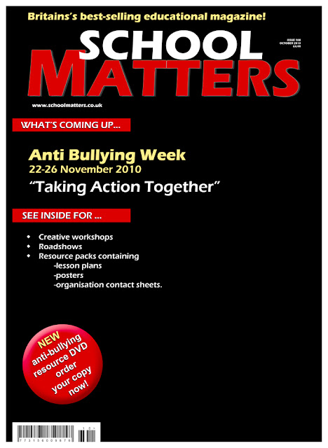 |
| Initial Layout Design |
The intention of the main image was to show both verbal and physical bullying, to highlight the main feature of that months issue, Anti-Bullying Week, which genuinely exists as do the resource packs, workshops and roadshows. Two images were taken, one of my son (yes poor thing was bribed once again) and one of his fist.
 |
Nathan Shouting Abuse |
 |
| His Fist |
As it was difficult to "green screen" the fist, because of the angle required, I used the lassoo tool to make the selection and dragged it across to the target image. The fist was then resized and the angle changed using the Edit>Transform menu options.
 |
| Lassoo Tool for Selection |
Using techniques learnt and built upon over the course of this module, these two images were merged,using layers and layer masks, converted to black and white using an adjustment layer, with grain added for more impact. The burn tool was used to create the shadows on the "teeth" so although obviously manipulated there was an element or realism to the effect. On this occasion I did not do any cosmetic retouching of skin blemishes or dirty thumb nail as I wanted the image to be one of gritty realism, of spotty teens who pick on each other!
 |
| Combined, Converted and Adjusted |
The finally adjusted image was flattened then incorporated within the magazine cover by dragging it onto the target image of the magazine background.The opacity was slightly reduced and a layer mask used to erase the hard edges of the frame. Not being very happy with the angle of my sons nose (almost staring right up it) I was lucky when resizing and positioning it on the page his nostrils were hidden by the title meaning I got away with not having to re-shoot it.
 |
| Showing Layers |
Once fully assembled a few minor tweaks were made with regards to a few typos, the web address font size and I experimented with positioning of the button,eventually leaving it in its original place! A few more taglines were also added. Reviewing the cover I was quite pleased with the final result but did think that it was lacking something on the right hand side. After moving the barcode or trying different "captions" I eventually decided to include the Childline Logo and help number which fortunately echos the colours on the cover. This I felt gave just the little extra touch that was needed to complete the project.
 |
| Final Cover Design |
Due to the cover having a white border to display on my blog it needed to have some form of layer style added to see the overall image.
On reflection I thoroughly enjoyed this assignment. Carrying out research was informative and I learnt a lot about magazine design. It was also satisfying to utilise a lot of the skills honed during the last few projects.Only a few minor adjustments were made to my initial ideas, for example I had originally wanted the Anti-bullying Week text to be larger but felt that encroached too much on the main image.
As far as the ethics of the production is concerned all the information on the front cover is factual, the image itself is a mixture of realism, due to the portrait having no cosmetic adjustments made, and manipulation due to the fist being inserted as teeth. I feel that converting the image to black and white emphasises the dark side of bullying and helps the image blend into the background creating a successful illustration.
The downside to using the technique of addition is that the audience knows the image is fake which removes the debate somewhat of is it ethical to use a manipulated image because it is obvious in this instance. However it does raise the debate as to should you have to use a combined image to get a point across? In this case I think it is valid as the one image puts across quite succinctly two areas of bullying and tells the story of that months issue. In conclusion I am pleased with my final Magazine Cover.

