For the final assignment of the course I need to draw together all I have learned and apply it to a personal project. It is important to think about a subject and treatment for which I have a personal enthusiasm, that over a period of time would build to and culminate in a collection of about 10-12 final images. The scope is very broad but I want to ensure I identify fully with the topic.
It is an idea to discuss some of the ideas being considered with my tutor and agree a deadline for producing the final set of images. The early a topic is chosen the more time you have to narrow down various ideas of composition and execution.
A brief from the outset is good practise and will assist with my own assessment at the end. Did I achieve what I had set out to do and was I satisfied with the end result? Could I have improved upon it? What did I learn during its completion?
Decisions taken and progress made should be noted in my learning log.
Showing posts with label Assignments. Show all posts
Showing posts with label Assignments. Show all posts
Saturday, 19 February 2011

Friday, 18 February 2011
Assignment 4: Real or Fake Review
Having decided to complete a magazine cover the next choice was, for what? Drawing upon my own knowledge and experience I went with an educational magazine aimed at teachers and looked at many magazine covers for inspiration. On the whole the ones that appealed to me most had black backgrounds with red and white fonts. It would appear that commonly the fonts used are sans serif. I took most of my ideas from an old Digital Photo magazine.
Britain's best-selling photo magazine became Britain's best-selling educational magazine. The title of my publication is School Matters, a play on words because school does matter and the magazine obviously will be about matters relating to school.
Other relevant information included on the cover: barcode, date, price, issue number and publication web address, the location and size of the font are loosely based on the Digital Photo magazine.
Using a black background meant it was best to use bright fonts so as per my original plan I kept to red, white and yellow to make certain aspects stand out. Taking on board the left third rule the contents of the issue were listed on the left. For added interest a round "button" advertising a resources DVD was included. Layer styles with drop shadow and outer glow were used sparingly for effect on both the button and some of the fonts. I experimented to see which titles/taglines suited these effects most.
The intention of the main image was to show both verbal and physical bullying, to highlight the main feature of that months issue, Anti-Bullying Week, which genuinely exists as do the resource packs, workshops and roadshows. Two images were taken, one of my son (yes poor thing was bribed once again) and one of his fist.
As it was difficult to "green screen" the fist, because of the angle required, I used the lassoo tool to make the selection and dragged it across to the target image. The fist was then resized and the angle changed using the Edit>Transform menu options.
Using techniques learnt and built upon over the course of this module, these two images were merged,using layers and layer masks, converted to black and white using an adjustment layer, with grain added for more impact. The burn tool was used to create the shadows on the "teeth" so although obviously manipulated there was an element or realism to the effect. On this occasion I did not do any cosmetic retouching of skin blemishes or dirty thumb nail as I wanted the image to be one of gritty realism, of spotty teens who pick on each other!
The finally adjusted image was flattened then incorporated within the magazine cover by dragging it onto the target image of the magazine background.The opacity was slightly reduced and a layer mask used to erase the hard edges of the frame. Not being very happy with the angle of my sons nose (almost staring right up it) I was lucky when resizing and positioning it on the page his nostrils were hidden by the title meaning I got away with not having to re-shoot it.
Once fully assembled a few minor tweaks were made with regards to a few typos, the web address font size and I experimented with positioning of the button,eventually leaving it in its original place! A few more taglines were also added. Reviewing the cover I was quite pleased with the final result but did think that it was lacking something on the right hand side. After moving the barcode or trying different "captions" I eventually decided to include the Childline Logo and help number which fortunately echos the colours on the cover. This I felt gave just the little extra touch that was needed to complete the project.
Due to the cover having a white border to display on my blog it needed to have some form of layer style added to see the overall image.
On reflection I thoroughly enjoyed this assignment. Carrying out research was informative and I learnt a lot about magazine design. It was also satisfying to utilise a lot of the skills honed during the last few projects.Only a few minor adjustments were made to my initial ideas, for example I had originally wanted the Anti-bullying Week text to be larger but felt that encroached too much on the main image.
As far as the ethics of the production is concerned all the information on the front cover is factual, the image itself is a mixture of realism, due to the portrait having no cosmetic adjustments made, and manipulation due to the fist being inserted as teeth. I feel that converting the image to black and white emphasises the dark side of bullying and helps the image blend into the background creating a successful illustration.
The downside to using the technique of addition is that the audience knows the image is fake which removes the debate somewhat of is it ethical to use a manipulated image because it is obvious in this instance. However it does raise the debate as to should you have to use a combined image to get a point across? In this case I think it is valid as the one image puts across quite succinctly two areas of bullying and tells the story of that months issue. In conclusion I am pleased with my final Magazine Cover.
Britain's best-selling photo magazine became Britain's best-selling educational magazine. The title of my publication is School Matters, a play on words because school does matter and the magazine obviously will be about matters relating to school.
Other relevant information included on the cover: barcode, date, price, issue number and publication web address, the location and size of the font are loosely based on the Digital Photo magazine.
Using a black background meant it was best to use bright fonts so as per my original plan I kept to red, white and yellow to make certain aspects stand out. Taking on board the left third rule the contents of the issue were listed on the left. For added interest a round "button" advertising a resources DVD was included. Layer styles with drop shadow and outer glow were used sparingly for effect on both the button and some of the fonts. I experimented to see which titles/taglines suited these effects most.
 |
| Applying Drop Shadow |
 |
| Initial Layout Design |
The intention of the main image was to show both verbal and physical bullying, to highlight the main feature of that months issue, Anti-Bullying Week, which genuinely exists as do the resource packs, workshops and roadshows. Two images were taken, one of my son (yes poor thing was bribed once again) and one of his fist.
 |
Nathan Shouting Abuse |
 |
| His Fist |
As it was difficult to "green screen" the fist, because of the angle required, I used the lassoo tool to make the selection and dragged it across to the target image. The fist was then resized and the angle changed using the Edit>Transform menu options.
 |
| Lassoo Tool for Selection |
Using techniques learnt and built upon over the course of this module, these two images were merged,using layers and layer masks, converted to black and white using an adjustment layer, with grain added for more impact. The burn tool was used to create the shadows on the "teeth" so although obviously manipulated there was an element or realism to the effect. On this occasion I did not do any cosmetic retouching of skin blemishes or dirty thumb nail as I wanted the image to be one of gritty realism, of spotty teens who pick on each other!
 |
| Combined, Converted and Adjusted |
The finally adjusted image was flattened then incorporated within the magazine cover by dragging it onto the target image of the magazine background.The opacity was slightly reduced and a layer mask used to erase the hard edges of the frame. Not being very happy with the angle of my sons nose (almost staring right up it) I was lucky when resizing and positioning it on the page his nostrils were hidden by the title meaning I got away with not having to re-shoot it.
 |
| Showing Layers |
Once fully assembled a few minor tweaks were made with regards to a few typos, the web address font size and I experimented with positioning of the button,eventually leaving it in its original place! A few more taglines were also added. Reviewing the cover I was quite pleased with the final result but did think that it was lacking something on the right hand side. After moving the barcode or trying different "captions" I eventually decided to include the Childline Logo and help number which fortunately echos the colours on the cover. This I felt gave just the little extra touch that was needed to complete the project.
 |
| Final Cover Design |
Due to the cover having a white border to display on my blog it needed to have some form of layer style added to see the overall image.
On reflection I thoroughly enjoyed this assignment. Carrying out research was informative and I learnt a lot about magazine design. It was also satisfying to utilise a lot of the skills honed during the last few projects.Only a few minor adjustments were made to my initial ideas, for example I had originally wanted the Anti-bullying Week text to be larger but felt that encroached too much on the main image.
As far as the ethics of the production is concerned all the information on the front cover is factual, the image itself is a mixture of realism, due to the portrait having no cosmetic adjustments made, and manipulation due to the fist being inserted as teeth. I feel that converting the image to black and white emphasises the dark side of bullying and helps the image blend into the background creating a successful illustration.
The downside to using the technique of addition is that the audience knows the image is fake which removes the debate somewhat of is it ethical to use a manipulated image because it is obvious in this instance. However it does raise the debate as to should you have to use a combined image to get a point across? In this case I think it is valid as the one image puts across quite succinctly two areas of bullying and tells the story of that months issue. In conclusion I am pleased with my final Magazine Cover.

Wednesday, 22 December 2010
Assignment 3 Feedback
Full Feedback can be found on the Tutor Report Page :o) Once again I am really happy with the feedback and suggestions given :o)
Overall Comments
Hi Jan,
Thank you for sending in your third assignment. As usual I have had a brief look at your images on your blog and they are of a very high standard indeed, so it is going to be difficult for me to advise you as to how you can improve. With quality images like these you should do well at the assessment if you decide to go for it.
Going to Work on an Egg
Peter has made a comment that to improve pictorially, I could remove one of the traffic cones so that I only have five components for the shot as for some reason odd numbers always give a slightly better composition. I never realised that so will clone one out and see what the result is :o)
I chose to clone out the far right as I liked the angle of the other cone. Had the original scene been made up of only 5 elements I may have spaced them slightly differently so although I can see the effect of having an odd number of elements I think I prefer the original shot.

Then experimenting I cloned out the angled cone. I think this is a better spaced composition however I do like the other cone better :o/

Then to play even further I created a duplicate cone which I placed in the frame, the reflection "falls off" but it does give an odd number of elements. I think this is too busy but was only to see what the effect was rather than a serious rework :oP

In conclusion I think I'd stick to my original image but remember in future to think of the "odd number" rule.
*amendment* doing a final review of this several months later I actually quite like re-work number one but still not entirely happy with the spacing in the frame am still sticking with my original shot ;o)
Painting by Numbers
I chose to clone out the far right as I liked the angle of the other cone. Had the original scene been made up of only 5 elements I may have spaced them slightly differently so although I can see the effect of having an odd number of elements I think I prefer the original shot.

Then experimenting I cloned out the angled cone. I think this is a better spaced composition however I do like the other cone better :o/

Then to play even further I created a duplicate cone which I placed in the frame, the reflection "falls off" but it does give an odd number of elements. I think this is too busy but was only to see what the effect was rather than a serious rework :oP

In conclusion I think I'd stick to my original image but remember in future to think of the "odd number" rule.
*amendment* doing a final review of this several months later I actually quite like re-work number one but still not entirely happy with the spacing in the frame am still sticking with my original shot ;o)
Painting by Numbers
Only a minor comment that the fern is possibly a shade too close to the edge of the frame, I cropped the original image to bring the fern into the corner a little more so easily remedied.


Gravy Train
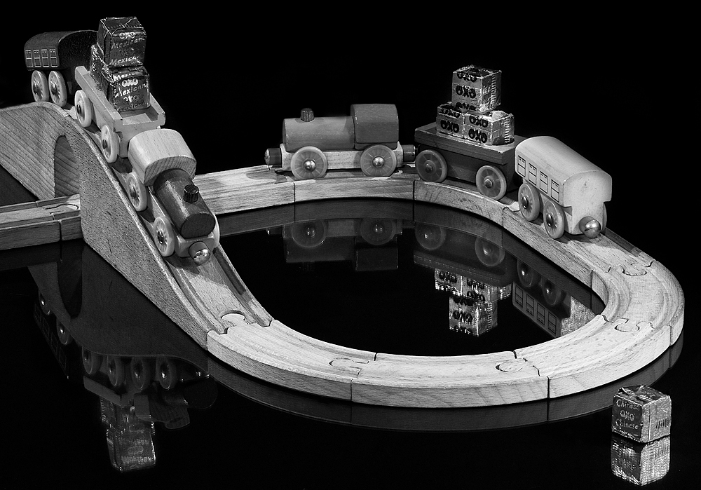
Comment was ...This one to me is not quite as good as some of your other shots, but it is still very good. Technically perfect, I would liked to have seen the train on the bridge come just a bit more into the frame so the viewer could see the Oxo cube a bit better. The only other thing that bothers me slightly is the way the track continues out of the frame as it tends to lead the eye out and is therefore a bit distracting.
This image I did have issues with constructing. Originally I did have less track but I was not happy with the composition and added more, possibly a mistake...I had wanted to make a complete circle but with the bridge made the scene to large, building the track with the bridge gave added height and interest. I'll see if I can clone some out without it appearing too odd, The train I did alter from one direction to another which impacted on the view/angle of the OXO cubes, bringing it further down then made the train on the track affected the reflection of the train in the background and the reflection of the train itself within the frame, so a compromise was made ;o)

This image I did have issues with constructing. Originally I did have less track but I was not happy with the composition and added more, possibly a mistake...I had wanted to make a complete circle but with the bridge made the scene to large, building the track with the bridge gave added height and interest. I'll see if I can clone some out without it appearing too odd, The train I did alter from one direction to another which impacted on the view/angle of the OXO cubes, bringing it further down then made the train on the track affected the reflection of the train in the background and the reflection of the train itself within the frame, so a compromise was made ;o)

The track just ending at the bridge seems odd although the piece of track cloned out at the back seems an improvement so I tried another version with leaving the track running off the frame under the bridge but removing the extra at the back.
 for a comparrison here all all three side by side. I think I prefer the second rework of just the small piece of track removed. Although a piece of track does lead the eye out of the frame to the lefthand side it does "join" up with the reflection of the bridge which should lead the eye back in.


Sunday, 28 November 2010
Assignment 2: Digital Image Qualities Review
Idea/Theme
Having thought of the still life theme and wanting to interpret that with concepts which affect everyone's lives I started to contemplate the ideals of Health, Wealth and Happiness. These are principles that we all aspire and relate to. Incorporating a personal connection with each image was another challenge; could I show where I have been, where I am, where am I going via photographs? How much of me did I want to reveal? I wanted my images to be honest so thought there should be no hiding, so my intentions were clear. I wanted to produce 6 images, within a theme, meeting the required lighting conditions, that I and others could connect with.
The Set Up
My dining room was turned into a make-shift studio which could be left undisturbed for an amount of time. I decided to light my subjects using an anglepoise lamp, based on the need for consistent lighting and not having to worry about the sun moving across the sky or disappearing behind clouds. However, having large windows and patio doors meant there would be mixed lighting conditions for each shot.
This challenge was overcome by pushing my table up against the window, draping my background material, black cotton velvet, over the existing curtain rail, which not only gave me an excellent backdrop but also acted as a black out curtain. The lamp was setup to the right hand side and a piece of large thick black card was placed opposite to cut out as much light as possible from the patio doors to the left. I also discovered that a certain time of day was better suited for shooting; as the sun moved round in late afternoon there was no longer reflected light bouncing off the cream walls. Each individual shot then had it's own challenge or adjustment.
Also wanting a consistent look to my series of shots I decided to use the same focal length for each and opted for my 100mm macro lens. I wasn't sure at first if I wanted the images to have a shallow depth of field or not and this lens would allow me to experiment. As I had created a situation which possibly needed the use of long exposure times plus the need to keep the camera still, I used my tripod and shutter release cable.
Workflow
Workflow followed was similar to that laid out in Assignment 1. Location/set up prepared in advance, equipment sorted, each subject was shot on average 20 times, experimentation with light and composition followed by initial editing, first selects, final selects and post processing.
Final Images
Image 1: Health
 The World Health Organization estimates that approximately 450 million people throughout the world struggle with a mental health problem. Depression is a major category of mental health distress affecting people of every age, background and ethnicity.
Statistics show that 1 in 4 Britons will suffer from a mental health problem within a given year, with anxiety and depression being the most common combination of mental health disorders in the UK. Between 8 and 12 percent of the population will struggle with depression and the effects on home, career, relationships and personal esteem are enormous. I'm part of a statistic!
ISO 200 F25 @ 20 seconds.
Having quite a bright light and reflective white paper I chose ISO200, preferring a greater depth of field I shot several frames and settled on f25. The camera's metering gave the shutter speed of 20 seconds for correct exposure.
Having a black background and white paper this is a high dynamic range image. Being predominantly black the histogram had most values towards 0 but values were spread across the entire axis. To prevent strong light and harsh shadows a large bedsheet was placed in front of the lamp as an improvised softbox/diffuser. To avoid fall off and dark shadows on the left hand side I used an A4 ringbinder covered in silver foil to bounce light back and provide an even light. At one point light was also reflected back using white card but this filled all the shadows with light and took away the element of texture. Due to the anglepoise lamp having a tungsten bulb the subject would have had a strong yellow/orange cast, to negate this I opted to use the custom white balance setting, taking a photograph of a piece of white card, filling the viewfinder with the image and adding this to the Custom White Balance Setting. Minor adjustments were made within ACR to fine tune the white balance by using the white balance tool. Subsequent local minor adjustments were carried out using a curves layer in photoshop.
Image 2: Wealth
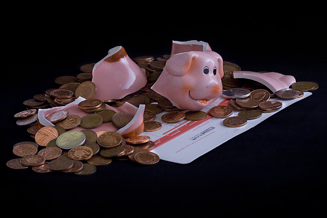 Single parents make up more than one third of UK households and tend to be on a low income. It is likely that more single parents will have to seek debt advice as the rise in every day expenses, such as food prices and fuel bills, means it will be very difficult to survive financially. It is estimated that the cost of raising a child from birth to the age of 21 is more than £180,000. I'm part of yet another statistic :o)
ISO 400 F22 @ 30 seconds.
Due to the piggy being highly reflective I had to change to angle of the light source and also move it further away from the sheet "diffuser". The light was still too harsh so another diffuser of tracing paper was added between the sheet and the subject. As this made a lower-lighting situation I increased the ISO to 400. These adjustments created a much more pleasing "glint" on the subject without blowing the highlights. The silver foil reflector was itself reflected in the piggy bank so I used a large sheet of white card instead. To obtain the correct WB and reduce the chance of a colour cast I created a custom white balance. In ACR I made a slight alteration to the tint and temperature sliders. Minor local adjustments were done via a curves layer in photoshop.
Image 3: Happiness

Image 4: Hobbies
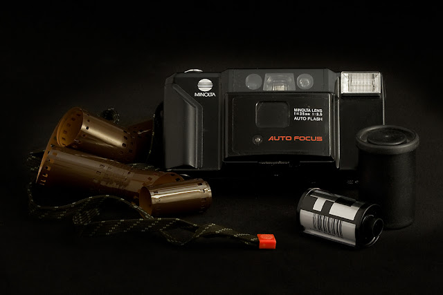
In January 2006 Konica Minolta Holdings announced its withdrawal from the camera and film businesses, marking the end to one of the best known brands in the photography world. As part of the surprise move, the Tokyo-based company said it would sell a portion of its digital single lens reflex camera assets to Sony. The company said it would stop making photographic film and color paper by March 2007, pulling out of a market in rapid decline due to the spread of digital cameras, which store images digitally.
It’s the end of the road for Kodachrome film as the last processor recently announced that they would stop processing the slide film on 30 December 2010. Kodak first announced that they would stop making the film early in 2009, and now D-Day has arrived. Kodachrome film was first introduced in 1935 and was the first successful colour film made available on the market. The decision to stop producing the film was made as sales started to take a dip early last year, with Kodak announcing that the ‘film represents just a fraction of 1% of Kodak’s total sales of still-picture films’. This is due to the digital revolution which seems to dominate photography these days.Kodak stopped making film cameras in 2006.
I still have my Minolta lurking in the cupboard with my negatives...will I ever use it again? I doubt it. Will I keep it? Yes :o) Sad to think that I have contributed to the decline in film as I did love using it, but the versatility and cost effectiveness of digital is unrivalled.
ISO 800 F20 6 seconds.
Again wanting a sharp image from front to back f20 achieved this result, combined with ISO 800 a shutter speed of 6 seconds was required to obtain the correct exposure.This image presented interesting challenges. It was a dark subject which blended into the background and would require good lighting but was also reflective which could cause blown highlights if harshly lit. Being mainly black against a black background this is a low dynamic range image.
A solution was reached by reducing/diffusing the light and increasing the ISO to 800. The silver foil reflector once again created too many reflections in the film and a harsh reflected light on the left of the camera. This reflector was replaced with a softer white fabric.On close inspection there was a slightly yellow cast to the right and a blue to the left. As I was shooting earlier in the afternoon daylight was bleeding through over the top of my large sheet of black card. To help cut this light blankets were draped in front of the patio doors (they don't have curtains) and this showed a huge improvement. I used a custom white balance but uploaded images were still showing a slight cast. No adjustments were made in ACR as I couldn't fine tune it to my satisfaction, highlighting my need to improve my skills employing RAW conversion, however applying a black and white adjustment layer in photoshop to make local adjustments worked beautifully.
Image 5: Celebration
 I have been trying to find the average cost of an 18th birthday celebration but nobody seems to have collated figures for this. However I did manage to find that the average cost of a wedding these days starts at £15,000.00? Wow.... I ask myself why? The last celebration I organised was in January for my daughter's 18th birthday and careful planning and shopping around kept the costs down. Everyone had a fantastic time and my pocket wasn't too dented.
ISO 200 F29 @ 25 seconds
Once more I did not want a shallow depth of field and F29 provided the effect I wanted. Reflectors and diffusers were used to create the soft light and shadows. With th ebright colours and lighting this is a mid range image. A curves layer was added in photoshop.
Image 6: Romance

The divorce rate fell by 2.5 per cent in 2008, the Office for National Statistics said. In 2007, out of 1,000 married people 11.8 got divorced, but this fell to 11.5 in 2008 – the lowest level since 1979. This is the fourth year in a row that the divorce rate has fallen. However, others warned that the figures gave a misleading picture.Claire Tyler, chief executive of Relate, pointed out that the data did not include figures on how many cohabiting parents separated. I'm part of the 2005 statistics ;o)
ISO 200 F29 10 seconds.
I thought this would be a low contrast image due to the majority of the tones being white/grey, although the values do stretch across the axis they are very low and there is a significant peak and bunching together of values towards the 255 end. But surprisingly it is more of a normal contrast image.
I employed a diffuser/reflector and a custom white balance. Slight adjustments were made in ACR to the exposure and temperature sliders. Further minor adjustments were made in photoshop via a curves layer and a B&W adjustment layer which was reduced in opacity and used to make local adjustments where I was still not entirely happy with the residual colour cast.
In Conclusion
I learnt a tremendous amount from carrying out this assignment. The use of diffusers and reflectors can greatly enhance the available light. This helped enormously with images of high and low contrast. If the opportunity is there to use a custom white balance I shall use it, as in the majority of cases it solved the issues with white balance/colour cast. Any residual problems were minor and easily resolved using ACR or photoshop.
From the outset I was aware that using my 100mm lens would compress the image and would probably have to use a minimum of f16 but it was surprising that I had to use up to f29 to achieve the depth of field for a pleasing result. Using a higher ISO also allowed me to capture images using low-light conditions. I would not go any higher than 800 due to the increased noise even though ACR does has the facility to adjust noise for both colour and luminance.
The black velvet fabric provided a seamless background and cut out the daylight really well. I did find out that bright/harsh lighting gave the velvet a grey appearance but the diffusers and experimenting with shutter speed/exposure corrected this problem. Another minor issue was with specks of dust/debris on the fabric which I did not notice at first but were clearly visible when viewing the images on my monitor. Images were either reshot after the velvet had been cleaned or specks were removed with the clone or healing tool.
After I converted the images to jpegs and altered the profiles to SRGB I noted that the subtle lighting and shadows tended to merge into the background. This gave the impression that the subjects were "floating". I have left the first images on my Blog to demonstrate this. On printing one of the images the loss of subtlety is not so bad but still not as good as I would have anticipated, therefore I reworked the Tiffs before uploading to my Flickr page for assessment. However it is interesting to note that the compressed jpeg images still aren't quite as accurate as I'd like which proves that you can't beat printing final images for display and that while some images can take compression and a reduction in size for display on the web others may need different processing to retain some of the original details.
On reflection I am quite pleased with the final set of images I have produced. They fulfil the brief given; a minimum of six images with varying lighting conditions applying knowledge gained over the course of the module. I also believe they met my own personal criteria of having a personal overtone which others will also connect with.
Having thought of the still life theme and wanting to interpret that with concepts which affect everyone's lives I started to contemplate the ideals of Health, Wealth and Happiness. These are principles that we all aspire and relate to. Incorporating a personal connection with each image was another challenge; could I show where I have been, where I am, where am I going via photographs? How much of me did I want to reveal? I wanted my images to be honest so thought there should be no hiding, so my intentions were clear. I wanted to produce 6 images, within a theme, meeting the required lighting conditions, that I and others could connect with.
The Set Up
My dining room was turned into a make-shift studio which could be left undisturbed for an amount of time. I decided to light my subjects using an anglepoise lamp, based on the need for consistent lighting and not having to worry about the sun moving across the sky or disappearing behind clouds. However, having large windows and patio doors meant there would be mixed lighting conditions for each shot.
This challenge was overcome by pushing my table up against the window, draping my background material, black cotton velvet, over the existing curtain rail, which not only gave me an excellent backdrop but also acted as a black out curtain. The lamp was setup to the right hand side and a piece of large thick black card was placed opposite to cut out as much light as possible from the patio doors to the left. I also discovered that a certain time of day was better suited for shooting; as the sun moved round in late afternoon there was no longer reflected light bouncing off the cream walls. Each individual shot then had it's own challenge or adjustment.
Also wanting a consistent look to my series of shots I decided to use the same focal length for each and opted for my 100mm macro lens. I wasn't sure at first if I wanted the images to have a shallow depth of field or not and this lens would allow me to experiment. As I had created a situation which possibly needed the use of long exposure times plus the need to keep the camera still, I used my tripod and shutter release cable.
Workflow
Workflow followed was similar to that laid out in Assignment 1. Location/set up prepared in advance, equipment sorted, each subject was shot on average 20 times, experimentation with light and composition followed by initial editing, first selects, final selects and post processing.
Final Images
Image 1: Health

Statistics show that 1 in 4 Britons will suffer from a mental health problem within a given year, with anxiety and depression being the most common combination of mental health disorders in the UK. Between 8 and 12 percent of the population will struggle with depression and the effects on home, career, relationships and personal esteem are enormous. I'm part of a statistic!
ISO 200 F25 @ 20 seconds.
Having quite a bright light and reflective white paper I chose ISO200, preferring a greater depth of field I shot several frames and settled on f25. The camera's metering gave the shutter speed of 20 seconds for correct exposure.
Having a black background and white paper this is a high dynamic range image. Being predominantly black the histogram had most values towards 0 but values were spread across the entire axis. To prevent strong light and harsh shadows a large bedsheet was placed in front of the lamp as an improvised softbox/diffuser. To avoid fall off and dark shadows on the left hand side I used an A4 ringbinder covered in silver foil to bounce light back and provide an even light. At one point light was also reflected back using white card but this filled all the shadows with light and took away the element of texture. Due to the anglepoise lamp having a tungsten bulb the subject would have had a strong yellow/orange cast, to negate this I opted to use the custom white balance setting, taking a photograph of a piece of white card, filling the viewfinder with the image and adding this to the Custom White Balance Setting. Minor adjustments were made within ACR to fine tune the white balance by using the white balance tool. Subsequent local minor adjustments were carried out using a curves layer in photoshop.
Image 2: Wealth
 Single parents make up more than one third of UK households and tend to be on a low income. It is likely that more single parents will have to seek debt advice as the rise in every day expenses, such as food prices and fuel bills, means it will be very difficult to survive financially. It is estimated that the cost of raising a child from birth to the age of 21 is more than £180,000. I'm part of yet another statistic :o)
ISO 400 F22 @ 30 seconds.
Due to the piggy being highly reflective I had to change to angle of the light source and also move it further away from the sheet "diffuser". The light was still too harsh so another diffuser of tracing paper was added between the sheet and the subject. As this made a lower-lighting situation I increased the ISO to 400. These adjustments created a much more pleasing "glint" on the subject without blowing the highlights. The silver foil reflector was itself reflected in the piggy bank so I used a large sheet of white card instead. To obtain the correct WB and reduce the chance of a colour cast I created a custom white balance. In ACR I made a slight alteration to the tint and temperature sliders. Minor local adjustments were done via a curves layer in photoshop.
Image 3: Happiness

David Cameron said there was "more to life than money" and GDP figures did not show the whole picture on how the UK was faring, now he is in power, the Prime Minister is planning to gauge the nation's "general wellbeing" via a regular household survey drawn up by the Office for National Statistics. Liberal Democrat MP, Jo Swinson said: "This is a positive and forward-looking move by the Government, which will give us a much better idea of the health of UK society.Relying solely on GDP to track the nation's progress excludes many of the things that we all know to be important, but that can't be measured by money."
So what makes me happy? Sunshine, chocolate and a surprise bunch of flowers. I was given a bunch of roses and hung onto them until they had dried out and were well passed their prime. About to throw them out I decided to photograph one instead.
ISO 200 F18 15 seconds.
Not having reflective surfaces and wanting to light inside the tightly furled, dried bud I was able to increase the light and therefore used ISO 200 giving more detail, less grain and brighter colours. With no highlights this is a low dynamic range scene. Having taken several shots I eventually settled on the image obtained using F18 @ 15 seconds preferring the softer focus at the edges with the sharp bud in the centre. I used the silver reflector to light the left hand side. No adjustments were made in ACR but a curves layer was used in photoshop to make local adjustments and boost colour and density.
So what makes me happy? Sunshine, chocolate and a surprise bunch of flowers. I was given a bunch of roses and hung onto them until they had dried out and were well passed their prime. About to throw them out I decided to photograph one instead.
ISO 200 F18 15 seconds.
Not having reflective surfaces and wanting to light inside the tightly furled, dried bud I was able to increase the light and therefore used ISO 200 giving more detail, less grain and brighter colours. With no highlights this is a low dynamic range scene. Having taken several shots I eventually settled on the image obtained using F18 @ 15 seconds preferring the softer focus at the edges with the sharp bud in the centre. I used the silver reflector to light the left hand side. No adjustments were made in ACR but a curves layer was used in photoshop to make local adjustments and boost colour and density.
Image 4: Hobbies

In January 2006 Konica Minolta Holdings announced its withdrawal from the camera and film businesses, marking the end to one of the best known brands in the photography world. As part of the surprise move, the Tokyo-based company said it would sell a portion of its digital single lens reflex camera assets to Sony. The company said it would stop making photographic film and color paper by March 2007, pulling out of a market in rapid decline due to the spread of digital cameras, which store images digitally.
It’s the end of the road for Kodachrome film as the last processor recently announced that they would stop processing the slide film on 30 December 2010. Kodak first announced that they would stop making the film early in 2009, and now D-Day has arrived. Kodachrome film was first introduced in 1935 and was the first successful colour film made available on the market. The decision to stop producing the film was made as sales started to take a dip early last year, with Kodak announcing that the ‘film represents just a fraction of 1% of Kodak’s total sales of still-picture films’. This is due to the digital revolution which seems to dominate photography these days.Kodak stopped making film cameras in 2006.
I still have my Minolta lurking in the cupboard with my negatives...will I ever use it again? I doubt it. Will I keep it? Yes :o) Sad to think that I have contributed to the decline in film as I did love using it, but the versatility and cost effectiveness of digital is unrivalled.
ISO 800 F20 6 seconds.
Again wanting a sharp image from front to back f20 achieved this result, combined with ISO 800 a shutter speed of 6 seconds was required to obtain the correct exposure.This image presented interesting challenges. It was a dark subject which blended into the background and would require good lighting but was also reflective which could cause blown highlights if harshly lit. Being mainly black against a black background this is a low dynamic range image.
A solution was reached by reducing/diffusing the light and increasing the ISO to 800. The silver foil reflector once again created too many reflections in the film and a harsh reflected light on the left of the camera. This reflector was replaced with a softer white fabric.On close inspection there was a slightly yellow cast to the right and a blue to the left. As I was shooting earlier in the afternoon daylight was bleeding through over the top of my large sheet of black card. To help cut this light blankets were draped in front of the patio doors (they don't have curtains) and this showed a huge improvement. I used a custom white balance but uploaded images were still showing a slight cast. No adjustments were made in ACR as I couldn't fine tune it to my satisfaction, highlighting my need to improve my skills employing RAW conversion, however applying a black and white adjustment layer in photoshop to make local adjustments worked beautifully.
Image 5: Celebration

ISO 200 F29 @ 25 seconds
Once more I did not want a shallow depth of field and F29 provided the effect I wanted. Reflectors and diffusers were used to create the soft light and shadows. With th ebright colours and lighting this is a mid range image. A curves layer was added in photoshop.
Image 6: Romance

The divorce rate fell by 2.5 per cent in 2008, the Office for National Statistics said. In 2007, out of 1,000 married people 11.8 got divorced, but this fell to 11.5 in 2008 – the lowest level since 1979. This is the fourth year in a row that the divorce rate has fallen. However, others warned that the figures gave a misleading picture.Claire Tyler, chief executive of Relate, pointed out that the data did not include figures on how many cohabiting parents separated. I'm part of the 2005 statistics ;o)
ISO 200 F29 10 seconds.
I thought this would be a low contrast image due to the majority of the tones being white/grey, although the values do stretch across the axis they are very low and there is a significant peak and bunching together of values towards the 255 end. But surprisingly it is more of a normal contrast image.
I employed a diffuser/reflector and a custom white balance. Slight adjustments were made in ACR to the exposure and temperature sliders. Further minor adjustments were made in photoshop via a curves layer and a B&W adjustment layer which was reduced in opacity and used to make local adjustments where I was still not entirely happy with the residual colour cast.
In Conclusion
I learnt a tremendous amount from carrying out this assignment. The use of diffusers and reflectors can greatly enhance the available light. This helped enormously with images of high and low contrast. If the opportunity is there to use a custom white balance I shall use it, as in the majority of cases it solved the issues with white balance/colour cast. Any residual problems were minor and easily resolved using ACR or photoshop.
From the outset I was aware that using my 100mm lens would compress the image and would probably have to use a minimum of f16 but it was surprising that I had to use up to f29 to achieve the depth of field for a pleasing result. Using a higher ISO also allowed me to capture images using low-light conditions. I would not go any higher than 800 due to the increased noise even though ACR does has the facility to adjust noise for both colour and luminance.
The black velvet fabric provided a seamless background and cut out the daylight really well. I did find out that bright/harsh lighting gave the velvet a grey appearance but the diffusers and experimenting with shutter speed/exposure corrected this problem. Another minor issue was with specks of dust/debris on the fabric which I did not notice at first but were clearly visible when viewing the images on my monitor. Images were either reshot after the velvet had been cleaned or specks were removed with the clone or healing tool.
After I converted the images to jpegs and altered the profiles to SRGB I noted that the subtle lighting and shadows tended to merge into the background. This gave the impression that the subjects were "floating". I have left the first images on my Blog to demonstrate this. On printing one of the images the loss of subtlety is not so bad but still not as good as I would have anticipated, therefore I reworked the Tiffs before uploading to my Flickr page for assessment. However it is interesting to note that the compressed jpeg images still aren't quite as accurate as I'd like which proves that you can't beat printing final images for display and that while some images can take compression and a reduction in size for display on the web others may need different processing to retain some of the original details.
On reflection I am quite pleased with the final set of images I have produced. They fulfil the brief given; a minimum of six images with varying lighting conditions applying knowledge gained over the course of the module. I also believe they met my own personal criteria of having a personal overtone which others will also connect with.
Sunday, 17 October 2010
Assignment 1: Workflow Review
I had several ideas about what subject I could choose for this first assignment, they included photographing Margate, which is a place I hold very dear from childhood memories and I also take my own children there, capturing Remembrance Day services, which is a project I undertook last year and thoroughly enjoyed and learnt alot from although I felt there were areas I could improve upon. Or finally update the documentary shots I have been taking of the change in my local High Street.
Then out of the blue my son was asked if he could help some friends with a media project they are doing as part of their coursework, making a 5 minute promotional video for a "film". Being teenage boys it was suitably titled "Zombie Apocalyse" and I thought it might have some interesting photographic opportunities. If it failed I could always try another topic! Not quite sure what I wanted to capture I had in mind a mixture of action shots, candid "before" shots and some zombie poses. I thought I could practice several things during this session, capturing shots within a limited time frame, my portraiture, using a longer lens than is my recent preference and using natural ambient lighting.
The workflow I followed was the one utilised in exercises 1 & 2.
[Choose model and arrange a mutually convenient time for the session
This was fairly straight forward as I was more or less taking advantage of something that had already been organised with the group of teenagers having agreed to meet at 11am at the local park, the majority arrived already in costume and wearing appropriate make-up (made for some interesting double-takes). I spoke to the person organising the shoot and he was more than happy for me to take photographs and all the people involved also had no objections.
[Choose a suitable location
A quiet corner of the local park where they wouldn't disturb the general public.
[Choose suitable equipment according to what you personally own or can be made available
I decided to use my 70-300mm lens as I wasn't sure what kind of shots I was after, the 70mm focal length would allow me to capture portraits while the 300mm focal length would enable me to capture any distant "action" shots whilst keeping out of the way of the actual filming. Still unable to find my flash I had decided not to take it in any event as it would interfere with their filming and I hoped to take advantage of the natural daylight.
[Prepare equipment. Ensure battery and spare are fully charged. Memory cards formatted and spare cards available. Lens and sensor are clean.
Both camera batteries were fully charged, any images on the cards were uploaded to my pc and formatted in camera. Lens was cleaned and I also took my 18-55mm kit lens incase I changed how I wanted to shoot my images.
[Set up session ensuring health and safety are taken into consideration
Some of the H&S was not down to me as I was not organising the whole event. However the organisers seemed to have it all under control and I followed all the rules associated with photographing outside; making sure there were no trip hazards, being aware of members of the public, trees and bushes, replacing any items moved, not causing obstructions and also being aware of the equipment being used by others.
[Ensure model is comfortable
I knew some of the cast and those I didn't I soon got to know. All were comfortable with having their photographs taken and the poses and positions they adopted were either under my direction or the direction of the "film crew" They were all having a tremendous amount of fun and I hoped to catch that in some of my final images. If not a candid shot I spoke to the individuals throughout, asking them to turn their head or hold a pose until I was happy with the end result.
[Undertake photo session varying expressions and poses altering focal length and camera position throughout the session
Zombie expressions are fairly zombie-ish with blank stares or grimaces but with the candid shots I got smiles and laughter so am pleased with the variety of expressions in my final set, I also managed to vary positions and focal length while still managing to tie the shots together as a final set.
[Take photograph using jpeg+RAW
I shot using Jpeg + RAW. Throughout the shoot I constantly checked my histogram and camera settings to ensure I was getting the correct exposure and the shots I wanted. I quickly reached the conclusion that the light was not good enough for the long distance action shots without the compromise of a larger aperture which would make me lose depth of field, or a higher ISO introducing noise which I also did not want to do. There were a lot of chase scenes, with our heroes being hounded by a mob of screaming zombies and I just could not get a fast enough shutter speed, I didn't mind some motion blur for the impression of movement and speed but everything was looking a mess. My panning skills leave a lot to be desired...another area to work on! I then decided to mainly concentrate on individual shots.
[Upload to PC using Adobe Bridge

[Use Template to embed metadata and apply custom name
 |
| metadata and file structure |
Metadata was applied and the images were saved to My Pictures folder as well as my OCA folder. I have a set file structure; within the OCA folder I have a seperate folder for DPP Project 1 and DPP Project 2 (Eventually incorporating the other projects) and each exercise has it's own individual folder.
[view images, complete technical check deleting outright mistakes
Metadata was applied and the images were saved to My Pictures folder as well as my OCA folder. I have a set file structure; within the OCA folder I have a seperate folder for DPP Project 1 and DPP Project 2 (Eventually incorporating the other projects) and each exercise has it's own individual folder.
[view images, complete technical check deleting outright mistakes
I followed the editing process established in exercise.
1) Technical edit - blurred and badly exposed/composed images were rejected straight away.
2) The selects - using the star ratings I made my initial choices.
3) First selects - these were chosen mainly due to the pleasing composition and lighting effects. I then took into consideration poses and expressions and did they sum up the atmosphere of the day? Did they tell a story and pull together as a body of work?
4) Group and review. After making the first selects I placed them into a seperate folder and left them alone returning to the other images 24 hours later. I found this a useful exercise and I found I then did include some shots I had previously rejected and changed my mind on others I had included as I felt the lighting was either better or the photograph would prove more interesting to the intended audience.
1) Technical edit - blurred and badly exposed/composed images were rejected straight away.
 |
| Technical Edit |
2) The selects - using the star ratings I made my initial choices.
 |
| The Selects |
3) First selects - these were chosen mainly due to the pleasing composition and lighting effects. I then took into consideration poses and expressions and did they sum up the atmosphere of the day? Did they tell a story and pull together as a body of work?
4) Group and review. After making the first selects I placed them into a seperate folder and left them alone returning to the other images 24 hours later. I found this a useful exercise and I found I then did include some shots I had previously rejected and changed my mind on others I had included as I felt the lighting was either better or the photograph would prove more interesting to the intended audience.
 |
| Group and review |
[Choose final images for processing
The final images I chose were then placed into a folder called edit. I calibrated my monitor using my Spyder3Express.
[Open in Camera Raw
[Use Workspace ProPhoto 16bit 300dpi
[Adjust if necessary. Exposure reading first, temperature, tint and anything else as required
I explored Camera Raw a little more with this exercise, experimenting with the Tone Curve, Sharpening, HSL/Greyscale and the Split Toning. Only minor adjustments were made in RAW as I like the control you can achieve in photoshop using layer adjustments.
I explored Camera Raw a little more with this exercise, experimenting with the Tone Curve, Sharpening, HSL/Greyscale and the Split Toning. Only minor adjustments were made in RAW as I like the control you can achieve in photoshop using layer adjustments.
[Open in Photoshop
[Crop if required
Most of the images were cropped, some more than others to make for better compositions and cut out distracting backgrounds and dead space.
[Create curves layer rename C&D (Colour and Density)
Again with most images I used a curves layer to bring out certain features or emphasise/reduce shadows and light.
In reviewing the exercise as a whole I think it was successful. My approach was flexible enough that when I realised what wasn't working I adapted the images I was taking accordingly. Learning to read light much better with regards to location portraiture, I still think it is something to work on but I am much happier with the results achieved. With some of the failed shots I would have been better off using flash but limitations were in place due to filming. Prefering to travel light I can however, see the benefits of employing reflectors and diffusers. I feel these 12 shots encapsulate the day as I originally intended.
[Crop if required
Most of the images were cropped, some more than others to make for better compositions and cut out distracting backgrounds and dead space.
[Create curves layer rename C&D (Colour and Density)
Again with most images I used a curves layer to bring out certain features or emphasise/reduce shadows and light.
[Create other adjustment layers/ layer masks as required. Fine tune adjustment layers using black and white paintbrushes to remove/reapply layer mask. Adjust opacity, size hardness of brush to obtain required effect.
With some of the images I created adjustment layers to clone out distracting elements or darken backgrounds.
With some of the images I created adjustment layers to clone out distracting elements or darken backgrounds.
[Save Master file with layers intact. Save As Tiff file, LZW, ZIP compression then flatten Image, Save As TiffV2 for conversion to other file/image sizes.
[Sharpen at last stage.
As I am not printing the images at this stage I resized for uploading to flickr, (as this is the method I have decided to use to enable my tutor to view my final set having emailed him) saved as jpeg to a folder called Zombie jpegs and sharpened appropriately. On this occasion I did not create an action to save my final Tiffs as jpegs but if dealing with a large number of shots I usually do. All files will be backed up on my external hard drive and also burnt to disk.
An excess of 80 shots was eventually reduced to 12. These are my final choices :-
1) I started off with the make up being applied to those who arrived without. I liked this shot as it includes the makeup artist and you can sense her concentration and the trust of the model as she lightly applies shadows under her eyes. The light was falling in the right direction to light the subject whilst creating interesting but not intrusive shadows.


As I am not printing the images at this stage I resized for uploading to flickr, (as this is the method I have decided to use to enable my tutor to view my final set having emailed him) saved as jpeg to a folder called Zombie jpegs and sharpened appropriately. On this occasion I did not create an action to save my final Tiffs as jpegs but if dealing with a large number of shots I usually do. All files will be backed up on my external hard drive and also burnt to disk.
An excess of 80 shots was eventually reduced to 12. These are my final choices :-
1) I started off with the make up being applied to those who arrived without. I liked this shot as it includes the makeup artist and you can sense her concentration and the trust of the model as she lightly applies shadows under her eyes. The light was falling in the right direction to light the subject whilst creating interesting but not intrusive shadows.

2) I liked the paradox of an attractive young girl being transformed into a zombie complete with bleeding scar. I was pleased with the composition, the inclusion of the make-up artists hands, hair and make up tray help tell the story. I liked the subtle light, I did have an alternative shot where the sun had come out from behind the clouds but found the contrast between the light and the shadows too much.

3) Boys will be boys and revel in loads of fake blood....

4) Though having said that young ladies seem to enjoy a gory scar here and there. Again I liked the subtle light, the detail in the scar, the candid pose; catching her smiling up at whoever had engaged her in conversation.

5) Taken during the wait before filming started I loved this intimate pose, proving zombies need love too. Or it could be body warmth as it was a very cold day and during breaks people were huddling together.

6) Into character at last with vacant stares. I chose this shot as it showed the beginning of filming and the effort the students made with their costumes, make-up and hair.

7) More blank expressions. This was interesting to me because of the texture of the tree and the colour closely matching her green eyes.

8) Zombies rule ok....another brilliant vacant stare complete with leaves tucked into back-combed hair.

9) Mean glares and a growl, and I loved his contact lenses although this shot doesn't really do them justice. I took a series of shots and this was the best.

10) On set...waiting for action, the students really got into it, they didnt mind the cold, the damp or the mud. I chose this shot because I think it shows the willingness to take part no matter what. I love the depth of field, the composition and the colours.

11) Full length version of a zombie, lurking in the background during a chase scene.

12) Great pose, great expression and the lighting was super to shoot in. I loved the depth of field and the fact that the background resembled the fake backdrops you can buy for studio shots.

In reviewing the exercise as a whole I think it was successful. My approach was flexible enough that when I realised what wasn't working I adapted the images I was taking accordingly. Learning to read light much better with regards to location portraiture, I still think it is something to work on but I am much happier with the results achieved. With some of the failed shots I would have been better off using flash but limitations were in place due to filming. Prefering to travel light I can however, see the benefits of employing reflectors and diffusers. I feel these 12 shots encapsulate the day as I originally intended.
Reflecting on my workflow it works well, it has the main points that should be carried out no matter what or where you are shooting, decide the subject, organise the time, sort out the equipment and review the process throughout from walking out the door though to capture and print/uploading. I suspect that most photographers who employ a workflow follow one along similar lines. There maybe slight variations with software, ie using lightroom, not capturing in RAW, sports journalists or papparazi may not have the time to process images and need to make decisions quickly and upload images on location. Some photographers will review images and delete in camera but I have always been taught that this can shorten a card's life expectancy and also runs the risk of corrupting the files.
There will also be a variation on how people name their files and the file structure in which they store them.
I store my files on disk and external harddrive also printing off proofsheets. Some people back up on location on a laptop and have duplicate and even triplicate disks at seperate locations. The final images are also saved according to what the final intention is, ie print or web use, for a book or a large print for exhibition it even varies depending on if you are printing them yourself or sending to a printhouse as you will need to find out what colourspace/profiles they use.
I have learnt new things over this part of the course through looking at fellow students blogs and researching on the many web sites which I have linked in the relevant posts. Learning to read the light, how to reduce the intensity of my fill in flash was handy, even though I didn't employ it this time round maybe I should have. Trying to capture the spirit of the people involved as well as the occasion itself was fun, talking to your models, getting to know then is a recognised technique for relaxing all parties concerned and obtaining better results. Although this assignment was primarily to do with workflow so much else has been absorbed in the process :o)
Subscribe to:
Posts (Atom)