I digress, the photographers we looked at were Diane Arbus, Rieneke Dijkstra, Philip-Lorca diCorcia, Cindy Sherman, Nan Goldin. Sally Mann, Walker Evans, Man Ray, Anastasia Taylor-Lind, Bill Brandt, Richard Avedon, David Bailey and Nadav Kander. As with the previous post on typology, these are just brief notes on each, some I had never come across until the lesson so it will be informative to have a quick look online at some of their work and get a gut feel about them. Should any particular catch my eye I can make a note to look at them in more depth. Trying to take onboard many styles or ideas will just confuse me.
Diane Arbus 1923-1971
Diane Arbus had this amazing knack of photographing the freaky or making the ordinary look freaky, love it, but I don't think I'd want her to take my photo ;o) Selected images can be seen at this website http://diane-arbus-photography.com/ This maybe because she was born into a wealthy Jewish family and stated "I grew up feeling immune and exempt from circumstance. One of the things I suffered from was that I never felt adversity. I was confirmed in a sense of unreality." The way she managed to catch her subjects so unawares was by spending time with them, talking to them until they dropped their guard. Apparently Susan Sontag didn't like her becasue she thought she captured easy targets. However there is a more serious question to be asked about her images, some were shot in institutions and you have to question the morality and intention behind some of them. Was she taking advantage, some of the shots do make for uncomfortable viewing but then everyone is part of our society and why should only the "acceptable" face of beauty been shown. Is it the photographs that are wrong or just our take on them? Interesting and thought provoking on many levels. Sadly she committed suicide at the age of 48.
In looking at her images I can see Sontag's point, as they are all unusual, but if what I have read is correct, Arbus got to know her subjects, they agreed to be photographed and why should all images being produced be of what the world considered 'normal beauty'?
 |
| Diane Arbus A young man with curlers at home on West 20th Street, N.Y.C. 1966 © The Estate of Diane Arbus |
 |
| Diane Arbus Mexican dwarf in his hotel room in N.Y.C. 1970 © The Estate of Diane Arbus |
 |
| Diane Arbus Child with a toy hand grenade in Central Park, N.Y.C. 1962 © The Estate of Diane Arbus |
Rieneke Dijkstra
Rieneke Dijkstra has a page on facebook, Rineke Dijkstra – Info | Facebook Dijkstra is a Dutch photographer born in 1959. Her subjects are varied but her idea is to capture people when they are at a transitional stage in their lives, young matadors after a kill, mothers who have just given birth, adolescents on the cusp of adulthood and new recruits about to enter the army.
She likes to consider her lighting (preferring to use natural light) and location very carefully and thinks she has better results if she can empathise with her subject. In an interview she said 'I want to show things you might not see in normal life. I make normal things appear special.' Dijkstra uses a 4x5 inch field camera with a standard lens and a tripod and likes to scan her negatives to enlarge them. After this she will walk away returning to them a few weeks after giving weight to edit/workflow argument of going away and coming back with fresh eyes.
 |
| Rineke Dijkstra Hilton Head Island SC USA June 24 1992 |
 |
| Rineke Dijkstra Julie, Den Haag, Netherlands, February 29 (+ 2 others) |
Clever ideas though not sure I enjoy her work. Trying to analyse that, I think it's because although the poses are natural and she says that she likes her images to look natural and like snaps, to me they seem to be a 'posed' natural? Its hard to put into words what I mean by that! Maybe I haven't looked at enough examples yet but many of the subjects come across as bored, and I see no emotion in them? More of her work can be seen here Rineke Dijkstra - Marian Goodman Gallery
Philip-Lorca diCorcia
Philip-Lorca diCorcia was born in America in 1951. His work varies between snap shots and staged scenarios. The careful choice of lighting gives his images a commercial/advertising feel to them. Despite this commercial feel to them they also fall into the field of documentary.
Well known for several series of work the most controversial was probably Hustlers, which brought him to the fore, and the law suit against him for one of his street images, where an orthodox Jew tried to prevent him from using an image on grounds of religion and privacy. Needless to say the Jewish man lost, the judge deeming it 'street art'.
Hustlers is a body of work which concentrates on the hustlers/rent boys in Hollywood. This influenced the way diCorcia lit and stage managed his subjects. He once commented that he was learning on the job and admits that on reflection he
'was developing it as I did it. When I look back at them, many of the figures are slam-bang in the middle of the frame. If you drew an X through the pictures, you’d find the figure at the intersection. But that’s how I did it, which reflects that I was not working or thinking for a magazine layout.'
 |
Philip-Lorca diCorcia, Brent Booth, 21 years old, Des Moines, Iowa $30, 1990-92, © Philip Lorca diCorcia |
 |
Philip-Lorca diCorcia, Ike Cole, 38 years old, Los Angeles, CA, $25, 1990-92, © Philip Lorca diCorcia |
He feels frustrated that when the series is critiqued what tends to get mention the most is that he paid the rent-boys with funds gained from the National Endowment for the Arts. I liked the images that I found online, thought it was very clever that he took what is considered a 'seedy' profession and gave it a commercial high glossy feel which makes for an interesting juxtaposition.
Cindy Sherman
At 23, when she first started out Cindy Sherman took a slightly different approach to those artists looking at pop culture making herself the subject and taking on various roles, librarian, blonde bombshell, domestic sex kitten etc. Sherman began this setof photographs in 1977 and stopped in 1980 when she says 'she ran out of clichés.' MOMA has all 69 black and white images from the Untitled Film Stills series which are printed as 8x10 glossies. Sherman has been quoted as saying that the series was "about the fakeness of role-playing as well as contempt for the domineering 'male' audience who would mistakenly read the images as sexy."
Even though this series was completed over twenty years ago she still continued to be the main model in her images, dressing up in wigs and costumes and in the 1980's moved to producing larger colour prints. Her later work seems to revolve around mannequins and mutilated dolls? in 1989 in response to censorship and the cuts in art funding she produced Sex, photographs featuring medical dummies in sexual positions..... A very interesting interview is here Cindy Sherman and lots of info here Cindy Sherman - Biography & Art - The Art History Archive
 |
| Film Stills 1977 |
 |
| Film Stills 1978 |
 |
| Film Stills 1978 |
She is hailed as one of the most influential modern artists...with "Untitled #96" from 1981 passing all records for photography this May 2011, selling for $3.89 million......
Interesting concept, to make a living mainly photographing yourself. Not an approach I would take as I am not keen to be on the other side of the camera.
Nan Goldin
Yet another photographer where there is so much you could write. Goldin has had an interesting personal and professional life and mixed the two to create some quite voyeuristic which have a feel of family album, but a rather dysfunctional family. From very early on Goldin has been drawn to the sub culture of sex, drugs n rock n roll and specifically the gay/ transvestite sub-culture that she was introduced to by friends.
One of her more famous bodies of work The Ballad of Sexual Despondency depicts autobiographical moments, violence, aggressive couples and drug use. Sadly many of her subjects from this series were dead by the 1990's from either drug abuse or AIDS. Suffering herself from substance abuse Goldin took to photographing herself while in rehab and has been associated with the gunge 'heroin chic' look although she has been quoted as saying this use to sell clothes and perfumes is 'reprehensible and evil.'
Not one to shy away from 'the taboo' Goldin photographed every detail of her life including the time she was beaten by a boyfriend. Her images always carry controversy but she is shocked when they are likened to pornography stating 'I never took pornography. I hate pornography. ....... I always found it distressing and based on contempt. To me, pornography is all about money. That's the difference between pornography and art.'
 |
| Nan one month after being battered 1984 © Nan Goldin, courtesy Matthew Marks Gallery, New York |
 |
| Jimmy Paulette and Tabboo! undressing, NYC 1991 © Nan Goldin, courtesy Matthew Marks Gallery, New York |
 |
Misty and Jimmy Paulette in a taxi, NYC 1991 © Nan Goldin, courtesy Matthew Marks Gallery, New York |
I have mixed feelings about her images, in some ways they feel rather voyeuristic, but again if taken with consent it does slightly remove that element. She proves once again, that taking photographs of something you know can be a good way into creating an interesting body of work and you have the advantage of being there, your subjects are available and it is familiar to you. The problem with familiarity could be that you stop seeing the details and what makes vertain aspects of the everyday unique. Another challenge which I face in assignment one. Not sure that Nan Goldins subjects will help (transvestites by their nature are quite unique) but by looking at her work and approach, look at the details in the images as well as the people may point me in a certain direction, though at the moment which one is not immediately apparent to me!
Sally Mann
At the beginning of her career Mann used an 8x10 view camera which she used extensively to photograph her children as they grew up producing the series Immediate Family 1984-94
 |
| Immediate Family 1984-94 |
 |
| Immediate Family 1984-94 |
After they had grown she changed direction exploring the collodion process and taking images of the landscape about her home. Then she started to examine the theme of mortality, photographing her pet dog, Eva, in different stages of decomposition (eeeeeeeeew) and even visiting the University of Tennessee Forensic Anthropology Facility, where the decomposition of human bodies is studied, to photograph the stages of decay of human bodies.
Not having seen any of these images, I will only have to to their word for it when they say 'dealing directly with the social taboo of death, Mann treats this subject with sensitivity, encouraging us to reflect on our own mortality and place within nature's order.' <shudders> Not for me I think!
Walker Evans
Walker Evans summed up art photography...'art in photography may come down to this: it is the capture and projection of the delights of seeing; it is the defining of observation full and felt.'
Evans photographed many subjects but his documentation of the Great Depression and the farm workers whilst working for the Farm Security Administration are amongst his well known. Let Us Now Praise Famous Men (1941) was a study of white tenant farmers in the deep south.
Other portraits produced were taken on the New York subway with a hidden camera. This body of work took three years to complete and the book Many Are Called was published in 1966.
 |
| Walker Evans Couple at Coney Island, New York 1928 © Walker Evans Archive, The Metropolitan Museum of Art |
 |
| Walker Evans City Lunch Counter 1929 © Walker Evans Archive, The Metropolitan Museum of Art |
Other images can be seen here Walker Evans at Photography-Now.net - The International Artist Index
Evans has influenced many photographers over the years including Robert Frank being 'Known as the progenitor of the documentary tradition in American photography.'
Can't do him justice in a short paragraph really, but his approach to taking documentary shots, making the everyday seem interesting can only be of use. I need to look more closely at his work, try and get some books from the library and again look deeper at the smaller details included in him images.
Man Ray
Man Ray was born Emmanuel Radnitsky in 1890. He changed his name due to anti-Semitic discrimination, being of Russian Jewish descent. Known as a Dada and Surrealist artist who turned to photography on order to reproduce his own works of art his most well known portraits are of artist Méret Oppenheim depicted nude, standing next to a printing press.
 | ||||

A photographer whose work I like looking at, very artistic, his use of shape and form and lighting to bring out those details are amazing. I don't think I shall be employing any of his solorisation techniques but still interesting to note how other artists experiment with degrees of manipulation.
Anastasia Taylor-Lind
Anastasia Taylor-Lind is a photojournalist based in the middle east and works for publications such as Marie Claire and the Sunday Times Magazine. The images we looked at certainly had a feel of cinematography to them the way they were lit and the colouring made them look more staged than natural. I have a feeling she was on display at the Taylor Wessing exhibition? I shall have to check....
 |
| Kossaks |
 |
| Kossacks |
Bill Brandt
Well there you go...whilst reading up on Bill Brandt I discovered he has been honoured with a blue plaque.... and apparently 'This is the first time that a 20th century British photographer has been acknowledged in this way'
Brandt photographed so much over his career and is considered to be one of the most important British photographers of the 20 century. Very influential and many photographer quote him as their inspiration to take up photography or their approach to taking images.
 |
| Bill Brandt Miners Returning to Daylight, South Wales 1931-35 © Bill Brandt Archive Ltd |
 |
| Bill Brandt Parlourmaid and under-parlourmaid ready to serve dinner c. 1936 © Bill Brandt Archive Ltd |
 |
| Bill Brandt Window in Osborn Street 1931-35 © Bill Brandt Archive Ltd |
Statement by Brandt
Briefly analysing his work, he manages to capture social situations and emotions without having to include extraneous details. Simple images which at the same time have a complexity to them, either through the lighting he uses, the expressions he catches, the juxtaposions or light and dark/ in the case of the miners, the working class maids standing by the adorned table, and the childrens faces in a cramped space looking out to a wider world. Another photographer who I would like to look at more closely. It was interesting to read on the V&A website that Brandt was influenced by Man Ray and Brandt is said to have influenced 'many distinguished British photographers of the last half of the 20th century Roger Mayne, Nigel Henderson, Don McCullin, David Bailey and Chris Killip.'
Richard Avedon
An American photographer for over 60 years.......black and white fashion photograph, portraits of the rich and famous, reportage, stunning work and another influence person in the field of photography, check him out here......I shall do the unforgivable here and just say I really like his work....I know there should be a because but ermmmmmmm ok because he seems to .......oh I give up its because they are good.......because....oh erm no I just give up....maybe once I finish watching these videos I can put it into words .......
http://www.richardavedon.com/
 |
| Marilyn Monroe, actress, New York City, May 6, 1957 Richard Avedon (American, b. 1923) Gelatin silver print; 56.5 x 59.1 cm (22 1/4 x 23 1/4 in.) The Metropolitan Museum of Art, New York |
 |
| Ronald Fischer, beekeeper, Davis, California, May 9, 1981 Richard Avedon (American, b. 1923) Gelatin silver print; 151.4 x 119.7 cm (59 5/8 x 47 1/8 in.) Collection of the artist © Richard Avedon |
David Bailey
Again what can you say about David Bailey? He shot predominantly in B&W but now also in colour, at first glance I found his work reminiscent of Richard Avedon , who I later read was one of the photographers Bailey admired. A very interesting interview can be found here PDN Legends Online: David Bailey which gives some insight to his early inspirations, Picasso, Henri Cartier-Bresson, William Klien, Irving Penn and Avedon. He describes how he prefers uncluttered backgrounds, keeping the backdrop plain white; composition isn't his main concern but a strong desire to 'capture emotion.'
Another thing I found pertinent was that he said he believes his style has not altered and that he takes the same pictures now that he did in the 60's. Looking at other photographers such as Paul Graham, others believe they stay 'in fashion' because they evolve and alter how they take photographers and also change the subject they photograph.
He has diversified with straight portraiture, fashion shoots and commercials, making an ad once for Greenpeace against the fur trade. He has taken images for album covers which all goes to show you can pitch your images to different sectors of the same market, which ties in with the thinking of the rest of PWDP...His own website has some examples of colourful floral still life images which shows another side oto his work.
 |
| Kray Twins David Bailey British, born 1938 |
 | |||
|

http://www.david-bailey.co.uk/David_Bailey.htmlNadav Kander
I've never heard of Nadav Kander before....but apparently he is quite well known and respected producing portraits of the rich and famous. He did a body of work called Obama's people which can be described as unconventional. Am wondering if he was influenced by Diane Arbus? Kander also did the coverwork for Take That's album Progress...Many strings to his bow he also does landscape....
 |
Rapper Tinie Tempah photographed for the Observer in February 2011. Photograph: Nadav Kander for the Observer |
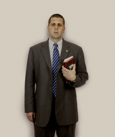 |
| Mark W. Lippert, 35, National Security Council Chief of Staff |
 |
| Denis McDonough, 39, Senior Foreign Policy Aide |
Born in Tel Aviv in 1961 Kander lived in South Africa and America now lives and works in London
In this post I have only briefly touched on these iconic photographers, but have the links saved should I wish to research them a little more in depth at a later stage, or wish to access their images to influence/reference any future coursework or personal projects.
references
Arbus, D. [n/d] Diane Arbus [photographs] [online] Diane Arbus Photography. Available from:
http://diane-arbus-photography.com/ [Accessed 4 June 2011]
Artists [n/d] Nan Goldin [online] Matthew Marks Gallery Website. Available from: http://www.matthewmarks.com/artists/nan-goldin/ [Accessed 4 June 2011]
The Jewish Museum Exhibitions (2009) Alias Man Ray; the art of reinvention [online] The Jewish Muesum Website. Available from: http://www.thejewishmuseum.org/exhibitions/manray [Accessed 4 June 2011]
Tate Modern Exhibitions [n/d] Walker Evans cruel and tender [online] Tate Modern Website. Available from: http://www.tate.org.uk/modern/exhibitions/cruelandtender/evans.htm [Accessed 4 June 2011]
The Art History Achive Biography & Art [n/d] Cindy Sherman [online] The Art History Achive Website. Available from: http://www.arthistoryarchive.com/arthistory/photography/Cindy-Sherman.html [Accessed 4 June 2011]
Chrisafis, A. (2008) My camera saved my life [online] Guardian Website. Available from: http://www.guardian.co.uk/artanddesign/2008/may/22/photography.art [Accessed 4 June 2011]
Collections [n/d] Sally Mann [online] Museum of Contemporary Phtography Website. Available from: http://www.mocp.org/collections/permanent/mann_sally.php [Accessed 4 June 2011]
Cotton,C. (2006) Interview: Philip Lorca dicorcia on Hustlers and Thousand [online] American SuburbX Website. Available from:
http://www.americansuburbx.com/2009/04/interview-philip-lorca-dicorcia-on.html
[Accessed 4 June 2011]
Metropolitan Museum of Art Cultural Department [n/d] The Walker Evans archive [online] The Metropolitan Museum of Art Website: Available from: http://www.metmuseum.org/works_of_art/introduction.asp?dep=19&type=WEA
[Accessed 4 June 2011]
MoMA Exhibitions (1997) The complete untitled film stills Cindy Sherman [online] The Museum of Modern Art Website. Available from: http://www.moma.org/interactives/exhibitions/1997/sherman/index.html [Accessed 4 June 2011]
The Photographers Gallery Exhibitions [2010] The family and the land Sally Mann [online] The Photographers Gallery Website. Available at: http://www.photonet.org.uk/index.php?pxid=964 [Accessed 4 June 2011]
J.Paul Getty Museum Explore Art [n/d] Walker Evans [online] J.Paul Getty Museum Website. Available from: http://www.getty.edu/art/gettyguide/artMakerDetails?maker=1634 [Accessed 4 June 2011]
Kander,N. [n/d] Nadav Kander [online] Nadav Kander Website. Available from: http://www.nadavkander.com/ [Accessed 4 June 2011]
Lichtenstein, T. [n/d] cindy sherman [online] Journal of Contemporary Art Website. Available from: http://www.jca-online.com/sherman.html [Accessed 4 June 2011]
profoto Photography Masters [n/d] Cindy Sherman fine art biography [online] profoto Website. Available from http://www.profotos.com/education/referencedesk/masters/masters/cindysherman/cindysherman.shtml [Accessed 4 June 2011]
Jaeger, A. (2008) A Conversation with Rineke Dijkstra excerpted from "Image Makers, Image Takers." Thames & amp; Hudson. [online] Cited in Popular Photography Magazine Website. Available from: http://www.popphoto.com/how-to/2008/12/conversation-rineke-dijkstra [Accessed 4 June 2011]
Oppenheimer, D. (2011) Diane Arbus [online] Jewish Virtual Library Website. Copyright American-Israeli Cooperative Enterprise, Reprinted with permission. Available from : http://www.jewishvirtuallibrary.org/jsource/biography/arbus.html [Accessed 4 June 2011]
Photographers [n/d] Man Ray [online] Artchive Available from: http://www.artchive.com/artchive/M/man_ray.html [Accessed 4 June 2011]
general research
http://en.wikipedia.org/wiki/Nan_Goldin
http://www.anastasiataylorlind.com/
http://www.billbrandt.com/index.html
http://www.richardavedon.com/
http://www.david-bailey.co.uk/David_Bailey.html
PDN Legends Online: David Bailey
Rineke Dijkstra - Marian Goodman Gallery
http://www.vam.ac.uk/content/articles/b/bill-brandt-related-photographers/
Portrait Homework
As per usual we had a task.....to create one photographic image printed A4...had to be a self portrait and to reflect on who we want to be. I think we were supposed to be inspired by Cindy Sherman ;o) Michael admitted this would be hard to pin down so give plenty of time for self reflection.
Pah! Easy! I jest of course I have NO IDEA who I want to be. It is a huge question mark. Therefore that is the angle I used to approach this brief. So often what we want to be is based upon where we have been, who we were and who we think are or who we maybe at any given time. Our ideas of who we are don't always match with the perception of others even at the same juncture. Being that this was to be 'art' I felt I could take certain liberties and play :o) I rummaged about in my old photographs....oh dear maybe was a bad idea to remind myself what a fat grumpy baby I looked! I examined the different roles I played and still play in my life, the element of dreams, of the past more clear than the future and the future being uncertain.
For those who want to know the set up.....camera on tripod with self timer, light was natural daylight coming from overhead velux window, some fill in flash which was stopped down.
To be able to get the correct height for the tripod and distance for focal length I have to admit that it wasn't shot in my bedroom...it's my dining room. I pushed the table to the correct position for the light, dragged my bedding downstairs and had great fun leaping about when setting the self timer....good job I have net curtains. Otherwise I dread to think what the neighbours would have thought!

I took some test shots of just the set up, then took some test shots of me, due to me not liking them I am NOT going to upload them here ;o) Suffice to say, the posing wasn't good, the lighting wasn't how I wanted. I used fill in flash and took a few more shots with the flash stopped down and I was happier with my pose, no arms in the way, double chins or head sinking too far into the pillow. The image I finally selected suited my purpose, gentle diffused light, not too sharp an image (us ladies like softer focus) and was the ideal backdrop for me to begin manipulating and constructing my image.
Lots of playing in photoshop, created bubble, then created memory bubbles, all slapped together in various layers. Bit of filter>render>lens flare and a star brush for effects on the background.
The bubbles were created by loosely following an online tutorial I discover a few years ago and had printed out. The tutorials I really like I do print a hardcopy and I discovered the hard way once that they get deleted and when you follow a link they are no longer there. I say loosely as some of the instructions, as in the size of the new document or colour they suggest does not always fit the image I wish to create.
For example here is an image create a while ago using blue rather than black

Basic instructions, which you can adapt as you wish, are as follows:
- open a new document set to whatever size and resolution suits your purpose
- create a new layer rename Bubble and fill with black, or which ever colour you wish to work with
- Filter>render>lens flare = 105mm prime, 105% brightness

- Filter>distort>polar co-ordinates and use the following settings 100% Polar to Rectangular
- Image>rotate canvas>180 degrees
- Filter>distort>polar co-ordinates with the following settings 100% Rectangular to Polar
- Your image should look something like this

- Create a circle with Marquee Tool, select the area you want to make a pleasing bubble, press Shift+Ctrl+I and hit the delete key
- Select the background layer and fill with black
- Select Layer one renamed Bubble and using Layer style add an Outer Glow and an Inner Glow, experiment with the settings to see what effects you can get
- Your image should look like this

- Take the image you wish to place in the bubble, make a selection and copy it to your Bubble document.
- Feather the selection/change the opacity to make it blend in with the bubble, experiment with the layer order to get the effect you want.
I created one bubble which was used to make 6 individual portraits of me through the years.

The final image was then ready for constructing. The original image of me on the bed was cropped, resized and converted to black and white, it was also fine tuned shall we say ;o) I want to concentrate more on the construction side than how many wrinkles were removed :oP ...... the background was altered by creating a background layer filled with black and using a layer mask. The bubbles were dragged onto the document, resized and placed where I wanted them. Opacity was experimented with until I was pleased with the overall effect. I also chose to add extra lens flare and a star brush to complete.
 |
| Tiff showing layers |
here is the result.....

Printing the image proved tricky as what appeared to be quite bright due to the screen actually came out very faint, could also be that I was using glossy paper, trying to use up what I have on this course homework. I amended the opacity and reprinted, a better result but still not totally happy with it. As I was running out of both paper and ink I left it was it was but given the chance would like to experiment with different paper and opacity again.
I quite like the idea of digital manipulation, enjoying the creative side of manipulation. As said before, although I'd possibly like to experiment with it more often I do tend to think there is a time and a place for it :o)
I quite like the idea of digital manipulation, enjoying the creative side of manipulation. As said before, although I'd possibly like to experiment with it more often I do tend to think there is a time and a place for it :o)


