Sunday, 11 September 2011

Tate Modern Trip

After looking at Struth a few of us then adjourned to the Tate Modern to take in Taryn Simon, Diane Arbus and the New Documentary Forms.

Taryn Simon

Tate Modern premieres an important new body of work by the American artist Taryn Simon. A Living Man Declared Dead and Other Chapters was produced over a four-year period (2008-11), during which Simon travelled around the world researching and recording bloodlines and their related stories. In each of the eighteen ‘chapters’ that make up the work, the external forces of territory, power, circumstance or religion collide with the internal forces of psychological and physical inheritance. The subjects documented by Simon include feuding families in Brazil, victims of genocide in Bosnia, the body double of Saddam Hussein’s son Uday, and the living dead in India. Her collection is at once cohesive and arbitrary, mapping the relationships among chance, blood, and other components of fate.

Tate Channel: TateShots: Taryn Simon

I found it hard to write up on this one.... I absolutely loved the concept of what she was trying to show but then felt that the idea is so much more than the photographs themselves? This is definitely a set of images that you need to understand the motives and intentions of the artist to appreciate the completed work.

a quote from the Guardian interview summed it up so well

for the casual or curious viewer, it may prove a demanding, even frustrating, experience, not least because the ambition and complexity of the idea almost overwhelms the actual work on the walls – a dilemma that is at the heart of much high-end conceptual art. In one way, too, Simon's work also refutes the long held notion that a great photograph should speak for itself, much of its impact resting on the interrelation of image and text, the latter giving the former much of its power and resonance.

Which in someways ties in with the research I have been carrying out on conceptual book covers, some ideas maybe too complicated and give no indication of teh true nature of the novel.

The rabbit experiments were an interesting addition and the explanation of the chocolate bilby...the Australians not wanting Easter Bunnies whilst trying to eradicate the entire species!

I walked in had a cursory glance round and walked out. Whilst I understood that she was capturing the portraits with no background clutter for a reason this then made the family shots appear typological, an impression of seen it all before. Rather like her emphasising that it's all a metaphor of us heading towards death...yes that old chestnut again. Although it is pertinent to this series as one of her 'families' had a living man declared dead to claim his land, hence the title of this body of work.

Simon has carried out an investigation into the nature of genealogy and its consequences, she painstakingly researched 18 family bloodlines, each with a fascinating story to tell: an Iraqi man who was apparently employed as Saddam Hussein's son's body double; a member of the Druze religious sect in Lebanon who believes in reincarnation and re-enacts remembered scenes from previous lives. Sadly none of these really interesting elements shine through the over all impression of 'beige' and all the connotations that colour brings.

Apparently the series took four years to complete and the majority of that time was spent on research, the photogaphic element took two months. Simon has been reported as saying 'I think I have just gotten tired of photography in a way.'

For me that shows.

http://www.guardian.co.uk/artanddesign/2011/may/22/taryn-simon-tate-modern-interview

Diane Arbus

This is a free entry exhibition at the Tate Modern Level 3

Diane Arbus (1923–71) is acknowledged as one of the great figures of American photography who fixed remarkable images of contemporary life. Her sympathy for her subjects exposed the variety and complexity of the human condition.

Originally a fashion-photographer, in the late 1950s Arbus began taking pictures of ‘things which nobody would see unless I photographed them’. She became known for her portraits of people whose appearance or lifestyle placed them at the fringe of conventional society.Some of the works were originally commissioned for Esquire magazine others were made for an article on ‘American Families’ published in the UK by The Sunday Times Magazine.

This becomes obvious as you walk into the rooms displaying her images. The black and white photographs are of transvestites, giants and dwarves etc yet they are presented sympathetically and with dignity. I didn't feel like a voyeur which is something I was concerned with. The warmth of the captures are even more evident when you see the actual images rather than online thumbnails, You find yourself smiling and laughing with the girls in their Easter bonnets, you see the person and their personality rather than their disability or 'difference'.

Arbus had an uncanny knack of  making supposedly ‘normal’ American citizens often appear eccentric and this contrasts with our ideas of what is normal and what isn't. What should or shouldn't be photographed. I researched her images when looking at portraits as part of my Art Photography course and came to the conclusion then that she had successfully captured her subjects, that anyone assuming she had taken advantage of people or situations possibly had their own issues which they projected onto the images.

Arbus often used a flash, even in daylight, and when looking at some of her shots I tried to work out if that was obvious? With some it was hard to distinguish if she had or if the sun had been strong that day. I couldn't detect many tell tale signs of the flash giving very hard shadows, or being reflected in the subjects eye, which shows to me she controlled her light/flash and exposures really well. The images on display her distinctive frontal, square-format portraiture, a style which developed after she began using a 2 ¼ inch, twin-lens Rolleiflex camera.

I really enjoyed looking at her work and regret not writing notes or spending more time there, but I think this is one of the problems when fitting in several exhibitions in one day.

New Documentary Forms

This new five-room display explores the ways in which five contemporary artists have used the camera to explore, extend and question the power of photography as a documentary medium. Consisting entirely of new acquisitions to Tate’s collection, it includes recent work by Luc Delahaye, Mitch Epstein, Guy Tillim and Akram Zaatari, as well as two important earlier works by Boris Mikhailov. Between them they cover subjects as diverse as the conflicts in Iraq and Afghanistan, studio photography in Beirut, elections in the Congo, everyday life in pre- and post-Soviet Ukraine, and power production in the United States. Each room concerns one discrete project, in which the artist calls into question the relationship between the documentary value of photography and the museum as its proper context.

Mitch Epstein
 
 
Akram Zaatari
 
 
Guy Tillim
 
 
Boris Mikhailov
 

Luc Delahaye


to be completed.....

Assignment two: A photographic book cover

All the preceding exercises and research have been leading up to the production of a book cover. The design must wrap around and include the front cover, spine and back cover. It must be for a work of fiction and the main photograph must be shot specifically for this project. Being fiction will give me a chance to conceptualise rather than choose a literal image.

The coursework provides eight titles to choose from although you can suggest a title of your own providing you can justify why and that it will be equally as interesting and challenging. The titles are:

Perfume: The Story of a Murderer by Patrick Suskind
Choice by Renata Saleci
1984 by George Orwell
Fahrenheit 451 by Ray Bradbury
The Outsider by Albert Camus
The Remains of the Day by Kazu Ishiguro
Far from the Madding Crowd by Thomas Hardy
The Dice Man by Luke Rhinehart.

About the Books

To be able to conceptualise a book it has become very apparent from my research that you do need to know the story. To enable me to make the initial decision as to which to produce an image for, I had to find out what they were about and what previous covers looked like.

Perfume: The Story of a Murderer by Patrick Suskind

Probably a very interesting book and it could be very challenging to conjure an image for the story, but a bit too weird for my liking. A young man, Grenouille, who in order to capture an exotic scent (basically the odour of virginal pre-pubescent girls) discovers he had to murder them in order to capture this scent. Which he does, for 2 years...sentenced to death he unstoppers his 'creation' at his execution where everyone is intoxicated by it and an orgy ensues... He gets a pardon but eventually hates himself, returns to Paris, douses himself in the remaining scent whilst standing amongst a group of lowlifes. The mix of thieves and murderers are overcome by the perfume, rip him to pieces and eat him......

Appreciating that if this as a commission the option to decline would be tricky am glad I have the chance to say no, but until I look at the others who knows?


Choice by Renata Saleci

Hmmmmm odd? From what I can find out this book is non-fiction? A study of choice and consumerism?


1984 by George Orwell

Such a well known book with terms that gradually filtered into the everyday vernacular I must admit to not knowing the finer plot. Winston Smith, parents killed by 'The Party' works for the Ministry of Truth, altering newspaper stories to echo the party line. He lives in a one bedroomed flat, eats basic rations and drinks gin. Threads that run through the novel are the surveillance of everyone, a love interest in the form of Julia, their planned rebellion and subsequent capture, torture, betrayal and ultimately Smiths acceptance of the party line.


Fahrenheit 451 by Ray Bradbury

Very similar to 1984 in that it is set in a dystopian society, a future American Society where reading is banned and firemen burn books. The main character, Guy Montag, is a fireman who starts to doubt what he does; burning books and even the homes of those caught reading and owning books.

Later on it is discovered that he has not been burning books but taking them home and reading them, he is ordered by his boss to destroy them along with his own home. Other complex plot lines which involve Montag killing his boss, being pursued by mechanical hounds, discovering a group of people who memorise books in order to preserve them, a nuclear war and the group setting off to the city to rebuild it.

Could be interesting, a lot of images spring to mind...


The Outsider by Albert Camus

The themes of this novel are free will, colonialism and the meaningless of human life. The main character Meursault appears to have no real emotions about anything. He is unmoved at his mother's funeral, assists a friend to set up an ex-girlfriend for a beating. During an encounter with some Arabs, who confront him over the beating, Meursault kills one. Despite killing him outright he puts a further four bullets into the body. The second part of the book concentrates on Meursault's incarceration and continued indifference. This detachment is seen as him having no remorse and being a 'souless monster'; he is sentenced to death by guillotine. Only at the end do we see any real emotion as he rages that people are not fit to judge him.


The Remains of the Day by Kazu Ishiguro

Stevens, an English butler, narrates this novel in the form of a diary, recalling his professional and personal relationships, mainly with a former colleague, housekeeper Miss Kenton. The story is told in flashback where it becomes apparent that Stevens and Kenton fell in love but neither admitted it or dared to cross the line. The two main characters come into contact once more, Miss Kenton eventually married and 20 years later is looking forward to the birth of her first grandchild. Stevens looks back on his life, thinking of lost opportunities but determined to focus on the the remains of the day, the rest of his life and future service with his current employer.


Far from the Madding Crowd by Thomas Hardy


Set in the English countryside Far from the Madding Crowd revolves around a few main characters over a span of many years. Gabriel Oak is a shepherd who saves enough money to lease and stock a sheep farm. He falls in love with Bathsheba Everdene, who refuses his hand in marriage. Years pass, his fortunes fail, hers improve, confused and unrequited love tangles follow (as ever with these stories). Bathsheba employs Gabriel on her farm yet falls in love and marries another man, Troy. He had another true love bearing his child though both die. He vanishes but re-appears six years later when Bathsheba is seriously considering marriage to William Boldwood. A fight ensues in which Boldwood shoots Troy and is sentenced to hang, this is changed to 'confinement at her Majesty's Pleasure'

Gabriel decides to leave and Bathsheba realises how much she needs and loves him and the couple wed.


The Dice Man by Luke Rhinehart.

Luke Rhinehart is a bored psychiatrist, one evening clearing up after a party he comes across a die hidden underneath a playing card. He thinks to himself, if it is a one he will rape Arlene, his neighbours wife...from here on in the plot describes how all his decisions are made on the throw of a dice, how he introduces others to this idea. Reviewers either love or hate this book so am quite tempted by it, also because I don't know the story at all.


Monday, 5 September 2011

Thomas Struth Exhibition

I've put off doing a write up on Struth because not quite sure how to frame what I wanted to say. Even now I'm not quite sure but if I let my fingers do the walking over the keyboard I guess I can add bits later, or amend in a few days when I finally get my head around it.

Introduced to Struth a while back his images never really spoke to me much, he is from the Dusseldorf Kunstakademie, tutored by Becher and it shows. Is that good or bad? Hmmmmmmm depends on how much you learn and then just duplicate or learn and move on from. I went along with an open mind hoping to be converted, as with some of Paul Graham's work. Some reviewers remark on how he captures people observing and therefore we connect with the people and places he portrays. I don't :o/ The monuments I agree are amazing, the tones are wonderful, but they do leave me cold. His earlier city scapes had definite overtones of Becher, even in the latest series there is a precise methodology to them.

The work was not exhibited in chronological order and jumped about in not only time but also subjects, maybe this was another reason I found no real coherence to his work, or had difficulty in trying to ascertain what his motives were. Possibly compounded by the fact only a few images from each series was shown.

His earlier work was typological, black and white shots of city streets with central focal points. They came across to me like a students portfolio, something which I think it was Clive also vocalised and this registered with the impression I got from them. For me there were feelings of deja vu, that I was looking at another photographers work, but not their best. His images seem to lack something I can't put my finger on. With other more recent exhibitions and other photographers, David Goldblatt to name one, there seemed to be a crispness about the black and white images that were lacking here. I got the overall impression of grey, and more grey, no real contrast.

Unable to post on my blog Clive elaborated more

'Struth is a contemporary of mine and when I saw that work I went straight to look at the date because I recognised it as being in the style we were shooting in as just graduated students, photography has its fashions, but with the difference that we would have been looking for something a little less deadpan.

Probably would have shot it, maybe even printed it, but decided not to use it.'


What I was trying put across was, as a student of the Bechers his earlier work still was very influenced by them,  as if he was still trying to find something different but not quite there.


Of the black and white images this one seemed to stand out for me. Maybe because it was a forerunner to the type of images he went onto produce; examining scale and perspective looking at the smaller detail within the images. This photograph was still produced in a small size and proved that bigger is not always better. You could see the details and it was tack sharp. I wasn't so overwhelmed by the size, I took my time to look, all I had to move was my eyes, rather than my entire head or feet.

I jotted down names and dates but none really stick out other than the famous Museum series, which were so much better 'in the flesh' than as small online thumbnails. Having said that I found myself questioning the overall quality of many of his prints; soft ,blurry, other nit picky things which the images didn't grab me enough to stand and look at long enough to work out quite what. Whilst appreciating that the motion blur worked with the museum scenes it was disconcerting to see in the family portraits.

Thomas Struth Pantheon Rome 1990
The technology series, came across as a jumble, I listened the the explanations of Pollokesque leanings, not wanting to have a centre of focus, (something that Meyeorwitz explored in his early street photography) our lack of understanding the image echoing the lack of comprehending how modern technology worked; even with the titles supplied do we really know what a Wendelstein 7-X Stellarator or Grazing Incidence Spectrometer is? His images didn't make me go WOW or want to rush to find out either. I found that sad. Other photographers seem to capture emotion as well as the high tech quality. Although Struths images did make me wonder how a jumble of objects looking as if they were thrown together worked it, was more the object itself I found fascinating rather than the way it was portrayed; clinical, no nonsense, it is what it is, which is Struths style to most of his subjects.


Grazing Incidence Spectrometer Thomas Struth
Taryn Simon
Dynamo III, Studying Magnetic Fields and Impending Pole Reversal

Taryn Simon Cryopreservation Unit 

Hoping that the Paradise images would be better than online and more inspiring, they were a disappointment too. Having said that there are possibly better images from the series had not been included. Once more they reminded me of things I had seen before and yet presented in a better way.


Paradise 27 Thomas Struth

Taryn Simon The Hoh Rain Forest

The Korean Semi Submersible Rig, 2007 was impressive, in the small thumbnail you don't appreciate the angles or perspective of the cables..., this reminded me of Burtynsky whose large scale prints seem to ask the questions what are we doing to the earth and mans relationship to the world with more humanity than Struth. I loved the humour on the Chemistry Frame Cupboard (however the humour belonged to the graffitti provided by the chemistry students rather than the photograph itself) so it wasn't all bad, but whereas other exhibitions have had me bouncing with this I felt deflated, a sense of 'and' 'so'?


Semi Submersible Rig DSME Shipyard Thomas Struth 2007

Going back to some of my scribbled notes I had intended to really take note of the intended use, situations faced by the photographer, were they planned or unplanned, technical details style and mannerisms. Due to the vast amount of images and the fact Struth tended to break his own rules, it was tricky to say even within series 'Struth always does this.' As Michael Lawton explained he never uses flash, but he did on Audience 2004 Florence, never stages his work, apart from the Pergamon Museum in Berlin where he drafted in 150 extras, never uses photoshop, but sometimes does ( although we were not told on which images) never takes commissioned portraits, they are always people he built a relationship with, oh apart from the Richter family and of course more recently Liz n Phil ;o)

As others have said maybe it was the size of the gallery, but don't think so, for some reason at this moment in time I cannot connect with Struth even if I can apprecate the muted tones of Tianaman 1997, or the minute figures in Times Square. Seeing other's describe his work with such high praise makes me feel I am missing his point... Does that make him unsuccessful? Well you can't please all of the people all of the time.

What did I take away from this? I only seem to write full notes if the images appeal, which is not a good thing and need to alter, that bigger isn't always better, I prefer other photographers, photographs mounted by means of bonding onto acrylic may have benefits; easy to clean, protects the image, enhances colour but can have the disadvantages of reflections of the lights and audience.Oh and that it doesn't matter how many long words you throw at the page in an interview or associated blurb, if I don't like it, I don't like it ;o)

Print out of on-line Struth review with my notes for learning log


Manipulating imagery

Not really to do with manipulation, but an interesting site to dip into anyway....

Book Cover Designer, Book Cover Designers, Book Cover Design, Cover Artists, Book Cover Artists, Graphic Artists, eBook Cover...

Manipulated images are frequently used to attract immediate attention and solve conceptual problems. This can be done by distorting a single image to develop the idea of strangeness or by combining two visual elements together.


New Bedlam Bill Flanagan (publisher Penguin 2007)
designer Darren Haggar


The Storm Margriet De Moor (publisher Knopf 2010)
designer Barbara De Wilde
Suburban Legends Joan Crate (published 2009)
designer David Drummond


Sunday, 4 September 2011

Accomodating type

For assignment two, the creation of my own conceptual book design, the emphasis is placed on the photographic element, so whilst not expecting me to be professionally competent with typography, it is still something that needs careful consideration.

 
With all the books I have examined so far there has always been a sufficient clear space for the title, authors name and any other information that was required. Clear meaning uncluttered, smooth and without detail.

 
There are three basic ways of fitting type onto an image

 
  • fit the type into an area without detail


  • place the type in a solid block on top of the image


  • place the photograph as a cut out on the cover.


A more sophisicated way to incorporate the typology is to build it into the image as with Eat, Pray, Love


Or the photographic elements can be broken into sections into which the type can fit.


Whichever style is adopted the photograph for my assignment should dominate the cover design and not be subordinate to the type.

The three main elements on the cover, as discovered in the previous exercises, are

  • authors name
  • book title
  • strap line/quotes
More often than not the title goes large at the top of the book cover with the author below. However I have discovered that this rule is broken with more well known authors such as Wilbur Smith, Nora Roberts and Joanna Trollope. In these instances the name goes larger as the author is the main selling point.


Problems with Creative Ideas

A post made by Alec Soth in his blog raises some issue with regards to creative ideas, basically a publishing company approached Alec to use one of his images for a book, he said 'no' and they designed something very similar which annoyed him.


His image....

Alec Soth Peters Houseboat


 The book cover....
Winter's Bone Daniel Woodrell

Lots of comments have been made backing up his annoyance whilst others say 'so it's similar, get over it, you said no.' Personally I side with the 'get over it' comments. Yes, it is similar, but so many images out there are.


Sworn to Silence Linda Castillo (publisher Panmacmillan 2009)

Snow huts.....huts snow....trees...it's not so original...and there are more out there.

Another example of huts, ok no snow but huts and a washing line, taken earlier this year by a good friend of mine who loves Dungeness.


Dungeness Hut Mark Watts 2011

I don't know if Mark has ever looked at Alec Soth's work, I doubt it. He likes Dungeness, he photographs what is there. What is there are boats, huts and washing lines.... sorry Alec you don't have the exclusive right to photograph huts and washing lines ;o) As with any photograph many people will shoot the same thing, from the same place and the same angle. Or if not the same at least very similar. Only a few will decide to publish and even fewer will have produced something of a high enough quality to be accepted.

Drawing the line between copyright and inspiration or even matched ideas can be difficult. How many have come up with ideas they decide to patent or copyright only to discover that someone else beat them to it 10 years ago? The book cover is not a direct copy and sadly you can't copyright an idea.

On a visit to my local library to complete the exercise 'choosing your imagery' I spotted the book Still Life With Chickens by Catherine Goldhammer...creative concept look familiar?


Once home I searched for it on the Internet to show a comparison, and came across a different version which immediately sparked recognition, it looked very much like an image by Joel Meyeorwitz ......

Checking up, yes it was...I impressed myself! Originally published in 1979 in Cape Light. Reprinted in 2002 by Little, Brown Company.... the plot thickens!


Joel Meyerowitz Cape Light 1979


Maybe Joel Meyeorwitz should be cross because he took a similar photograph published in 1979, about twenty years before Peter's Houseboat, which Soth could be said to have copied? Meyeorwitz obviously didn't object to having a chicken added to his photograph as much as Soth did a young girl to his ;o)

Monday, 29 August 2011

Examining conceptual ideas

The books I have just been looking at were fairly complex with their imagery, the next three contrast by have very simple detail or graphical devices in order to cater for a difficult or involved production.

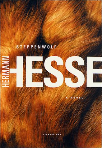
Steppenwolf Hermann Hess (publisher Picador 2002)
designer Henry Sene Yee
This book is a good example of the way book covers and publicity materials are different or change with the passage of time.


Steppenwolf is the story of a man exploring his own nature, elements of his personality one high, the spiritual nature of man; while the other is low, animalistic; a "wolf of the steppes". This can be a problem with images which are very simple. I originally had no idea what the book was about and on looking at the cover, and the previous ones I assumed it to be about a werewolf!

Jane Eyre Charlotte Bronte (publisher Vintage 2009)
designer Megan Wilson

Another book which has had many designs, the earliest here in the middle (now out of print) is a 1943 edition published by Random. The one on the end is the 2007 version of a Vintage publication. Penguin Classics also has many versions of the same book.


All these book covers lend themselves to the story of Jane Eyre. This could be because I have read the book and seen several films/televised versions. The simple example informs the reader the book is about a young lady and the inclination of her head alludes to her personality.

Beowulf translated by Seamus Heaney
 (publisher WW Norton 1999)
 Again more comparisons of the same book.


For me this was the least successful of the covers. Beowulf is an epic Anglo-Saxon poem, set in Scandinavia and written between the early 8th and early 11th century. The only manuscript was damaged by fire in 1731 and fell into obscurity before being reprinted in 1815 by an Icelandic scholar.

As no-one really reads Anglo-Saxon all versions are translations of the original poem, some are prose, others in poetic form. Seamus Heaney has been congratulated many times over for his most recent translation as he has preserved the feel of the original, retains many historical elements and portrays Beowulf as human rather than a caricature.

Although undeniably a hero, which the chain mail represents( and chain mail is mentioned in the poem), the poem constantly alludes to Beowulf's helmet. As the book is said to be a very accurate translation it is a shame the chain mail suggests more the medieval period and is very clean and shiny, not how I, at least, consider Beowulf. However this is a very subjective view and others may not agree.


Not directed to compare previous editions of the same book I found it fascinating to see the different approaches taken and to see what my preference was with the example encountered. Some are obvious illustrations rather than photographs but was an interesting exercise nonetheless. Simple conceptual ideas can be successful but the wrong choice of image could give the reader the incorrect impression of the book.