Deliberately NOT looking at the artists involved or any of their work prior to attending the exhibition I just found out the bare facts...it was an exhibition presenting the work of 17 South African photographers all of who live and work in South Africa and the images were made between 2000 -2010.
Blurb ;o)
'Exhibition: This exhibition features works by some of the most exciting and inventive photographers living and working in South Africa today. The exhibition presents the vibrant and sophisticated photographic culture that has emerged in post-apartheid South Africa. The works on display respond to the country’s powerful rethinking of issues of identity across race, gender, class and politics.'
When Armano posted on the Flickr forum that he was going in June and there was to be a short talk by the curator I decided to join him. Having seen the Paul Graham exhibition twice I think I realised when there is so much work to take in it does help to see it more than once. One of the thoughts I have had with regards to group or retrospective style of exhibition is occasionally you don't see enough of the artists images to be able to form a true appreciation or understanding of their work. Some are fine, others in the hmmmmmmm bracket I'd like to see more of...but I guess that's what the Internet and research is about, and I don't mean fine as in a dismissive fine ;o)
Walking around with Armano and having someone to bounce thoughts and ideas off was useful, I did my usual witter of what it could be about, or why had they had what they had, or what I liked or disliked about an image, with some backtracking immediately the idea had been and voiced because I can argue myself into a corner fairly well :oD Attending the talk given by Tamar Gard (UCL) one of the exhibition curators was insightful and realising we had missed a corner we had to go back in afterwards ;o) After the talk I did wonder how much of her take on the exhibit was coloured by the fact that she is a white, female South African of a certain generation? Not saying it was biased but we all have our own individual slant on life depending on our upbringing and as with the Paul Graham Trouble Land series I wonder if my daughter would understand the possible "shock value" of a few of the images hung in the gallery? Once again the idea of how a person will read an image so depends on who they are. (and how they will take an image)
Doesn't surprise me to read about Gard 'She was appointed Lecturer at UCL in 1989 and was promoted to reader in 1995 and professor in 2001. Her research interests have focused on questions of gender and sexuality, the woman artist and the body, as well as race and representation,' I think some of that comes through with some of the images on display.
The first thing we thought about was the title of the exhibition Figures and Fictions, guessing (and rightly so after attending the talk) that the 'Figures' were the people and the 'Fictions' the stories that are told about them, the stories that we could make up about them, and the actual 'true' story behind each image.
The first image that confronts you is Pieter and Martyna Vermulen with Timana Phosiwa, 2006 Peter Hugo, a huge colour canvas depicting a middle-aged white couple sat cradling a black toddler. Immediately you are struck by its size and the colours. This is no anthropological study, nor does it show whites beating blacks or civil wars, all the stereotypical ideas one associates with images traditionally coming out of SA and Africa as a whole. A scene that several years ago you would have been hard pressed to find. This image conjours up so many stories and there are so many details to be read into it...I think I may do a separate post just on this photograph, especially as this was one discussed in some detail by Gard.
Not all the images in the exhibition are as large or as colourful. Many of the younger photographers come out of the Market Photo Workshop started by David Goldblatt in the late eighties. 'At the outset, the aim was to provide visual literacy and practical training to young photographers who were excluded from formal training in tertiary education institutions by the policies of the government at the time' and they were all taught film and darkroom techniques, this influence can be seen in their black and white work.
However as SA has become less isolated, due to historic boycotts and embargoes, it has become open to the influences of the international art; these influences and ideas have filtered through into the styles and colours in the streets and into photography.
Each artist has their own wall space, the exhibition space organised with opposite walls painted in dark purple and white, and you really do need to walk around several times to take it all in. 17 themes,17 different approaches equals information overload at times. Looking at analysing photographs (part of my current coursework) I viewed the images asking some the 10 pointers in the pwdp materials....first impression, the genre,intended use,immediate situation facing the photographer, planned or unplanned, technical details, style or mannerism, photographers intent, success.
Here goes my thoughts and impressions....
Jodi Bieber
Born in SA Jodi Beiber was born in 1967and brought up in a white middle-class suburb not knowing much of the struggles going on in her country.Working for the Star newspaper in 1993 brought her face to face with the political upheavals leading to the first democratic elections in 1994. Jodi Beiber is a product of The Market Photography Workshop and her black and white images from others bodies of work are indicative of this. She mixes her own projects with working for non profit organizations producing booklets and leaflets. Inspired by the Dove 'Real Women' campaign she took images of everyday women in their own homes. One of the downsides of being exposed to Western ideals is an increase in anorexic African women due to our fashion industry ideals of what constitutes 'Real Beauty'
Her aim was to create a body of work that went against everything the media was/is portraying as beautiful but she also found she came up against the ideas of different cultures of what constituted beauty, an example she gives of tall, thin, black women being suspected of being ill or having aids, whilst the fuller figured woman was thought to be healthy. Also some tribes believe the lighter the skin the more beautiful the woman. But that also was a trend in Elizabethan times when people would paint their faces with lead! The difficulties she encountered were the issues surrounding the public perception that she wanted to create 'porn', the submissive attitude of some that their husbands 'wouldn't like it', religious views or the fact they just were not happy with their body shape.
To ensure that her models were as comfortable as possible they were all volunteers, photographed at home and their poses were on the whole self-directed. Obviously these images were planned as the models had to dress, or undress, appropriately and the shoot set-up had to be constructed. Only 3 of the 31 images from this series, large colourful pigment prints on cotton rag, are on display and I think this is one example where more is better. To me the subjects come across as a few scantily clad, rather eccentric women, whereas when viewed altogether it makes for a much more satisfying result.You can see the entire series on her website plus other work she has produced here | Jodi Bieber | Looking at the set gives credibility to the V&A blurb 'The results reveal a complex relationship between self-image and body identity and their relationship to fashion, photography and the media.' I enjoyed trying to get clues about the people from their homes and trinkets as much as the idea behind the images, but the series was also tinged with 'Big Brother' overtones that people will do anything for 5 minutes of fame?
Was she successful? Yes I think so but only after seeing all the images not just the few on display.
Kudzani Chiurai
Well if he has his own webpage I couldn't find it :o/ Therefore limited info about him really which is a shame. He was born in 1981 in Zimbabwe and apparently his early work focused on the political,economic and social situations there. I've found some information with regards to previous work called Political Posters which were silkscreen prints of political slogans such as 'we always have reason to fear', 'shopping for democracy' and 'vote at your own risk' reflecting the Zimbabwean political crisis. He is currently living in Johannesburg in August House, Doornfontein, where several other artists also reside. Looking at issues such as xenophobia and black empowerment with The Parliament he has turned to satire, making a series of portraits 'starring' fictitious cabinet ministers. We aren't informed of the actual aim of this body of work but am guessing it is to make people question the conventions of their up-bringing and the stereotyping of their politicians and public figures.
He chose a well known South African pop icon, rather than an unknown, to model for him stating that 'he is part of that collective consciousness.....people look to him as a role model' and that seeing him outside of TV 'is to be aware of the artifice of the roles he adopts, of his performance of black masculinity and popular culture as image.' So it could be that he is also asking people such as role models, to question the part they play in perpetuating these stereotypes?
The images themselves are large colourful prints again on cotton rag and are beautifully produced. The shots are planned; working alongside a stylist and another photographer,Siyabonga Ngwekazi (the model) struts and poses artfully for each character and, with the help of various costume changes, carries off the parody very well. I enjoyed Chiurai's photographs, not sure if they fulfilled his brief as I still am not entirely positive what it was ;o)
Hasan and Husain Essop
I found the work by twins Hasan and Husain Essop very interesting on many levels. They produce colourful digital composite images cloning themselves over and over again. This is a consistent way of working and they have produced other series using the same techniques. There are many reason that they give for working like this, firstly that they have a 'split personality' being brought up by traditional Muslin parents yet growing up in cosmopolitan Cape Town. Secondly they state 'This is our experience. We don't want to make an objective statement. We don't want to put words in other people's mouths' and lastly there is the conflict of religious beliefs of Islam and the depiction of the human figure. Told by their mother that 'anything you draw that has life, you are going to have to give life to it,' photographing themselves was a solution to that problem. Earlier work, Fast Food 2008 and Thornton Road 2008 contain more of the juxtaposition of East v West, religion v pop culture.
Their series Halaal Art was shot in Cape Town and recorded the ritual of cleansing meat for consumption. The shots are planned and they work fairly quickly due to rapidly changing light. The frames are shot with the camera on a tripod, Husain goes through a series of acts which Hasan will photograph. They then swap roles and effortlessly seem to know what space the other has occupied. Noting that with each successive generation Western culture is nibbling at the edges of Islam, they have taken the opportunity to investigate the Muslim way of life and the rituals as they still exist in Cape Town today.
Finding a solution to a photographic problem is a challenge many photographers face and I think the solution found by the Essop twins is brilliant. Not only are the images composed and expertly merged they also successfully tell the story associated with butchery in the halaal tradition and the feast of Eid. The lighting, especially on the night shot, is excellent. The idea of clones conveys the idea of having to be two people at the same time with many inner and exterior conflicts superbly. Can you tell I enjoyed this set?
David Goldblatt
Where to start? So much has been written about David Goldblatt how do you find something original to say? Born in 1930 David Goldblatt is a South African Jew who had the awkward mix of being privileged white yet persecuted Jew, which probably goes some way to explaining his interest in portraying and helping those who he feels are disadvantaged. Photographically he has, for six decades, consistently produced work that was/is critical of South African society and practically, he set up the Market Photography Workshop in 1989. His photographs show the suffering of the black community as much as the poorer white.
More recently he has started to develop and explore an interest in colour and larger size prints. His earlier black and white prints produced as silver gelatin prints and the colour work on display in the exhibition is pigment on cotton rag. It is interesting to contrast his earlier work on display elsewhere in the V&A with his newer photography.
His style fall into genre of documentary, trying in the beginning to communicate with South Africans rather than the rest of the world believing that no-one else would understand how South African society operated. Although his approach and medium may be changing somethings remain the same; Goldblatt's images still do not really focus on large events or crowds, they look at the ordinary man in the street, injustice and how people struggle against it. He states 'It's the attempt to be intensely engaged with the particular that propels me.' He continues to caption his work with precise information to convey the context of the image. Unlike other photographers in this exhibition he leaves no room for writing our own fictions.
Images on show are from recent projects Ex-Offenders, depicting former criminals at the scenes of their crimes and Tradesmen. Out of all the images on show I found the Tradesmen shots more of a reflection on the change in SA society. Although there is still a long way to go it shows that the black tradesmen can now ply their trade in the suburbs which would have been unheard of not to mention illegal during the Apartheid years. Hand painted signs, which we see as a regular occurrence, sprang up on trees and poles, a signifier that change, even if gradual, was on its way.
It's funny, I hate exhibitions where you are told nothing but Goldblatt's approach of 'this is what it is' wasn't satisfying either, although admittedly some of them did need the back story, or rather the back story made you double take to the faces shown, especially in Ex-Offenders. Technically good photographs, because I didn't have to think that hard about them I probably didn't do them justice so will be interesting to view them again.
Pieter Hugo
It is Hugo's image that 'opens' the exhibition but as stated I think I'll cover that separately. He started out as a photojournalist but crossed genres into a more documentary style. Several of his bodies of work are represented by the images on show, but they all seemed to show forms of juxtaposition/contrast. A worker at a toxic waste dump in Ghana sports a Sun City T.shirt,a street performer has a muzzled hyena, something I associate with rolling savannas, under several flyovers resembling spaghetti junction ( Hugo describes it as hybridisation of the urban and the wild) and a honey collector wears a plastic bag over his head as protection.... In his series Messina/Musina he looks at family and culture. The group photo on display shows several young men in tweed, customary dress for those just circumcised. I have to ask why? I mean I understand the colonial reference but as I said to Armano at what point did the elders say 'I know once we've put the knives away wear tweed!'? Whilst adhering to these traditions it was interesting to note the modern detail in the background, a calendar showing African landscapes, something displaying Mickey Mouse (not sure what now my notes weren't that clear... I must learn shorthand or write legibly) crucifix, and a Cuthberts carrier bag.
His back stories are fascinating http://www.pieterhugo.com/the-hyena-other-men/
The title of his series Messina/Musina actually sums up the ideals of the whole exhibition, the gradual change of SA and the reclaiming of the land by the indigenous population. Messina was founded as a copper-mining town and was called Messina due to a spelling mistake. It was altered back to Musina in 2002.
Hugo works with a large format camera and that impacts on the way he works, being more obvious, and having to ask permission to shoot. I found his images really interesting and reflect a country with obvious colonial influences, going through a transitional period.
Terry Kurgan
I'm not quite sure what to make of Terry Kurgan's work on display. I think the stories behind the images are more interesting than the photographs themselves. Photos from just one of her series Park Pictures, are large colour portraits of the street photographers who operate in Joubert Park, Johannesburg. Text alongside the portraits reveal information about the photographers, I felt it a shame that the images themselves could not do this. She had been invited to show the change in the derelict inner city I don't know that this set of photographs do that?
What I found more interesting were the smaller shots taken by the photographers themselves which their subjects had not returned to claim. They showed people in their everyday clothes, and were more representative of what South Africans and the migrant population, are like without their traditional clothes or Sunday best they provide the real historical archive of the area. Spotting the similarities in their fashion, attitudes and the faux backdrops, an idea also employed by Europeans to show circumstances/landscapes totally unrelated to their current situations, was fun :o)
Sabelo Mlangeni
Sabelo Mlangeni has embraced modern technology and is on facebook ;o) Another student from the stable of the Market Photography Workshop he is documenting South African during its struggle after apartheid. He had images from two series on display; Men Only and Country Girls. He works exclusively in black and white and his subjects, as demonstrated by these sets, concentrating on the poor and marginalised sections of society.
Men Only are almost voyeuristic shots, peering round curtains etc, taken in a hostel,built originally in 1961 for migrant mineworkers, but now occupied by taxi drivers or security guards, poorly paid young males moving from the countryside looking for work. He stayed there for a few weeks to gain their trust and enable him to get the results he did. The blurb states that he uses 'soft focus shots and close ups to move away from the stereotypical image of it as a violent and unlawful place.' I agree that the images are more about the daily grind of surviving in the hostel and the relationships between the residence but I could still feel a sense of disquiet, also not sure about it being something different? Maybe to that specific place, but the images have a familiarity about them.
Country Girls I found more interesting. This body of work was shot over a period of six years and probes the South African attitude to gay life. Within the framework of the law, South African is very forward thinking, they were the first country to legalise gay marriage and to recognise the rights of gay people but paradoxically they are extremely traditional in their views of accepted gender roles and are very homophobic. This body of work would not have happened before as it shows cross-dressing men, photographed as Mlangeni came across them, Gard informed us that the photographs on display are of transvestite hairdressers.
Santu Mofokeng
Santu Mofokeng has two series on show Chasing Shadows and Child- headed Households; totally different subjects but somehow intertwined. Chasing Shadows is concerned with spirituality and depicts the caves which are used for both Christian prayer and a place of traditional healing. Many people go there to seek a cure for AIDS and one of Mofokeng's subjects was his brother covered in ash. This links to his other set, which shows how children orphaned by this disease continue to support each other, going about their daily domestic routines as best they can.
He started off as a Street Photographer, then was employed by a newspaper as a lab assistant, later joining Afrapix to document the anti-apartheid struggle.
I love his comment 'After 1994, I wanted some kind of closure about the work I was doing in the townships; basically saying "I'm done with social documentary". I could not continue to justify invading other people's spaces,because if you show social maladies the benefit accrues to the photographer but it doesn't change anything.' which so backs up my feelings with some documentary photographers (Goldberg) that their work glorifies them but does not affect change.
I found his black and white images showed wonderful tonal qualities and the detail/lighting was beautifully captured especially in Chasing Shadows.
Zwelethu Mthethwa
Born in 1960 Zwelethu Mthethwa is a painter as well as a photographer and there is definitely a painterly feel to the backdrops of his series The Brave Ones. On first glance you wonder what on earth you are seeing. These huge brightly saturated images of the Kwa Zulu Natal landscape, with young men in strange garb makes you wonder. They dress in a strange mix of the traditional, the modern and old colonial influences. ie African headdress, fringed shirts, bow ties, kilts, football socks and builders boots? Apparently this is Shemebe ceremonial dress and Mthethwa chose to isolate his subjects from the dance where this would be worn, to further demonstrate the blurring of the boundaries of masculine and feminine fashion, his models appearing very androgynous, whilst also telling a story.
At first I could not understand why he chose to photograph them not dancing, I mean you would still look and ask 'why that mix?'. But then I realised that that would still have given you a context for that dress code and by removing that clue he enables the audience to make up their own 'fictions.' Shame in some ways as during the talk Gard had a powerpoint presentation which showed images of this ceremonial dance...and the whole costume was finished off with pith helmets.........
Something which may not strike the observer immediately is the steady gaze directed to the camera by each of the subjects. Mthethwa prefers his subjects to look dat the camera stating:
'That for me comes from the fact that in South Africa the gaze is a political thing. In South Africa, where black people were seen as non-citizens, they were not allowed to return the gaze, but for me when they stare back it’s like they are saying, "I am here, I have the power to look at you. You are looking at me, but I am also looking at you".
I enjoyed this series, they show traditional ceremonial dress but not how they would have been shown years ago by white anthropologists and also break free from the school of being black and white which still has a strong hold over other contemporary photographers.
Zanele Muholi
Zanele Muholi is a lesbian and describes herself as a visual activist, like Mlangeni she is trying to confront the prejudice faced by the gay community despite South Africans progressive constitution. Stating that they are seen as 'deviants' Muholi explains that home life is still very traditional and heterosexual, with women expected to be with men and produce children. She works with both colour and black and white, producing very different portraits of different gay characters.
In Faces and Phases a set of large black and white traditional portraits some of the things I noted besides the models, were the differing backdrops she used. This was not a set produced as a uniform typology or anthropological convention like Van Wyk's. Some were just head and shoulder shots, others down to the knees, the backdrops were the landscape, or cloth or walls. All her shots were taken outside using available light and handheld. The women photographed were an elcetic mix, and she successfully shows the diversity
and difference which was her aim.
Beulahs examines gay young men and how they dress using accessories usually associated with women and in contrast to Faces and Phases are bright colourful frames. Only two images were shown from this series and I found it interesting that the young man wearing more western clothes was posed in a modern shopping mall yet the two young men dressed in a more traditional fashion were stood against a plain wall, a foil used time and time again in African portraiture. I associate it with the war torn images where people stand against the wall showing their scars or the poor villagers are pictured against their mud huts. Was this the purpose?
Gard also pointed out that the beaded skirts and accessories are of the plastic/reproduction variety that is mass produced for the tourist market.
Interesting series which left me wanting to see more, this is an interesting yet frustrating exhibition in the respect that the images you see are just a tantalising taster.
Jo Ractliffe
Jo Ractliffe was born in 1961 and took up photography n the early 1980's. Currently she resides and works in Johannesburg, being the senior lecturer in Photography at the Wits School of Arts. Ractliffe is also involved in the teaching programme at the Market Photo Workshop.
Interesting to discover that she was one of the founder members and curator of the Joubert Park Project, on which Terry Kurgan based he series Park Pictures around.
Looking at the traumatic aftermath of various events her series Terrano Ocupado (occupied land) examines the aftermath of the Border War between Angola and South Africa in the 1970's and 80's, using a documentary style. Her photographs depict the migrants in the area of Roque Santeiro market, which apparently derives its name from a Brazilian soap opera, and Boa Vista, one of Luanda’s oldest and largest slums, as well as traces of titled murals showing Portuguese exploration of Africa.
Although this series is in black and white Ractliffe has recently produced colour work and has established this as her primary medium. To be honest I think this set may be better in colour? I said at the time to Armano that you couldn't see the vibrancy or otherwise of the tiles, in one specific photograph the slums, the huts and rubbish ('Woman on the footpath from Boa Vista to Roque Santeiro Market' 2007) seemed to blend into the landscape so you couldn't really see what was what, unless of course that is what she was trying to say? That the people are part of the landscape now and overlooked and regarded with the same attitude as the rubbish? Having said all of that I'd still like to see them in colour ;o) I didn't feel that her tonality matched that of Santu Mofokeng.
On the V&A website she is quoted as saying
I had an argument with an Angolan general's wife who said, "I know people like you, you're not going to photograph the bank, you're not going to photograph these beautiful new complexes, you photograph the terrible parts of the city". But I don't want to do the sanitised picture of the oil high rises you know, because that's not it. I find what's very inspiring about Luanda and what I'm hoping to get in these pictures is a kind of enterprise, you know, the business of life. People are extraordinarily enterprising and people make [something] out of nothing.'
I am kind of torn by this argument, yes we need to see what is going on 'behind the scenes' and recognise that the people in some places are still suffering but to be honest most of the images we are shown are of the war torn and the suffering, I'd would have liked to see some of the high rises as contrast. Angola is apparently one of the most expensive countries in Africa because of it's resources...why isn't that wealth going towards helping these migrants? These questions will not be asked if you don't realise that the whole country is not made of slums?
Berni Searle
Berni Searle born in 1964 is an artist who works with sculpture and photography. In an exhibition you will always come across that which makes you raise an eyebrow think 'why?' and 'whats with all the metaphors and meanings,' along with 'do I get it? Can I be bothered to get it?' Sadly this set, Once Removed, fell into that category for me. I may change my mind but it is looking dubious. A semi-naked woman with a huge wad of wet, cotton wool like material over her head, a dripping, decaying black artificial floral crown didn't move me at all. But you can't get all the people all the time....I read her statement, I followed all the ideas behind the individual elements but I still walked away saying 'well that one left me cold.' It could be I'd love her other work, but her other work wasn't on display. The artists/photographs on display in the exhibition are many and varied but I also didn't think that this body of work compared well against the others.
Mikhael Subotzky
Another set that left me wanting more :o) Mikhael Subotzky was a Magnum nominee in 2007 (being one of Magnum's youngest members) and his series Security captures the security guards employed to protect the middle and upper classes in the wealthy districts of Johannesburg. The images are impressively large and colourful, depicting the guards alongside their 'Wendy Houses' as the garden shed like structures that they sit in are called.
Interestingly he is one of the youngest photographers being shown along with Chiurai born in the same year, 1981, Mlangeni, 1980 and the Essop twins 1985. I tried to see if the age of these photographers has impacted on their work and in someways I think it has. Chiurai and Essop in particular seem to have embraced large colourful prints and an element of 'fakery' to tell their stories, made up characters/posters or the manipulation of the subject, whilst the others tell what they see and what is real. Subotsky has embraced large colourful prints which isn't usually the medium a photojournalist operates with. His earlier works, such as Beaufort West, also examined crime and violence.
Influenced by photographers such as David Goldblatt, Walker Evans , Jeff Wall, Martin Parr and Joseph Koudelka, he describes his motives behind his work as 'trying to show people things that they ignore...sometimes....to make a political point, but sometimes......to express myself and try and qualify my experiences.' and I loved his comment 'I do have a real problem with the assumption that photographers can change the world by telling these “truths”.'
A wry observation, given that he is exhibiting in an exhibition with the title Figures and Fictions Contemporary South African Photography :-
we definitely have a very particular history of photojournalism and documentary photography here that relates to the polarized politics of apartheid where it was very clear who the bad guys were. And I was very much initially inspired by this tradition. But there is a huge variety of photographic traditions in the continent as a whole, and I would like to think that we can soon stop looking at the photography and art produced here purely in terms of this “African context”. There have been a number of very important survey exhibitions which have served to highlight that which is produced here. But now I think it is time to take the geographic context from the degree to which it is present in the work, rather then from that which is presumed by where it was made or who made it.
Guy Tillim
Guy Tillim was born in 1962 and started out as a photojournalist. more recently photographing African locations affected by war. Another photographer who at one time worked for Afrapix and press agencies such as Reuters and Agence France Presse. Attending a white boarding school it wasn't until he went to university at 17 that he became more aware of what was going on in his own country. He became well known for his black and white images, and gives David Goldblatt as one of his early influences; stating that at first he was 'bought by the foreign media; there was a way to view what was happening in South Africa that was devoid of subtlety...Yet there were some photographers—such as David Goldblatt—who weren’t working within that idiom at all.'
Tillim now shoots with colour digital and his images seem to have crossed from photojournalism, to documentary and now is being accepted as 'art photography.' When questioned about this he replied 'I think we can’t really invent labels for ourselves you ask questions of visual language, or challenge preconceptions. I’m not really sure how it happens for myself, that is, going from working for newspapers and magazines into an art gallery. But they’re not mutually exclusive.'
The images on display here depict the village of Petros in Malawi. This was a commission to shoot the famine but he found he could not photograph something he knew nothing of and took a different stance. A strange mix of traditional portrait, (complete with ubiquitous mud hut wall) which have been described as 'Caravaggio-like' , and 'fragmentary views of scenes linked by threads, limbs or leads.' I have a weird mix of emotions with this set. Although I appreciate both approaches and think they have been brilliantly executed, they left me with that voyeuristic feel of 'look at another impoverished African village', which sits at odds to the exhibition blurb of 'His portraits of the villagers seek to convey not so much their poverty as their sense of dignity'
His capture of the quiet spaces in between is a fairly innovative approach and works well, I loved the shot of the little girls running out of the frame, suggesting a lightness of spirit, the joy of the young running off to play, maybe hide-n-seek or similar.
He has succeeded in not portraying famine as it is traditionally perceived but in looking at the photographs I don't know that I would have guessed that the villagers were in the middle of a famine?
Roelof Petrus Van Wyk
Van Wyk, born in 1969, is a descendant of the original seventeenth-century Dutch settlers and currently lives and works in Johannesburg. According to the blurb he is 'part of a generation concerned with questioning the historic role of their parents and redefining their identity as 'Africans'.'
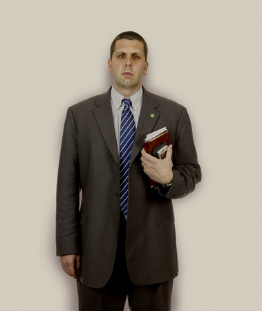
His large, digital images, invite a close examination of the 'Afrikaner Tribe' - the series 'Young Afrikaner - a Self Portrait' dominating the last wall of the exhibition. Taken out of context and with no titles I wonder if the viewer would know what this series of photographs was representing? However they do have a disturbing feel to them, reminiscent of anthropological images of Africans and Jews, almost dehumanising the subjects. Again, there is that direct gaze which makes you look closely, wondering who these almost perfect, advertising modelesque (have I just made that word up?) people are. You wonder how they fit into this exhibition of mainly black faces.
This is probably what they, themselves wonder. They are products of a changing society, born into different pre-democracy world, and trying to find their place within it.
His work has been likened to that of August Sander, but they reminded me more of Rineke Dijkstra. Sander was cataloguing people by type, which admittedly Van Wyk is, but Dijkstra photographed people on the cusp of change, which this group obviously is.
Impressed by the scale, production and beautiful portraiture I enjoyed looking at these images, but am not sure that without the back story I would have read them correctly? Or is it ok to make up your own fictions with this set :o)
Nontsikelelo 'Lolo' Veleko
Born in 1977 Lolo Veleko is based in Johannesburg and is fascinated by 'the inventive dress style and confidence of South Africa's 'born free' generation.' Another photographer from the Market Photo Workshop where she is now a project manager/co-coordinator.
The images in Beauty is in the Eye of the Beholder (pigment prints on cotton rag) capture young people experimenting with colour and fashion, carefully constructing a 'look', framed against their urban backgrounds. Her photographs seem to be a mix of different genres such as street fashion, landscape and portraiture in environment.
Another series which I have mixed feeling about. The portrayal or bright young urban things certainly flies in the face of most of the imagery I associate with photographs coming out of Africa.Whilst I love the fact she has gone out into the streets and photographed young people as and when she finds them, providing a record of the change in fashion and attitude of the younger generation born after apartheid, I find her actual photographs a bit too much like snap shots. She seems to be concentrating on the clothes more than the people, with the lighting casting dark shadows on their faces, obscuring their eyes and occasionally other features. Also she prefers to have her subjects dead centre feet planted firmly on the floor as if standing at ease,very few of them adopt any other pose, which becomes more apparent when you view the whole series. These, more than Van Wyk, reminded me of Sander with a typological approach.
Graeme Williams
Graeme Williams was born in Cape Town in 1961; another photographer who worked for Reuters and Afrapix covering the transition to ANC rule. After the 1994 elections he had a change of heart over 'hard photojornalism' and decided 'OK I’m going to stop that completely'.
For me, Williams seemed to have embraced a fresh, different approach to documentary photography in Africa more than most. His series The Edge of Town is loosely framed and very much along the lines of Joel Meyerowitz' earlier street photography, where he deliberately chose to not have a main focal point. He cites Antonin Kratochvil http://www.antoninkratochvil.com/and Paolo Pellegrin as two of his influences.The first thing that strikes you about these images are how vibrant they are and how discordant the elements can appear. He admits it was a challenge to capture the untimacy he wanted without intruding into people's personal space.
With this series he wanted to show that ten years after democracy 'There were both signs of change and lack of change and it remained a society demarcated by race, wealth and a divisive history.'
Not wishing to photograph the same place twice he travelled to over 100 different towns and townships mainly photographing the poorer groups in South Africa. He gives two reasons for this, firstly a case of accessibility than choice; the upper and middle classes being locked away behind high walls and security guards as demonstrated in the series by Mikhael Subotsky. Williams stated 'The lower income groups live more openly and are thus more accessible to strangers. I was always constantly amazed by how welcoming and open my subjects were to me'. Secondly 'I believe that the only true measure of long-lasting change within South Africa will be the degree to which we can effectively improve the lives of the country's poor and thereby reduce the disparities in wealth, education and power.'
Starting the project in black and white Williams felt it was not working and switched to colour. I think this was the right decision. He set out to make his viewers slightly unsure of what was happening in each image, just as he felt unsure of the changes in South Africa. I think he managed to capture that really well.
Conclusion
I think I'll write the conclusion after reviewing the exhibition for the second time on the study day ;o) I reserve the right to add to the above or completely change my mind lololol :o)
references
Artists [n/d] David Goldblatt [online] Goodman Gallery Website. Available from: http://www.goodman-gallery.com/artists/davidgoldblatt [Accessed 4 June 2011]
Artists [n/d] Nontsikelelo Veleko [online]Afronova Gallery Website Available from: http://www.afronova.com/Nontsikelelo-Lolo-Veleko.html [Accessed 7 June 2011]
Bieber, J. (2011) jodi beiber [online] Jodi Bieber Website. Available from: http://www.jodibieber.com/index.php?pageID=17&navLay=3 [Accessed 2 June 2011]
Casper, J. (2008) Documentary in a new context [online] Lens Culture Website. Available from: http://www.lensculture.com/tillim.html [Accessed 7 June 2011]
Coetzee, C (2011) Figures and fiction; contemporary South AFrican photograpy various artists at Victoria and Albert Museum. [online] Art Throb Website Available from: http://www.artthrob.co.za/Reviews/2011/04/Carli-Coetzee-reviews-Figures-_and_-Fictions-Contemporary-South-African-Photography-by-Various-Artists-at-Victoria-and-Albert-Museum-(V_and_A).aspx [Accessed 7 June 2011]
Colberg, J. (2009) A conversation with Mikael Subotsky [online] Conscientious Extended Website. Available from: http://jmcolberg.com/weblog/extended/archives/a_conversation_with_mikhael_subotzky/
[Accessed 6 June 2011]
Derbyshire, J. (2011) Rainbows of the inner city [online] New Statesman Website. Available from : http://www.newstatesman.com/photography/2011/03/south-africa-johannesburg-city
[Accessed 5 June 2011]
Exhibitions/New Photography 2008 (2008) Mikhael Subotsky [online] Museum of Modern Art Website. Available from: http://www.moma.org/interactives/exhibitions/2008/newphotography/mikhael.html
[Accessed 6 June 2011]
Hirsch, C. (2008) Artist:Guy Tillim [online] a.magazine Website. Available from: http://interviews.amagazine.org/?p=121 [Accessed 7 June 2011]
Hugo, P. [n/d] Pieter Hugo [online] Peter Hugo Website. Available from: http://www.pieterhugo.com/
[Accessed 4 June 2011]
Jeppie, S. (2008) On intention and method [online] Art South Africa Website. Available from:
http://www.artsouthafrica.com/?article=691 [Accessed 2 June 2011]
Jacobs, K. (2009) Hasan and Husain Essop [online] Art Throb Website. Available from:
http://www.artthrob.co.za/09apr/artbio.html [Accessed 2 June 2011]
MacGarry, M.(2005) Jo Ractliffe [online] Art South Africa Website. Available from: http://www.artsouthafrica.com/?article=225 [Accessed 6 June 2011]
O'Toole, S (2008) Jo Ractliffe [online] Frieze Magazine Website. Available from: http://www.frieze.com/issue/article/jo_ractliffe/ [Accessed 6 June 2011]
Photographers [n/d] Jo Ractliffe [online] South African Journal of Photography Website. Available from: http://saphotojournal.co.za/index.php?option=com_content&view=article&id=236:jo-ractliffe&catid=27:photographers-profiles&Itemid=88 [Accessed 6 June 2011]
William, G. [n/d] Graeme Willliams [online] Graeme Williams Website. Available from http://graemewilliams.co.za/web/ [Accessed 7 June 2011]
general research
http://www.terrykurgan.com/about.htm
http://www.marketphotoworkshop.co.za/
http://www.vam.ac.uk/content/exhibitions/figures-fictions/about/
V&A Figures & Fictions Contemporary South African Photography Sponsored by Standard Bank Exhibition Leaflet
 |
| Postcards, leaflet and initial jottings from the exhibition stuck in my learning log |