Saturday, 9 July 2011

Figures and Fictions Take Two

I'm glad I had the opportunity to see this exhibition twice. There was definitely not enough time in just one visit to look at and take in all there was to take in about the images or the artists. I was interested to see if my ideas would alter with a second viewing. To be honest I don't think they did. The images I had liked/been impressed with, I admired still. The images that had left me cold, still did. The only one I think that I could read a bit better was Jo Ractliffe, but I still am of the opinion I would have liked her images better in colour, especially the Portuguese tiles.

The opening image, which I didn't write up about first time around, is a large and stunning portrait by Pieter Hugo. From the outset it challenges pre-conceived ideas about South Africa; the white are rich, the black are poor and that the races do not mix.

Pieter and Maryna Vermeulen with Timana Phosiwa 2006 Pieter Hugo

At first glance it appears to be a normal photograph of a family type group. Then you start to examine and question it, with no caption beyond the names you are allowed to make your own fictions with regards to the image, their relationship and the parallels drawn with other ideas, the association with 'Christ'  like Madonna and Child pose.

Gradually you notice the bare floor, the ragged but clean clothes of the adults, the woman has no footwear, the sofa is an old car seat. Both adults are 'damaged' the scab on the side of the womans face we are told by the curator, is a melanoma, the man has a prosthetic leg, you draw parallels with them being damaged with South Africa being a damaged country.

So who is the well fed, smartly dressed child? Have they adopted him? Do they have a child who entered a mixed race relationship and this is their grandchild? More questions. The answer is that the couple are poor and cannot afford to buy their own house or land. They rent a rundown room from the child's father in Blikkiesdorp. The child's father is a petty ex convict and the woman acts as a nanny and cares for the boy.

I found this image a great way to open the exhibition, it contains the figures that can allow you to draw your own conclusions and make up your own fictions. Now that apartheid is no longer a topic to be photographed there is a void to be filled, different stories to tell and different approaches to be taken. This exhibition goes a long way to showing how South African Photographers are going about filling that void and seeking new ways of looking at their country, where the set ideas of race and power are no longer there. Having said that I still felt the same frustration second time round that I wanted to see more images from some the series shown, especially those of Pieter Hugo and Mikhael Subotzky.

Going back to Jo Ractliffe I could start to see more detail in her work and draw more information from her photographs but she wasn't a favourite.

I still had mixed feelings about Lolo Veleko, loving the striking clothes but not sure of the poses, Terry Kurgan's park photographers still came across as mundane portraits and nothing more, despite Jose trying to tell me otherwise ;o)

Likewise Clive loved Berni Searle and her different approach and metaphors, Gareth listened intently to me trying to tell Clive what I "got" from her series and swore I was making it up...had to admit that I was but Clive had asked me to think of something I got from her imagery so I did ;o)

Serious debate also took place and when asked what had I got from this exhibition I could honestly say several things; the fact that there are many approaches to looking at things, you can use colour for documentary, most of the work on display used ambient lighting, you can mix images of slightly differing subject (ie people or no people for example David Goldblatt's Tradesmen mixes photographs of just adverts signs with those  of the tradesmen themselves) within the same series and that digital manipulation is being recognised as legitimate photography which can be displayed alongside other work in a "serious" exhibition.

I had drawn up some sheets which were along the guidelines given further along in PwDP with regards to analysing photographs, this has helped me come to the conclusion that you don't always have enough information either in the captions or within the images themselves to know if you have pinned down an exact meaning, or know for sure what the indended use was for, but that doesn't always matter as long as you can take something away from the photograph!

Once again a very worthwhile trip out and I look forward to the next.

http://www.vam.ac.uk/content/exhibitions/figures-fictions/about/

Examining things you sometimes find the darker side

Sadly my local area hit the news for the wrong reasons. When things happen locally, in areas where you walk and shop it is always a shock, as well as a tragedy for those involved. The difference of 2 days.....it is so hard to believe that the exact same spot where I was taking photographs (after forgetting my memory card) was the scene of a murder 48 hours later.

Art Photography Course The Constructed Image

We started by asking the question Why do art photographers feel they have to construct an image? Some of the answers were control of the subject, control over light, pondering or commenting on life through images. The amount of construction varied from artist/photographer to artist/photographer. We examined and discussed imaged from Jeff Wall, Gregory Crewdson, Sam Taylor-Wood, Erwin Olaf, Simen Johan, Nick Waplington and Sandy Skoglund.

We were also given a very interesting handout which was from the bjp online with regards to constructed images.

http://www.bjp-online.com/british-journal-of-photography/feature/1936947/paper-rock-scissors

The constructed image usually applies to scenes or objects which are deliberately set up for the camera, but more recently this has also applied to digitally constructed and manipulated images. The two names which immediately spring to mind are Jeff Wall, due to his set up images dealing with observation, and Cindy Sherman because of her staged self-portraits. The article quotes Olivier Richon, head of photography at the RCA says, stating that he thinks students are thinking more towards this style of photography and ' aspire towards the gallery' because 'In the gallery you can do what you want – it’s a white page'.

Read more: http://www.bjp-online.com/british-journal-of-photography/feature/1936947/paper-rock-scissors#ixzz1TX0rxyax

New photographers highlighted were Danny Treacy, Noemie Goudal, Julia Curtin, Julie Cockburn, Victoria Jenkins and Peter Ainsworth all new names which I shall have to do further research on but for the moment here are a few of their images and weblinks.

Danny Treacy


Grey Area
http://www.noemiegoudal.com/

Les Amants (Cascade)

http://www.juliacurtin.com/

Migratory Mexican field worker's home on the edge of a frozen pea field. Imperial Valley,                      California.


Left: Crystal 2 | 2010 | Altered found photograph
Right: Crystal 1 | 2009 | Altered found photograph

Experiment 5 (Hydromancy)

http://www.peterainsworth.co.uk/

A series of activities completed in edge spaces, Leeds, 2008

Most of these new artists seem to deal with physically constructing an installation and photographing them rather like Thomas Demand, which just adds to the confusion of is photography art or just a way of recording art, and making the 3D become 2D, you lose the ability to walk around the art piece, therefore giving it an element of mystique, make you wonder what it is like 'on the other side'?

I quite like the idea of photography being used as an art form, to create surreal imagery, possibly to enhance documentary and therefore may try to incorporate it into my final portfolio, bearing this is mind I have looked further into the work of the Essop twins which I shall write up in more detail in a separate post.

Jeff Wall

Jeff Wall a Canadian artist, is well known for his large back lit images which are elaborate productions involving cast and crew and digital post production. He apparently was inspired to use light boxes after seeing  illuminated adverts.

An interview with him can be found here http://www.telegraph.co.uk/culture/art/3669616/Jeff-Wall-Conjuring-something-out-of-nothing.html

It was interesting to read that he isn't concerned about what his images mean stating 'I'm aware that the subjects I choose do have meaning," he says, "but over the years I've found that understanding these meanings is less important for me. My burning issue is how to make the next picture good.'

A ventriloquist at a birthday party in October 1947 1990
Transparency in lightbox 2290 x 3520 mm
Collection of the artist. Courtesy Marian Goodman Gallery, New York
Cinematographic photograph
© The artist

Looking at his images of rooms am wondering if there is anyway I could make my rooms have a surreal touch and photograph them? I don't know what for but could be fun?

Gregory Crewdson

Gregory Crewdson, born in Brooklyn, New York, in 1962,  and he creates what he calls 'frozen moments'. He does this is the manner almost of film making using a large crew to shoot and then develop the images during post-production. Meticulous planning goes into the production of each image, especially with the lighting. In some cases he introduces extra lighting and effects such as artificial rain or dry ice.

Gregory Crewdson
Untitled from the series 'Beneath the Roses'
2004
Although I find his images captivating and the lighting effects he uses enhance the images due to the huge production crew involved it does seem to me that he is more a 'director' than a photographer? Does give you something to think about if you wanted to construct images for any reason.

Sam Taylor-Wood

Sam Taylor-Wood was born in England in 1967 and is a filmmaker, photographer and visual artist. Amongst her many bodies of work and installations she created a series of self portraits where she was suspended in harnesses, digital manipulation was undertaken to remove all trace of the harness and the chair has no shadow.

Bram Stokers Chair
This is the form of construction which I find I am more attracted having a go at myself, not the suspending part, but the digital manipulation to enhance an image without overly altering the subject and the use of minimal props.


Erwin Olaf

Erwin Olaf was born in 1959 in the Netherlands. Using a mix of photojournalism and studio photography he documents social issues in what I think is a really clever manner. You double take, as the images are very stylized and commercial in appearance, you then notice the underlying theme.

Royal Blood Di 1997
Not sure I like the whole commercial feel but the idea of creating a contrast this way is a fascinating concept, not sure I'd use it in this way but again his work shows that contrast is a way of making an image work.

Simen Johan

Simen Johan was born in 1973 in Norway and his work explores our interest in fantasy, some of which are quite dark and disturbing. Working with both film and digital manipulation he combines 100's of negatives to create his images.


Not quite what to say about his work, I like it, possibly dark but lots of it makes me laugh, maybe I have a dark twisted side? Clever the way a lot of his images have the same direction of light, small errors in lighting or depth of field can make an image appear too fake, even when you know it is...maybe that doesn't make sense written down but I know what I mean....


Nick Waplington

Nick Waplington is a British photographer who has more recently been exploring the ideas of reality within photography by working with constructed and manipulated images. He uses a large format camera and then digital manipulates these to create his final images.


Bethnal Green Road2004
Roebling Hall


I quite like the idea of taking several images of the same place then merging them together. It helps to show the diversity of the people who frequent that space at some point in time, but without producing a series of shots would not be able to show it. The manipulation is subtle and it isn't an 'untruth' as such. Am coming round to the idea more and more that this could be something I could adapt. Again the light direction seems to be the same or has been manipulated to appear so.

Sandy Skoglund

Sandy Skoglund was born in Massachusetts in 1946 and creates various tableaux of conceptual art. She learnt about photography because she wanted to document them. Her works are noted for her inclusion of an overwhelming amount of one object and either bright, contrasting colours or a monochromatic colour scheme.

Revenge of
the Goldfish
1981

Radioactive Cats - 1980

Fox Games
1989

Although not traditional 'straight' photography these images help re-inforce how important colour can be when composing an image. I really like this work, who knows it's influence may creep in at a later stage in the course. Especially when I have to look at creating a book cover.....

Research

http://www.bjp-online.com/british-journal-of-photography/feature/1936947/paper-rock-scissors#ixzz1TX0rxyax
http://www.whitecube.com/artists/wall/
http://www.telegraph.co.uk/culture/art/3669616/Jeff-Wall-Conjuring-something-out-of-nothing.html

Homework Week Five

As this was our final week we did not have to complete this task, but I decided to combine the ideas thrown up with a project from the original PwDP using many images to construct an obvious montage.(Cubism and mosaics) I have to admit that I did get bored putting it together, also realised that I hadn't taken enough images of the sky so the end result has a flat edge which could be manipulated further had I felt I wanted to continue....lazy I know but it may get completed or altered at some stage.....It was a good experiment into different techniques that can be used to present an image and to be meticulous when shooting the individual shots with which to construct the final montage.


I also experimented with subtle addition, using the ideas gleaned from looking at Nick Waplington's Bethnal Green Road image  and the bodies of work Fast Food and Halaal Art by the Essop twins. Very subtly they merge images together to recreate scenes which are not that far removed from the truth.

Original shot no processing

Two shots combined and colour corrected


Shots taken within seconds of each other but make for a more interesting image when combined using layers and layer masks, I felt the bus balanced the image with the reds being a complementary colour to the green.

Art Photography Course Documentary

Week four saw us examining the documentary impulse within art photography. The photographers we examined were Stephen Shore (again)William Eggleston, Stephen Gill, Hans van der Meer, Paul Seawright, Alec Soth,  Mitch Epstein and Helen Levitt.

William Eggleston

Not sure where to begin on Eggleston, again such an iconic photographer who can really be credited with bringing colour photography to the forefront of documentary photography. His use of colour and the everyday as his subject was very controversial.

one of many interviews with him can be read here

http://www.wmagazine.com/artdesign/2008/11/william_eggleston?currentPage=1

A fair few of his images have also be used for album covers, I found this blog entry about it

http://blakeandrews.blogspot.com/2009/07/william-egglestons-album-cover-guide.html

Tricycle, Memphis, 1969-71

Untitled (plate 7 from the series 'Fourteen Pictures'), 1980

Untitled (plate 11 from the series 'Troubled Waters'), 1980
When I was first introduced to Eggleston's work about three years ago I did wonder what on earth? I really couldn't see what all the fuss was about and what made his images such a great influence. Now I have researched and read more I realise what a turning point the use of colour was. With some of his images I still wonder ok why? Like the red ceiling one, but the subtle use of tonailty in the green scene above I can appreciate, ok it's just a livingroom but it captures a style, a fashion and the colours work well together. He captures the everyday, sometimes I think shots are bland but maybe I am still learning about him, or maybe some of them are and no-one likes to point it out?

Stephen Gill

Born in Bristol but now living in London Stephen Gill started his own publishing company to ensure he had total control over how his photographs are seen.

An interview with him can be read here

http://www.telegraph.co.uk/culture/photography/7813330/Photographer-Stephen-Gill-the-devil-in-the-detail.html

He has concentrated on taking images in and around Hackney. His latest series Outside In has a very novel approach, he literally scooped up rubbish he found in Brighton and dropped inside the chamber of his camera, the randomness of where the items then fell, created the resulting images.

An article on Lensculture explains

http://www.lensculture.com/gill_outsidein.html


I really like this idea and the effects, maybe you could kind of adapt it by putting your 'findings' in a glass and shooting randomly to gain a similar surprise result, because I don't fancy putting water and rubbish inside my camera.......but a good way to document the litter problems we face.

More information and images can be found here http://www.stephengill.co.uk/portfolio/news on his website.

Whilst finding myself oddly drawn to his images I don't think it is an approach I would use. His photographs are blurry, out of kilter, yet seem to sum up the places he captures despite this.

Hans van der Meer

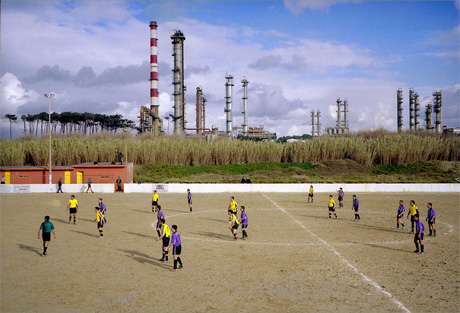
Van der Meer is a Dutch photographer who has combined sports photography and documentary together with a different take on the subject. (A new name to me) Instead of focusing on the premier leagues he has turned his attention to amateur and lower league teams and the basic stadiums in which they play. He does not zoom in on the play or players, but concentrates more in showing the environment as a whole.

The whole series European Fields can be found on his website http://www.hansvandermeer.nl/


Warley, England

Perafita, Portugal

Celerina, Switzlerland

I love his use of depth of field, the wide field of view and the small appearance of the people making the backdrops appear more impressive.


Paul Seawright

Paul Seawright, born in Belfast, is another photographer who is new to me, but then I haven't really looked that much into documentary photographers as yet. He has produced many bodies of work and documents things both home and abroad. He photographs people, landscapes and architecture. His portfolios can be found on his website. http://www.paulseawright.com/

One of his most recent bodies of work was a commission from the Imperial War Museum to cover events in the Afghan war.


His images have been described as exploring 'malevalent landscapes.' Not sure we have any of those locally, but I suppose some alley ways or the edges of local woods could be viewed in this way. Not sure I'd want to photograph that at the moment though, but it is an interesting concept, local areas we find a bit creepy or scary for no real reason.

Alec Soth

Alec Soth (pronounced Both) is an American photographer, and yet again somebody new to me. I don't think I have come across his work either. An interview with him can be found here

http://toomuchchocolate.org/?p=1067

He has some interesting comments about how he used to produce his work for himself, but now when thinking about selling himself and having to consider an audience you lost the 'purity of intention'. They also discuss how work can be read differently from its intention, how his book Sleeping by the Mississippi is viewed in Europe as a social commentary but is wasn't meant to be. Soth is also brutally honest about accepting editorial work that he shouldn't have and describes one job as a 'nightmare.' Too tight a deadline, with equipment he was unfamiliar with. working with traumatised chimps (ones that had been released from scientific research) who he couldn't get close to. A good lesson to us all to know our limitations and not get attracted by money.


He doesn't seem to have a set style, maybe as I haven't looked at enough of his work, but I found a lot of his comments insightful.

Mitch Epstein

Mitch Epstein was a student of Garry Winogrand, who introduced him to the colour work of William Eggleston. One of his bodies of work concentrated on what he knew, and was very personal to him, Family Business documented the demise of his fathers businesses, retail furniture and low-rent real estate.

American Power was an exploration of American energy production sites.

Epstein has produced many bodies of work from around the globe his work can be seen on his website
http://mitchepstein.net/index.html

Lichtenberg, Berlin 2008

BP Carson Refinery, California 2007

Newton Street Row Houses 2000
from Family Business
The juxtaposition of the elephants against the built up area I found really amusing. He seems to use conventional jules of diagonals, repeat patterns, frames within frames and contrast really well.

 
Helen Levitt

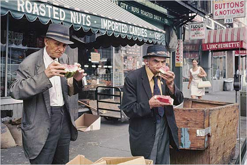
Helen Levitt born in 1913 took many photographs on the street of New York during the 1930's and 40's but in the 60's started to use colour. In 1959 she received a Guggenheim grant to explore her family territory but a burglar broke in and stole all of her colour transparencies. :o(

New York, circa 1940, © Helen Levitt.

New York, circa 1940, © Helen Levitt.

New York, circa 1959-60, © Helen Levitt.

New York, circa 1971-early 1990s, © Helen Levitt.

New York, circa 1971-early 1990s, © Helen Levitt.
One of the things you cannot help but notice in her images is the humour. Not a name I knew before which I hope to address as the images I have found so far are an intriguing history of street/documentary photography.

Research

http://www.vam.ac.uk/vastatic/microsites/photography/photographer.php?photographerid=ph020&row=0
http://www.wmagazine.com/artdesign/2008/11/william_eggleston?currentPage=1
http://blakeandrews.blogspot.com/2009/07/william-egglestons-album-cover-guide.html
http://www.telegraph.co.uk/culture/photography/7813330/Photographer-Stephen-Gill-the-devil-in-the-detail.html
http://www.lensculture.com/gill_outsidein.html
http://www.stephengill.co.uk/portfolio/news
http://www.hansvandermeer.nl/
http://www.paulseawright.com/
http://toomuchchocolate.org/?p=1067
http://mitchepstein.net/index.html
http://www.lensculture.com/levitt.html


Homework Week Four

Our assignment was to create one image that you consider questions the world as an art image from a documentary perspective. Out of all the photographers work examined I still felt that Stephen Shore's resonated more with me therefore looked to include street furniture and the cables cutting across the sky, as with Shore I also hope to capture some of the local residents.


Taken in my local neighbourhood on a grey summer day, I used to exposures show the grey skies but lighten the foreground.
I combined looking for images to complete this homework with gathering images for my assignment one.


I wondered if the road sign would make for an interesting final shot, again trying a low viewpoint I sat in the pavement waiting for other elements to come into play, the woman on her mobile phone was quite an interesting element but I didn't think the image was balanced. Likewise the green van provided contrasting colours but there was not enough movement within the image.


The church hall grabbed my attention as it is a place where the community gathers, another image I felt would show traces of people, it also fitted my criteria of containing signs, the pre-school school helped show the generations, I took a series of shots with different people passing by to edit them once home.


The sign for East Wickham Farm also caught my eye due to the grafitti, a sign of people on a sign, it also gave me the opportunity to shoot from a slightly different perspective as the fence is about 6 foot tall and the sign a few feet taller, meaning I had to shoot upwards.


This was supposed to be a shot of a small pet cemetery but due to fences,plants and other objects getting in my way I couldn't get a better shot, but then did it show traces of people? I guess it showed the affection they have for their pets, but it didn't work so that aspect didn't have to be thought about.


Woodland Farm Trust, this helps illustrate the contrast to be found within the locality, the traffic cones add to the countryside/urban aspect but I felt this image again had no movement or any other interest to it.


 This was an accident, hit the button while moving my camera......


Trying to show the unique side of Welling in someways is difficult as in so many ways it isn't! It is a typical London suburb, however it does have the odd unique element, the inner city farm being one of them. Shooting a few different aspects of the farm and its signs I hoped that I would be happy with one of them to include in my final set.


Walking back to where I parked my car I spotted the Welcome to Welling sign and thought this might make a good introductory shot, the weather was again unpredictable, with the cloud cover coming and going and playing havoc with the light. On reviewing them at home I determined to go back and try again.


My car was parked in one of the local pubs which, a Bexley London Borough sign is right outside so tried to capture a shot which had the Bexley sign, the pub sign but also incorporated people/vehicles. Again possible for location that would need reshooting.