Having used Thomas Struth and Candida Hofer as influences, both photographing historical architecture, their large interiors and using tripods and digital cameras I didn't note any of this down. This has now been amended within my feedback post here http://janfairburnoca.blogspot.co.uk/2013/08/assignment-three-feedback.html
I also completed much research not noted , slaps wrists, but this has also been updated. See,I do the work but then don't prove it....
I think you can see the influences of both within some of my shots, however I did want to try and take a few more without people in, even though they were taken deliberately with them to give an idea of perspective and scale. Bearing this is mind I attended another open day, getting there at the very end so most people had already left. Decision was made to become a friend of Crossness, which gives you access time outside of open days, as I think it will be a brilliant place to document as the improvements and alterations are gradually made.


These were the images I chose from the shoot as being first selects, I then had to decided if they would integrate into my original layout. Whilst I thought some of them were better images I wasn't sure if they would help tell the narrative or were too similar to shots already included. So for better or for worse I have decided to replace this image ........................................................with this.......


This was one of the harder choices to make. The reasons for the decision though are as follows:
- it is more in keeping with having no people in the shot
- it gives a better idea of the space and scale of the building
- it contains a lot of detail the more you look at it, the vents in the floors, the open iron work upper floor, the colourful screens in the distance, columns, stairs and the restoration work as an ongoing process
- you can see the contrast between the old and the new tantalisingly peeking out in the distance
- although I was really pleased with the long exposure effect of the original I am not convinced it is something you would find within a magazine article
- the different lighting conditions on the final shoot gave a colder feel and I think it contrasts well against the larger image it is placed against on the spread, warmer tones full of people, colder tones for an empty industrial space.
reasons for keeping the original of personally liking it, well that isn't good enough when thinking about a clients needs, it is the only shot I have showing an image from a high perspective, it does effectively show the ornate screens but then some of the other images I have also show the decorative paint work. Therefore it was a done deal.
then I decided to replace this

with this
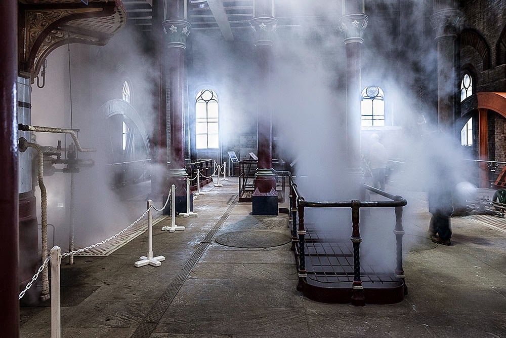
At first I had anticipated re-shooting the original shot without people but sadly on the day this was impossible as the Trust had set up huge 6ft tall visitor information boards across the space, Proving you have to be flexible in this business! Although I loved the symmetry of the columns and the contrast you can see between the new and the old, the blurry people are too distracting. I thought this at the time but didn't have that many shots to choose from when completing the original assignment. However the bonus of attending the open day at the closing stages was that I got to see them venting the steam from the engines, other images show the columns and the ironwork but none have the movement of the steam and eerie spectral atmosphere it provided. This is was Crossness is all about, the steam engines, so as part of a narrative it had to be used.
Looking at the other shots I don't think any of them should be replaced, I think I have a better mix of people/non people shots, including them to show perspective and the heritage site as a magnet for interested tourists and other photographers documenting this historical building. I did however decide that the large image on the final spread would change to it's original colour. I think the brown sepia tones give it as much of a historical feel as does the black and white and it means it is in keeping with the rest of the article.
 |
| PS spread with gridlines and showing text/images groups |
So my final spreads look like this


Before altering the final images I did quickly print off some A3 prints at work, not a photographic printer with a calibrated monitor so the colours and brightness are all totally awry but it gave me an idea of how the layout worked and I was happy with it in print.
Conclusion
I welcomed the positive constructive criticisms and questions raised. They made me look again at my work and consider how I could alter it to improve the final assignment. Hopefully I have addressed each issue, and justified my decisions where changes were made or not. Attending the last open day ensured I could obtain some different images which still told the narrative of the place. I am pleased with the final result and you have to stop tweaking bits eventually.....