So here are some more of the explorations shots I have been taking in and around my area...some are just random, wondering what would they be, others were picking up on the visual theme of physical signs which tell the residents and those passing through about the neighbourhood. After taking pictures of the stables, and noting the other signs appearing in my images I started looking to include them as a linking theme. Paul Graham's Troubled Land series has a linking visual theme of the political signs in Northern Ireland. I've looked quite a bit at his work and wondered how it could influence mine. But signs aren't enough so am thinking I need to incorporate something else to make the images work, the urban/greenery theme is a possibility.
Far too dark...I know in some of Grahams stuff, Shimmer of Possibilites has dark images but they have also other points of interest like the contrasting lights in the background....this one of mine is just naff ;o)
Roadside Vendor Paul Graham from A Shimmer of Possibilities
Fun shots after the thunderstorm and a blocked drain.......
One of the local primary school's had the usual signs outside asking for vouchers, advertising the local superstore, along with the usual 'No Parking' sign. This image was a possibility for inclusion but I dismissed it after a while because I thought a school a bit of an obvious choice, however it did also spark the idea that while including signs I would like to see if I could include the different generations within my images too.
While musing on signs I continued to revisit places, shoot different scenes, examining anything and nothing, seeing where it went. I got quite frustrated when it seemingly went nowhere.......and the clouds were still there and the rain still fell..............
Revisiting some signs that were spotted before and trying new angles, also looking at new ideas..........
Back to the cemetery, the same sign a different place, but I felt I wanted to include more of the gravestones.
A missing cat sign, they spring up on posts from time to time. Quite sad really, but I thought an ideal trace of the people inhabiting the area, I wasn't very keen on the background though....
Same missing cat sign, I preferred this location so made a mental note to return. Shooting different signs and noting where they were meant I could review my images and could go back and reshoot to improve them.
While driving to work one day I noticed a sign shop which has recently closed down, I thought this would possibly work as a subject, a closed sign, in a sign shop, another visual link of signs. I also noted the tekephone cables crossing the sky and thought when I took some images I'd try to compose the shots similar to those of Stephen Shore. He photographed the small shopping strips so if the pictures worked they would have that double link. After work I rushed to get my camera. On parking my car in a side road I saw the bus shelter complete with grafitti, another sign and trace of people, I stood for a while waiting for various vehicles to come past, or hopefully pedestrians. Unfortunately due to the weather not many people were about on foot. Then I moved to shoot the sign shop, once more hoping to capture passing cars or people.Yet again the grey ominous clouds came overhead; it started to rain again! Some of my images when I reviewed them, had rain spots on the lens therefore were discarded before I even considered any other aspect.
Having taken a variety of shots decided that some of the images would benefit from the inclusion of people. Especially if I want to expand upon the idea of including the generations. So this is where I am now...decided on signs............and trying to make it work within the course brief and my own artistic ideas... I started off using f5.6 but decided I wanted to have more of the background detail, I found I was drawn to th eimages of others that had greater depth of field, and gradually increased to f16. I was happy with this although f16 does present problems of a slow shutter speed in low lighting conditions. This was a compromise I was prepared to make as I still have not mastered properly the technique of hyperfocal distance. Where shots did include movement I wanted to demonstrate by having the pedestrians/vehicles slightly out of focus again using SHore as a reference as some of the vehicles in his pictures are a little unsharp, Some images were rather underexposed but hoped this could be corrected in processing if necessary.
With the poor weather it was becoming very apparent that I couldn't wait/hope for better weather and that maybe another concept could be to show that images do not always have to be shot on brilliant sunny days, that in life a little rain does fall (or a lot as is now)the grey skies a reflection on the mood of the people due to the current economic climate.
Note*
An issue that transpired with using my 18-55mm lens at 18mm and f16 was chromatic aberration which needed to be processed in ACR. Due to some sloppy processing this was not always completed sufficiently therefore I need to make sure I check for this as it is a basic error.
A lot of thinking has been going on, test shots, trying out ideas to see if they 'fit', discarding them because they didn't, discarding some because although the idea did fit, the images were not matching the expectation....then add to the mix the recent mixed weather...oh it has been fun ;o)
5th of June was our local cottage hospice fun day, I thought I might capture some interesting ideas then, but once again the clouds and the rain came, people went home and it was just too miserable to capture anything that was useful. Here are some of the shots taken, I wasn't pleased with some of them. Although I quite liked the one of the Dr Pepper bottle.
From the Hans Van Der Meer set The Landscape of Lower League
Thinking along the lines of Hans Van Der Meer and his lower league teams I shot this of local boys playing football.
I used a low vantage point rather than a high one, the empty bottle is the main point of interest, showing the environment and how people just don't think before they dump rubbish. The boys appear small and insignificant but are important to the scene adding movement and corresponding colours. Could they have left the litter? Although not done intentionally this reminded me of the small figures in the landscapes by John Davies
Similar train of thought but with cricketers in the background.
Again I was experimenting with a low view point and wide angle to try and create a more dynamic image, the subject large in the foreground with the people in the background appearing small and insignificant, but there nonetheless. The exposure wasn't fantastic the weather still showing no signs of improvement, they were however useful in trying to work through ideas. The cricketers being in white made the image feel bland and drab, nor did they provide movement. No real contrast or other questions to ask, a non image really!
I liked Paul Grahams idea of taking nothing in particular, just time passing. The St Johns with their arms folded are waiting for an accident (or not as the case maybe) The boys passing time playing football, people wandering aimlessly.....
The co-ordinating colours grabbed my eye, and the movement of the girl throwing balls at the Tin Can side stall.....
Cropped a bit too tight on the woman's head and I could have done with being a few more inches round to capture her writing, I wasn't fussed I chopped the man's head off, he wasn't needed ;o)
On Sunday I got caught in not one but two thunder storms! Ok, I know they had been forecast but the weather men don't always get it right, besides I dressed for the eventuality and hid between the showers!
I like being given a brief to work from, it helps to focus your mind, but then when the brief is quite loose that focus can wander. Reading a link recently posted to the flickr forum was quite interesting as it was echoing a few thoughts I had had recently, especially after completing some of the Art Photography sessions recently.
The author speaks of being handed a blank sheet of paper and being told 'draw something' and what do we draw upon? Memories and accepted images. Memories and who we are affects what we shoot and how we shoot it. Someone who hates bananas will capture the offending fruit in a totally different way to how a banana lover would! Reading the article further there is a hypothetical project set about photographing 'my environment' and how easy is it to regurgitate the local ASDA car park.... do I get Brownie points that my set so far has none of that?
This was one of the issues I was encountering with my first assignment, how easy it would be to be lazy, to rapidly fire off shots of the local shops, a swing in the park, some litter in the gutter. (I know I have been there, seen that, done that bit as part of my Art Photography course) I wanted to take something that was slightly different but how?
What does make my locality different when so much of it is semi-detached suburbia, much like any other outer London Borough? I also wanted there to be some kind of theme running through the images, not only would it be of my area but with a link to each image. Initially I was going down the route of Metamorphosis, of how some places or objects have a dual purpose, or were going through an obvious change but am struggling to find enough images that fit this personal remit. Some of the subjects I found failed in the interest stakes, or at the photogenic stage. Not sure if that was their failing, mine, or a bit of both! Rain curtailing experimentation does not help!
When we went to see Paul Graham, and when reviewing other artists, it is interesting to note that it can be one image that suddenly provides a 'way in'. The theme on which to hang the rest of series. Once that is established you can look about for circumstances that echo your ideas, build upon it, and hopefully there will be enough material out there to end with a finished portfolio that not only meets the brief but also your own artistic intention.
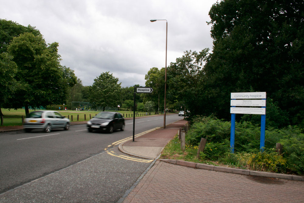
Oddly, just a short way from the local high street we have a stables. This being quite a unique thing to find in an urban setting, made its way onto my hit list. After experimenting with angles and composition I ended up taking a shot of their sign for 'MANURE BRING A BAG' this then became my key; everyday, everywhere, wherever we go, whatever we do there are signs telling what to do, where to go, showing us the way, offering us services. These signs, though some are generic, will be unique to a specific location, even a road sign telling you the mileage will alter a mile down the road. So........if all goes according to plan My Local Neighbourhood will have a sub-heading of 'Signs of Life' or something similar.......or maybe not if it all goes awry....Possibly at this point also another thought which hadn't made it to the front of my brain yet was the contrast between green spaces and urban.
Another low viewpoint, after taking images of the horses, I saw the sign and shot that, thought it could be something slightly unusual although I may return to improve the composition slightly.
Same day out, yes it rained again, I explored the bus shelter with reflections and grafitti, interesting but I thought too messy. Stephen Shore loved his posts n poles ;o)
I've been out on over 10 different days, sometimes 2/3 quick jaunts out on those days to different areas. All still within 5 minutes drive or a quick walk from my front door. Sometimes I knew the vague area I wanted to capture and saw an opportunity once there, others I saw in passing and made a mental note to return. Some of these ideas worked, some didn't some worked as images but not on the right track to be included in the final set. I do have some images that I could include but am still groping about and seeing if anything else turns up trumps to replace a current selected shot. Although I know the area switches from leafy green to housing estate really quickly it has been fascinating to capture the diversity.
This week we were discussing what makes a Landscape 'art' rather than 'artistic' or just 'decorative'. Some of that must be subjective...and while reading John Berger's essay 'Understanding a Photograph' who argues that photography isn't art at all made it an interesting chat. Been pointed in the direction of this article online which I may find interesting but am all 'read out' at the moment so will look later. SEESAW MAGAZINE: What's Next? - Aaron Schuman & Charlotte Cotton
The artists we examined were Edward Steichen, Ansel Adams, Edward Weston, Robert Adams, Stephen Shore, Joel Sternfeld, Edward Burtynsky,Simon Norfolk, John Davies, Joe Cornish, and Charlie Waite.
Edward Steichen
Edward Steichen was born in Luxembourg on 27th March, 1879 and moved to the US when he was 3. At the age of fifteen Steichen began a lithography apprenticeship with the American Fine Art Company in Milwaukee. He also attended lectures by Richard Lorenz and Robert Schode at Milwaukee's Arts Students League. He took up photography in 1895 but also continued to paint. Apparently he burnt all his canvases in 1922! Steichen was renowned as an artist, fashion photographer, curator, writer, and technical innovator.
In 1899 some of Steichen's photographs were exhibited at the Second Philadelphia Salon.In 1904 he began to experiment with colour photography.
During the First World War Steichen became commander of the photographic division of the American Expeditionary Forces. This gave him the opportunity to become involved with aerial photography. Witnessing the horrors of the Western Front, changed his artistic direction moving from impressionistic photography to concentrate on realism. He is quoted as stating: "I am no longer concerned with photography as an art form. I believe it is potentially the best medium for explaining man to himself and his fellow man."
In his early work he used a style of photography known as Pictorialism. The Pictorialists believed that 'the aesthetic promise of photography lay in an emulation of painting.' Pictorialist techniques included a jiggled tripod, a lens bathed in glycerin, or other darkroom tricks which produced 'painterly soft-focus effects.'
After the war Steichen became director of Photography at the Museum of Modern Art. This included the organization in 1955 of what became the most popular exhibition in the history of photography, The Family of Man.After the war Steichen became director of Photography at the Museum of Modern Art. This included the organization in 1955 of what became the most popular exhibition in the history of photography, The Family of Man.
This a photography he said represented the 'culmination of his career'. Consisting of over 503 photos taken by 273 photographers from 68 countries which were selected from nearly 2 million pictures submitted by both famous and unknown photographers. The images gave 'a striking snapshot of the human experience which lingers on birth, love, and joy, but also touches war, privation, illness and death.' Steichen's intention was to visually prove man's shared experience and photography's role in its documentation.
The exhibition later travelled in several versions to 38 countries and was viewed by over 9 million people. In 2003 the Family of Man photographic collection was added to UNESCO’s Memory of the World Register in recognition of its historical value. It is a much cited and referenced collection of images.Steichen died in West Redding, Connecticut, on 25th March, 1973.
There is so much to be said about Ansel Adams that I wouldn't know where to start and by looking at carious websites feel I would merely be quoting things that have been said 1000 times. Suffice it to say he was an amazing landscape and still life photographer. His images are breathtaking in both black and white and colour; his work has been tremendously influential. I think the best thing I can do is link to this site which tells you quite a lot about the man and his images. http://www.anseladams.com/ He uses lighting, exposure, depth of field and textures to show every last detail.
this is part 1 of five which can be found if you follow this link.
El Capitan (Winter)
Rose and Driftwood
Although Adams produced brilliant images, without a large format camera and the stunning areas he was photographing I don't think I'll be attempting to copy his work.
Edward Weston
Another very famous photographer, you can find his biography here http://www.edward-weston.com/edward_weston_biography.htm His images of nudes, high key portraits, natural forms and landscapes influence many of today's photographers. I knew of his work before I knew of him, if that makes sense. He also took images of everyday items which he thought showed shape and form. His technical use of lighting to bring out detail is amazing.
One of the comments I picked up on from this documentary is that Weston thought that his photographs should reflect what he thinks about the world around him. This is true, if you think the world is dark and scary you capture that specific area, if you think it is full of beautiful shape and form this is what you will look for. Practise and experience tells him where to look and how to look, and the importance of knowing the limitations of his equipment. More than showing his audience what something is he also wants to convey how it makes you feel.
Robert Adams is an American photographer born 1937. A name I have heard of but don't really know his work so I was quite interested to be introduced to it. Apparently he is best known for his photographs which investigates urban sprawl in the American West. Various blurb informs me that 'in much of his work, Adams balances a sense of hope for Nature's persistence against despair with man's destruction of what was, until relatively recently, wilderness'.
His body of work titled Summer Nights was taken along the eastern edge of the Rocky Mountains in Colorado, and as the title intimates many of the photographs were shot at night in summer; some at twilight others where electric lights are balanced against the darkening skies.
Robert Adams’s work examines the modern post-war landscape and in 1975 his work was included in an exhibition titled New Topographics: Photographs of Man-Altered Landscape, at the International Museum of Photography, Rochester, New York. The exhibition is considered to be the turning point for a new generation of landscape photographers, providing a new approach to landscape photography; that of social landscape. His photographs are described as showing discreet traces of man’s presence so it could be useful to examine some of his work closely when considering Assignment One.
Looking at this series I like his use of light, it provides an excellent contrast to the encroaching night. Although I have no intention at the moment to shoot in black and white or in the evening it is worth looking at some the work he shot in greater detail, due to it being where he lived trying to note what made him choose the scenes he did etc.
Stephen Shore
Stephen Shore is an American photographer who was born in 1947. He was shooting colour at about the same time as William Eggleston and like Eggleston, Shore 'has become known as a pioneer of colour photography' with three of his pictures acquired by the Museum of Modern Art, New York when he was only 14. Mini biog can be found here http://billcharles.com/catalog/stephen_shore/1/.
Watching the interview of him on the Tate website was interesting, he tells how he initially used a handheld camera but the then went on the road with a larger-format camera; primarily a 4x5 followed a year later by a 8 x 10. He became fascinated by 'small town America' and the beginning of shopping strips and fast food restaurants.The later images were published together in 1982 as Uncommon Places.
He talks about getting to grips with the limitations of his equipment, which something that I too need to do, and how using tripods and large format altered his photographs to a more studied images. His scene selection was also something that I noted, he wanted things that were typical but also special. This rang a chord with how I want to approach Assignment One. I liked the way in his earlier work he photographed the ordinary, included street furniture, allowing them to dissect the frame. His use of very subtle motion blur to indicate movement is effective (makes mental note of these compositional elements)
I think there is much of Shores work that I could interpret in mine, buildings, street furniture, the everyday, and motion blur.
Joel Sternfeld
Joel Sternfeld was born in New York in 1944 and is another photographer who began to work in colour in the early 1970's. He also uses a large format camera which allows him to capture a lot of detail, and like the other photographers who use this equipment it makes the images appear more formal.Initially though he started by shooting street photography with small and medium format cameras.
Sternfeld, like Walker Evans before him, has consistently recorded and explored the American people producing one of his best known projects American Prospects in 1987.
One of the things that I notices almost straight away with Sternfeld's work is how he uses the tones within his images, they are all very similar with no jarring contrasts.
McLean, Virginia Artist: Sternfeld, Joel
Date: December 1978
Exhausted Renegade Elephant, Woodland, Washington
Artist: Sternfeld, Joel Date: June 1979
Canyon County, California
Artist: Sternfeld, Joel Date: 1983
I really like the way Joel Sternfeld uses colours and tonality and if possibly would love to try and incorporate some of this in my portfolio.
Edward Burtynsky
To quote what is in the short biography on his website, Burtynsky's work has the predominant theme of 'nature transoformed through industry.' He likes to identify places that are 'rich in detail and scale yet open in their meaning.' Burtynsky examines the conflict of us wanting a better life yet knowing what we produce effects the environment in a negative way. He descibes his images as 'reflecting pools of our time' and seek to both attract and repulse.
Homesteads #32View from Highway 8, British Columbia 1985
Mines #17Lornex Open Pit Copper Mine. Highland Valley, British Columbia 1985
Railcuts #3C.N. Track, Fraser River, British Columbia 1985
Nickel Tailings No. 6,
Sudbury, Ontario 1995
Rock of Ages # 1,
Active Section, E.L. Smith Quarry, Barre, Vermont, 1991
Burtynsky uses a very high vantage point to include all of the, the scale is huge and the people when included look like ants. It is difficult to immediately tell when his images are of so he successfully makes their meaning open. He cleverly makes the 'ugly' look beautiful which gives the audience a mixed feeling when they view his images and his intention to both attract and repulse, in my view is achieved. Most of the photographers I have looked at so far have used the same viewpoint and focal length when producing their sets, it adds to the coherence. Something else to consider when working on mine.
Simon Norfolk
While looking up Simon Norfolk online I came across an article on Lensculture which I thought very insightful. It explains how Norfolk has set about to capture war and effects without going for the obvious. In fact, like Burtynsky, he tries to make his images beautiful so the viewer questions what it is they are seeing and there is a certain juxtaposition in the majority of them, contrasts of the horror of war balanced against the beauty of nature or the colourful everyday.
Former teahouse in a park next to the Afghan Exhibition of Economic and Social Achievements in the Shah Shahid district of Kabul. Balloons were illegal under the Taliban, but now balloon-sellers are common on the streets of Kabul providing cheap treats for children.
Part of the fire fighting system of the supercomputer that designs France’s nuclear weapons
The Granizal district of Medellin, Colombia, first populated by refugees (IDPs) 30 years ago. The football pitch was previously the camp’s refuse patch and can’t be built on due to the danger of subsidence.
Norfolk's work has been descibed as having a 'forensic approach' which in its literal sense refers to forensic imaging or crime scene photography (being the art of producing an accurate reproduction of a crime scene) providing evidence of what was there. So by photographing what remains after a tragic event I guess it can be described as such. I am guessing in the art sense it also means extracting detail from an image/scene, close examination and adding information to a story. Something else for me to research at a later stage.
Not sure how I feel about what she is trying to do, and I think I'd probably have been one of the people who wouldn't have let her in my house.
Back to thinking about forensic approaches, could possibly include that thinking in line with Ass 1. Am thinking along the lines of remains, as we have some historical ruins in the vicinity.
John Davies
John Davies is a British photographer who has, amongst other subjects, exmines and researches the English industrial landscape. Like Burtynsky the landscapes are vast and full of detail, the people mere specks. He produces work, using film, in both black and white and colour. When composing his work he likes 'to find interesting aspects round the edges.'
Runcorn Bridges Cheshire 1986
Ladbroke Grove London 1985
Bowling Greens Stockport 1988
Victoria Promenade Widnes 1986
Again I am noticing the same viewpoint and focal lengths being used, I love his idea of having important details in the background as well as the foreground, and the inclusion of people although they appear insignificant, are important as they add perspective to the scene.
Joe Cornish
Joe Cornish was born in Exeter in 1958 and is a landscape photographer who now works freelance for the National Trust. According to his biography from 1986 to 1995 he was 'responsible for the majority of the photography in more than thirty travel books.' Interesting to note that he changed direction with the size of camera he used moving from 35mm and 6x6 film, to a Horseman SW 612 wide-angle (don't know what one of those is so something else to check) and then onto 5x4. Willing to embrace digital technology he says he equipment now also includes...
..... four digital formats. They include a digital compact (Panasonic Lumix LX-3); so-called 4/3rds (Olympus E3); 'FX' or full frame 35mm digital (Nikon D-700); and finally, medium format digital (Phase One P-45+). The resolution of the first three formats is really very similar, around 10 or 12 megapixels, while medium format is in a different league of 39mp. The Phase One is usually deployed on the amazing Linhof Techno field camera, helping me preserve my link with large format discipline. Why so many formats? Because the variety is stimulating, and each camera has its own particular strengths (and weaknesses). Who knows, I may eventually concentrate on medium format exclusively; it is the natural successor to LF film. Yet as I write this I am enjoying the challenges that variety offers, and still feel in the early days of my photographic 're-learning curve'.
Cornish also has started to use a 10x8 to produce black and white, and I find it surprising that he is using such a variety when so many others stick to just one or two.
Budle Misty Sunset
Dunraven Bay
Northumberland Beach
Sandy Mouth
Having looked at his work I do think the colours and setting are beautiful. I can see why they become calendars and coasters, however whereas a few months back these may have been the kind of landscape images I would have aspired to take, I now feel myself drawn more to the social landscapes of Burtynsky and John Davies. I find them more interesting, containing so much detail, more narrative and more relevant to me.
I'd love to be able to produce images like Cornish, if on holiday capture the colours and the feelings of tranquility and escapism, but as a body of work I don't think it would be my 'thing' although I am still trying to work out exactly what my 'thing' is.
Now I really like Charlie Waite, there is something about his images that make them feel more contemporary and not quite sure why that is as yet. I love the way he uses the light, the contrast between bright scene and dark clouds, how the light shows the shape of the land and the texture of it all. His colours are vibrant yet never clash, all the elements come together balanced and as he says 'interlock so beautifully.' Even when the scenes are not so colourful he use of tonality is there. Although the majority of his work is in colour he also shoots black and white.The way he uses light reminds me of the style of Edward Weston.
St Quirico D'Orcia Tuscany Italy
Loch Indaal, Islay, Scotland
The Manger, Uffington, Wiltshire, England
Roverto, Veneto, Italy
Unfortunately there isn't anywhere in Welling that provides such stunning views, but if the light is in my favour it will interesting to see if there are any scenes where the light can help produce texture and form.
References
hmmmmmmm running out of time to reference this section as I have the others....will have to come back at a later point perhaps.....
This exercise in looking at these photographers has proved very useful, it has given my some ideas of what I might look for in when shooting images for my portfolio, make use of the available light, shooting when the sun is low to create shadows, look to include as much detail as possible, try to include juxtaposition and contrast.
Homework Week Three
To create one photographic image printed A4, subjective and personal. We had to create an image that could be defined as landscape, but it must consider the impact of the social and human on the landscape.
The images was NOT to be ARAT... (another rock or another tree) it is to explore the landscape from the perspective of how we interpret it as lived experience.
Erm or as a death experience?
Ok it's a bit chocolate box like but it is local to me, it's a view, it shows the impact man has on the environment. Taking into consideration some of the techniques I have read about I tried to find a high vantage point from which to shoot this image, to provide a more panoramic scene. In the distance you can see Canary Wharf which I thought would add that touch of interest as used by John Davies among many. Unfortunately the higher points did not afford the most interesting views therefore I had to change my initial approach. Changing my vantage point also meant I could no longer see Canary Wharf which was a bit disappointing, however I did feel that other elements included in the shot still provided interest.
Using my lens at the wide end has provided the field of view that I was after; the images in the background appearing to be more distance and the proportion in size to those in the foreground is quite dramatic. It also enabled me to capture a large area of ground and sky. One of the disadvantages to this however, is that some of the detail I wanted to be seen (such as the housing estate between the trees) is no longer visible.
Other possible disadvantages of using the wide end is softer focus at the edges and vignetting. I've never noticed vignetting although occasionally my images do seem soft. I put this down to not having sharpening in camera and sharpening in processing seems to rectify the issue. However I must experiment to find out if there is a certain point at which I encounter this.
I was pleased with the tonality of this image, the way the tree frames the subject and that the centre of the frame is rather empty which forces you to look around. The tree helps lead your eye around the frame.