Saturday, 30 July 2011
Video Test.............
Well that seems to have worked.....I've known since setting my blog up that you could embed videos but never got round to doing so. I have previously just pasted links but having seen this video on Eileen's Blog I thought I really needed to give it a go. I think Bill Brandt's images really do capture a moment in time and convey the emotions of the people really well so it's great to actually hear the man himself talk about them.
What struck me about him personally was how quietly spken and modest he is. When discussing his images he put a lot of them down to luck, a policeman turning a corner, standing under a light and looking up at him, a young girl coming into frame and dancing while he photographed a group of children. On one of his images about the parlour maids he said 'anyone could have taken that photograph, anyone.'
He says that at the time of taking his photographs he didn't really think about them as becoming part of history, but acknowledges now that they have become more interesting because they captured a disappearing world. Sometimes I think I forget that when shooting the everyday, thinking that maybe it isn't interesting enough, that it is too ordinary. A good lesson to learn and something to consider, in even a few weeks time the snapshots we take can have caught the history of a place. A few years go I took images of my local high street which has now changed an awful lot.
Monday, 25 July 2011
Reflecting on all that has gone before....
After analysing photographs and essays and researching and thinking I didn't really need the coursework to say "before you move on.....spend some time reflecting...." My brain was fried and I so couldn't have read more if I had wanted too! ;o) Even thinking about what I had learnt/developed through the last section and last lot of exercises was put on the back burner while I vegged for a weekend watching the weather and TV...neither of which were terribly impressive but hey ho.
Some normal, routine, life chores to do this week, cut the grass, service my car, had an advisory on the brakes when it was MOT'd so that to do too....various parts of my house could do with painting but I feel no inspiration to pick up a brush....anyone out there bored and fancy decorating my hallway? No didn't think so..... Oh, and I need to chase insurers re my car being written off ...they still haven't asked for my log book and the people sorting out my £200 out of pocket expenses chased me last week as they said they "hadn't got a response" from their last letter...I rang them and said errrrrrrrrrrm you did but I had rung to say the amount was wrong and you were going to send another letter....You haven't? "Oh so I see" came the reply, "I'll make sure that's a priority...." one week later......
Therefore with all those things to remember and sort out I haven't as yet put my thinking head back on as to how I am going to use the skills gained to improve my photographic practice, promote or disseminate my work or extend my knowledge of photography in general.......well that's not quite true, I think I know, but having a basic idea and turning those fleeting ideas into coherent thought for my blog haven't happened yet. But they will...and I shall update this post then :o)
Update...
Well it's going to start off as my update, not sure if I will complete it but as random first thoughts grab me here goes...
Assignment One which was all about my neighbourhood, has shown me new things and reminded me why other ideas or practices should be followed and practised. In the 'heat of the moment' of trying to snap at something (yes I know in general we shouldn't snap at anything, we should always think about it) I forget to alter a shutter speed or white balance and things don't always turn out as hoped.
Even with editing, the skills I brushed up on or learnt in DPP I have to remember to use, or the best order in which to process ...and spend ages on an image to think damn I should have done X first....
Close observation of my local area...hopefully I do notice more of the finer detail around me, there must be so many different ways to view a place, looking at the work of others shows this. Even within Hackney Stephen Gill produced different bodies of work so show the area....
Hackney Wick for all its blurry, quirky angles of Hackney Market could be said to be 'straight' photography. Snaps of the area.
With Hackney Flowers Gill collected flowers, seeds, berries and objects from Hackney, that were then pressed in his studio and re-photographed alongside his own photographs building up multi-layered images extracted from the area.
Buried is also very creative, but for me pushing it a bit too far..images of Hackney were then buried, later dug up and a book made of the resulting decay. Can see the artistic intention, shows how the area affects everything, how things decay, that there is a connection between places/environment and change...but hmmmmm not sure how I feel about it as 'photography'. More of an Art installation but then we get back to the argument of photography versus art and I don't want to go there for 5 mins ;o)
Having looked at Hackney Flowers the Outside In series I think I'd really like to experiment with the multi layered approach. Maybe this is something I could try next time.
Jim Goldberg used this approach with his open see project, both photographers have been described as incorporating 'ephemera' in their work, and I like the idea. When looking at the constructed image Julie Cockburn also uses old photographs to create new work. This idea of creating new work from old, or producing constructed imagery seems to be gaining recognition or is it that I am just noticing it more? Something to investigate...
Communication...it's all well and good thinking about taking on board new ideas, or doing the actual research I must make sure I include my links, say how the work makes me feel, express an opinion or how I think I may take inspiration from what I have read. Or even say what I don't like. This is tricky for me as sometimes I don't 'feel' or if I do am not sure how to express it. 'I like that' needs a because, but sometimes I can't explain why...something else to practice. Also along these lines I have revamped some of my earlier entries to show my thought processes, putting in some of the notes I had in my physical learning log; some of these are a bit brief still but am hoping to fill in the blanks under separate cover. It still may not be perfect as some written retrospectively, but will be an improvement (I hope) and will serve to show a learning curve between Assignment One and Assignment Two.
Promoting and disseminating......
Vocabulary.....deep joy, the language of photography and captions. I haven't really got that far into the course yet but it's coming...thinking about promoting and captioning etc.... When you go to an exhibition and you read some of the captions, the blurb, describe them as you will......I absolutely loathe some of the airy fairy way things are put. I loved the Shadow Catchers exhibition but the text, even in the book drove me nuts! 'Alchemical transformations....transcending decorative effects...harnessing the ephemeral.....poetic dialogues.....enigmatic traces.......poetic paradox.....' As much a some of the descriptive irritates beyond belief, I can appreciate that the phrases do sum the work up beautifully, but conversely other times I look and think 'Its a circle on a black background......'
But I will have to change my mindset, it maybe an idea to go through my Shadow Catchers book again and make myself a list of these phrases, I may need them. I could have a side line..publish a book 'Jan's Book of Stock Blurb phrases.' ;o) Seriously though I need to look at more images and seriously look at how things are captioned and why in more depth.....How you 'sell' your images is so affected by how you describe them, it points the audience in the right direction. Makes sure they spot the parts you want them to spot, read the message you are trying to convey.
Important to makes sure the image stand up to scrutiny too..... see it's easier to say what you should do, but producing it is more difficult.
On analysing images, I can see why it is important when producing photographs to think about the intended use as well as the intended purpose. On examining bodies of work,going back Hackney Flowers, Gill has produced a body of work which shows his neighbourhood, but as some of the background photographs are found and not of the area it wouldn't work as Social Documentary, nor as Editorial, maybe as commercial if you wanted a different approach to selling seeds......
When you apply for a new job you revamp your CV depending on what skills are required, I think when trying to disseminate images you can apply the same kind of thing. What is the requirement, what aspect within my image shall I choose to highlight for that specific purpose? Images can be read in different ways, exploit that :o)
When writing about the photograph and the essay I tried as much as possible to write my analysis in the style of an essay, making my points brief, relevant and factual. I had to accept that there was some information I couldn't research/find. Or with Berger, some of his statements about art, whilst taking them on board, I didn't feel qualified enough to argue or comment on a specific point , no matter what else I read or how many times I read the offending paragraph. It did help to write, go away, read , change it, go away, come back again...but after a while you have to say enough... and move on.
Throughout both analyses I made sure the points I was making could be referenced and noted at the bottom the references used. Sitting there with my printed notes about Harvard referencing but with some of the online info am still not positive I'm always doing it spot on......I am aware that there is a difference between referencing and bibliography and as I go through the course will try to differentiate between the two on my postings, but at the moment what I am trying to practice is applying the format without having to look it up every time ;o)
Back to Assignment one...I can see that should have experimented more with different view points times of day, focal length etc but I was really hampered by the poor weather and time due to having my car written off, excuses possibly but also reasons. So have to admit to sticking with what I knew rather than trying out different techniques and focal lengths. I did practice including people; a while ago I realised how much time I had wasted in the past waiting for them to 'get out of my way I want to take a photograph!' especially when on holiday. I then came to realise how important including people can be, they anchor a place, they give it perspective, a time, a feeling, an insight of the place they inhabit. Assignment one emphasises this point, you don't always have to have people, but showing signs of them help tell the story.
Workflow...organisation...so important :o) My main processing workflow, not such an issue you do it wrong, scrap it and start again, but always try to make sure you have enough cards and battery life, if you're organised even impromptu shoots shouldn't have issues...although I dare say we have all done it and will no doubt still do it ;o) Luckily I was only 5 mins away from home when I messed up! My daughter has just started to do some modelling/posing (not serious/serious modelling) for photographic students and some professionals who wish practise portraits or change direction with what they are currently doing. Last week she attended a shoot when the chaps battery ran out, he went upstairs to get his spare and charger, only to discover he had left both behind at a wedding venue 2 days previously......
Promoting my work.....well so far most of my images have been produced without promotion in mind, I take what interests me, images for the coursework, never with serious promotion behind it, but I guess even personal projects can have a worth elsewhere. How you approach your subject if you do wish to promote it, will impact on how you will capture that image, depending on the market you are aiming for. Bearing that in mind will no doubt impact quite a bit on artistic and processing decisions. You'd have to research the market, make contacts and discover if there is a niche for your ideas. Understanding the vocabulary required to caption your images and how to pitch your photographs depending on where they are to appear is also important. People wishing to visit a beauty spot want to know what is there, not that it was shot at ISO 400 ;o) I shall try to really think about the techniques used with each image so that they can be described in both technical and poetic terms.....
The more images you take, the more practise you get, the more at home you are with your equipment. I need to experiment more and find out just what I can achieve with what I have. I want the technical to become more second nature so I can start looking more closely at what I am capturing not so much how to achieve it.
To extend my knowledge of photography I have been reading many online articles, following the blogs of other photographers and picking up on their ideas, which can help you choose to follow certain paths or not.
I intend to continue along these lines, have just subscribed to the bjp as I think it always carries interesting articles and follows/discusses current trends. I shall carry on dipping into the theory books I have. Roland Barthes, Susan Sontag and now the Liz Wells The Photography Reader. I say dip in as it can be a bit mind blowing. Sometimes I think it is possible to over do the reading, there are many opposing ideas out there and as a learner you can confuse yourself, or get too hooked into 'well they said THIS so it must be right!' There has to be a balance between reading enough to learn and assimilate information and calling it quits before you have information overload :o)
Going to photographic exhibitions, either as part of a group or as an individual I think is a brilliant exercise, not only do you get to examine the work of other photographers up close, rather than in a book or on screen, but also you can see how a body of work is put together, what links it, what makes it successful. So far I found it useful in opening up creative ideas which I could apply to my own work. You aren't always provided with the information about how an image was achieved but this can form the basis of experimentation, 'I liked the blur in the background if I do 'X' will it achieve the same result?'
The 10 point check list for analysis is something I shall printout every time when visiting an exhibition, to remind me how I should be looking at an image. This will help me understand more about the photograph, the photographer and to decide if the image is successful in its aims rather than 'do I like this.' I can take the knowledge of what makes an image work for a specific purpose and then apply that to my own.
The Internet is a great source of information, but care must be taken as to the reliability of some sites and my local library isn't toooooo bad with photography books. As and when I identify with an individual photographer whose work I am interested in, I'll get books from the library which show their work, look for their bodies of work online, see how they develop their ideas. Reading reviews, articles and interviews with them also gives an insight to their ways of working. YouTube has a brilliant selection of interviews. I'm currently halfway through watching The Genius of Photography and I am going to investigate BBC iplayer as I've missed some of the British Masters and The Impressionists series.
I applied this way of thinking to Paul Graham, I saw his exhibition at the Whitechapel Gallery, I visited his http://www.paulgrahamarchive.com/ looked at his archive, read several interviews Paul Graham: | The Observer , Paul Graham, dancing with life - British Journal of Photography he gave and watched a video.....
Paul Graham from white tube on Vimeo.
On analysing his images I saw the visual links of signs, juxtaposition, contrasts, analagies to myths or other stories/books, all vehicles used to make his images work. I tried to do the same with assignment one. My intention is to continue analysing work, get as much information as I can from the images presented to me
so I can attempt to replicate the techniques.
Which all goes to show no matter what I have learnt so far there is so much more out there to read, explore, discover and apply! Where was that darkened room?
Wednesday, 20 July 2011
Reading about Photography Exercise: Analyse an essay
Analysis of Understanding a Photograph - John Berger
Understanding a Photograph – John Berger is an essay written in 1972 which sets out to dispute the idea that photography should be considered art.
Understanding a Photograph – John Berger is an essay written in 1972 which sets out to dispute the idea that photography should be considered art.
His main arguments are:
- Unlike paintings and sculptures, photography has not moved into the realms of being ‘preserved in sacred isolation’ in museums and therefore has not been made mysterious to exclude the masses.
- To have a value as ‘Art,’ art must have a monetary value and is only valuable as property or props which indicate a certain lifestyle.
- Photographs have no value as they are not rare and can be easily reproduced.
- Photography is everyday; the fact everything can be photographed and continually would render it meaningless. The only message a photograph has is that the photographer thought the scene worth capturing.
- Photographs are considered ‘good’ only when properly composed yet this composition is merely an imitation of paintings. True composition cannot happen in photography unless studio shots.
- Photography is a popular medium used mainly for the production of mementos.
- Due to it’s representation of realities photography is merely a weapon which needs to be understood only to enable us to use it politically.
According to Berger (1972) paintings and sculptures as an art form are dying. This he argues, is due to their consideration as property; becoming isolated, available only to the elite. However, in contradiction to this painters and sculptors are still producing bodies of work. Statues are erected in public spaces and not all are shut inside museums to be considered the preserve of the ‘nobility’. With the development of the Internet art is available to a much wider audience.
Aaron Schuman, editor of SeeSaw magazine and Charlotte Cotton, curator and head of the Wallis Annenberg Department of Photography, Los Angeles County Museum of Art, recently discussed the direction photography is taking. Cotton talks about elitism only being an issue when attributed to a ‘high-art version’; if a common understanding, part of a ‘collective culture’, it takes a different form, being ‘self elected elitism rather than the elitism of an establishment.’
Berger’s (1972) stance that photographs have not yet reached the levels of being displayed in museums and considered as ‘property’ is no longer valid. Since 1972 more museums have photographic archives, and specialised museums have opened, for example The Museum of Photographic Arts, The Canadian Museum of Contemporary Photography, National Media Museum and the Museum of Modern Art.
Another argument is that mass production removes value, Berger (1972). Nonetheless the Mona Lisa's monetary value and artistic integrity has not altered despite being reproduced. The same can be said of photographs. In May 2011 Cindy Sherman's "Untitled" (1981) sold at auction for $3,890,500.00. There will be an original, authenticity being one way value is attributed, it is just more difficult to prove. But even so each image has its own unique path to being created. Admittedly a photograph is taken using a mechanical process but there are variables, settings can be altered, light experimented with and artistry applied. Value can also lie in social, cultural and aesthetic worth.
It was Benjamin (1936) who argued that original pieces had an ‘aura’ and that the physical setting, usually within the homes of the ruling elite, made them even more distant from the masses and that reproduction diminished this aura and therefore value. Many of Berger’s arguments are based upon his and Benjamin’s Marxist outlook on how art is perceived/stored or shown to the ruling classes/proletariat. Most of the arguments within Understanding a Photograph echo points raised by Benjamin but this is not referenced.
Berger’s writing style is easy to read, he does not use overly technical jargon or flowery vocabulary, the essay is presented as his opinion with no academic evidence or references being given.
In a similar vein Berger (1972) points out that a photograph is testimony to what someone has deemed worthy of recording. The possibility exists that this event or subject can be photographed continually which he argues would render it meaningless. However each photograph would be individual, taken from an alternative perspective, the audience can read into it their own interpretations, discover diffferent messages therefore enabling it to retain meaning.
In a similar vein Berger (1972) points out that a photograph is testimony to what someone has deemed worthy of recording. The possibility exists that this event or subject can be photographed continually which he argues would render it meaningless. However each photograph would be individual, taken from an alternative perspective, the audience can read into it their own interpretations, discover diffferent messages therefore enabling it to retain meaning.
Berger (1972) points out that photographers mimic the composition of paintings and only images considered as good follow these rules. Paintings follow the Fibonacci ratio, but this ratio occurs in the natural world therefore it can be argued that it is art, in whatever form, imitating life. These rules of composition make an image more pleasing to the eye, easier to read, make them have more impact but art evolves. It was not until the 15th Century that the Florentine architect Fillipo Brunelleshi created the first painting known to make use of linear perspective. Picasso and Matisse tore up the rule book yet again. Why can’t photography do the same?
Since when has ‘art’ merely been produced for the sake of being ‘art’? Photographs, it is true, are used on the whole by people capturing ‘mementos’, family, friends and holidays but they are also used to capture historic events, to convey a precise moment in time, emotions and possibly to deliver a message. The extravagant court portraiture of the Tudor period was used mainly for politics, to show the health and wealth of the nation/monarch or the latest triumph in battle. The fact that it was a popular medium used mainly for producing a political or religious message never detracted from the fact it was ‘art’.
The dawn of the digital age has changed how images can be manipulated and images can be changed to represent many things. It is difficult to argue now that photographs only pin down one moment in time. This is so dependent on the particular style or genre of photography.
As to the use of photography as a weapon? This accusation could be put to many aspects of day to day life. Propaganda rears its ugly head in many forms of art, written or visual.
Having argued against most of Berger’s points I can’t say resolutely that he is wrong in his initial statement that photography should not be considered art. I just don’t think the issues raised to back his arguments have stood the test of time. In a recent article in the British Journal of Photography David Campany, a writer and academic, was asked the question ‘what is the relationship between photography and art?’ He replied, ‘I don’t have a clue anymore.’ This makes me feel better that I too, have reached no solid conclusion.
Any drawing is a drawing, but are all drawings art? All photographs are photographs, but are all photographs art? Returning to the original question, is photography art, to be honest I am not sure. Having been to the Shadow Catchers exhibition, photographic techniques can definitely be said to produce works of art. However, I have also seen photographs exhibited that I have viewed and questioned ‘what makes that art?’ It would appear, as with most works of art, the answer is subjective. As far as I am concerned there is an artistic approach to photography, and, as with any piece of art, it can succeed or fail with its message/ability to stir emotion. I have also reached the conclusion I don't know enough about art to argue against some of the comparisons he makes with regards to paitings versus photographs.
An observation made by Schuman was that maybe photography is pushed as art because ‘it’s scary for institutions to promote a visual medium as something other than ‘Art’.’ Cotton and Schuman spoke in detail of changes in photography and of losing the idea of considering the photographer as an ‘artiste,’ this freedom would allow photography to just ‘be’, that ‘it’s finally come into its own.’ Maybe we should allow photography to stand on its own two feet and just ‘be’.
References and Research
Balcomb, R. (2001) Is photography art?[online] The Scream Online Magazine of Art. Available from: http://thescreamonline.com/essays/essays06-01/rsb_photo_essay.html
[Accessed 19 July 2011]
Benjamin, W. (1936) The work of art in the age of mechanical reproduction [online] Marxist Internet Archive. Available from: http://www.marxists.org/reference/subject/philosophy/works/ge/benjamin.htm
[Accessed 19 July 2011]
Briot, A. (n.d.) Reflections on photography and art. [online] The Luminous Landscape. Available from: http://www.luminous-landscape.com/columns/Reflections-Introduction.shtml[Accessed 19 July 2011]
Cotton, C & Schuman, A. (2011) What's next: Aaron Schuman and Charlotte Cotton: in conversation [online] Seesaw Magazine. Originally published in FOAM:Whats Next?#42 http://www.foam.org/whatsnext Available from: http://seesawmagazine.com/whatsnextpages/whatsnext.html [Accessed 18 July 2011]
Payne,O. (2008) A history of perspective in art [online] Op Art. Available from:
Smyth, D. (2011) Is photography art? [online] 1854 A blog by the Editors of BJP. British Journal of Photography. Available from:
http://www.bjp-online.com/british-journal-of-photography/blog-post/2038062/photography-art
[Accessed 19 July 2011]
Sunday, 17 July 2011
Reading About Photography Exercise: Analyse an essay, initial thoughts.
The essay which I have to analyse is Understanding a Photograph by John Berger which originally appeared in Selected Essays and Articles:The Look of Things, 1972 by John Berger.
John Berger is an influential critic and writer with Marxist views and so I wondered how much of that has coloured his attitude towards the art establishment and photography. The first instruction is to read the essay through twice, once straight off, no stopping, just to absorb the argument and then a second time making pertinent notes.
A three page essay, I must admit to not reading through all in one go....I read about one and a half pages....stopped...had a cup of tea....then returned to finish it. Not that John Berger writes in a higher academic fashion that is difficult to comprehend just that it is an essay full of opinions which I want to fully understand and take in before forming my own opinion, whether pro or anti his...quite difficult to do, read and try to remain impartial just taking in his argument.
Second time round I attacked it with my biro, scribbling things to the side, then with my highlighter pen, it looks quite impressive to the onlooker, but as yet I've got to form my thoughts and points around those jottings, the highlighting was the easy bit ;o)
The third time I used a different colour pen...I don't know how many times I read it althogther but it was lots.
This was all done a few weeks back in between shooting for assignment one. It was then put to one side and now I'm picking it up again to complete the exercise. As said before it isn't hard to read, no unnecessary jargon floating about, I don't feel the need to have my thesaurus or online dictionary to hand as with some, but it still needs careful consideration. Checking my understanding of what he states, do I agree with my previous jottings, thinking about how to form my responses to the questions being asked of me, have I managed to understand it enough to form my own opinion of his writings?
To help me form my own ideas I have done some research, mainly from online articles but also looking at some of the essays in the photography reader by Liz Wells. These essays are in part four: Photography and the postmodern.....I glazed over a bit but I do think there maybe some points in there I could use, so will try again later.
A really useful site I found which gives hints on essay writing here
http://www1.aucegypt.edu/academic/writers/
Only one way to find out if I've read it enough I guess ;o) Onwards and upwards as they say......
 |
| Reading and delving into the mists of Essays ;o) |
 |
| Lots of underlining, highlighting and notes, stuck in my learning log |
 |
| Two of the many articles I downloaded and read relevant points underlined |
Saturday, 16 July 2011
Writing Analytically Exercise: Research and analyse
Exercise: Research and analyse
After analysing my own photograph I had to write an analytical account of a famous image provided in the course materials. I chose Robert Frank, London Street 1951. Researching the background information I had to take care to include only facts and not copy the opinions of any critics. Tricky when you share the same opinion and then have to find a way to re-word it after they have used the best terminology and syntax. Using the analysis checklist my essay can be up to 1000 words. My word count came to about 900, I think I've covered it all and don't want to make things up or pad it out.
Probably done it to death now and over thought too many things, written about 5 draft versions, each time I cut stuff out, add other bits, wonder if the points I have put in are relevant to this one image. Tricky to find info on this one, and once you have read about others or seen it in context with the rest of the work it was then difficult to think about first impressions etc.
Was useful to find this website about writing essays
"How to Write an Essay -- 10 Easy Steps"
I applied some of the ideas, cutting out irrelevant waffle. I have a tendency to link things so they flow and read 'nicely' but then when you look at the sentences they are just waffle...so they went... hope now everything there has a point. The brief does give a 10 point checklist but it can be adapted...hopefully the extra included has pertinent points to make about the image or how Frank works to give an idea of why/how the image was created.
London Street 1951, Robert Frank

Frank, R. London Street,1951, Museum no. Ph.1229-1980 Copyright Victoria and Albert Museum.
Robert Frank was born in Switzerland in 1924. In the early 1950’s Frank travelled round Europe with his 35mm Leica camera, during which time he set out to capture the streets and culture of post-war London. An investigation of the obvious class system, Frank (1958) tells us that Bill Brandt influenced this early work.
London Street, 1951, produced as a silver gelatin print approximately 8x12 in size, is a good example of Frank’s black and white, grainy observation of everyday life. The influence of Bill Brandt’s The English at Home (1936) and his examination of the social classes can clearly be noted. Frank’s images are a cross between the genre of Street and Social Documentary photography.
After analysing my own photograph I had to write an analytical account of a famous image provided in the course materials. I chose Robert Frank, London Street 1951. Researching the background information I had to take care to include only facts and not copy the opinions of any critics. Tricky when you share the same opinion and then have to find a way to re-word it after they have used the best terminology and syntax. Using the analysis checklist my essay can be up to 1000 words. My word count came to about 900, I think I've covered it all and don't want to make things up or pad it out.
Probably done it to death now and over thought too many things, written about 5 draft versions, each time I cut stuff out, add other bits, wonder if the points I have put in are relevant to this one image. Tricky to find info on this one, and once you have read about others or seen it in context with the rest of the work it was then difficult to think about first impressions etc.
Was useful to find this website about writing essays
"How to Write an Essay -- 10 Easy Steps"
I applied some of the ideas, cutting out irrelevant waffle. I have a tendency to link things so they flow and read 'nicely' but then when you look at the sentences they are just waffle...so they went... hope now everything there has a point. The brief does give a 10 point checklist but it can be adapted...hopefully the extra included has pertinent points to make about the image or how Frank works to give an idea of why/how the image was created.
 |
| Reviewing my essay checking points |
London Street 1951, Robert Frank

Frank, R. London Street,1951, Museum no. Ph.1229-1980 Copyright Victoria and Albert Museum.
Robert Frank was born in Switzerland in 1924. In the early 1950’s Frank travelled round Europe with his 35mm Leica camera, during which time he set out to capture the streets and culture of post-war London. An investigation of the obvious class system, Frank (1958) tells us that Bill Brandt influenced this early work.
London Street, 1951, produced as a silver gelatin print approximately 8x12 in size, is a good example of Frank’s black and white, grainy observation of everyday life. The influence of Bill Brandt’s The English at Home (1936) and his examination of the social classes can clearly be noted. Frank’s images are a cross between the genre of Street and Social Documentary photography.
Frank is widely recognised for his series The Americans (1959) but London Street, 1951 was not published in book form until nearly twenty years after it was taken. Robert Frank, The Lines of My Hand, Yugensha, 1972, p. 51
Street photography is unplanned; Frank would walk the streets looking for situations or characters to photograph, reacting instinctively to that which was presented to him. Frank (1958) tells us that ‘My photographs are not planned or composed in advance and I do not anticipate that the onlooker will share my viewpoint.’
There is a proof-sheet in the book London/Wales Scalo, Zurich, 2003, pp. 10-11 which shows he took photographs of the hearse from many different angles, originally shooting from the front before he stepped sideways, capturing the street-cleaner perfectly framed and the young girl running off into the mist, a mixture of skill and luck; timing being an all important factor with street photography.
This simple shot of Belsize Crescent, London, at first glance may seem to have captured nothing of interest, but once you actually look into the photograph there is so more to see. He is quoted as saying ‘When people look at my pictures I want them to feel the way they do when they want to read a line of a poem twice’ (Frank 1958) meaning that you have to read it more than once to understand and appreciate the content.
The first thing that struck me when looking at this image, was it's composition and how instantly recognisable it is as a typical London street.The damp, foggy streets are indicative of typical English weather and the smog that pervaded London during this era. This would have provided a soft diffused light with reduced contrast.
Unfortunately, there does not seem to be sufficient information available to be able to analyse the technical details of this image. Frank used a 35mm Leica with either a 28mm or 35mm lens, but I can't say for certain which he used here. Neither do I know what aperture/shutter speed/film was employed. I could speculate based on the amount of grain, depth of field, angle of view, architectural verticals and the amount of/lack of blur with regards to the running figure. It is a grainy image, quite a wide field of view, the verticals are straight and the little girl is frozen mid step but to say how it was achieved would be pure guesswork.
The image contains tried and tested compositional techniques; when dividing the frame the elements fall neatly into the ‘rule of thirds’ and even better the ‘Fibonacci ratio’ as shown below.
 |
| Figure 1 |
 |
| Figure 2 |
In an interview for swissinfo in 2009, Sarah Greenhough , head of the photography collections at the National Gallery of Art Washington DC, stated ‘Frank always wanted to be recognised by Life magazine. For years Robert Frank's photos were refused by Life and bought by European publications.’ This suggests an intended editorial use.
The row of terraced houses provide a repeat pattern until they tail off into the misty background, the diagonals of the roof tops, road and the wall all assist with leading your eye into the frame. The window/door of the hearse provides frames within frames and the characters supply the human element which help complete the scene. This obvious formality appears to have been lost by the time he completed The Americans (1959) having been influenced by Walker Evans (Papageorge 1981).
Studying the figure of the young girl who has her back to the camera, running away, this is another element taking the viewer into the photograph. The fact that she is running provides movement in what otherwise would be a very still frame. She stands out, the only energetic and vibrant element contained within the photograph; a counterpoint to the stillness and sombreness of the hearse, a sharp contrast to the pale misty background. Being black and white the image conveys the atmosphere of grey, dull, dampness really well, and there are no bright colours to distract you from the smaller detail.
The wet street allows there to be a reflection on the pavement which adds further interest. The eye is then led around the photograph to the coalmen making a delivery, also a typical event in daily London life during this period, and finally down to the street cleaner, beautifully framed by the window of the open hearse door.
Frank (1961) stated:
Black and white are the colors (sic) of photography. To me they symbolize the alternatives of hope and despair to which mankind is forever subjected. Most of my photographs are of people; they are seen simply, as through the eyes of the man in the street.
Frank's intention was to capture post war London and the different social classes. I feel he has been successful. It is a scenario which was being repeated across London being regularly observed by the man in the street. The smog sums up that period in time, the child symbolises hope and the energy of life, the hearse reminding us no matter what we achieve in life we all share the same fate, while the men represent the working classes going about the daily grind.
The image contains definite compositional techniques, movement, human interest, a narrative and a strong sense of time and place.
References and online resources
Bonzom, M. (2009) Seeing America through the lens of Robert Frank [online]. swissinfo.ch Website. Available from: http://www.swissinfo.ch/eng/Home/Archive/Seeing_America_through_the_lens_of_Robert_Frank.html?cid=7210740 [Accessed 1 June 2011]
Christie’s Bid Department (2005) Frank,R. London Street , 1951 [online]. Lot 38/Sale 1502 Christies Website. Available from: http://www.christies.com/LotFinder/lot_details.aspx?intObjectID=4478978 [Accessed 1 June 2011]
Essay Reviews (2010) Robert Frank [online] Worldtrade.com on Art. Available from: http://www.wordtrade.com/arts/robertfrankR.htm [Accessed 1 June 2011]
Frank, R. (1951) London Street, 1951 [Photograph, Gelatin silver print, printed 1979] [online image]. Place Victoria and Albert Museum. Available from: http://www.vam.ac.uk/users/node/5020 [Accessed June 1 2011]
Frank, R. (1958) Robert Frank a statement. (1958) U.S. Camera Annual, p115 [online]. Cited in Readings Robert Frank a statement 1958 Jerome Nevins Website. Available from: http://www.jnevins.com/robertfrankreading.htm [Accessed 1 June 2011]
Conclusion
Due to this the analysis was based more on reading the photograph itself. This was challenging as I could speculate on a lot of elements but these would not be fact.
A very useful exercise in many ways, it has:
- Shown me how photographers influence each other-Brandt influencing Frank
- Indicated how photographers’ work evolves over time-knowing it was Frank’s earlier work
- Emphasised that decisions made influence the shot i.e. time of day, camera/lens choice
- Made me think more carefully about the composition/planning of my own shots, learning what techniques/elements are successful or approaches I visually prefer
- Provided a framework with which I can approach looking at images
- Given me the chance to practice writing a formal analysis/essay
Writing Descriptively Exercise: Write a caption
Exercise: Write a caption - part one
Using the same photograph I had to write a 50-word caption about the subject for a general audience.
Apart from reading through the course module to give me some ideas of how to approach caption writing I did some online research and came across this article by Michael Freeman, which is actually echoed within the course.
How to Write a Professional Photo Caption | Pixiq
It outlines how important captions are to grab the audiences attention and are an 'enticement to read'. You need to think about who you are writing for and ensure your caption encourages them to look more carefully at an image.
When writing the caption think about what the image contains and don't make generalizations. Use the 5 W's: Who, What, Where,When,Why.., and when talking to pupils in school I like to add How to the list, as sometimes that is just as relevant.
What to say is just as important as what not to say, don't spell out the obvious, don't use unnecessary words, don't overload with detail, try to leave some intrigue and watch spelling and grammar. Be accurate, be truthful, be brief and be flexible as different magazines will have a different way of captioning images. It is best to discover the magazine's preference before submitting work. The Online Photographer had some insights about when NOT to use puns or inappropriate captions...The Online Photographer: In Praise of Captions
Bearing all of this is mind I gave it a go......

Danson Park Danson Lake
Exercise: Write a caption - part two
Write a 50-word caption about the photographical elements of the image, as if for a pratical photographic magazine.

Winter dusk in Bexley, the vibrant colours of the sunset reflect in Danson Lake, catching the eye. A mix of planned composition and fortuitous timing, the silhouetted boots add interest whilst forming an implied triangle with the geese. Ripples on the water create texture and a sense of movement.
I had several draft versions of the caption before settling on the above. The example in the module has 'fortuitous' and I was trying to avoid using it too but when you are trying to use the best vocabulary sometimes you have to 'borrow'....it was luck that they swam across and luck that they formed a triangle but I had seen them coming and waited and waited and hoped.....so it was a mix of timing and luck, but fortuitous is a better word than luck, or chance or inadvertent...yes I did get out my thesaurus ;o)
Writing captions is not as easy as it would appear. My approach was to think about the intended audience and write from that perspective. Write what was there, think about the 5'W's and my added H, cut out the unnecessary words, change the order, think about the descriptive words, could they be more dynamic without appearing OTT? The two final captions are totally different, they reflect that the information is aimed at different audiences and I hope they provide honest information relevant to the guidelines of the exercise.
Using the same photograph I had to write a 50-word caption about the subject for a general audience.
Apart from reading through the course module to give me some ideas of how to approach caption writing I did some online research and came across this article by Michael Freeman, which is actually echoed within the course.
How to Write a Professional Photo Caption | Pixiq
It outlines how important captions are to grab the audiences attention and are an 'enticement to read'. You need to think about who you are writing for and ensure your caption encourages them to look more carefully at an image.
When writing the caption think about what the image contains and don't make generalizations. Use the 5 W's: Who, What, Where,When,Why.., and when talking to pupils in school I like to add How to the list, as sometimes that is just as relevant.
What to say is just as important as what not to say, don't spell out the obvious, don't use unnecessary words, don't overload with detail, try to leave some intrigue and watch spelling and grammar. Be accurate, be truthful, be brief and be flexible as different magazines will have a different way of captioning images. It is best to discover the magazine's preference before submitting work. The Online Photographer had some insights about when NOT to use puns or inappropriate captions...The Online Photographer: In Praise of Captions
Bearing all of this is mind I gave it a go......

Write a 50-word caption about the photographical elements of the image, as if for a pratical photographic magazine.

Winter dusk in Bexley, the vibrant colours of the sunset reflect in Danson Lake, catching the eye. A mix of planned composition and fortuitous timing, the silhouetted boots add interest whilst forming an implied triangle with the geese. Ripples on the water create texture and a sense of movement.
I had several draft versions of the caption before settling on the above. The example in the module has 'fortuitous' and I was trying to avoid using it too but when you are trying to use the best vocabulary sometimes you have to 'borrow'....it was luck that they swam across and luck that they formed a triangle but I had seen them coming and waited and waited and hoped.....so it was a mix of timing and luck, but fortuitous is a better word than luck, or chance or inadvertent...yes I did get out my thesaurus ;o)
Writing captions is not as easy as it would appear. My approach was to think about the intended audience and write from that perspective. Write what was there, think about the 5'W's and my added H, cut out the unnecessary words, change the order, think about the descriptive words, could they be more dynamic without appearing OTT? The two final captions are totally different, they reflect that the information is aimed at different audiences and I hope they provide honest information relevant to the guidelines of the exercise.
Writing Descriptively Exercise: Describe a photograph
As explained in the previous post outlining the aims of this section of the course, I had to choose one of my own photographs and describe it, following the timeline of conception to completion. Factual information had to be included about the subject and the decisions taken leading up to the making of the picture.
I decided to describe and examine a photograph which was submitted as part of my DPP final portfolio.

I decided to describe and examine a photograph which was submitted as part of my DPP final portfolio.

Assignment Five for Digital Photographic Practice was the production of a personal project, the scope was broad but I had to be able to fully identify with the topic. The theme -‘A life in my shoes’ the concept - to show places that were significant in my life alongside footwear worn during that precise moment in time. Inspiration was taken from Joy Gregory’s Cinderella Stories, and some Beatles lyrics;
Joy Gregory photographed places that people dream of visiting, familiar landmarks in the cities of faraway countries. She photographed golden 'Cinderella Shoes' at each location in the style of tourists photographs. Rather than show places I aspired to visit the twist was to photograph places where I has been. Opposed to depicting hopes and dreams the images should evoke memories of what had transpired in the past. Hopefully the images would also resonate with the audience.
Danson Park, Bexley, has a 7.8 hectare lake which
There are places I remember
All my life though some have changed
Some forever, not for better
Some have gone and some remain
All these places have their moments
With lovers and friends I still can recall
Some are dead and some are living
In my life I've loved them all
All my life though some have changed
Some forever, not for better
Some have gone and some remain
All these places have their moments
With lovers and friends I still can recall
Some are dead and some are living
In my life I've loved them all
Joy Gregory photographed places that people dream of visiting, familiar landmarks in the cities of faraway countries. She photographed golden 'Cinderella Shoes' at each location in the style of tourists photographs. Rather than show places I aspired to visit the twist was to photograph places where I has been. Opposed to depicting hopes and dreams the images should evoke memories of what had transpired in the past. Hopefully the images would also resonate with the audience.
Danson Park, Bexley, has a 7.8 hectare lake which
Subject and location chosen the style/genre had to be considered. The images within the set were autobiographical so opted for a landscape/documentary approach. Location in selected, the time of day had to be considered, which was a moot point really, as sunset was a required element. The immediate problem to contend with was the unsettled weather; lots of rain clouds equaled no sunset on my many attempts to capture one. Even though there was no sunset I still experimented with positions and viewpoint.
A planned photograph, but open to the positioning and exact location, I had to remember to take the boots with me and a black plastic bin bag to lay/kneel on due to the mud around the waters edge.
The park was visited on several occasions with test shots taken from different sides of the lake and with differing viewpoints. I experimented with the boots being in realistic positions on the ground, 'commercial' style shots balanced in trees and at the waters edge silhouetted against the sky. Fortunately the accessibility of the park made it possible to undertake a number of outings.The silhouetted images provided a more dramatic effect especially when at the waters edge.
The final shot was captured due to remembered advice about looking back. The trek out had so far proved fruitless; cold, windy, really muddy underfoot, with dense cloud cover. Giving up in disgust I trudged back to my car, but in looking back noticed the wind was creating breaks in the cloud, in the distance the breaks were getting bigger. Making my way to the lake as quickly as possible, the boots were set up on the edging, all the time keeping my fingers crossed that they would not fall in. They were positioned to give a clear silhouette against the reflections in the water. Taking out the plastic bag to protect me from the worst of the mud I captured a few frames whilst grovelling on the floor!
Wanting coherence to my portfolio each image within the set was taken with a similar focal length, aperture and low perspective. The low perspective was chosen because the main subject was shoes, and the idea of keeping your feet on the ground, in this particular shot it also enabled the boots to be fully outlined against the water. Wanting a fairly a wide field of view a focal length of 24mm was used. Experimenting with shutter speed, flash and positioning, the final camera settings were F5.6 1/125, ISO 400, @ 24mm which captured the colours of the sunset and the exposure needed to provided the silhouette.
A planned photograph, but open to the positioning and exact location, I had to remember to take the boots with me and a black plastic bin bag to lay/kneel on due to the mud around the waters edge.
The park was visited on several occasions with test shots taken from different sides of the lake and with differing viewpoints. I experimented with the boots being in realistic positions on the ground, 'commercial' style shots balanced in trees and at the waters edge silhouetted against the sky. Fortunately the accessibility of the park made it possible to undertake a number of outings.The silhouetted images provided a more dramatic effect especially when at the waters edge.
 |
| Test Shots |
 |
| Test shots with and without flash |
Wanting coherence to my portfolio each image within the set was taken with a similar focal length, aperture and low perspective. The low perspective was chosen because the main subject was shoes, and the idea of keeping your feet on the ground, in this particular shot it also enabled the boots to be fully outlined against the water. Wanting a fairly a wide field of view a focal length of 24mm was used. Experimenting with shutter speed, flash and positioning, the final camera settings were F5.6 1/125, ISO 400, @ 24mm which captured the colours of the sunset and the exposure needed to provided the silhouette.
What helps to complete this shot is the geese, thinking they were going to be fed, swimming across the lake towards me. In previous test shots I had captured the ducks and had hoped to do the same, but it is a variable you cannot always rely on. Several shots were taken while waiting for the geese to be framed as I had hoped they would be.
Workflow adopted was:

- Download from card using Adobe Bridge save using date and unique file name
- Saved in My Pictures and duplicate to external harddrive
- Open files in Bridge and select using ratings
- Final file opened in RAW
- Adjustments made in RAW to Exposure, blacks.clarity and vibrance

The final image was resized according to my requirements either for web or print.The prints were produced using an Epson R285 printer, Epson ink, and Epson Premium Glossy paper. I chose glossy paper for this project as growing up most of my family snaps were produce on Kodak glossy and it was another link to memories. Using all Epson products, added to monitor calibration, ensured correct colours when printing.
This has proved a useful exercise, showing that the image was thought about and planned it in advance, thinking about the purpose and intended audience, coherence of the portfolio, genre, problems that maybe encountered and ways to solve them. It has made me question choices and ideas, decisions made either in advance or when editing. Not all images are planned in such a way and it has become more apparent that there are areas I need to brush up on, for example understanding more the expected results when using different focal lengths. Also when retrospectively talking about processing I don't always note every decision/ adjustment made, if I do this from now on it can help with taking images in the future. I think I will also look up to see how layers can be put into groups and extend my knowledge of photoshop more especially if I want to play with constructed imagery.
This has proved a useful exercise, showing that the image was thought about and planned it in advance, thinking about the purpose and intended audience, coherence of the portfolio, genre, problems that maybe encountered and ways to solve them. It has made me question choices and ideas, decisions made either in advance or when editing. Not all images are planned in such a way and it has become more apparent that there are areas I need to brush up on, for example understanding more the expected results when using different focal lengths. Also when retrospectively talking about processing I don't always note every decision/ adjustment made, if I do this from now on it can help with taking images in the future. I think I will also look up to see how layers can be put into groups and extend my knowledge of photoshop more especially if I want to play with constructed imagery.
PwDP Part one: Writing about photography overview
Part one: Writing about photography contains three projects and five exercises:
Exercise: Write a caption
Exercise: Research and analyse
Project Writing Descriptively
Due to the nature of photography we tend to become more absorbed in the idea of taking a photograph more in the terms of it practicality and technicality. Occasionally it is more useful to take a step back and evalute the timeline between conception to the final product. In the process of completing my NCFE photography courses it was necessary to write a final synopsis of how, why and when images were taken so am familiar with the concept. Having said that because it is something previously undertaken I appreciate just how difficult it can be, it is easy to get bogged down with the focal length. aperture and exposure etc rather than the ideas, feelings and intention behind the shot. The other problem is for shots whch just 'work' and are happy accidents. Trying to then attribute a backstory is when you can fall into the track of spouting rubbish just for the sake of it...or as a discussion on the weareoca thread summed it up that's also known as 'marketing' ;o)
Exercise: Describe a photograph
Taking one of my own photographs I have to describe fully the timeline of shooting, comencing with the circumstances or background. Using at least 200 words the aim was to be complete and factual informing the reader about the decisions made leading up to the making of the picture.
Exercise: Write a caption
Using the same photograph as in the previous exercise I have to firstly write a 50-word caption about the subject of the photograph for a general audience and secondly write a 50-word caption purely about the photographical elements of my image , as if for a photographic magazine, describing things like the composition and movement within the frame.
Project Writing Analytically
Whatever the reason, for entertainment, pleasure, meeting a brief the underlying theme of this course is that photographs are produced for a purpose. It is important therefore that I can 'read' a photograph, look at them with an analytical eye and be able to ask answer what did the photographer set out to do? How was it attempted? Was it successful?
To begin this process it is recommended that I start by looking at my own images as I would have all the background information about them. Then to assist with the structure of this thought process a handy checklist is provided, things to consider are:
For this exercise I had to choose one of my own images and subject it to this analysis based on the 10 points above writing approximately 500 words. Has this detailed analysis altered my opinion of the chosen photograph?
Exercise: Research and analyse
Given the choice of four iconic photographs Pikes Peak Park, Colorado Springs,Colorado 1970 Robert Adams, London Street 1951 Robert Frank, Shell-shocked Soldier,Hue 1968 Don McCullin and Afghan Girl 1984 Steve McCurry I then had to choose one of the images and perform the same exercise ensuring I stuck to fact rather than opinion and complete the analysis using 1000 words.
Project Reading About Photography
A well planned and thought through essay will be useful and follow a structure which develops an argument and uses good evidence to back it up. An essay may take many forms, be light-hearted or provocative.
It is always useful to read acknowledged essays whether you agree with their stance or not.
Exercise: Analyse an essay
I have been given a copy of John Berger's essay Understanding a Photograph written in 1972. After reading it through several times I have to highlight areas or make notes on key points or anything I do not understand. I have to summarise in one line the point of each paragraph and answer some pertinent questions.
- Writing descriptively
Exercise: Write a caption
- Writing analytically
Exercise: Research and analyse
- Reading about photography
Project Writing Descriptively
Due to the nature of photography we tend to become more absorbed in the idea of taking a photograph more in the terms of it practicality and technicality. Occasionally it is more useful to take a step back and evalute the timeline between conception to the final product. In the process of completing my NCFE photography courses it was necessary to write a final synopsis of how, why and when images were taken so am familiar with the concept. Having said that because it is something previously undertaken I appreciate just how difficult it can be, it is easy to get bogged down with the focal length. aperture and exposure etc rather than the ideas, feelings and intention behind the shot. The other problem is for shots whch just 'work' and are happy accidents. Trying to then attribute a backstory is when you can fall into the track of spouting rubbish just for the sake of it...or as a discussion on the weareoca thread summed it up that's also known as 'marketing' ;o)
Exercise: Describe a photograph
Taking one of my own photographs I have to describe fully the timeline of shooting, comencing with the circumstances or background. Using at least 200 words the aim was to be complete and factual informing the reader about the decisions made leading up to the making of the picture.
Exercise: Write a caption
Using the same photograph as in the previous exercise I have to firstly write a 50-word caption about the subject of the photograph for a general audience and secondly write a 50-word caption purely about the photographical elements of my image , as if for a photographic magazine, describing things like the composition and movement within the frame.
Project Writing Analytically
Whatever the reason, for entertainment, pleasure, meeting a brief the underlying theme of this course is that photographs are produced for a purpose. It is important therefore that I can 'read' a photograph, look at them with an analytical eye and be able to ask answer what did the photographer set out to do? How was it attempted? Was it successful?
To begin this process it is recommended that I start by looking at my own images as I would have all the background information about them. Then to assist with the structure of this thought process a handy checklist is provided, things to consider are:
- The genre
- Intended use
- Situation facing the photographer
- Was it planned or unplanned
- Technical details if important
- Style or mannerism
- The photographer's intent
- Is there sufficient information availableSuccess
For this exercise I had to choose one of my own images and subject it to this analysis based on the 10 points above writing approximately 500 words. Has this detailed analysis altered my opinion of the chosen photograph?
Exercise: Research and analyse
Given the choice of four iconic photographs Pikes Peak Park, Colorado Springs,Colorado 1970 Robert Adams, London Street 1951 Robert Frank, Shell-shocked Soldier,Hue 1968 Don McCullin and Afghan Girl 1984 Steve McCurry I then had to choose one of the images and perform the same exercise ensuring I stuck to fact rather than opinion and complete the analysis using 1000 words.
Project Reading About Photography
A well planned and thought through essay will be useful and follow a structure which develops an argument and uses good evidence to back it up. An essay may take many forms, be light-hearted or provocative.
It is always useful to read acknowledged essays whether you agree with their stance or not.
Exercise: Analyse an essay
I have been given a copy of John Berger's essay Understanding a Photograph written in 1972. After reading it through several times I have to highlight areas or make notes on key points or anything I do not understand. I have to summarise in one line the point of each paragraph and answer some pertinent questions.
Assignment One: Your own neighbourhood Feedback
I think I got more feedback for this first assignment than I did for the whole of the last course. Which can only be good but meant I have a lot to take in and digest. Another difference is that I have been asked not to quote any of the feedback online, no issue with that, just I did like to put bits onto my blog when I amended things as it made sure in my head that I had done the required work. Minor adjustment in thinking but not a problem.
A few issues with it being a new course and originally receiving a draft copy, the revised module arrived but I missed the fact a sentence had been removed meaning I sent printed final images when it's no longer an option. Also a disc containing my original unedited files went walkabout, I swear I put it in the parcel, but that meant Joe could only partially comment on the work :o/
Some handy tips about best practise, which I shall take on board. Level two requires you to think outside the box more, and communicate on every decision you make. In light of this I have revamped some of my earlier posts. I had done the research but not PROVED it.....so a fair amount of time this week was spent updating blog. A few more adjustments to make but you get 'worded out' after a while. The thing about having to think outside the box is you have to know the size of the box you are in, being my first level 2 I feel as if I am rattling around inside a huge one and finding the walls and edges is going to take a while. It is good that I am going to be pushed but just how far will I need to be pushed? I don't want too many bruises ;o)
Next assignment I shall make sure I send an in-depth document covering everything I did to achieve the final result, that all comments are relevant, no padding (that will be hard as I quite like to be anecdotal and a bit quirky with my observations) but I guess with educational documentation you need to be formal. Keep my quips to the blog ;o)
Some of my images still had fringing on them, which I should have spotted :o/ Means I also need to go off and do some more experimentation with my lens to see at what point this actually happens, also re-edit the offending photos.
So more experimentation with photographic techniques, read through all of the module now I have it, look at the links to the indicated sites and tie it in with the module aims.
Overall summary is that it was a reasonable assignment with scope for further detail and experimentation. Reasonable is better than poor. Honest feedback and I'll take onboard all the suggestions for improvement :o)
*update re-working Here
Thursday, 14 July 2011
PwDP Assignment One Appraisal
An appraisal of Assignment One: ‘Your Own Neighbourhood’ to include:
- a brief chronicle of my photo shoots
- post processing notes
- the basis of selection of format and delivery method
- the specification of my digital files and the rationale behind this choice
- the conceptual approach taken to produce the portfolio
- how the final portfolio matches my own initial aims
Wednesday, 13 July 2011
PwDP Assignment One: Your own neighbourhood Review
Aim: to produce a small portfolio of images that express the character of my local neighbourhood, area or locality in which I live. These photographs should convey a strong sense of place, indicate what is unique and what it means to it's residents.
Dismissing obvious choices of the rundown or picturesque I set out to capture my neighbourhood by photographing a mix of the everyday places in Welling that are unique to the area whilst expressing its character.
My initial plan was to be particularly observant while out and about and when a potential location/subject was seen to return later with my camera. Test shots would be taken to see if the initial ideas worked and if they did more images were to be taken or return another time. I planned to incorporate ideas gained from looking at other photographers.
Over the past few months I have examined a few genres and the work of many photographers, with brief descriptions and examples of their work contained in other posts on my blog. Two photographers who examine their immediate location are Tom Hunter and Stephen Gill; both produced bodies of work in and around Hackney. I dismissed using their work as an influence to mine; Tom Hunter's due to the body of work I looked at, Unheralded Stories 2010, retelling stories and myths whilst emulating great painters.Great attention was paid to fragments or details of paintings and my knowledge of classical art isn't that in depth (although it is something to be borne in mind, possible research for anything I may undertake in future) In this and other series, he asked friends to pose for him. I planned for my images to not be posed.

Stephen Gill was dismissed because his images of Hackney Wick (2005) were taken with a cheap film camera, bought for 50p at the market which he was photographing. The images are on occasion blurry, out of kilter and very quirky, this is an approach which I did not want to adopt for this portfolio. His more recent work of Brighton, was produced by introducing rubbish inside his camera and oddly didn't wish to do that. But again, it might be an idea to investigate, how could I achieve similar results without damaging my equipment?

Joel Sternfeld has a great tonality to his work, using similar colours, but there were not many scenes that presented me with the opportunity to explore this way of working.
Wanting to include the residents, either by explicitly depicting them as part of the scene or subtlety showing their impact on the environment or community, I planned to use the work of Paul Graham as an inspiration. Having seen his retrospective exhibition at the Whitechapel Gallery, drawing ideas from the bodies of work Troubled Land, 1984-1985 American Night 1998-2002 and A Shimmer of Possibilities 2004-2006, seem a plan. Troubled Land, on the surface looks like a simple landscape series until you start to spot tell tale signs in each image. Some of these signs are posters, others are just paint splats on a road, graffiti or political rallies. There is juxtaposition between the tranquility of the countryside and the political unrest. My intention was not to faithfully replicate his shots but bear in mind the elements and devices he used.
Graham stated he included devices that made 'the landscape act as a reflection on that society.'

Hoping to use signs as my visual link, indicating shared experiences and conveying a sense of place I set out on several photo shoots, over many days and in various locations. Showing the contrast within the area, with images that contained this contrast, or by including images when put together indicated this, was an intention.
Adobe bridge was used to download images and edit, applying ratings to images that I felt had worth.
First exploration with recycling. Chosen as they had the depth of field, lens flare that I wanted to include, or ideas to work on later.

Second Exploration with recycling and ideas of metamorphosis... I loved the random cloud in the sky and the splash of colour the poppy gave.

second exploration of metamorphosis....sign spotted....chosen for sharpness of main subject, similar tones bright blue skies and possible further exploration of the themes.

Exploring local charity event what makes a community....but it rained.....bottoms...later used in Bottoms up OCA comp......loved the colour co-ordination of the purples and pinks....vandalism of the picnic table, unusual adult exercise equipment...possibility for further exploration.

Unique places .....signs....bus stops...rain spots......street furniture.....more contrast coming through......liked the reflections on the bus shelter, bright splash of red of the buses on a cloudy day....Stephen Shore influence of street furniture and shops.

More cemetery exploration..re shot signs .....exploring green spaces...similar colours/tones, possible views, chosen as contrast of green spaces and houses in the background.....weather wasn't so good maybe a return visit...

Community hospice represents the neighbourhood....investigation into can I show its presence in signs? What else is there represented by signs...school with local superstore advert....ruins...decided I don't want to go picturesque....more houses being renovated......sign images too dark but starred as I could go back and try again if the rain held off, work out what time of day would give the landscape some interesting shadows, if any as its pretty flat....

Back to the cemetery, if possible I really wanted to be able to include the thieves sign.....pet signs....football stadium...again chosen for further exploration.

Stephen Shore inspired images......including signs.........clouds interesting texture and detail..urban space....

Looking around searching for urban/green space contrast and places that the community use....all with signs....I liked the juxtaposition of the tower blocks in the background of the stables field...but it didn't have a sign if that was going to be my visual link.....the sun was shining!

Local shops...more signs.....bright splashes of the rainbow shop sign (weather contrast again?) and Danson Festival caught my eye....bus shelter with posters....It's not always sunny so should also represent that...contrast in weather as well as green/urban...or am I playing with too many themes at the same time? Weather is more accident than design but is is a feature :o/ Challenges with how to stay dry, get correct exposure....

Green Chain walk..... route and signs, more urban/green...love the skies....love the red and greens....complementary colours....

Chosen due to showing shops but more for ideas than inclusion....roundabout with bus, blue skies, note* I have this thing about buses.....

Second edits chosen for ideas that I was still exploring or images I liked and wondered if I could incorporate and those which showed other photographers as an influence, included my visual linking theme of signs and urban/green space contrasts, sum up the area.
 |
| Second Edit |
 |
| Third Edit |
 |
| Third Edits discarding some |
After the third edit I went back through some of the discards, swapped some about as I felt the elements or composition was stronger, and selected my final images. They were chosen as they showed other photographers influences, contained the linking visual themes of signs, contrast, complimentary colours, similar colours/tones human activity and conveyed a sense of place.

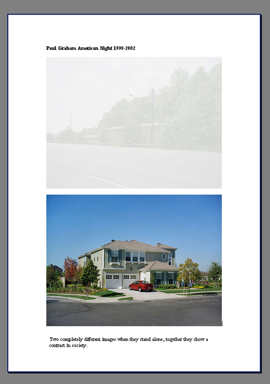

Graham's series A Shimmer of Possibilities also influenced images I taken. A couple walked past; the man carrying a pot plant and walking to the left of the woman, this struck a chord, it was a similar scenario to an image of Graham's, a man walking down the street, a woman to his right whilst carrying shopping. There were many other similarities within the frame which only came apparent after I had taken the series of shots, not sure how much of this was accidental or subliminal due to studying this work.
Another image which echo's Grahams composition even if the subject is not identical, still pondering if it is on purpose, accidental or subliminal?

Another photographer whose work was examined is Stephen Shore America America


Having seen Hasan and Husain Essop's work, Halaal Art, at the V&A Facts and Fictions exhibition, and later some work by Nick Waplington ( in particular Bethnal Green Road) a technique I considered implementing subtle digital manipulation; adding something or someone to a scene. I had the opportunity to use this technique for the image Untitled (Welcome to Welling) which I felt balanced the scene and the resemblance to the Paul Graham shot became more apparent.
This technique was also employed on the image Untitled (BP & Bus) to make it more balanced and make more of the complementary colours.


It was interesting to note that both Shore and Graham included images which didn't have ideal weather or lighting conditions. This is something that I struggled with throughout this project. It would have been handy to experiment a little more with focal length and viewpoints but when I found something that worked was reluctant to try something else in case the weather turned. Which it did, frequently! After a few days which had sunny spells the following weeks provided nothing but rain and overcast skies.
In some ways this was useful as the overcast skies provided diffused light and therefore no problem with deep shadows, but on the other hand the light was poor. Returning to places to re-shoot became more and more difficult, constant rain preventing me from returning and experimenting with other focal lengths, depth of field or viewpoints. Earlier shots had been taken using my lens at 18mm because I had wanted a wider view; as much as this being a conscious decision at the outset, I was also partly forced to continue due to weather conditions.
Another reason for adhering to the same focal length and overall similar viewpoint was to provide visual coherence to the set. This was something I noticed when examining other photographers’ portfolios; they usually shoot from the same viewpoint and use the same focal length throughout, for example John Davies with his Metropoli Project 2000-2003. My personal preference is for a portfolio which has the same of similar viewpoint but in hindsight I could have experimented with this more had the weather given me the opportunity to return after examining initial results.
I tried to overcome the weather problem by being ready to zip out whenever the sun shone, no matter what time of day. On dull days I increased my ISO to 400 but did not want to go any higher, as I don't like to introduce too much digital noise. This can start to happen with my camera at 800 ISO.
Initially shooting at f5.6 but preferring a greater depth of field changed to f16. This became an issue with poor light, giving a slow shutter speed and some images coming out slightly under-exposed; on reflection I should have stopped being so stubborn and altered to f11, comparing the results to see if I was happy with that compromise. Not terribly good at working out hyperfocal distance, this is a technique I should practice.
Although able to adjust the images in post processing, it would have made life a lot easier if the exposures had been correct at the outset. With some images bracketing was done, using the AEB setting in my camera. Trying to shoot using manual settings it may have been better to use Aperture Priority. Using AEB in Aperture Priority mode would have enabled me to still control my depth of field the camera to make the variations in shots by varying shutter speed. Alternatively using AEB in shutter priority mode will keep the shutter speed at the speed I select and the camera would vary the exposure by changing the aperture. This could have been useful to experiment with blur.
Another problem I encountered was chromatic aberration, which I had to adjust by using the Lens Corrections tab in ACR. Mental note to take lots of test shots and discover at which point this problem arises.

One of the issues I could have encountered due to slow shutter speed, was camera shake, but being aware of this I made sure I firmly locked my arm and leaned against a solid wall or post. It also meant that in some images moving vehicles/pedestrians had slight motion blur but this was something I wanted to capture, having seen examples of it within the work of Shore.
An option available was to use a tripod but made it very awkward when shooting scenes in the busy street (I didn't want to cause obstruction) and prevented me from achieving the low viewpoints in some of the shots.
On the days it did rain I stayed under bus shelters, shop canopies, juggled an umbrella or when shooting the Abbey ruins stood underneath a wide archway. On several occasions I got rain spots on my lens which, not noticing at the time meant I had to ditch more images. Guess in future I could make a series with that as a feature!
As with all the exercises and final assignments for DPP I followed a strict workflow which worked when I planned my shoots. Impromptu outings proved how you should double check everything before you leave as I did leave home without a memory card one day!
With adaptations to fit the individual photoshoots on the whole, I followed the workflow outlined here . However since this was written at the beginning of level 1 I have fine tuned it a little more, trying to complete more adjustments in RAW. Still getting to grips with the tools in RAW I prefer the flexibility that layers/layer masks afford me. A fuller account of my workflow and processing details will be provided on submission.
This is a map of the area I was shooting in, as you can see it has large areas of both green space and urban areas; I planned to capture this contrast using the devices of contrasting images and, if possible, juxtaposition within single frames. The linking visual themes of my final portfolio are physical signs, depiction of the generations which live in the neighbourhood, the contrast of open space/urban life and finally the consistent focal length and viewpoint.
 |
| Green Chain Walk through Welling and into Abbey Wood |
Image One: Untitled (Welcome to Welling)

Having seen the Paul Graham retrospective when I saw the couple walking away from me, a man carrying the pot plant, it struck a chord with the image in A Shimmer of Possibilities with the couple carrying their shopping home.
I visited this spot about 3 times hoping to get all the required elements in place, good lighting, traffic (I don't know why but I wanted a bus if possible) and pedestrians. As I was not lucky enough with the timing I decided this was an opportunity to make a constructed image, taking inspiration from the Essop twins and Nick Waplington.

F22 1/40 ISO 200 18mm

Image Two: Untitled (Woodlands Farm Trust)
Woodlands Farm Trust is an Inner City Farm and unique to the area. Just over the border in Greenwich, the Farm caters for the community in many ways; open days in Spring where you can watch the lambing, fun days in Summer and, as advertised here, several barn dances throughout the year.

F16 1/15 ISO 400 18mm

Image Three: Untitled (BP & Bus)
Having taken a shot which included the bus I felt the right hand side of the frame empty, however I had taken a series of shots beforehand; one of which included a red car entering the frame. The timing of this shot had been intentional, taken so the car did not obscure the children at the bus stop. On examining this shot there was too much empty space to the left. This presented another opportunity to use the technique of addition, altering the scene slightly, but with it still maintaining an element of truth. Once combined the image is balanced and the complementary colours are more obvious.


F16 1/200 ISO 400 18mm

Image Four: Untitled (Welling High Street)
Welling High street as with many small town shopping areas has suffered from the recession but it still attracts shoppers and pupils travelling home.

F6.3 1/40 ISO 400 18mm

Image 5: Untitled (Danson Festival)
Bexley has many open green spaces which contrast against the urban sprawl of the area. Danson Park is an area which holds many events across the year, encouraging the community to make use of its facilities.

F11 1/30 ISO 400 18mm

Image Six: Untitled (Flea Market)
St Michael's church hall which is the hub of the community in Welling. My children went to the toddler group here and also were christened in the church.

F16 1/160 ISO 200 18mm

Image Seven: Untitled (Stables)
The Mounted Rover Legion own a stables on the outskirts of Welling, which is unique to the area.

F8 1/160 ISO 400 18mm

Image Eight: Untitled (Thieves)
The local cemetery not only serves its purpose as a burial ground/ place of mourning it also is on the Green Chain Walk being crossed by a public footpath. Sadly not all respect the area.

F16 1/640 ISO 400 18mm

Image Nine: Untitled (Closed Shop)
An example of the housing to be found in the area and the small corner shops which try to survive, or not, during the recession.

F16 1/80 ISO 400 18mm

Image Ten: Untitled (Bus Shelter)
Another example of everyday streets and houses in the area revealing human activity.

F16 1/200 ISO 400 18mm

Image Eleven: Untitled (East Wickham Farm)
East Wickham Farm, owned by the parents of Kate Bush who still has a recording studio there.

F16 1/200 ISO 200 18mm

Image Twelve: Untitled (Missing Cat)
A parade of local shops with flats above, a family walks home with their shopping.

F16 1/100 ISO 400 18mm

Image Thirteen: Untitled ( Building & Maintenance)
Unable to move more people choose to improve the homes they own.

F20 1/100 ISO 400 21mm

Image Fourteen: Untitled (Community Hospice)
Green and Bexley Cottage Hospice is build on the edge of Bostall Heath and many of their charity fundraising events are held there.

F20 1/30 ISO 400 18mm

Image Fifteen: Untitled (Lesnes Abbey Ruins)
Lesnes Abbey which was destroyed during the abolition of the monasteries.

F10 1/320 ISO 400 18mm

Conclusion
On reviewing my portfolio the observations pick up smaller details within the larger scene, the people within the frames depicting the generations, compositional elements such as implied triangles, movement, dark clouds giving texture and detail, there are complementary or similar colours and all containing the visual link.
Workflow habits were consolidated when planned shoots were undertaken and as already stated impromptu outings proved how important following workflow preparations are. Editing and making the final edits made me look closely at what made the images work for me, references to the photographers examined,the content, timings, composition techniques and tonality of the shots.
On closer examination some shots did not appear to have many compositional elements, appearing quite simple, but I felt they worked as part of the portfolio.This is a vehicle used by both Graham and Shore. Graham's image below has the visual device he required against a simple backdrop, there are no diagonals, repeat patterns or movement within the frame but within the series Troubled Land it works due to the visual link.

The genre chosen for this body of work was suitable, but on looking closer at Stephen Gill and Tom Hunter acknowledge that I could have tried a different approach. The idea of constructed/layered images does appeal and I could adapt my ideas to include this style. Should I complete this project again I could possibly shoot using my 50mm lens.
Using a prime lens would make me approach shooting in a different way, you cannot zoom in, you have to physically get closer or walk backwards to focus on your subject or position them within the frame; really consider the shot. Having an aperture of f1.8 allows more light into the camera, I could use faster shutter speeds (less blur) and a lower ISO, making better use of available light. The 50mm lens can produce really pleasing effects of bokeh. (the way the lens blurs out of focus areas) Although the 50mm f1.8 allows more light to enter into the camera I find that my lens does if on auto focus it does 'hunt' when the light dips below a certain level. I would have to experiment to find out what point this happens.
Another advantage to using the 50mm lens is the way it renders perspective, it closely matches what is seen by the human eye. The only caveat to that is having a crop sensor; the lens does not achieve the same result as it would on a full frame, according to the information I read it would need a 35mm prime lens to achieve the same result as a 50mm lens on a full frame.
Pleased that I did not allow the inclement weather to halt my shoots it would be interesting to discover the effect different lighting/weather conditions would have had with some of the images. Having said that it makes a change to see photographs without clear blue skies and the blazing sun. The clouds providing texture and detail. Overcast days did allow for diffused lighting which meant I didn't struggle with too much contrast. It can be difficult to control exposure when faced with a scene that contains a large dynamic range.
I have chosen to send the final portfolio images as printed and mounted photographs whilst emailing the original files to my tutor. I felt this would allow him to examine my printing and presentational skills and also note the specification of my digital files. The mounts I ordered allowed me to print images 9x6 but the actual aperture size was 8.5x 5.5. Next time I mount prints a larger size would allow more detail to be seen.
On the whole I was fairly pleased with my final portfolio. Things I was disappointed in were: the bad weather not allowing to me take more photographs and provide a wider choice for selection, again bad weather preventing me from returning to certain locations to re-shoot scenes that could be improved through changing viewpoint or angles, my control of exposure not always as good as hoped, not taking a more adventurous route with my images.
Things I could do next time are: More experimentation with focal length, especially investigate fringing issue, use bracketing more, instead of trying to include a lot of detail within the frame concentrate on a smaller part of the scene, take on board some of the manipulation techniques that are being used more (layering, ephemera etc) try and make the poor weather work for me, although that would have to be investigated to find out how, more inclusion of umbrellas? Experimentation with shutter speed to capture rainfall? Looking for elements within the frame that provide a juxtaposition IE pictures of sunny holidays in travel agents windows, sunflowers beaten down by the rain?
*update feedback Here
*update reworking Here
Subscribe to:
Posts (Atom)