Monday 29 August 2011

Examining conceptual ideas

The books I have just been looking at were fairly complex with their imagery, the next three contrast by have very simple detail or graphical devices in order to cater for a difficult or involved production.

Steppenwolf Hermann Hess (publisher Picador 2002)
designer Henry Sene Yee
This book is a good example of the way book covers and publicity materials are different or change with the passage of time.


Steppenwolf is the story of a man exploring his own nature, elements of his personality one high, the spiritual nature of man; while the other is low, animalistic; a "wolf of the steppes". This can be a problem with images which are very simple. I originally had no idea what the book was about and on looking at the cover, and the previous ones I assumed it to be about a werewolf!

Jane Eyre Charlotte Bronte (publisher Vintage 2009)
designer Megan Wilson

Another book which has had many designs, the earliest here in the middle (now out of print) is a 1943 edition published by Random. The one on the end is the 2007 version of a Vintage publication. Penguin Classics also has many versions of the same book.


All these book covers lend themselves to the story of Jane Eyre. This could be because I have read the book and seen several films/televised versions. The simple example informs the reader the book is about a young lady and the inclination of her head alludes to her personality.

Beowulf translated by Seamus Heaney
 (publisher WW Norton 1999)
 Again more comparisons of the same book.


For me this was the least successful of the covers. Beowulf is an epic Anglo-Saxon poem, set in Scandinavia and written between the early 8th and early 11th century. The only manuscript was damaged by fire in 1731 and fell into obscurity before being reprinted in 1815 by an Icelandic scholar.

As no-one really reads Anglo-Saxon all versions are translations of the original poem, some are prose, others in poetic form. Seamus Heaney has been congratulated many times over for his most recent translation as he has preserved the feel of the original, retains many historical elements and portrays Beowulf as human rather than a caricature.

Although undeniably a hero, which the chain mail represents( and chain mail is mentioned in the poem), the poem constantly alludes to Beowulf's helmet. As the book is said to be a very accurate translation it is a shame the chain mail suggests more the medieval period and is very clean and shiny, not how I, at least, consider Beowulf. However this is a very subjective view and others may not agree.


Not directed to compare previous editions of the same book I found it fascinating to see the different approaches taken and to see what my preference was with the example encountered. Some are obvious illustrations rather than photographs but was an interesting exercise nonetheless. Simple conceptual ideas can be successful but the wrong choice of image could give the reader the incorrect impression of the book.

The role of concept

The majority of the time the main theme of a book is very complicated and hard to sum up in a single image. This is the over-riding reason for designers to use conceptualised images, employing allusion, allegory, symbols, juxtaposition and manipulation. All devices to be used/considered for assignment two.

A book jacket plays a rhetorical role and serves an artistic purpose. Covers are designed to attract attention and generate immediate interest, ultimately to sell the book. The cover visuals provide clues about the book's contents, creating a first impression designed to support the book.

Exercise: Conceptual cover design

Out of the six titles, I had to get hold of as many as possible, familiarise myself with the contents and make notes on each of the cover designs accessed. I thought I'd also look at some of the other titles mentioned in this section. Not as easy at it seems :o/ On a trip to my local library do you know how many they had? None! Some of the titles are not even stocked by Bexley Council libraries. Out of the two titles they did have, The Opposite House and Presence were luckily at the main library. Trip out the next day proved to be just as fruitless, Presence, although listed as being held was missing from the shelf and The Opposite House was not the edition I needed to examine.

Plan B was a quick pop into WH Smith a few 100 yards along, unfortunately Smith's isn't a book shop which stocks a huge selection of titles and I drew a blank there as well. Plan C was a drive into Bluewater and a visit to Waterstones. Yet again they had none of the titles on their shelves. On asking at customer services 3 of the titles did not show on their system, the others they could order in but only if I wanted to buy them, not just look at them....not really wanting to spend that amount of money on six books researched them using a different tack. Plan D was to ask my mother if Croydon Libraries had them, they too only had The Opposite House and Presence. To familiarise myself with the books contents I looked for book reviews on each, and information on the designers. Some designers, for example Henry Sene Yee, have websites which give details of their design processes.

http://henryseneyee.blogspot.com/

A interview with John Gall also highlighted important factors to consider
http://turnstylenews.com/2011/06/15/john-gall-on-book-cover-design-clarity-of-communication/

and a video snippet was also enlightening
http://media.barnesandnoble.com/?fr_story=7db6b96ab6a251fe4e0ba1f0d1994613abcd86a0

basically READ THE BOOK!


Missing Men

author: Joyce Johnson
Publisher: Penguin (Non-Classics)
Publication date: July 5, 2005
Genre: Biographies and Memories
designer: Joe Montgomery
photographer: Nonstock
photographer: Andre Thijssen
Typefaces: Trade Gothic/Century

Missing Men Joyce Johnson (publisher Penguin 2005)
designer Joe Montgomery

Missing Men is Johnson’s second memoir, documenting her childhood, her mother’s story, and her life after Kerouac; a man with whom she had a two year relationship. Her life shaped by male absence: she has been widowed, her grandfather committed suicide, the death of her first and her second marriage ended in divorce.

Being biographical the image chosen followed previous research in respect that it is a clear, not obviously manipulated, photograph. In this instance a crumpled unmade bed. Due to the second bed, just out of the frame, the cover resembles an open book. This suggests Johnson is making her life story an open book, there for all to discover.

There are several devices on this cover, designed by Joe Montgomery, which outline absences,’ firstly the ‘i’ is absent from the word in the title. The crumpled sheet alludes to a missing partner and cleverly the crease replaces the missing letter. Because of this I suspect this is not a stock image and time was taken to obtain props, create the crease and shoot the scene.

The yellow sheet is a perfect foil for the simple black text, the designer choosing to use two typefaces, Trade Gothic and Century. Unable to get hold of the book I can’t comment on if the photograph extends to the back.

It is clear that the designer was aware of the subject matter, as the conceptual ideas relate to the theme and had the placement of the text in mind before the scene was shot. Without obviously depicting figures in the distance, or out of focus portraits Montgomery successfully makes us aware that people are absent.


The Honeymoon's Over


The Honeymoon's Over eds.Andrea Chapin and Sally Wofford-Girand
(publisher Grand Central Publishing 2007)


This book is a collection of true stories, written by women on the break up of their various relationships. True life stories tend to use photography and sometimes still life to depict elements within the book. Being a collection of 22 essays the designer has chosen one specific image to try and incorporate the general theme. Not being able to read any of these stories I cannot comment if one of them actually revolved around having burnt the toast! It could be that one of the women was in an abusive relationship and her husband would complain about his breakfast, who knows....

The ideas that spring to mind are a play on the title and the well used phase 'the honeymoon is over' suggested that the good part is ended and things go downhill from here, or have been spoilt. Another phase 'burnt toast' usually applies to celebrities who are now 'has beens' and on this occasion could referring to partners no longer the flavour of the month. The fact it is really burnt could be alluding to the dark side of relationships or the bread has been spoilt, it can't be retrieved so you throw it away? I found this quite hard to pin down, it could allude to a few themes, which in some way could be considered a good thing as it the image could mean many things to many people, therefore reach a wide audience. 

The dark image provides a background for the lighter lettering and stands out against the white background. Probably a stock image.


NoVa

author: James Boice
Publisher: Scribner
Publication date: December 30, 2008
Genre: Fiction
Design info:
designer: Paul Sahre
art_director: John Fulbrook III
Typeface: Prensa


Nova James Boice (publisher Scribner 2008) designer Paul Sahre

NoVa is an acronym for Northern Virginia where this story is set. It opens with the suicide of a teenager called Grayson Donald; the book investigates the effect his death has on his friends and neighbours, examining contemporary America and the gradual falling apart of modern society.

Being fiction the imagery is more experimental; an inverted photograph of a picket fence. Not able to get hold of the book I can’t quite tell if the image is slightly fuzzy for effect or if it is the poor resolution of the online images. If deliberate it could be a device intimating that not everything in life is clear.

The fence represents the traditional picket fence you find in Virginia (virginia-white-picket-fence), setting the location and alludes to ‘manicured’ America suburbia. Being inverted it hints at: things being not as they seem, the death of Grayson Donald turning lives upside down, gravity makes the innocent fence, with its sharp points facing down, feel lethal. This makes the reader aware that the novel explores difficult topics.

The sun could either be sunset indicating the end of the day/allegory of society as we currently know it coming to an end, or sunrise. The lightness of the sky implies that it is more likely to be sunrise, indicating the optimism of the human race that all will turn out ok in the end, burying their heads in the sand. The sunburst is a clever play on the title NoVa and the scientific definition of nova, being a cataclysmic event. The white sky provides space for the type, typeface Prensa.

The designer Paul Sahre would have had knowledge of the story and completed research into the meaning of the word nova and what scenery/subjects would be represent Virginia. Analysing the image raises questions such as is this a stock image? If so was the sunburst effect added after? Was it taken specifically for the book with Sahre passing the brief onto a photographer? What at first could be dismissed as a very simple idea is in fact a very clever, complex representation of the themes which run through this book.


The Opposite House

The Opposite House
author: Helen Oyeyemi
Publisher: Anchor
Publication date: June 10, 2008
Genre: Fiction
Design info:
designer: Rodrigo Corral
photographer: Robert Polidori
Typeface: Copperplate

The Opposite House Helen Oyeyemi (publisher Anchor 2008) designer Rodrigo Corral


A novel, the photography is again slightly more experimental and inverted. This immediately suggested a world that is not as it seems, a character unsettled with where they are or in a situation they are not comfortable with.

The Opposite House introduces us to Maja, a 25-year-old singer whose black Cuban family migrated to London when she was seven. From what I can gather the book also intertwines with a viewpoint of a goddess who lives in 'somewherehouse' from which she can access both London and Lagos...but without having the book this is gleaned from various book reviews.

Maja is not happy with her lot in life and increasingly thinks about Cuba, which is the location of the photograph. The image is inverted due to the notion of memories, not knowing the place intimately, feelings of insecurity and is slightly dark. The poorly lit streets also signify an element of unknown and a feeling of disquiet. The pale sky allows space for the darker type, typeface: Copperplate. It could be a stock image, the clouds could have been manipulated to fit the type.

I struggled with this one and possibly due to not physically having the book and the plot appearing quite complex.


A General Theory of Love

A General Theory of Love
author: Thomas Lewis
Publisher: Vintage
Publication date: January 9, 2001
Genre: Non-Fiction
Design info:
designer: John Gall
photographer: Boris Schmalenberger
Typeface: Helvetica


A General Theory of Love Thomas Lewis (publisher Vintage 2001) designer John Gall

Taken from a book review -

Three eminent psychiatrists tackle the difficult task of reconciling what artists and thinkers have known for thousands of years about the human heart with what has only recently been learned about the primitive functions of the human brain. The result is an original, lucid, at times moving account of the complexities of love and its essential role in human well-being.

A General Theory of Love draws on the latest scientific research to demonstrate that our nervous systems are not self-contained: from earliest childhood, our brains actually link with those of the people close to us, in a silent rhythm that alters the very structure of our brains, establishes life-long emotional patterns, and makes us, in large part, who we are. Explaining how relationships function, how parents shape their child’s developing self, how psychotherapy really works, and how our society dangerously flouts essential emotional laws, this is a work of rare passion and eloquence that will forever change the way you think about human intimacy


So there you go, a very complex topic, how would you go about representing that? A general Theory of Love is a factual, scientific book and the designer, John Gall, has chosen still life. The authors/publishers would want to appeal to a large audience and rather than stereotype individuals, Gall opted to avoid including figures at all. The idea of 'people' is represented by the empty chairs. An initial thought could have been along the lines of sitting in a psychiatrist's chair. Standard wooden chairs, which imply practicality rather than romance, a stiff, unemotional side to a relationship provides a juxtaposition to the intimacy implied by the touching of the two chairs. The plain chairs also intimate the scientific nature of the book.

The contact symbolises the need to lean on each other.The empty room, which has a feel of a hospital ward, hints at the empty and barren but the touching chairs again hint that there is, nonetheless a bond.

The colours and tonality work well, the light room a contrast to the darker type,Typeface: Helvetica. Left aligned the sans serif font does suggest a serious, academic work.Only one typeface has been used but the quote has been centred and italicised to make it stand out. All the type is contained in a text box which removes it from the image, suggesting some level of removing or distancing from the subject. I noted that the type does fit well with sections of the ceiling and walls.

All of the above suggests this is not a stock image and that time was taken to consider the location and the aptness of the props.

Presence


Presence: Stories
author: Arthur Miller
Publisher: Penguin (Non-Classics)
Publication date: December 2, 2008
Genre: Fiction
Design info:
designer: Paul Buckley
photographer: Michelle Hines


Presence : Collected Stories of Arthur Miller
(publisher Penguin 2008) designer Paul Buckley

A collection of six short stories Presence has been described as

an essential addition to the body of Arthur Miller's work, but it is more than that: it is an arresting self-portrait, unmediated by directors, actors, gossip columnists or biographers.

and
these six pieces reveals a different Arthur Miller than the one we know from his plays, a writer less interested in big themes and clashing ideologies and more focused on small moments of memory and mystery.

Of the stories

Finally, comes "Presence," a perfect little gem of a story from a writer whose brilliant career was long and important. Although this is his farewell book, Miller's presence is assured. He will be with us, in his plays, stories and essays, for a very long time.
Based upon these reviews I reached the following conclusions; the work is fictional therefore the photography has been manipulated. Due to the book having six stories the decision was made to choose an image that would be representative of a theme which ran though all six. Memories can be hazy, therefore the 'misty' image. The title is Presence, hence the presence of a lone figure, alluding the the singular main character in each tale. It could also represent the presence of Miller himself, always with us even though he died in 2005. This would have been a fairly simple shoot to organise and complete.

No details have been given as to the two typefaces used but the author has been given prominence suggesting someone well known and prolific. The black font stands out against the grey background and is set diagonally across the front.

Conclusion

Completing this exercise was made more difficult due to my inability to source the books and discover exact details of their contents. It was easier to analyse some covers more than others, I feel more confident about my conjecture with Missing Men and NoVa. This could be that these designs, although conceptual, contained elements that were more obvious or discovered through research.

It has become even more apparent that you should the book to be able to design a cover which attracts attention, generates immediate interest, supports the themes of the book and ultimately sells it. Further analysis reinforces the idea that different photographic images suit, or are chosen, for specific genres. Although, as previously mentioned some do cross over. Three of the books were factual, three fictional. All three factual books had still life images. Manipulation is minimal/not used when images depict factual events. Typefaces were simple and kept to a minimum, more decorative font was used on Presence. Out of the six books five designs opted for dark/black type on a light background, but all were contrasting.

Conceptual design can be successfully used for both fact and fiction, any genre, to portray complex ideas or compilations.


Initial notes in learning log


Research

http://www.amazon.co.uk/General-Theory-Love-Vintage/dp/0375709223 [Accessed 4 September 2011]

http://www.fotolibra.com/gallery/800958/virginia-colonial-national-historical-park-yorktown-white-picket-fence-brick-wall/[Accessed 31 August 2011]

http://www.guardian.co.uk/books/2007/may/12/featuresreviews.guardianreview19 [Accessed 4 September 2011]

http://www.guardian.co.uk/books/2009/oct/31/presence-arthur-miller-review  [Accessed 4 September 2011]

http://henryseneyee.blogspot.com/ [Accessed 31 August 2011]

http://media.barnesandnoble.com/?fr_story=7db6b96ab6a251fe4e0ba1f0d1994613abcd86a0 [Accessed 31 August 2011]

http://www.myshelf.com/miscellaneous/07/honeymoonsover.htm [Accessed 4 Spetember 2011]

http://www.powells.com/cgi-bin/biblio?isbn=0670033103[Accessed 31 August 2011]

http://turnstylenews.com/2011/06/15/john-gall-on-book-cover-design-clarity-of-communication/[Accessed 31 August 2011]

An overview of book cover design

Within this section there are specific novels mentioned and I needed to look for particular editions as fashions within book design alters and different editions have different covers. The images used for producing fiction covers follows two routes; using stock images which fit the ideas or conceptual covers shot as an assignment.

Why would an art director use stock images? Stock images can be useful especially for historical books, both fact and fiction. However there are advantages and disadvantages to this approach for any genre. Whilst existing images are easy to source it can take a long time to find an image that fulfills the design brief in respect of ideas and layout. This problem appears to be remedied by mixing archival images with modern photography, illustration and photography, and manipulation.

More often that not the final images chosen indirectly refer to the contents of the book rather than directly illustrating the theme. This can aid with the mystery of the tale, create an atmosphere and draw the readers eye to the book. An example given is a series of books written by Alan Furst, specifically Red Gold published by Random House 2002, designer Robbin Schiff, with the photography by Brassai and Kertesz. These books are espionage novels set in pre-war Europe and the shadowy, low-key images do suit the subject really well.


Red Gold Alan Furst (publisher Random House 2002) designer Robbin Schiff


Two more photographers to add to the list to investigate.

Covers that are custom made can be art-directed to ensure they fit the layout and allow for the typography, something which was highlighted as being very important within the last section where I touched on layouts. Disadvantages can be the cost of setting up scenes and getting to a location but the example given to illustrate a designed cover is Eat, Pray, Love by Elizabeth Gilbert which was shot indoors within a very small space and the elements were not difficult to source being everyday objects. The choice of  items are very pertinent to the words they spells out.


Eat, Pray, Love  Elizabeth Gilbert (publisher Viking Adult 2006) designer Helen Yentus

A couple of useful links to help with looking at book covers and how they use photographs are : -

The Book Cover Archive

Covering Photography
The Book Cover Archive came in handy when looking for titles with inverted images. It also has design information such as the photographer, illustrator and designer for each novel. On some but not all the details also include the typeface used. Because the site has a multitude of titles to look at I looked for similarites in book titles/genres/design. I did have an issue with getting the smart search to work for me :o(
Covering Photography is an archive and resource for the study of the relationship between the history of photography and book cover design. The images / book covers can be accessed via the categories of by Photographer, Author, Publisher, Publication Date and Designer. As yet I have to delve deeper into this one.
What I have been doing is looking closely at my own books and books in the local library, trying to see the links and patterns to book design/genre. I was quite surprised to discover that whilst there were some definite themes to some many others crossed over. A lone figure in a minimalist landscape for example, is used for sagas, romances, general fiction, thrillers to name a few. The treatment of the image was more dark for the crime/thriller genre but the initial idea was the same. As seen on another post, huts and washing lines can be popular ;o) Examining conceptual ideas

A very brief overview... 
  • Chick Lit mainly uses illustration. The fonts are decorative. 


  • Saga seem to use a mix of illustrations, historical archive, modern photographs and a combination of these elements in one design. These images work together well to indicate the books to sell the book. Fonts again are fancy.


  • Historical novels appear to use images of women which have been cropped; costumes and props chosen suit the period. More decorative fonts.


  • Horror uses mainly illustrations, where photographs are used they are dark and atmospheric. They also combine photography with illustration. Uppercase and serifed fonts.


  • Lifestyle - mainly photography, some manipulation with selective colour in a black and white image. Is white lettering the fashion or just accidental these are the examples I have chosen? Mix of serif/sans serif and upper/lower case. Sharp images which show directly the theme of the book or obvious allusion.


  • Real life stories, biographies, cook books, pets, travel guides, hobbies, gardening use clear sharp photographs of the subject. Observation that the word Mandela does not stand out very well, dark lettering against a dark background and the white lettering merges with his grey hair. Fonts all upper case but a mix of serif and sans serif.


  • General fiction uses both illustration and photographs, again both obvious or by allusion. Mix of font/typefaces.


  • Thrillers/Crime/Spy novels tend to use out of focus photographs, to promote mystery.Type all upper case on the examples shown.


  • Science fiction/ fantasy uses a mix of photograpy, illustration and the combination of both. Uppercase fonts.


More confirmation that you need to know the contents of the book to be able to design a cover which relates to the theme either directly or through allusion. Books with hidden themes/elements of mystery use out of focus images. Other design devices used are cropped images not depicting the subject completely. Font type/size is important to the layout and does seem to vary with genre, romance and saga in particular using a more decorative typeface. The importance of prominence of name versus title depends on the reputation of the author. Manipulation has been used to a greater or lesser extent on creating both the imagery and space for the type.

Research

Images from :

http://www.amazon.co.uk/  [Accessed 29 August 2011]
http://bookcoverarchive.com/19 [Accessed 1 September 2011]
http://www.bookdepository.co.uk/ [Accessed 29 August 2011]
http://waterstones.com/waterstonesweb/ [Accessed 2 September 2011]
http://www.whsmith.co.uk/ [Accessed 2 September 2011]

Project: Photographic book covers / Exercise Choosing your Imagery

This next section of the course looks really fascinating, wondering how and why books get the covers they do. As an avid reader I shall look through my own books as well as following the recommendation of the module to visit the local library and bookshops, thinking about the decision making behind producing the imagery.

Exercise: Choosing your imagery

To complete this exercise I need to find an example of book covers featuring five different types of photographs. For each category 100 words need to be written describing why I believe the publishers chose the direction, images and design for each book. The different types are: -

  • an out-of-focus photograph
  • an inverted photograph
  • an historical archival photograph, but not depicting the subject precisely
  • a still-life close-up
  • a minimalist landscape or outdoor scene with a large area of sky
Popping into the local library some of the categories had a wealth of examples to choose from whilst others were a little thin, especially the inverted photograph. Quite a few publications choose to use illustrations rather than photography and after getting home, on closer inspection one of the books chosen was an illustration. Also the historical, archival image depicted the subject too precisely so back to the drawing board with those two...

Books chosen after first library visit


Out Of Focus Photograph


Brother & Sister Joanna Trollope (publisher Black Swan 2005)
As these exercises lead up to Assignment Two: A photographic book cover, where you have to consider all aspects of the cover design elements: image, typeface, title, authors name, strap line, spine and blurb, not only did I look at the photographic choices but also the dimensions and layout of the book as a whole.


Approximate dimensions and layout 'sketched' in Publisher
 

Other Joanna Trollope titles were researched to see if this had a bearing on the design choice for Brother & Sister, from the titles below you can see there is coherence to the publications. The quotes, author's name, and titles are all in the same place and use the same typeface and font size. All the images are out of focus suggesting hidden facets of the characters lives and some mystery.

Other Trollope titles with the same layout

Joanna Trollope is a well known author and emphasis has been placed on her name rather than the title. This implies that the publisher recognises Trollope has a following which seeks out her name regardless of subject matter. Readers can instantly spot a title by the 'corporate identity' approach.

Brother & Sister (2004), is a novel exploring the themes of adoption and the nature of identity. The image on the front depicts a blurry male and female character, the male in the distance. The out of focus image alludes to the uncertainty of their own identity. The female at the front represents Nathalie as the main driving force to the plot line, whilst David (her adopted brother) is in the background, showing he is possibly more reluctant to follow her decision to trace their birth parents. A smaller version of the image is also shown on the spine of the book allowing for this information to be shown when the book is placed on a shelf. The colour of the photograph fades into the upper section of the book providing a clean space for the author's name. The light background continues on the back where the blurb, in a dark font is easily read.The image selected successfully expresses the element of the unknown and an awkward relationship.

Minimalist landscape/outdoor scene with a large area of sky

Assegai Wilbur Smith (Pan Books 2010)

Approximate dimensions and layout 'sketched' in Publisher


As with Joanna Trollope, other Wilbur Smith titles were researched to see if this had a bearing on the design choice for Assegai. From the titles below you can see there is coherence. The quotes, author's name, and titles are all in the same place and use the same typeface and font size. All the images are of an African landscape, sunset and with crossed weapons. Born in Africa, Smith has an abiding interest for the peoples and wildlife of his birth country; this is reflected in the majority of his work and the imagery on the examples given here.

Other Smith titles with the same layout

Wilbur Smith is another author considered a ‘brand,’ with emphasis placed on his name rather than the title of the book, recognition by the publisher that Smith has a loyal fan base.

Set in the Masai tribal territories, the minimalist landscape and lone figure instantly inform the reader of the African location. The large expanse of sky has left enough space for the strap line and authors name while the dark silhouetted foreground provides the perfect foil for the title. The generous area of sky left remaining has allowed for the inclusion of the Assegai weapons which suggest that conflict is a theme contained within the novel. The darker background allows the lighter text on both the back and front of the book to stand out. The simple landscape combined with the spears convey the location and possible story content well.


Still life close up


The Hollow Nora Roberts (publisher Piatkus Books 2008)


Approximate dimensions and layout 'sketched' in Publisher

Nora Roberts is widely recognised as a writer associated with the supernatural. Her trilogy  Sign of Seven concerns three main characters over a period of many decades who at the age of 10 took a blood oath at a pagan stone, unleashing a 300 year old curse. The first book has a stone embellished with an Ankh, the Ancient Egyptian symbol of life and in Wiccan/Neopagan traditions, it is often used as a symbol of immortality. This symbolism alludes to the theme of ritualism and paganism.

The Hollow is the second book in Nora Roberts Sign of Seven trilogy, the first being Blood Brothers and the last The Pagan Stone. It follows that the design of the covers would have a similar look, however from the novel Dance of the Gods and many other titles it can be seen that the publishers currently favour this layout for all of her books.

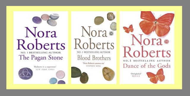
Nora Robert's novels with the same design

Being the second book in a trilogy, The Hollow uses similar imagery; a few loose stones appear scattered at the top and bottom of the design with one of the stones adorned with a pagan symbol. This symbol alludes to beginnings and endings, being a version of the Celtic Trinity Knot (or the Triquetra from Latin, meaning "three-cornered.") all clues to the mystical content of the novel and the three main characters from the previous story. Reading into the stone analagy further, the main character numbers swell to six, as the boys are joined by three girls, with the main character Fox finding he is becoming increasingly interested in Layla... possibly the two stones in the foreground. The choice of the plain white background allows the stones to immediately catch the eye. The authors name is the most prominent text with a quote from Stephen King placed next to the symbol.This adds weight to Roberts as an author and hints at the genre. The same image is used on the spine, with the white background continuing onto the back for the blurb. Simple still life has been used very well to convey a very complex plot.


Conclusions so far...

Having researched three design covers so far, although each one has a completely different photographic image, they do have similar features with images representing aspects of the novel. The main images have been echoed on the spine.There has been some degree of manipulation with each; with Brother & Sister the photograph has been extended to allow for the strap line and authors names to be added, the landscape on Assegai has been inverted on the back cover and spears have been superimposed, on The Hollow  it is impossible to say if the group of stones were shot together or separately and merged, but the different direction of the shadows imply that they were shot as individual items. It was also interesting to note the grouping of the stones did not follow the rule of three associated with still life images, but as mentioned, that could be due to the stones representing the number of characters in the book and their relationships.

With each cover, the authors' name was more prominent than the title, a minimum number of fonts and colours have been used. It was interesting to note that in each case the authors' names were printed in an embossed metallic or metallic effect font. Joanna Trollope's novel Brother & Sister has more font styles and colours therefore for me, this is the least successful design even though the image works well to convey the contents of the book.

The designs also incorporate quotes/strap lines to catch the readers attention, the publishers logo and cover design information, a barcode and price.

Having read an awful lot of novels I had never previously taken much notice on how the blurb was styled. The word count for each was between 120-150 words, all were centred and used fonts which were a contrast to the background.

The size of the paperbacks were very similar approximately 200mm high 120 mm wide. The thickness varied with the number of pages in the book.

The most pertinent point that comes across is that the designer/artistic director had intimate knowledge of the plot line and characters choosing the elements accordingly and even with looking as just three novels there is an indication that specific genres seem to prefer a certain style of imagery.

Notes on book covers for learning log
second and third library visits

Historical archival photograph

  • an historical archival photograph, but not depicting the subject precisely -
finding an image to fulfil this remit was a little trickier, my first problem was with the interpretation of the task. Did 'not depicting the subject precisely' mean not depicting the physical subject within the photograph or not depicting the subject/theme of the novel? I decided that it could mean either and to trust my judgement when an historical archival photograph was eventually found . On my trip to the main library in the borough, I discovered that it was really difficult to find exactly what I needed!

Some of the images appeared to be archival but could have been modern day constructed images, others were illustrations and the rest were very obvious depictions of both the storyline and the object photographed. Eventually I came across The Dig by John Preston, publisher Penguin Books 2008. The image is credited to Fox Photos/Hulton Archives/Getty images. Hulton Archive deal specifically with historic stock images and editorial shots. Inside the archive The plot concerns an archaeological dig set in 1939 and the image does not depict the theme even if it does the era.


The Dig John Preston (publisher Penguin Books 2008)


Approximate dimensions and layout 'sketched' in Publisher

The Dig is John Preston’s fourth novel but there is no pattern to the layout of previous covers. Unlike the designs examined so far, The Dig has its image at the top of the cover and has been extended down to make space for the text. The cream colour of the front is continues on the spine and back cover. The title is below the image in large red lettering, with the authors name below in a slightly smaller black font.This provides more evidence to the theory that when an author is more prolific/well known, emphasis is given to their name rather than the title of the book. There are two quotations on the front by well known writers; Ian McEwan and Robert Harris adding weight to Preston as an author.

Other titles by John Preston
The Dig is a fictional account of the discovery and subsequent archaeological dig of the Viking longboat burial mound at Sutton Hoo, in 1939. The archival image hints at the historical content of the story, sets the period and alludes to the wealth of the main character, yet it gives no clues to the dig itself. This adds intrigue, as the audience will wonder what ‘the dig’ refers to and encourages them to read the blurb on the back. On the back there are four further quotes promoting the book, which in turn persuades the reader to pick it up. I'm not quite sure if this is a completely successful image to have chosen. Although the image does portray the historical element, I am not convinced it raises enough curiosity to catch the imagination.


Inverted photograph

I still have as yet to track one down...watch this space...

*update

As with the historical image, to find a cover with an inverted photograph to suit my purpose proved very difficult. I had to visit the main library, WH Smith, Waterstones and my local library twice before finding a book cover with an inverted image.

An inverted image could mean could mean upside down, mirror images, inverted colours and/or tonalities... there are a few examples given in the module but both were upside down, maybe I should have stuck with my gut feeling that anything within the definitions given above would have been ok, but feeling unsure I emailed my tutor to check if any would be within the remit to write up on, the answer was 'well what do you think?'

TBH I think any would be ok, but it is handy to get confirmation you are headed along the right lines... eventually decided to see what I could find and go from there. Hoping to get a different example to the inverted idea of upside down idea to show research had been completed rather than just blindly following the module, it was disappointing not to be able to find anything at all.


Definition: (1) ~ image: one that shows the subject upside down when projected or seen. * Also an image whose tonalities and colours are reversed. (2) ~ telephoto: design of lens with strongly negative groups in front and positive groups behind for short-focal lengths such that the distance from the rear vertex to focal plane is greater than the focal length. * Also known as reversed telephoto, retro-focus. (3) ~ selection: process in image or graphics manipulation by which all the objects not at first selected become selected, thus reversing or inverting the original selection. (4) ~ microscope: made to look at under-side of objects which cannot be turned over e.g. Petri dishes, so the objective points vertically upwards.

Using the The Book Cover Archive link I found the following book designs :-


Not many at all, given the number of covers that must be on the site, and of the examples found most were upside down rather than colour adjusted or horizontally reversed. Added to the fact I found it difficult to physically track one down shows it is not a popular design concept. Having had physical examples of the previous categories emphasised how important it is to actually get hold of the books. You can measure the dimensions, discover how effective embossed text is, colours are truer than on screen, find out more of the plot than the blurb offers to work out why different photographic elements were chosen. It also helped with looking at the overall layout, spine and back cover. I am left wondering why inverse images as not as popular? Do the designers themselves shy away from the ideas? Do the publishing houses reject them? Has it been found that the same novel but with a different jacket sells less copies with an inversed image? I may have to email a few publishing houses to find out....

On my second trip to the local library to look at designs in general, which genres used which imagery, did any cross over, which used more photographs than illustration (notes on a different post) I eventually found an inverted photograph. It is an upside down reflection rather than a reversed/inverted image but I made the decision to run with it.

Ordinary Thunderstorms William Boyd (Publisher Bloomsbury Publishing 2009)


Approximate dimensions and layout 'sketched' in Publisher
The dimensions on this are larger because it is hardback.

Looking at Boyd's other novels some have been published by Penguin Books; these had a different artistic approach. Having said that I have found two different versions of Brazzaville beach by Penguin, one of which follows a similar creative pattern to Ordinary Thunderstorms. I am now intrigued with Brazzaville Beach as the imagery is so different....a brief scout about shows that a different thread of the story has been chosen to illustrate the contents of the book Brazzaville Beach - Wikipedia, the free encyclopedia


In Ordinary thunderstorms the main character, Adam Kindred, a young climatologist, has his world turned upside down. The photograph chosen for this novel cleverly picks up on many of the themes. A puddle not only alludes to the clouds Kindred studies but also provides an ideal device to project reflections. The London Eye highlights the location and the upside down character suggests the topsy- turvey events which occur throughout the book.  The grainy, hidden portrayal of the figure is a mechanism many thrillers employ. The black and white image works well with the choice of sans serif red and white type. I felt this book cover was a very successful design.


Notes on book covers for learning log
Summing Up
Having looked closely at all five categories the general design route for the majority of books is influenced by previous publications, if the book is part of a series and the idea of the author as a brand. The photographic images are then chosen taking into consideration the contents of the book and the genre. Having said that some devices such as out of focus images are used by many genres to suggest the unknown or mystery and still life can be successfully applied to any genre.
Quotes and strap lines are used to promote the book, publisher logos and barcodes are also applied as standard. Typefaces very slightly but apart from romantic sagas which employ more decorative fonts, they are large and clear, very readable. I did not discover a preference over using serif or sans serif.
Without reading the blurb it was possible to deduce something about these novels, either the genre, location or era. In this respect I think these designs all work well.

A very general observation

  • illustrations are used by most genres although true life stores/biographies and information books tend to use photographs.
  • out-of-focus photographs are associated with several genres but are used to convey a sense of mystery,intrigue, memories and, depending on the treatment, menance.
  • inverted photographs are used to allude to worlds turned upside down, or situations not really as they would normally be viewed.
  • historical archival photographs are used on fictional as well as factual publications to represent a particular era
  • Still life close up images are used across the board, again with both fact and fiction. The images can obviously represent the theme or use allusion and allegory.
  • Minimalist landscape photographs are also used across them with fact and fiction. These are used to show a set location, depending on the time of day and treatment can create atmosphere and if combined with figures hint at other themes within the book.

Research

Images from :

http://www.amazon.co.uk/  [Accessed 29 August 2011]
[Accessed 1 September 2011]
http://bookcoverarchive.com/19 [Accessed 1 September 2011]
http://www.bookdepository.co.uk/ [Accessed 29 August 2011]
http://en.wikipedia.org/ [Accessed 4 Spetember 2011]

General Information
http://www.gettyimages.co.uk/ [Accessed 29 August 2011]
http://www.idigitalphoto.com/dictionary [Accessed 28 August 2011]