Sunday 28 November 2010

Exercise 14: Interpretative processing

With this exercise I had to chose an image that was open to creative interpretation. Using the different adjustment controls available in Photoshop I had to give a different look or feel to the image and make three different versions. As per the recommendation an image with a fairly low dynamaic range was selected.

The original image was taken in the Limehouse Basin on a rather cold and overcast day at the end of September. Not a terribly inspiring photograph but it was ideal for this exploration of interpretative processing.


Original
 

For the first adjustment I attempted conversion to a night scene, playing with so many different layers and processes even though I wrote some of them down I lost track of what effects were eventually used to complete the final image. I created layer adjustments and layer masks so that the original image was not destroyed during the process but in my experimentation the tiff was flattened and saved without saving with layers intact, which is a something that I never usually forget to do! The main effects used were; Exposure reduced and a cooling filter with the density increased added. Saturation was slightly decreased and the burn tool was applied to the lighter areas that remained a little too light. Using the black and white adjustment brushes on the layer masks or adjustment layers fine tweaks were made to local areas. I was rather pleased with the end result and believe the final photograph represents a late evening/ night shot well.


Night


The choice for my second conversion was to create an image that would not look out of place in an old photograph album depicting a historic scene. Once more layers were employed. To create a sepia tone I used variations in the Image menu, in order to use this option the image had to be converted to 8 bits. In variations I moved the fine/coarse slider down a notch and selected more yellow once and more red once. I played with the opacity until I was happy with the colour. Noise was added and using the erase tool with a dry media brush faded/distressed the edges. A few scratches were added for effect and the burn tool was used in an attempt to make the edges look grubby. I was pleased with the final image,the sepia tone is realistic but the distressed edges could be slightly more subtle. If I was to undertake this exercise again I'd possibly use different brushes to make it look less uniform and also experiment with the eraser opacity.


Aged
 
For the final change I wanted to create a sunset. To make this I used a New Adjustment Layer/gradient map. On the gradient editor a red was chosen for the dark areas and yellow for the light. The blend mode was changed to overlay and the layer opcaity reduced. Once again the erase tool or adjustment brushes were used on local areas. I am particularly pleased with the warm glow showing thru the yachts sails and the "sun" behind the clouds. The warmth that has been added to the building and water are effective, especially with the glints on the ripples. Having uploaded the image I think I could have toned down the orange on some of the clouds but for the aim of this excercise it proves that images can have different interpretations.


Sunset


I enjoyed the creative/artistic side of this task, it shows that the feel atmposphere and therefore effect of an image can be amended within photographic software. This means the original intention/interpretation of a shot can be altered. Even though on reflection some of the alterations on the sunset could have been toned down a little all images are completely different to the original and I feel I have been successful with the creative interpretation. I would probably use this technique if creating an image that I considered to me more a piece of "art work" rather than straight photography.

Exercise 13: Managing colour

For this exercise I needed to find 2 or 3 images that had a significant colour cast and to correct it, taking care to retain a reasonable colour and colours that would be expected ie a grey surface would remain grey. I needed to make sure that at least one of these images contained a known grey surface ie concrete, steel, aluminium , asphalt, thick clouds and shadows on white.

As I had shot these images in JPEG+RAW I could experiment with adjusting colour cast with both. The first thing I noticed was that the colour cast was more obvious with the original jpegs.

The first image I chose has a yellow cast, although admittedly it isn't that strong a cast but enough that the skin tones are rather sallow and the blue sky appears a rather washed out murky colour. This was also an ideal image to choose as it has several surfaces that I could select as my grey point.


Original Jpeg file

Original raw file
When working with the JPEG image the white balance control was not available so I chose to use the grey dropper available through the Curves window. The steel handrail gave the best results when using the dropper but even so this made the image shift a little too far.


I then used different techniques, different layers, changing the opacity and experimenting with the targeted adjustment tool, to obtain a satisfactory result.


Adjusted Jpeg
Working with the RAW file gave me access to finer control of the white balance. I experimented with the presets but found none really matched the result I was looking for so I adjusted the white balance slider using a Custom setting. I then altered the hue and saturation very slightly.


Adjusted RAW file
 Looking at the end results they are pretty close together and any differences could be due to over correction with one of the tools/techniques used. I am happier with the RAW conversion as the white buildings in the background do not appear to be as stark a white. I still need to become more conversant with the adjustment tool in RAW to fine tune any local adjustments. I still prefer to do this via layers in Photoshop.

The second image has a distinctive blue cast. Once gain the colour cast is more obvious in the JPEG file.

Original Jpeg file

Original RAW file
Once again I used the grey dropper tool and layer adjustments/ targeted adjustment tool to correct the image. The image appeared to be ok on my screen but now it has been uploaded I think it could have been brightened a little more as the snow now looks rather grey.


Adjusted Jpeg


Again I chose to adjust the whte balance slider and alter the hue. The difficulty I experienced with this image in RAW was keeping the colour of the bears correct, I tried to do local adjustments in RAW but they were not very successful. In practise I would have then opened the image in Photoshop and completed the adjustment with layers, however as this task was about the comparison of managing colour with either RAW or JPEG I left it as it was.

Adjusted RAW


In conclusion I would still choose to do my main colour cast/white balance adjustments in RAW, once the techniques of all the tools have been mastered it gives more fine-tuned, subtle results than working with jpegs. Having said that at the moment I obtain better results when mixing both RAW, converting to a TIF and doing fine-tuning with layers and layer masks.

Exercise 12: Managing tone

I should take an image with both jpeg and raw so I can practice the procedure on both.

Tiff or jpeg
  • Set the black and white point, close them in until just short of clipping.
  • Assess and if necessary adjust the brightness of the mid-tones, best done by eye
  • Assess and if necessary adjust the contrast
  • If needed make corrections to localised areas
handy hints on setting black and white points

http://pcin.net/update/2007/02/21/set-your-white-and-black-point-digital-photography-tip-of-the-week/
or
http://www.cambridgeincolour.com/tutorials/levels.htm

Raw
  • Set the black and white point but make sure you set the white point first by adjusting the Exposure slider, ensure that the clipping warnings are displayed so they can be adjusted precisely.
  • Assess and if needed adjust the brightness of the midtones. Use either Exposure, Brightness and Tone Curve.
  • Assess and if needed adjust the contrast, experimenting with both Contrast and Tone Curve.
  • If necessary make corrections to localised areas.
another useful video clip

http://www.youtube.com/watch?v=yT44Nd4xnGg

RAW

Original RAW image with clipping warnings displayed.

Original RAW


As per the recommendation the White Point was set first by adjusting the Exposure slider. This done I utilised some of the other sliders to see what effects they had on the mid tones which now needed adjusting. I found a combination of adjustments gave a desired effect including using a Tone Curve.

RAW Sliders Adjustments

RAW Tone Curve


Final RAW Image


The result after making these adjustments in ACR is an image with the correct exposure and tones. Using ACR gives a high amount of control to fine tuning White and Black points and local adjustments can also be made if required.

JPEG

Original Jpeg which needed adjusting but as clipping warnings cannot be made in Photoshop all adjustments are done by eye.


Original Jpeg


The first stage to altering the White and Black points in a jpeg are to use levels, and to slide the right and left hand arrows in without losing any information. I chose to use a levels adjustment layer so any changes could be altered or fine tuned using the brush tool.

Levels Layer


Further fine tuning was made to the mid point and also adding a brightness/contrast adjustment layer.

Contrast Layer

Final Jpeg


The final jpeg also has correct exposure and tones following the adjustments.

In conclusion I have decided that the RAW conversion offers fine tuning to a greater degree, especially as you can enable the clipping warnings. Fine adjustmenst can be made locally but as I am not proficient with thgis yet I would as mentioned in previous exercises combine adjustments in ACR and Photoshop. As this image did not require an awful lot of adjustment and as layer adjustments were used I was please with the final jpeg result. Using RAW also offers all the other benefits or retaining all original information in the file.

Optimising tone and colour

In this section of the course I need to consider very carefully they way I process my images as this will have an impact on the quality. To optimise, in the context of the following exercises, means to improve by using basic adjustments. Hopefully most images taken are spot on but this isn't always the case and on occasion a different setting may give a more pleasing end result.

Before any adjustments to the images are made ideally my monitor should be calibrated. I purchased a Spyder3 Express a while back and make sure I re-calibrate when I get the reminder to do so. When processing my images I make sure that the monitor is not situated in direct light and try to make sure the lighting conditions are always the same, or as close as possible to the same. Since employing the Spyder3 I have noticed that my prints are much closer to my monitor.

When optimising an image I should check the following, contrast range, brightness, unwanted colour cast and that blacks and whites are not tinged with colour.

Exercise 11 : Raw

The purpose of this exercise is to demonstrate the advantages of processing in RAW whilst putting the advantages into perspective. The remit is to shoot three scenes with different lighting conditions, daylight, artificial lighting and high dynamic range, in both RAW and jpeg then open and process each pair of images.

Finally I need to compare the two versions paying particular attention to dynamic range, white balance and colour and local adjustment of any kind.
Do I notice any differences between the raw and jpeg?


High Dynamic Range RAW

This image was taken in Covent Garden of a street performer "juggling" a bike. The bright sky, stalls and white brickwork and his dark shirt has provided the high contrast needed to experiment with recovering any details.


This is the RAW image before any conversion has taken place. The histogram shows the values stretching across the axis. As it was a very grey day with low light I shot using ISO 800, any increase in exposure in post production would run the risk of introducing digital noise, especially in the darker areas.

I was happy enough with the white balance so left this unchanged. In RAW, using the adjustment brush the exposureof teh sky was lowered and exposure of the performers shirt increased. Other tweaks were done using the fill light, blacks and brightness sliders.
As you can see the histogram now shows a slightly better balanced image with no intense blacks or whites. The details have been brought out in the shirt and hat with no introduction of noise.


High Dynamic Range Jpeg


This is the unedited jpeg image. The histogram is not that different to the RAW and indicates that it has a high dynamic range.
I experimented with different adjustments. Levels and curves had no effect on the blown out sky at all. Using Exposure created a very flat uniform grey sky where adjusting the raw image allowed you to see the slights variations within the cloud cover. I used adjustment layers rather than amending the original image to preserve it as much as possible.


The adjusted histogram once more shows that there are no longer intense whites or blacks. On face value there does not appear to be that much difference in the end result. I found fine tuning in RAW easier as there are more tools available, even though I need to master the adjustment brush a little more. Some of the adjustments are also more subtle and easier to control in RAW. Having said that I do like the flexibility that adjustment layers provide and in reality would possibly combine various techniques to achieve the final result.

This is a comparison of a selected area of both final images. The jpeg is on the left. Where I had altered the blacks in RAW the hat looks a little more blue which in fact it should not something to pay attention to in future, but the main comparison was for coloured artifacts. They are more visible in the jpeg image but I had to increase the magnification to 600% to really see it. You can see the difference more on my screen than you can in the uploaded jpegs, although the effects can be seen in both the hat and the shade in the balcony.


Daylight Raw

This was also taken in Convent Garden of a bystander watching the juggler. The image appears a little "cold" and was slightly over-exposed on the man's fingers and nose, with a minimal amount of highlight clipping.

After adjusting the exposure, temperature, tint and vibrance the image is correctly exposed and is much warmer. Possibly now uploaded the columns have a richer hue than in reality but I quite like the effect.
Daylight Jpeg

The final adjusted jpeg is also correctly exposed and has a warmer feel, I found some of the adjustments too over powering, channel mixer can be used to correct cast as can photo filter. In this instance I used a curves layer and hue and saturation. This image looks too pink but if I continued to experiment I possibly could have achieved a better result.
Artificial light RAW

For the third required shot, artificial light, I decided to choose an image not only shot in artificial light but which also had quite low lighting as the other two images I had were taken in fairly bright daylight. I wanted to compare how different RAW and JPEG processing would be in lower light conditions.

Once more I could see that the colour cast was more overpowering in the jpeg than the raw before any processing took place; even though I had set the WB to tungsten there was a distinct yellow cast.


RAW original

Several adjustments were made in ACR, exposure was increased slightly, a custom white balance was applied, temperature 2650 to obtain the correct colour of the Christmas decoration, slight sharpening and as there was a hint of lens flare from a Christmas tree light the clone tool was used to remove this and a distracting glint in the top lefthand corner. A tones curve was used to alter some of the shadows. Finally local adjustments were made with the exposure brush to the blue bauble in the background.


Using the Clone Tool


Using some of the tools at the moment is quite tricky. Having never used the clone tool before it took me a few attempts to work out which circle was the target site and which was picking up the source. Moving the circles around was also an interesting experience but I gradually got the hang of it. In this instance the clone tool worked more efficiently than the spot healing tool. Once mastered I can see that it could be more area specific and adjustable than using Photoshop, although the Photoshop clone tool with an adjustment layer is very easy to apply and amend after. Finding I learn through experimentation as much as reading I wish I had checked the Adobe site first this time ;o)

Adobe Photoshop CS4 * Remove spots in Camera Raw

The final processed image is properly exposed with very little clipping in either highlights or shadows. The adjustments made to the white balance and colours has rendered a photograph very close to the actual scene. Local adjustments were easy to make (once I stopped arguing with the adjustment brushes) and made for subtle amendments.


Final RAW


 Artificial Light JPEG

On first inspection the colour cast is more pronounced in the jpeg and the shadows also appear much deeper.
 
Jpeg Original

With Photoshop there are several options available to adjust the image. Using the clone tool I corrected minor problem areas. I found using the Photoshop clone tool much easier but this is probably due to familiarity.


Various layers applied
The first adjustment attempted was with a Levels adjustment layer, I was particularly concerned with recovering the correct colour balance and details from the shadow areas. This was fairly successful in bringing detail out from the bauble although the extent of the adjustment over exposed the bear so the amendment was applied locally. Levels was more successful than a Curves layer which seemed to introduce too much digital noise. The most difficult correction was to the colour. Channel mixer was not subtle enough and the colour balance although better still failed to achieve, in my eyes, the correct result. Therefore another adjustment layer was applied, Hue and Saturation.

Although I was able to recover some of the detail and colour and the final result is fairly accurate I am not as pleased with the jpeg as with the raw file.


Final JPEG


Side by Side for comparison


In conclusion I have found that whilst RAW conversion will take a little getting used to as the tools are not as familiar the results it gives makes it a worth while exercise. The level of control offered and subtley of the results you can achieve compared to the jpeg file is quite impressive especially when trying to correct colour balance and recover highlight/shadow clipping. If the levels of adjustment required is fairly low then a high resolution correctly exposed jpeg file will probably still return high quality results, I started this exercise being in favour of RAW conversion but was prepared to have an open mind as to the level of advantages offered, now I have completed it I am more convinced than ever that RAW is a fantastic tool to have in my photography tool kit. 


The value of raw

There are some who argue that shooting RAW does not have much benefit over larger file jpegs. The RAW file can be considered at the digital version of a negative; it holds all the information captured by the original camera settings and these can be of real practical value. These settings can be manipulated later using RAW conversion software and some of these features are not available in photoshop or other photographic software. Reading the following two articles was interesting as they argue from both sides of the fence.

http://www.kenrockwell.com/tech/raw.htm

http://www.northlight-images.co.uk/article_pages/why_use_raw.html

Luckily I am able to access a friend's vast personal library of photography books on many topics and have temporarily borrowed Camera Raw with Adobe Photoshop CS, Bruce Fraser Copyright 2005 Peachpit Press, RAW 101 Better Images with Photoshop and Photoshop Elements Jon Canfield Copyright 2005 SYBEX Inc and RAW Workflow from Capture to Archives, Philip Andrews, Yvonne J.Butler, Joe Farace Copyright 2006 Elsevier/Focal Press.

As ever it is impossible to sit and read huge chucks of such detailed technical books, many of the techniques they begin to introduce you can only grasp when undertaking the practical, but it has given me a greater understanding as to why RAW can be such a powerful tool and I can see that given the opportunity I will enjoy sitting and "playing,"

These books explain how raw differs from JPEG, and how to exploit those differences. One of the best things about shooting raw is the freedom it confers in imposing your own interpretation on your images.

Raw capture, gives you total control. I have a tendency to do the barest minimum in RAW and then fix things Photoshop as this is something I know and it is my comfort zone but Bruce Fraser likes to point out “the fact is that Camera Raw allows you to do things that simply cannot be replicated in Photoshop.”

Fundamentally, a digital raw file is a record of the raw sensor data from the camera, accompanied by some camera-generated metadata, a record of the sensor data.

So why shoot raw? It is something asked by many photographers and the authors of these books. As stated already, the basic answer is simply, control. When shooting JPEG, the camera's on-board software carries out varies tasks to produce a colour image, then compresses it using JPEG compression and you get locked into the camera's interpretation of the scene. With raw, the only on-camera settings that effect the captured pixels are the IS0 speed, shutter speed, and aperture. Everything else you can control when converting the raw file.The white balance, the colormetric rendering, the tonal response, sharpening and noise reduction and, within limits, even the exposure compensation can be re-interpreted.

You also produce a file that can withstand a great deal more editing in Photoshop than an 8-bit per channel JPEG. Edits in Photoshop are "destructive"-when using tools such as Levels, Curves, Hue/Saturation, or Colour Balance; the actual pixel values are altered.

Having extolled the virtues of RAW there are limitations; you have to take the time to process the raw file to obtain an image. Some professionals, for example wedding photographers and photojournalists will not use RAW due to time constraints.

Raw files are larger than JPEGs-typically somewhere between two and four times as large. This becomes an issue with both storage and the size of memory card you use. Another important issue with raw files is the use of proprietary formats for raw files, and concerns over their long term readability.

It will be interesting to undertake the exercises with regards to RAW to see if I still will be so heavily on the side of shooting in RAW.

Project 3: Processing the image

Project 3: Processing the image is comprised of 8 exercises and 1 assignment :-

Exercise 11: Raw
Exercise 12: Managing Tone
Exercise 13: Managing Colour
Exercise 14 Interpretive processing
Exercise 14: Black-and-white
Exercise 16: Strength of interpretation
Exercise 17: Colour into tones -1
Exercise 18 Colour into tones -2

Assignment 3: Monochrome

Assignment 2: Feedback

The full report can be seen on the Tutor Feedback page :o) 

Feedback on Assignment 2.

Image 1 Health
This image is a high dynamic range shot as you say in your notes and the exposure is very accurate. There is nice detail in the highlight areas and the subject stands out nicely against the jet black background. It also demonstrates what you can do with a simple lighting set up. Pictorially the image is not that exciting and you could afford to lose one of the paper packets in the background to tidy it up a bit.

I agree that the image is not that exciting but in some ways that was what I was trying to achieve, Citalopram anti-depressants are for when life doesn't feel that exciting. I did start off with only one paper object in the background but to me it then appeared unbalanced. However I shall clone one out and see what the effect is :o)

Two versions, with either piece of paper removed.


Looking at the two amnded images I think I prefer the last.

 
Image 2 Wealth
This shot reminds me of my life savings (!). Again you have shown what can be done with a simple set up, and who is to tell that this shot was not taken with an expensive studio flash unit and soft box? The lighting on the broken piggy bank is just right and the whole image is nicely positioned within the frame. Well done.

Image 3 Happiness
You quote David Cameron as saying “There is more to life than money”, but that’s not bad coming from a multi millionaire!  However, this shot is in the low dynamic range because there are no highlights as such. The colors and texture are lovely and this is a fine “still life” shot.

Image 4 Hobbies
Another low dynamic range subject which has been well handled. I particularly like the red lettering on the camera and the red plastic toggle at the end of the strap. This is the only bit of bright color in the image and therefore draws attention to the viewers’ eye. The camera is also nicely positioned on the right hand third with the surrounding film and cassette adding further interest. Brilliant.

Image 5 Celebration
This one is a mid range shot which again has been well lit. However, pictorially for me it is a bit untidy. The plastic poppers are nicely placed in the frame, but you could get away with fewer streamers as they tend to clutter the image a little, but this shot does have the makings of an interesting image. Try it with fewer streamers.

Originally I did have less streamers but it looked sparse for a celebration, I was going for the look that the floor has when it has been swept and the remaining mess is in a heap ;o) I have dismantled my set-up for the time being, I'll see if any of my earlier shots are as sharp or have a more pleasing composition.

This is the original shot but with some of the streamers photoshopped out.


This is an alternative composition, I am not happy with the lighting, this was one of my rejects as I kept shooting, checking shooting then checking to move the reflectors etc. However it does demonstrate the image with less streamers. If I have time later I will see if I can reshoot a similar composition :o)


Image 6 Romance
This is a normal contrast image which again has been well carried out. The ring is nicely placed within the subject and the circular court stamp echoes the ring. The torn up wedding shot also adds interest and the components of the image combine to tell a story. Another winner.

I really enjoyed completing this assignment and was pleased with the positive feedback and constructive critisism. Seeing the merits of the suggested amendments I completed the alterations and am happy with the final images. Using subjects/topics close to my heart helped focus my attention on composition and communicating certain emotions which I think I managed to do.

Assignment 2: Digital Image Qualities Review

Idea/Theme

Having thought of the still life theme and wanting to interpret that with concepts which affect everyone's lives I started to contemplate the ideals of Health, Wealth and Happiness. These are principles that we all aspire and relate to. Incorporating a personal connection with each image was another challenge; could I show where I have been, where I am, where am I going via photographs? How much of me did I want to reveal? I wanted my images to be honest so thought there should be no hiding, so my intentions were clear. I wanted to produce 6 images, within a theme, meeting the required lighting conditions, that I and others could connect with.

The Set Up

My dining room was turned into a make-shift studio which could be left undisturbed for an amount of time. I decided to light my subjects using an anglepoise lamp, based on the need for consistent lighting and not having to worry about the sun moving across the sky or disappearing behind clouds. However, having large windows and patio doors meant there would be mixed lighting conditions for each shot.

This challenge was overcome by pushing my table up against the window, draping my background material, black cotton velvet, over the existing curtain rail, which not only gave me an excellent backdrop but also acted as a black out curtain. The lamp was setup to the right hand side and a piece of large thick black card was placed opposite to cut out as much light as possible from the patio doors to the left. I also discovered that a certain time of day was better suited for shooting; as the sun moved round in late afternoon there was no longer reflected light bouncing off the cream walls. Each individual shot then had it's own challenge or adjustment.

Also wanting a consistent look to my series of shots I decided to use the same focal length for each and opted for my 100mm macro lens. I wasn't sure at first if I wanted the images to have a shallow depth of field or not and this lens would allow me to experiment. As I had created a situation which possibly needed the use of long exposure times plus the need to keep the camera still, I used my tripod and shutter release cable.

Workflow

Workflow followed was similar to that laid out in Assignment 1. Location/set up prepared in advance, equipment sorted, each subject was shot on average 20 times, experimentation with light and composition followed by initial editing, first selects, final selects and post processing.

Final Images

Image 1: Health

The World Health Organization estimates that approximately 450 million people throughout the world struggle with a mental health problem. Depression is a major category of mental health distress affecting people of every age, background and ethnicity.

Statistics show that 1 in 4 Britons will suffer from a mental health problem within a given year, with anxiety and depression being the most common combination of mental health disorders in the UK. Between 8 and 12 percent of the population will struggle with depression and the effects on home, career, relationships and personal esteem are enormous. I'm part of a statistic!

ISO 200 F25 @ 20 seconds.

Having quite a bright light and reflective white paper I chose ISO200, preferring a greater depth of field I shot several frames and settled on f25. The camera's metering gave the shutter speed of 20 seconds for correct exposure.

Having a black background and white paper this is a high dynamic range image. Being predominantly black the histogram had most values towards 0 but values were spread across the entire axis. To prevent strong light and harsh shadows a large bedsheet was placed in front of the lamp as an improvised softbox/diffuser. To avoid fall off and dark shadows on the left hand side I used an A4 ringbinder covered in silver foil to bounce light back and provide an even light. At one point light was also reflected back using white card but this filled all the shadows with light and took away the element of texture. Due to the anglepoise lamp having a tungsten bulb the subject would have had a strong yellow/orange cast, to negate this I opted to use the custom white balance setting, taking a photograph of a piece of white card, filling the viewfinder with the image and adding this to the Custom White Balance Setting. Minor adjustments were made within ACR to fine tune the white balance by using the white balance tool. Subsequent local minor adjustments were carried out using a curves layer in photoshop.

Image 2: Wealth

Single parents make up more than one third of UK households and tend to be on a low income. It is likely that more single parents will have to seek debt advice as the rise in every day expenses, such as food prices and fuel bills, means it will be very difficult to survive financially. It is estimated that the cost of raising a child from birth to the age of 21 is more than £180,000. I'm part of yet another statistic :o)

ISO 400 F22 @ 30 seconds.

Due to the piggy being highly reflective I had to change to angle of the light source and also move it further away from the sheet "diffuser". The light was still too harsh so another diffuser of tracing paper was added between the sheet and the subject. As this made a lower-lighting situation I increased the ISO to 400. These adjustments created a much more pleasing "glint" on the subject without blowing the highlights. The silver foil reflector was itself reflected  in the piggy bank so I used a large sheet of white card instead. To obtain the correct WB and reduce the chance of a colour cast I created a custom white balance. In ACR I made a slight alteration to the tint and temperature sliders. Minor local adjustments were done via a curves layer in photoshop.

Image 3: Happiness

David Cameron said there was "more to life than money" and GDP figures did not show the whole picture on how the UK was faring, now he is in power, the Prime Minister is planning to gauge the nation's "general wellbeing" via a regular household survey drawn up by the Office for National Statistics. Liberal Democrat MP, Jo Swinson said: "This is a positive and forward-looking move by the Government, which will give us a much better idea of the health of UK society.Relying solely on GDP to track the nation's progress excludes many of the things that we all know to be important, but that can't be measured by money."

So what makes me happy? Sunshine, chocolate and a surprise bunch of flowers. I was given a bunch of roses and hung onto them until they had dried out and were well passed their prime. About to throw them out I decided to photograph one instead.

ISO 200 F18 15 seconds.

Not having reflective surfaces and wanting to light inside the tightly furled, dried bud I was able to increase the light and therefore used ISO 200 giving  more detail, less grain and brighter colours. With no highlights this is a low dynamic range scene. Having taken several shots I eventually settled on the image obtained using F18 @ 15 seconds preferring the softer focus at the edges with the sharp bud in the centre. I used the silver reflector to light the left hand side. No adjustments were made in ACR but a curves layer was used in photoshop to make local adjustments and boost colour and density.

Image 4: Hobbies


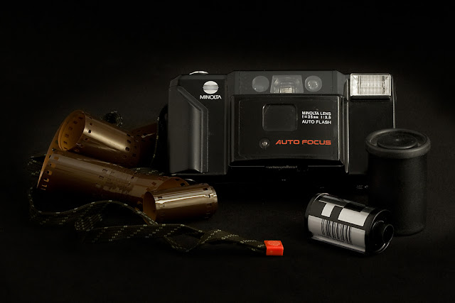
In January 2006 Konica Minolta Holdings announced its withdrawal from the camera and film businesses, marking the end to one of the best known brands in the photography world. As part of the surprise move, the Tokyo-based company said  it would sell a portion of its digital single lens reflex camera assets to Sony.  The company said it would stop making photographic film and color paper by March 2007, pulling out of a market in rapid decline due to the spread of digital cameras, which store images digitally.

It’s the end of the road for Kodachrome film as the last processor recently announced that they would stop processing the slide film on 30 December 2010. Kodak first announced that they would stop making the film early in 2009, and now D-Day has arrived. Kodachrome film was first introduced in 1935 and was the first successful colour film made available on the market. The decision to stop producing the film was made as sales started to take a dip early last year, with Kodak announcing that the ‘film represents just a fraction of 1% of Kodak’s total sales of still-picture films’. This is due to the digital revolution which seems to dominate photography these days.Kodak stopped making film cameras in 2006.

I still have my Minolta lurking in the cupboard with my negatives...will I ever use it again? I doubt it. Will I keep it? Yes :o) Sad to think that I have contributed to the decline in film as I did love using it, but the versatility and cost effectiveness of digital is unrivalled.

ISO 800 F20 6 seconds.

Again wanting a sharp image from front to back f20 achieved this result, combined with ISO 800 a shutter speed of 6 seconds was required to obtain the correct exposure.This image presented interesting challenges. It was a dark subject which blended into the background and would require good lighting but was also reflective which could cause blown highlights if harshly lit. Being mainly black against a black background this is a low dynamic range image.

A solution was reached by reducing/diffusing the light and increasing the ISO to 800. The silver foil reflector once again created too many reflections in the film and a harsh reflected light on the left of the camera. This reflector was replaced with a softer white fabric.On close inspection there was a slightly yellow cast to the right and a blue to the left. As I was shooting earlier in the afternoon daylight was bleeding through over the top of my large sheet of black card. To help cut this light blankets were draped in front of the patio doors (they don't have curtains) and this showed a huge improvement. I used a custom white balance but uploaded images were still showing a slight cast. No adjustments were made in ACR as I couldn't fine tune it to my satisfaction, highlighting my need to improve my skills employing RAW conversion, however applying a black and white adjustment layer in photoshop to make local adjustments worked beautifully.

 Image 5: Celebration

I have been trying to find the average cost of an 18th birthday celebration but nobody seems to have collated figures for this. However I did manage to find that the average cost of a wedding these days starts at £15,000.00? Wow.... I ask myself why? The last celebration I organised was in January for my daughter's 18th birthday and careful planning and shopping around kept the costs down. Everyone had a fantastic time and my pocket wasn't too dented.

ISO 200 F29 @ 25 seconds

Once more I did not want a shallow depth of field and F29 provided the effect I wanted. Reflectors and diffusers were used to create the soft light and shadows. With th ebright colours and lighting this is a mid range image. A curves layer was added in photoshop.

Image 6: Romance


The divorce rate fell by 2.5 per cent in 2008, the Office for National Statistics said. In 2007, out of 1,000 married people 11.8 got divorced, but this fell to 11.5 in 2008 – the lowest level since 1979. This is the fourth year in a row that the divorce rate has fallen. However, others warned that the figures gave a misleading picture.Claire Tyler, chief executive of Relate, pointed out that the data did not include figures on how many cohabiting parents separated. I'm part of the 2005 statistics ;o)

ISO 200 F29 10 seconds.

I thought this would be a low contrast image due to the majority of the tones being white/grey, although the values do stretch across the axis they are very low and there is a significant peak and bunching together of values towards the 255 end. But surprisingly it is more of a normal contrast image.

I employed a diffuser/reflector and a custom white balance. Slight adjustments were made in ACR to the exposure and temperature sliders. Further minor adjustments were made in photoshop via a curves layer and a B&W adjustment layer which was reduced in opacity and used to make local adjustments where I was still not entirely happy with the residual colour cast.

In Conclusion

I learnt a tremendous amount from carrying out this assignment. The use of diffusers and reflectors can greatly enhance the available light. This helped enormously with images of high and low contrast. If the opportunity is there to use a custom white balance I shall use it, as in the majority of cases it solved the issues with white balance/colour cast. Any residual problems were minor and easily resolved using ACR or photoshop.

From the outset I was aware that using my 100mm lens would compress the image and would probably have to use a minimum of f16 but it was surprising that I had to use up to f29 to achieve the depth of field for a pleasing result. Using a higher ISO also allowed me to capture images using low-light conditions. I would not go any higher than 800 due to the increased noise even though ACR does has the facility to adjust noise for both colour and luminance.

The black velvet fabric provided a seamless background and cut out the daylight really well. I did find out that bright/harsh lighting gave the velvet a grey appearance but the diffusers and experimenting with shutter speed/exposure corrected this problem. Another minor issue was with specks of dust/debris on the fabric which I did not notice at first but were clearly visible when viewing the images on my monitor. Images were either reshot after the velvet had been cleaned or specks were removed with the clone or healing tool.

After I converted the images to jpegs and altered the profiles to SRGB I noted that the subtle lighting and shadows tended to merge into the background. This gave the impression that the subjects were "floating". I have left the first images on my Blog to demonstrate this. On printing one of the images the loss of subtlety is not so bad but still not as good as I would have anticipated, therefore I reworked the Tiffs before uploading to my Flickr page for assessment. However it is interesting to note that the compressed jpeg images still aren't quite as accurate as I'd like which proves that you can't beat printing final images for display and that while some images can take compression and a reduction in size for display on the web others may need different processing to retain some of the original details.

On reflection I am quite pleased with the final set of images I have produced. They fulfil the brief given; a minimum of six images with varying lighting conditions applying knowledge gained over the course of the module. I also believe they met my own personal criteria of having a personal overtone which others will also connect with.

Thursday 25 November 2010

Planning Assignment 2

I am still thinking along the lines of still life for Assignment Two. Always up for challenging myself nothing in photography is ever "easy" but I want to make myself think hard about what I am taking photographs of and the technical side of producing the images. Having read parts of On Being a Photographer and On Looking at Photographs (Jay and Hurn) I wanted to have a clear purpose behind the reason for taking each image, I wanted each image to be personal to me but to also illicit some kind of reaction/emotion/recognition from my audience, even if that audience did not share the same experiences they should be able to empathise with them and have their own interpretation/memories kindled.

Gauntlet thrown down to myself! I am hoping to find enough objects/scenarios that will translate into still life images that can encapsulate stages in my life/the end of things/moving on as the theme. Hopefully the images will speak for themselves and require no explanations.

I've had a quick squizz through Minimalist Lighting Techniques by Kirk Tuck Copyright 2009 published by Amherst Media Inc, and whilst a lot of it does not apply, as I don't have the lights, soft boxes or the room size there are some interesting pointers about how to set up for still life within a studio and some techniques that I can duplicate with everyday household items...bring on the sheets, kitchen foil and clothes pegs!


'The studio is all about “making” and not just “taking” a photograph. Out on the street, all you need to do is react to whatever transpires in front of you. The whole point of using a studio is to be able to control every aspect of your photography. In the studio, you decide what background to use, what kind of lights to use, the color and character of the light, and so much more. Of all the decisions you’ll make, the most important technical choices will concern the lighting—whether or not to use hard, chiseled light with deep black shadows or soft, effulgent light that wraps around your subject and provides soft transitions between highlights and shadows.' (p24)
Section 2, Light and Lighting Explained covers points such as fall off which I found quite relevant, and how the use of silver reflectors can flood areas with reflected light. A brilliant series of shots of an orange with different lighting techniques (p39-45) showed how to make an interesting shape whilst not creating harsh specular lights or deep shadows. A diffuser was made by using tracing paper and an old picture frame, fill light to the other side of the subject was a simple white T shirt on a hanger. Things to bear in mind when I set up my shoot.

Thinking about Metering :o)

Obviously the last set of tasks have all been about colour casts and dynamic range, all link in to correct exposure. One of the tasks had me "spot metering" with my camera. The 400D unlike some of the later models does not actually have a spot metering mode so I had to investigate and find out which of the modes was the best to use on this occasion and what did the other modes actually offer.

Cameras measure the light reflected back from the subject to the camera. Reflective light meters assume that all scenes have an average distribution of light, medium and dark tones, the meter also assumes that the average of all tones in the scene is 18 percent grey. On the whole this assumption is correct and will produce a properly exposed image. But as we know not all scenes will contain average tonality, e.g. snow or large expanses of water.

The modes on the 400D are as follows :-

Evaluative Metering

This is the default setting and will analyse from virtually the whole viewfinder area, with the meter analysing the point of focus and automatically applying compensation is the surrounding areas are much lighter or darker. To calculate the correct exposure the camera analyses subject position, brightness, background, front and back lighting and camera orientation.

This mode produces correct exposure in average scenes that include a distribution of light, medium and dark tones. If shooting scenes already mentioned IE snow, water it can be useful to use exposure compensation to increase or decrease exposure by one or two stops. Evaluative metering mode in the default for all Basic Zone Modes.

Centre-weighted Average Metering

Centre-weighted Average metering makes use of the AF points but although there are nine AF points only the seven AF points in the centre are used, hence the name. Centre-weighted metering gives more weight to the area of the scene within the seven AF points in the centre of the viewfinder. The camera then averages the exposure for the entire scene. This is useful for backlit subjects and where the tones are not average and require exposure compensation.

Partial Metering

This mode meters from a central 9 percent of the viewfinder. Once again this is handy in backlit or side-lit situations when you want to make sure the subject is properly exposed.

Exposure Compensation

You can use exposure compensation to override the camera's default exposure. EC is set in 1/3 or 1/2 stop increments up to +/- 2 f-stops. It can be combined with Auto Exposure Bracketing and be used in all Creative Zone modes except for Manual.

Auto Exposure Bracketing

AEB ensures at least one exposure in a series of three will be acceptable, one exposure will taken at the standard exposure with one lighter and one darker. AEB can also be set at 1/3 or 1/2 increments up to +/- 2 f-stops. However AEB cannot be used in some circumstances, i.e. with flash or Bulb settings. AEB settings are cancelled if you change the lens, replace a cf card or battery or turn off the camera.

AE Lock

Another handy feature if you don't want to set the exposure on the area where you set the focus, for example if shooting a portrait and the brightest spot is the persons forehead, in this situation you may wish to expose for the highlight but focus on the eyes. This can be achieved by using AE Lock.Once again this function is not available in Manual mode.

When thinking about exposure the issue of flash rears it's ugly head. To flash or not to flash that is the question! Built in flash can produce harsh or unnatural illumination on the subject and more often than not harsh shadows behind. Overexposure and red-eye are also a common effect. The 400D's built in flash and capability to use external flash units offer a greater control and help to avoid these problems.

There is a table in the Digital Rebel Field Guide which gives the Built in Flash Range with the 18-55mm lens

Built-in Flash Range with the EF-S18-55mm Lens
ISO
18mm
55mm
100
1- 3.7 m (3.3-12.1 ft)
1- 2.3 m (3.3- 7.5 ft)
200
0.7 - 5.3m (3.3- 17.4 ft)
1 – 3.3, (3.3- 10.8 ft)
400
0.7 - 7.4m (3.3 – 24.3 ft)
1- 4.6m (3.3- 15.1ft)
800
0.7- 10.5m (3.3 – 34.4 ft)
1- 6.6m (3.3 – 21.7 ft)
1600
0.7- 14.9m (3.3- 48.9 ft)
1- 9.2M (3.3 – 30.5 ft)


which made interesting reading. Not that I expect to remember all of it just like that ;o) Handy to note that whatever the focal length or ISO the closest you should be is approx 1m and using the highest ISO at 18mm you can reach up to 14.9m (though my brain still likes to operate in feet) Obviously upping the ISO will increase the range, I'll have to find a simple way to remember the increments but in general the longer the focal length the shorter the distance the flash covers and the higher the ISO the farther the distance the flash illumination covers.

The 400D also offers a red-eye reduction option and a Flash Exposure lock and flash exposure compensation. Now I have investigated FEC I will probably use it more :o).

Interesting review...
Canon EOS 400D Rebel XTi Digital Camera Flash - Full Review - The Imaging Resource!