The full report can be seen on the Tutor Feedback page :o)
Feedback on Assignment 2.
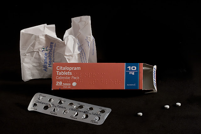
Image 1 Health
This image is a high dynamic range shot as you say in your notes and the exposure is very accurate. There is nice detail in the highlight areas and the subject stands out nicely against the jet black background. It also demonstrates what you can do with a simple lighting set up. Pictorially the image is not that exciting and you could afford to lose one of the paper packets in the background to tidy it up a bit.
I agree that the image is not that exciting but in some ways that was what I was trying to achieve, Citalopram anti-depressants are for when life doesn't feel that exciting. I did start off with only one paper object in the background but to me it then appeared unbalanced. However I shall clone one out and see what the effect is :o)
Two versions, with either piece of paper removed.
Two versions, with either piece of paper removed.
Looking at the two amnded images I think I prefer the last.
Image 2 Wealth
This shot reminds me of my life savings (!). Again you have shown what can be done with a simple set up, and who is to tell that this shot was not taken with an expensive studio flash unit and soft box? The lighting on the broken piggy bank is just right and the whole image is nicely positioned within the frame. Well done.
Image 3 Happiness
You quote David Cameron as saying “There is more to life than money”, but that’s not bad coming from a multi millionaire! However, this shot is in the low dynamic range because there are no highlights as such. The colors and texture are lovely and this is a fine “still life” shot.
Image 4 Hobbies
Another low dynamic range subject which has been well handled. I particularly like the red lettering on the camera and the red plastic toggle at the end of the strap. This is the only bit of bright color in the image and therefore draws attention to the viewers’ eye. The camera is also nicely positioned on the right hand third with the surrounding film and cassette adding further interest. Brilliant.
Image 5 Celebration
This one is a mid range shot which again has been well lit. However, pictorially for me it is a bit untidy. The plastic poppers are nicely placed in the frame, but you could get away with fewer streamers as they tend to clutter the image a little, but this shot does have the makings of an interesting image. Try it with fewer streamers.
Originally I did have less streamers but it looked sparse for a celebration, I was going for the look that the floor has when it has been swept and the remaining mess is in a heap ;o) I have dismantled my set-up for the time being, I'll see if any of my earlier shots are as sharp or have a more pleasing composition.
This is the original shot but with some of the streamers photoshopped out.

This is an alternative composition, I am not happy with the lighting, this was one of my rejects as I kept shooting, checking shooting then checking to move the reflectors etc. However it does demonstrate the image with less streamers. If I have time later I will see if I can reshoot a similar composition :o)
Image 6 Romance
Originally I did have less streamers but it looked sparse for a celebration, I was going for the look that the floor has when it has been swept and the remaining mess is in a heap ;o) I have dismantled my set-up for the time being, I'll see if any of my earlier shots are as sharp or have a more pleasing composition.
This is the original shot but with some of the streamers photoshopped out.

This is an alternative composition, I am not happy with the lighting, this was one of my rejects as I kept shooting, checking shooting then checking to move the reflectors etc. However it does demonstrate the image with less streamers. If I have time later I will see if I can reshoot a similar composition :o)
Image 6 Romance
This is a normal contrast image which again has been well carried out. The ring is nicely placed within the subject and the circular court stamp echoes the ring. The torn up wedding shot also adds interest and the components of the image combine to tell a story. Another winner.
I really enjoyed completing this assignment and was pleased with the positive feedback and constructive critisism. Seeing the merits of the suggested amendments I completed the alterations and am happy with the final images. Using subjects/topics close to my heart helped focus my attention on composition and communicating certain emotions which I think I managed to do.


No comments:
Post a Comment