I passed phew! My tutor had indicated that there shouldn't be a problem but you always hold your breath! Second Class Upper Division which I think is fair and am pleased with :o) Having be given APEL for the two other level one modules I had to learn quite quickly what was the standard for the OCA submissions and how to show progression, learning and research as well as produce work of a suitable standard.
Assessor feedback concluded that my submission was well presented, and showed progress. The work demonstrated that I am articulate and self aware, my blog showed I appreciate the value of research. Have competent technical skill, can transmit ideas and emotions. My shoe series was described as evocative :o) Good use of colour and light. The main areas I could have gained more points on were invention and communication with my learning log described as not the easiest to navigate but was realistic, useful and of value to me. So areas to look at on the next level.
Showing posts with label Feedback. Show all posts
Showing posts with label Feedback. Show all posts
Sunday, 8 May 2011

Tuesday, 29 March 2011
Assignment Five : Personal Project Feedback
Well that's my last assignment done and feedback received :o) Once again positive feedback about which I was happy, with a few constructive ideas to improve individual shots. With some of the critique the composition was either beyond my control or deliberately done, I shall carry out the amendments and review/compare to see if they improve the overall images.
Tutor Report Form
Note to self to watch my horizons ;o) I knew that the building was a little tipped but thought I had corrected it enough, obviously not and one of those cases where in the end you can't see the wood for the trees! Also I was attempting to retain the tips of the railings. Part of the problem I think is that using a wide angle lens has distorted the lines of the building, even when adjusted some of the verticals are still out :o/
The final image has a slightly different crop as rotating and transforming the image has lost some of the background, however the more upright building in a vast improvement and the loss of the railings does not impact on the final shot. This too, if anything, has removed a distracting bright patch from the left hand side.
Tutor Report Form
Hi Jan,
Thank you for sending in your fifth and final assignment. As usual I have just had a brief look through it and it is very much up to your usual high standard. All the images are very accurately exposed and biting sharp and you have also chosen an unusual but interesting subject matter. Anyway, please find below my comments in more detail:
Feedback on assignment
Image 1 (1960s)
For me the lighter area at the top right hand corner is just a bit too bright and you could afford to tone it down a bit. You could also afford to crop off the gate area at the top right as it is a little too distracting. However, the shoes are nicely positioned in the frame and the texture detail is excellent.
The bright area in the garden was toned down but the brighter area to the rear was left as I was suggesting a bright path to an unknown future, but can see how it is a little distracting and could also be toned down. Experimenting with the crop from the original shot I left the gate in on purpose thinking it helped narrate the story of entering the garden and starting on a journey down a path.
 |
| Bright patch toned down |
 |
| Toned and cropped |
 |
| To compare |
Putting them side by side I do prefer the tighter crop.
Image 5 (1980s)
Again you have another colorful and interesting image. However, the church in the background is just a little too tight in the frame and could do with a bit more space around it, particularly at the top.
Due to the height of the church it was tricky to fit all the bell tower in, however to try and correct this I created a duplicate layer which was then distorted and using the clone tool and layer mask the layers were merged to give a little extra height.
 |
| Final Image height added |
 |
| To compare |
When taking the crematorium shot I took an extra frame to give the extra height, on framing the church a few of the initial shots were fine, but with the final image the composition was obviously altered slightly and I failed to notice. Due to the intricate detail of the tree I thought that cloning might not give a satisfactory result, to my eye it does look a little fuzzy but if you had not seen the original shot this could be put down to the aperture and wide angle making the background soft.
The final image with extra height gives a much better shot.
The final image with extra height gives a much better shot.
Image 6 (1990s)
Very nice reflection on the shoe in the foreground and the red matches very nicely that of the London buses. You could afford to crop off the pedestrian on the far right who is partly out of the frame anyway. This would make a tidier composition.
This image was shot and framed intentionally to contain the commuters who stride over the bridge each day. The line of the bridge takes you into the centre of the frame, because of the wide angle the clouds also lead from the corners of the frame to the centre as do the street lights. Cropping to remove the pedestrian removes too many elements that I feel help complete this photograph, the detail in the sky, the rear of the bus and the repeat pattern of the street lights.
Using Joel Meyerowitz as one of my influences I noted that in several of his images he has cropped people entering or leaving the frame, as this was an effect I was attempting to recreate I will stick to my original shot.
This image was shot and framed intentionally to contain the commuters who stride over the bridge each day. The line of the bridge takes you into the centre of the frame, because of the wide angle the clouds also lead from the corners of the frame to the centre as do the street lights. Cropping to remove the pedestrian removes too many elements that I feel help complete this photograph, the detail in the sky, the rear of the bus and the repeat pattern of the street lights.
 |
| Simple crop of just the bus |
 |
| Cropped side and top |
 |
| To compare |
 |
| Meyerowitz montage |
Image 7 (1990s)
The trainer shoes are nicely placed in the frame and the shadows of the tree and framework form interesting patterns on the building. Again the image is nicely lit with the hint of a nice blue sky. Although you say in your notes that the building is a swimming pool there is no indication of the buildings use to the viewer as there is in the crematorium shot.
The part of the building behind the trainers is the sports complex cafe, the swimming pool cannot be photographed from the outside due to the glass not being smoked and obvious privacy issues. Not wanting any obvious signage in the shot this was one of the photographs I hoped would be open to question and interpretation to the audience, the trainers being a clue that it was a municipal leisure centre.
The part of the building behind the trainers is the sports complex cafe, the swimming pool cannot be photographed from the outside due to the glass not being smoked and obvious privacy issues. Not wanting any obvious signage in the shot this was one of the photographs I hoped would be open to question and interpretation to the audience, the trainers being a clue that it was a municipal leisure centre.
Image 8 (2000s)
Another interesting and unusual shot that is attractive to the viewers eye. The only problem with this one is that the building is leaning to the right and is distracting. For a better effect straighten the image so that the verticals on the mansion are upright.
Note to self to watch my horizons ;o) I knew that the building was a little tipped but thought I had corrected it enough, obviously not and one of those cases where in the end you can't see the wood for the trees! Also I was attempting to retain the tips of the railings. Part of the problem I think is that using a wide angle lens has distorted the lines of the building, even when adjusted some of the verticals are still out :o/
 |
| Dodgy verticals even when corrected.... |
 |
| Comparing before and after verticals |
 |
| To compare final shots |
 |
| Final amended image |
Image 9 (2000s)
I like this shot very much. The colors of the sky and water are lovely and the silhouetted foreground boots add the interest. I think that you could afford to crop a little off the darker area on the left hand side so the viewer concentrates on the boots and the color of the scene.
I found, because of the geese to the extreme left of the image, cropping just a little gives not enough space to the side of the frame or cut them in half which left a messy shot. Cropping them out entirely also removed the interesting blue patch of sky so have used a curves layer to lighten the far left instead.
I think this adjustment works well and adds more detail although the sharpening around the geese needs to be adjusted as there is a slight halo now uploaded.
I found, because of the geese to the extreme left of the image, cropping just a little gives not enough space to the side of the frame or cut them in half which left a messy shot. Cropping them out entirely also removed the interesting blue patch of sky so have used a curves layer to lighten the far left instead.
 |
| to compare |
 |
| Final adjusted image |
I think this adjustment works well and adds more detail although the sharpening around the geese needs to be adjusted as there is a slight halo now uploaded.
In conclusion I took on board the suggestions and altered the images accordingly, the amendments have made for better final images although I have chosen to keep one photograph unaltered. Having worked really hard on this final project I was a little disappointed in myself that I hadn't spotted some of the obvious corrections before sending to Peter but this is also part of teh learning curve, I should probably step back for a day or two then come to the images with fresh eyes as you do when you do the first edit :o)
Friday, 18 February 2011
Assignment 4 Feedback
Full Tutor report can be found on the Tutor Report Page.
Once again I was pleased with the feedback given and it was noted that I had completed research before undertaking this element of the course :o)
This particular assignment is so well done it is difficult to improve upon and this is a credit to your hard work and understanding of not only this assignment, but all your previous work also.
Only a few pointers to improve/correct so I shall rework the image accordingly to see what impact they have.
In the photograph itself there is “noise” but that does go with the dramatic image and the anti bullying contents of the magazine.
The image is also a bit flat and would benefit with a bit more contrast and at first the fist in the mouth in the form of teeth is not that clear. I would paint the fist the same color as the yellow text so that the viewer recognizes them as “teeth” and this will add a bit more impact to the image.
The noise was deliberately added for effect so I was pleased that this was noted :o) On reflection the flatness was possibly not so much due to the contrast but because of the opacity of the main image, I increased this to 86% as I felt having it at 100% was a little too overpowering. Experimenting with the contrast and brightness I found altering the values too much also increased the noise to the detriment of the image. I adjusted them slightly but then used dodge and burn to lift certain areas. To make the "teeth" pop a little more I used the lasso tool to select the fist and applied a yellow photo filter using the same colour yellow as the font, f4ee8d, this has the desired effect but keeps it subtle.
On the text side for me it is perfect, but I would replace the “o” in “Order Your Copy Now!” with a capital “O”.
Text amended as advised and I do think it is more eye-catching.
Other than that there is little else that I can say except well done for completing an exceptionally good assignment.
Having taken on-board the comments given by Peter and made the necessary amendments I can see the improvement to the cover. The main image is lifted, the teeth "pop" more and can be seen as a fist. I had been concerned with them looking too fake, although obviously they are, but I think the photo filter has done the trick. Changing the lower case to upper case has also given the text more impact. Minor alterations but definitely worth making :o)
Once again I was pleased with the feedback given and it was noted that I had completed research before undertaking this element of the course :o)
This particular assignment is so well done it is difficult to improve upon and this is a credit to your hard work and understanding of not only this assignment, but all your previous work also.
Only a few pointers to improve/correct so I shall rework the image accordingly to see what impact they have.
In the photograph itself there is “noise” but that does go with the dramatic image and the anti bullying contents of the magazine.
The image is also a bit flat and would benefit with a bit more contrast and at first the fist in the mouth in the form of teeth is not that clear. I would paint the fist the same color as the yellow text so that the viewer recognizes them as “teeth” and this will add a bit more impact to the image.
The noise was deliberately added for effect so I was pleased that this was noted :o) On reflection the flatness was possibly not so much due to the contrast but because of the opacity of the main image, I increased this to 86% as I felt having it at 100% was a little too overpowering. Experimenting with the contrast and brightness I found altering the values too much also increased the noise to the detriment of the image. I adjusted them slightly but then used dodge and burn to lift certain areas. To make the "teeth" pop a little more I used the lasso tool to select the fist and applied a yellow photo filter using the same colour yellow as the font, f4ee8d, this has the desired effect but keeps it subtle.
On the text side for me it is perfect, but I would replace the “o” in “Order Your Copy Now!” with a capital “O”.
Text amended as advised and I do think it is more eye-catching.
Other than that there is little else that I can say except well done for completing an exceptionally good assignment.
 |
| For Comparison |
 |
| Re-worked Image |
Having taken on-board the comments given by Peter and made the necessary amendments I can see the improvement to the cover. The main image is lifted, the teeth "pop" more and can be seen as a fist. I had been concerned with them looking too fake, although obviously they are, but I think the photo filter has done the trick. Changing the lower case to upper case has also given the text more impact. Minor alterations but definitely worth making :o)
Wednesday, 22 December 2010
Assignment 3 Feedback
Full Feedback can be found on the Tutor Report Page :o) Once again I am really happy with the feedback and suggestions given :o)
Overall Comments
Hi Jan,
Thank you for sending in your third assignment. As usual I have had a brief look at your images on your blog and they are of a very high standard indeed, so it is going to be difficult for me to advise you as to how you can improve. With quality images like these you should do well at the assessment if you decide to go for it.
Going to Work on an Egg
Peter has made a comment that to improve pictorially, I could remove one of the traffic cones so that I only have five components for the shot as for some reason odd numbers always give a slightly better composition. I never realised that so will clone one out and see what the result is :o)
I chose to clone out the far right as I liked the angle of the other cone. Had the original scene been made up of only 5 elements I may have spaced them slightly differently so although I can see the effect of having an odd number of elements I think I prefer the original shot.

Then experimenting I cloned out the angled cone. I think this is a better spaced composition however I do like the other cone better :o/

Then to play even further I created a duplicate cone which I placed in the frame, the reflection "falls off" but it does give an odd number of elements. I think this is too busy but was only to see what the effect was rather than a serious rework :oP

In conclusion I think I'd stick to my original image but remember in future to think of the "odd number" rule.
*amendment* doing a final review of this several months later I actually quite like re-work number one but still not entirely happy with the spacing in the frame am still sticking with my original shot ;o)
Painting by Numbers
I chose to clone out the far right as I liked the angle of the other cone. Had the original scene been made up of only 5 elements I may have spaced them slightly differently so although I can see the effect of having an odd number of elements I think I prefer the original shot.

Then experimenting I cloned out the angled cone. I think this is a better spaced composition however I do like the other cone better :o/

Then to play even further I created a duplicate cone which I placed in the frame, the reflection "falls off" but it does give an odd number of elements. I think this is too busy but was only to see what the effect was rather than a serious rework :oP

In conclusion I think I'd stick to my original image but remember in future to think of the "odd number" rule.
*amendment* doing a final review of this several months later I actually quite like re-work number one but still not entirely happy with the spacing in the frame am still sticking with my original shot ;o)
Painting by Numbers
Only a minor comment that the fern is possibly a shade too close to the edge of the frame, I cropped the original image to bring the fern into the corner a little more so easily remedied.


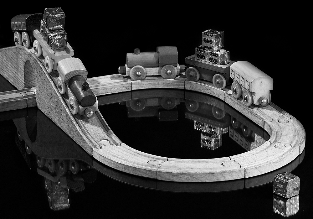
Gravy Train
Comment was ...This one to me is not quite as good as some of your other shots, but it is still very good. Technically perfect, I would liked to have seen the train on the bridge come just a bit more into the frame so the viewer could see the Oxo cube a bit better. The only other thing that bothers me slightly is the way the track continues out of the frame as it tends to lead the eye out and is therefore a bit distracting.
This image I did have issues with constructing. Originally I did have less track but I was not happy with the composition and added more, possibly a mistake...I had wanted to make a complete circle but with the bridge made the scene to large, building the track with the bridge gave added height and interest. I'll see if I can clone some out without it appearing too odd, The train I did alter from one direction to another which impacted on the view/angle of the OXO cubes, bringing it further down then made the train on the track affected the reflection of the train in the background and the reflection of the train itself within the frame, so a compromise was made ;o)

This image I did have issues with constructing. Originally I did have less track but I was not happy with the composition and added more, possibly a mistake...I had wanted to make a complete circle but with the bridge made the scene to large, building the track with the bridge gave added height and interest. I'll see if I can clone some out without it appearing too odd, The train I did alter from one direction to another which impacted on the view/angle of the OXO cubes, bringing it further down then made the train on the track affected the reflection of the train in the background and the reflection of the train itself within the frame, so a compromise was made ;o)

The track just ending at the bridge seems odd although the piece of track cloned out at the back seems an improvement so I tried another version with leaving the track running off the frame under the bridge but removing the extra at the back.
 for a comparrison here all all three side by side. I think I prefer the second rework of just the small piece of track removed. Although a piece of track does lead the eye out of the frame to the lefthand side it does "join" up with the reflection of the bridge which should lead the eye back in.


Sunday, 28 November 2010
Assignment 2: Feedback
The full report can be seen on the Tutor Feedback page :o)
Feedback on Assignment 2.
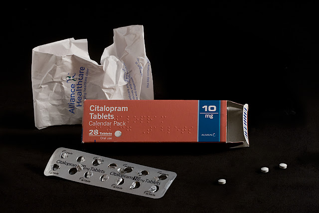
Image 1 Health
This image is a high dynamic range shot as you say in your notes and the exposure is very accurate. There is nice detail in the highlight areas and the subject stands out nicely against the jet black background. It also demonstrates what you can do with a simple lighting set up. Pictorially the image is not that exciting and you could afford to lose one of the paper packets in the background to tidy it up a bit.
I agree that the image is not that exciting but in some ways that was what I was trying to achieve, Citalopram anti-depressants are for when life doesn't feel that exciting. I did start off with only one paper object in the background but to me it then appeared unbalanced. However I shall clone one out and see what the effect is :o)
Two versions, with either piece of paper removed.

Two versions, with either piece of paper removed.


Looking at the two amnded images I think I prefer the last.
Image 2 Wealth
This shot reminds me of my life savings (!). Again you have shown what can be done with a simple set up, and who is to tell that this shot was not taken with an expensive studio flash unit and soft box? The lighting on the broken piggy bank is just right and the whole image is nicely positioned within the frame. Well done.
Image 3 Happiness
You quote David Cameron as saying “There is more to life than money”, but that’s not bad coming from a multi millionaire! However, this shot is in the low dynamic range because there are no highlights as such. The colors and texture are lovely and this is a fine “still life” shot.
Image 4 Hobbies
Another low dynamic range subject which has been well handled. I particularly like the red lettering on the camera and the red plastic toggle at the end of the strap. This is the only bit of bright color in the image and therefore draws attention to the viewers’ eye. The camera is also nicely positioned on the right hand third with the surrounding film and cassette adding further interest. Brilliant.
Image 5 Celebration
This one is a mid range shot which again has been well lit. However, pictorially for me it is a bit untidy. The plastic poppers are nicely placed in the frame, but you could get away with fewer streamers as they tend to clutter the image a little, but this shot does have the makings of an interesting image. Try it with fewer streamers.
Originally I did have less streamers but it looked sparse for a celebration, I was going for the look that the floor has when it has been swept and the remaining mess is in a heap ;o) I have dismantled my set-up for the time being, I'll see if any of my earlier shots are as sharp or have a more pleasing composition.
This is the original shot but with some of the streamers photoshopped out.

This is an alternative composition, I am not happy with the lighting, this was one of my rejects as I kept shooting, checking shooting then checking to move the reflectors etc. However it does demonstrate the image with less streamers. If I have time later I will see if I can reshoot a similar composition :o)

Image 6 Romance
Originally I did have less streamers but it looked sparse for a celebration, I was going for the look that the floor has when it has been swept and the remaining mess is in a heap ;o) I have dismantled my set-up for the time being, I'll see if any of my earlier shots are as sharp or have a more pleasing composition.
This is the original shot but with some of the streamers photoshopped out.
This is an alternative composition, I am not happy with the lighting, this was one of my rejects as I kept shooting, checking shooting then checking to move the reflectors etc. However it does demonstrate the image with less streamers. If I have time later I will see if I can reshoot a similar composition :o)


Image 6 Romance
This is a normal contrast image which again has been well carried out. The ring is nicely placed within the subject and the circular court stamp echoes the ring. The torn up wedding shot also adds interest and the components of the image combine to tell a story. Another winner.
I really enjoyed completing this assignment and was pleased with the positive feedback and constructive critisism. Seeing the merits of the suggested amendments I completed the alterations and am happy with the final images. Using subjects/topics close to my heart helped focus my attention on composition and communicating certain emotions which I think I managed to do.
Sunday, 17 October 2010
Assignment 1: Workflow Feedback
My tutor has replied and I have my feedback :o) Pleased with and in agreement with the comments made.
I could have submitted the minimum amount of images but wanted some constructive critisism of the images I knew hadn't worked as well as they could.
Feedback below :o)
Thank you for sending in your first assignment which you have thoroughly understood and handled it very well. Your work flow is fine, but the only thing I did read somewhere in your blog is that you print in Pro Photo RGB. If you are happy with this then that is fine but beware that the color space is so large that many colors are not printable or viewable on your monitor and you may need to do complex editing on subtle colors that are not printable. Smaller color spaces are restricted to colors more likely to be printable, so color changes are fairly small when converted to print. For now I would use sRGB and as you gain more experience switch to Adobe RGB. However, please find below my comments on your images:
I have lots of things to build upon and think about with most areas. Obvious really, or I wouldn't be doing this course. Printing Pro Photo RGB was something I did with my last course when submitting my final portfolio, having had a discussion with regards to best practice and colour space. To be honest not having a large professional printer it probably doesn't have much benefit so possibly converting to Adobe RGB would be ok. I don't think I would use sRGB but it would be interesting to print 3 version sof the same image to see if there was much difference. I calibrate my monitor and using an Epson printer make sure I use Epson inks and Epson papers so I don't need to worry about custom profiles. My printer isn't high enough spec for paper manufacturers to provide free profiles and so far I have been happy enough with the results produced to continue using Epson. Sadly , I also have to run on a budget!
I found some interesting links online about printing, from some who say don't use Pro Photo, to some who recommend its use, to others who say use, but with care and not with every image. As ever divided opinions :o)
Feedback
Image 1
This image is technically perfect and tells the viewer what is happening. There are nice catch lights in the models eyes and the make up artist is included so that the viewer is aware of the activity involved. A fairly wide aperture has been used to render the background out of focus, thereby keeping the eye on the main subjects themselves. Nice one.
Image 2
A similar shot the previous image, this time the models face is half in shadow but it does high light the work of the make up artist. Nothing wrong with that but if you wanted to add a little sparkle you could have used fill in flash. To do this set your separate flash gun at two stops less than the camera, ie if the camera is set at f8 set the flash to f4. this would add catch lights to the eyes and help “fill in” the shadow area.
I couldn't find and so didn't take my flashgun, but this is a useful tip to remember, I did contemplate using the fill in flash but was torn between wanting to keep the shadow whilst also having catch lights. A similar shot with the model looking up with the sun shining provided sparkle but I felt the light was a little harsh, maybe I could have played with that a little more in photoshop to tone it down?
Image 3
As in all your shots the exposures and color balance are very accurate indicated by the skin tones of the models. In this shot the dark back ground has forced the viewers eye to concentrate on the model. Well done.
Image 4
Again you have a good catch light in the models eye and apart from the make up you have a good profile of an attractive model. However the high light area in the back ground is a little distracting and should be toned down a bit in Photoshop.
Will rework :o)
Image 5
This one is a good candid image of the two people having fun and totally unaware of the camera. A very effective but simple composition. Nice one.
Image 6
I don’t think this is quite as good as some of your other images as it is a bit untidy, but nevertheless it is in keeping with the subject matter. As a viewer I would like to see a bit more of the models face but apart from that there is nothing else to say.
I also felt this wasn't a good shot but was being a bit OCD'ish and not wanting to submit an odd number of images included it.
Image 7
As you say in your notes the eyes do match the back ground very well. This is a better shot than the previous image as the model is nicely positioned within the frame and again there is “sparkle” in her eyes. Another nice one.
Image 8
Again this one could do with a touch of fill in flash to give that extra sparkle to the eyes, but you do have a nice diagonal composition with the head tilted to one side. This adds further interest to the image
Again I agree with the need to use flash, on this one the students were filming and I didn't want to have random flashes going off in their background. I should have waited until they stopped rolling and taken again.
Image 9
Again you have a competent image and the model is nicely cropped within the frame. The direct sun light is a bit harsh but in this case that adds more interest to the subject matter.
Image 10
An unusual low level shot and the models pose has formed a nice triangular composition. As you say in your notes the depth of field is excellent indicating that you have used the correct aperture for this subject.
Image 11
This one could do with either a more full length view to include the models limbs, or, going in closer for a more deliberate crop of the upper body and head. As it is it looks just like a grab shot without any thought to composition.
This was one in a series of shots, the others were taken a little further back still "cropping" the limbs, but the model was blinking or there was too much clutter in the shot also a lot of bags and coats were dumped just to one side, I cloned out part of a sign that said "Dead Meat Sucks" for the submitted image. It was a slight experimentation with subject matter; uncomfortable subject, uncomfortable pose, uncomfortable composition. It wasn't as successful as I hoped as it does look just like a grab shot. But if you don't experiment you don't learn from your mistakes :o)
Image 12
For me, the back ground is a touch too light and detracting and the back grounds on most of your other images are better. Also the models heels have just been chopped off slightly, which looks a bit untidy. In situations like these go in closer for a deliberate crop, or zoom out so that all the subject is included.
I quite liked the light background but will rework to see what effect it will have, I also was aware at the outset of the closer crop but wanted to get in just that little bit closer, my thought process at the time was along the lines of patterns and not always having to include the obvious, unfortunately as I didn't take a shot from further back I can't rework that part. However I will experiment with cropping in a little more to see what results it gives :o)
Image 1
This image is technically perfect and tells the viewer what is happening. There are nice catch lights in the models eyes and the make up artist is included so that the viewer is aware of the activity involved. A fairly wide aperture has been used to render the background out of focus, thereby keeping the eye on the main subjects themselves. Nice one.
Image 2
A similar shot the previous image, this time the models face is half in shadow but it does high light the work of the make up artist. Nothing wrong with that but if you wanted to add a little sparkle you could have used fill in flash. To do this set your separate flash gun at two stops less than the camera, ie if the camera is set at f8 set the flash to f4. this would add catch lights to the eyes and help “fill in” the shadow area.
I couldn't find and so didn't take my flashgun, but this is a useful tip to remember, I did contemplate using the fill in flash but was torn between wanting to keep the shadow whilst also having catch lights. A similar shot with the model looking up with the sun shining provided sparkle but I felt the light was a little harsh, maybe I could have played with that a little more in photoshop to tone it down?
Image 3
As in all your shots the exposures and color balance are very accurate indicated by the skin tones of the models. In this shot the dark back ground has forced the viewers eye to concentrate on the model. Well done.
Image 4
Again you have a good catch light in the models eye and apart from the make up you have a good profile of an attractive model. However the high light area in the back ground is a little distracting and should be toned down a bit in Photoshop.
Will rework :o)
Image 5
This one is a good candid image of the two people having fun and totally unaware of the camera. A very effective but simple composition. Nice one.
Image 6
I don’t think this is quite as good as some of your other images as it is a bit untidy, but nevertheless it is in keeping with the subject matter. As a viewer I would like to see a bit more of the models face but apart from that there is nothing else to say.
I also felt this wasn't a good shot but was being a bit OCD'ish and not wanting to submit an odd number of images included it.
Image 7
As you say in your notes the eyes do match the back ground very well. This is a better shot than the previous image as the model is nicely positioned within the frame and again there is “sparkle” in her eyes. Another nice one.
Image 8
Again this one could do with a touch of fill in flash to give that extra sparkle to the eyes, but you do have a nice diagonal composition with the head tilted to one side. This adds further interest to the image
Again I agree with the need to use flash, on this one the students were filming and I didn't want to have random flashes going off in their background. I should have waited until they stopped rolling and taken again.
Image 9
Again you have a competent image and the model is nicely cropped within the frame. The direct sun light is a bit harsh but in this case that adds more interest to the subject matter.
Image 10
An unusual low level shot and the models pose has formed a nice triangular composition. As you say in your notes the depth of field is excellent indicating that you have used the correct aperture for this subject.
Image 11
This one could do with either a more full length view to include the models limbs, or, going in closer for a more deliberate crop of the upper body and head. As it is it looks just like a grab shot without any thought to composition.
This was one in a series of shots, the others were taken a little further back still "cropping" the limbs, but the model was blinking or there was too much clutter in the shot also a lot of bags and coats were dumped just to one side, I cloned out part of a sign that said "Dead Meat Sucks" for the submitted image. It was a slight experimentation with subject matter; uncomfortable subject, uncomfortable pose, uncomfortable composition. It wasn't as successful as I hoped as it does look just like a grab shot. But if you don't experiment you don't learn from your mistakes :o)
Image 12
For me, the back ground is a touch too light and detracting and the back grounds on most of your other images are better. Also the models heels have just been chopped off slightly, which looks a bit untidy. In situations like these go in closer for a deliberate crop, or zoom out so that all the subject is included.
I quite liked the light background but will rework to see what effect it will have, I also was aware at the outset of the closer crop but wanted to get in just that little bit closer, my thought process at the time was along the lines of patterns and not always having to include the obvious, unfortunately as I didn't take a shot from further back I can't rework that part. However I will experiment with cropping in a little more to see what results it gives :o)
Thank you again for allowing me to comment on your work which I have thoroughly enjoyed doing. Your work flow is fine and your images are excellent, but from your notes you say that viewing and deleting files in camera reduces the cards life expectancy and can corrupt files. I have been doing this for years and never had a problem, so don’t worry too much about that.
Again this was information supplied by previous tutors so just something I have accepted as good practice. Once more divided opinions as to it is just older or poor quality cards that suffer from the deletion of individual images, to never ever do it, or try to limit the habit.
or just plain good advise as to why you shouldn't delete individual shots :o)
- The LCD on your camera lies. You got that right – the LCD on your camera lies. As of this posting, there is no way to calibrate the little screens at the back of your camera. Even if there were, there you can’t always control your ambient light – and that can sometimes make a gorgeous image look like crap on that tiny LCD. Wait until you get to a larger screen, then make your judgement.
- You can’t trust your fingers. If you delete images straight from you camera, you will, at some point, delete an image you don’t want to erase. Call it clumsiness, Murphy’s Law, or plain bad luck – but whatever you call it, it will give you a headache. Yes, you can try to recover it when you get back to your computer, but in the meantime, you can’t use your memory card.
- Your batteries are weak. That LCD at the back of your camera is a power hog, and the more time you spend reviewing, trimming, and deleting images, the less time you have to shoot. If you keep deleting images, before you know it, you’ll end up with an empty battery and an empty memory card.
- You’re too slow. Even the best multi-taskers cannot shoot and review images at the same time. If you keep deleting images from your camera, you’re going to miss everything you want to shoot. At the end of the day, all your shots will be reminders of the ones that got away.

Toning down the highlight was a little tricky as it was totally blown, I used two different adjustment layers, levels and exposure to keep the result looking as natural as possible without getting any banding or usual effects. This does emphasise her profile more.

As suggested a closer crop of upper body and head. I had liked her pose in the original series, which I have had to lose in this final version, but agree that the submitted shot didn't work. Even after cropping I don't think it is a particularly interesting image. Possibly it would have been better to not have included it the final set but I did want constructive comments.

Again I have slightly adjusted the brightness of the background. It had to be done sympathetically as it started to look too fake. I also tried cropping in a little closer but none of my attempts gave satisfactory balanced compositions. The best compromise I got was adding a vignette but would not have done this within the set as it would not have been in keeping. As a stand alone shot it may have improved it. Next time I would step back to include the entire subject and use selective cropping if I felt it was needed. You can always take away but you can't add if you never included it!

Subscribe to:
Posts (Atom)