Idea/Theme
All the exercises in this project have been to do with recognising tones, the strength of interpretation and understanding how the practical use of channel adjustments can help fine tune black and white images, also to understand the creative effect of a monochrome image.
Due to weather and outside lighting conditions not being very favourable I decided to create a still life theme once more. For this assignment I set myself the challenge to include humour (well they made my mum smile!), objects which were nostalgic, children's toys familiar to me and probably the majority of any prospective audience, mixed with common idioms, whilst also exploring the monochrome image qualities of form, tonal contrast, texture and possibly key.
The ideas I had were many and varied but some were not achievable, either because I was unable to secure the correct props or they just did not translate as well photographically as anticipated. Wanting to experiment with either shadows or reflections, open-minded as to which, I purchased a piece of perspex to stand my subjects on.
The Set Up
My dining room was again converted into a temporary studio, table pushed against the window, black or white fabric used as a backdrop, perspex laid flat on top, and this time with the added bonus of a small light box and two small lamps with daylight bulbs. Working with several small items, some slippery, masking tape and sticky pads were employed where necessary. Camera, tripod, release cable, macro lens and 70-300mm lens were used.
Workflow
Workflow as before, check all equipment, arrange set up, shoot images, check whilst shooting, re-shoot if needed, edit, process.
Final Images
Due to consistent lighting conditions and a similar set up with all the final images I used my 100mm macro lens and an aperture of f29 for all except for one, as this provided the required depth of field. Lucky to have held onto several of my children's and my own personal childhood toys I was able to incorporate some in each scene, hopefully adding the humour and recognition. These props also added the texture/repeat patterns that I hope would create a final interesting monochrome set. All images were shot using Jpeg+Raw, opened in ACR for basic correction if needed and then processed in Photoshop using the Black and White Adjustment layers and other Adjustment Layers as required. To have a balanced set I hoped to create 3 high key images and 3 low key.
1)
Going to Work on an Egg
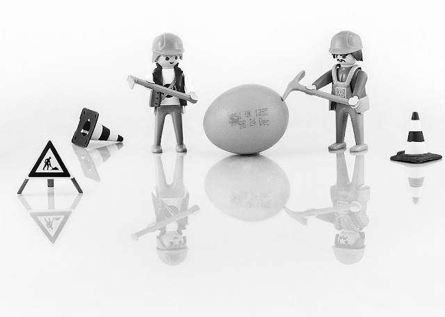
ISO 200 100mm f29 2 Seconds
Playmobil workman were the chosen toy for this shot, using my new light box for the first time. Setting it up and using the daylight lamps did make cutting out stray light and controlling specular light and unwanted reflections an easy process. Although a fairly simple scene with only six elements it did take a while to assemble to my satisfaction, deciding to go for reflections utilising the perspex ensured that I had to position the camera to include all of the reflections and take care that the reflections themselves added rather than detracted from the final tableaux. Test shots were taken to achieve the correct exposure for a higher key result. Following my usual workflow the final photograph was selected for conversion. Difficulties encountered were with the white elements getting lost in the background so careful local adjustments were made with contrast and the dodge and burn tool. One of the workmen originally wore a white hard hat so I took another frame, having swapped the hats over and merged the 2 images together. Several B&W adjustment layers were used to provide the tonal contrast and a final contrast layers were used to bring out even more detail and make the items "pop" slightly more. The colour slider alteration to the reds dramatically improved the tones on the traffic cones, road sign and writing on the egg. On reflection I am really pleased with this final shot.
2)
Pay Peanuts You Get Monkeys
ISO 200 100mm f29 4 Seconds.
This is the original 1970's Pick Up Monkeys game, the idiom "You Pay Peanuts, You Get Monkeys" came straight to mind, the Monkeys provide the game element, a repeat pattern and once again the opportunity to show the creative effect of using the colour sliders. The shelled peanuts have a great texture. Light box and side lamps were used to light the scene. Once more construction for a pleasing composition took a while, difficulties faced were the barrel kept rolling, which I solved by using a small piece of BluTac. Ideally I would have like more of the monkeys' features to be on show but there was a compromise to camera angle versus reflections. I did consider propping each monkey at a slight angle using sticky pads or BluTac but these also reflected in the perspex and the complicated reflections were very challenging to clone out after. There were only four of each coloured monkey in the barrel therefore I moved a blue monkey from one end of the row to the other , re-shot and merged the two images together. Several black and white adjustment layers were used, as well as contrast, and the dodge and burn tool was used to create more of a dramatic effect on the shelled peanuts. I was pleased with the overall composition, but can see that it could be improved by seeing more of the monkeys, and as an after thought I am wondering if I had included a few pennies at the front of the frame in the left-hand corner there would have been a little more emphasis on the money/payment aspect of the idiom.
3) Painting By Numbers
ISO 200 100mm F20 0.6 seconds
Playmobil, Lego, magnetic numbers and paint, combined together make "Painting By Numbers". For this scene I decided to add shadows to the elements as well as reflections, therefore I removed the light box and used not only the side lamps but also the spot lights in my dining room. Setting this tableaux up was great fun, posing the model interesting, ensuring all shadows and reflections worked together was time consuming and challenging but I am really pleased with the end result; the curving lines of the potted palm shadows/reflections and paint brushes all lead the eye around the frame. To complete the image an extra frame was shot to capture the paint spilling from the tube, a section of the original photograph was cropped, a filter applied to make a line drawing effect and applied as a layer to create the painting being completed by the "numbers."
It took several attempts to get the correct exposure on this scene. I started to process a chosen image but when I altered the contrast some areas were still appearing darker than I wanted and changing them locally using differing methods/layers/cloning were not producing the desired result so I scrapped it and re-shot using a different aperture and creating a higher key slightly more exposed image. This was much easier to process. Black and White adjustments layers, a curves layer, a contrast layer and dodge and burn were all used in post production.
I was really pleased with the final image and I can't decide if my favourite shot from the high key images is the simplicity of Going to Work on an Egg or the composition and twist on Painting by Numbers.
For the next three images I decided to experiment with low key scenes utilising a black background.
4)
Cool as a Cucumber
ISO 200 100mm f29 10 seconds.
The original idea had been create a scene including more cucumber ice cubes, however despite following numerous instructions on how to obtain clear ice all were turning out cloudy. Still wanting to use it as a concept I changed tack and raided Barbie's clothes and equipment to make "cool cucumber" characters and used the ice-cube as a table. I did not use the light box due to the lower lighting conditions caused by the black background, this meant taking care with the angle of the lights to not have light reflecting in the perspex or specular lighting on the cucumbers. The shutter speed had to be increased to allow the correct exposure. Several Black and White adjustment layers were used, a contrast layer, curves layer and finally a little dodge and burn to bring out the texture and tones on the cucumber skin. The only minor problem with this shot was the ice cube melting and slipping on the smooth surface. Sticky pads placed behind to "frame" it helped to secure it's position. I was really happy with the composition and subject matter, the lighting/shade on the ice-cream showing its form and shape using a contrast layer really brought out the reflections.
5)
These Boots are Gonna Walk All Over You
ISO 200 70mm f29 13 seconds.
Walking boots and magnetic letters made for a very simple composition. Although very few items included the problems I encountered were the size of the subject and inclusion of the reflection; I had to change the lens length (using a focal length of 70mm) and the orientation of the camera to be able to include the height of the boots and the full reflection. The orientation of the perspex was also altered due to the reflections "falling" off the edge. My initial idea had been to spell out the word YOU in capital letters but none of these would remain upright so lower case were used instead.
The boots were too large to fit in the light box so once again I took care over extraneous light. Black and White/Contrast layers were used in the final processing. I am really pleased with the sharpness of the boots and details in the reflections. The inside texture of the boot add interest as do the laces being stripy; I don't think the final result would have been as satisfactory if they had been plain.
As previously stated some of my initial ideas did not work either photographically, unable to find props or unable to incorporate the elements to make a coherent final set. This was one of my stand-by ideas which I ended up using. Although a pleasing image I think this is the weakest "idiom" in the set.
6) Gravy Train
ISO 200 100mm f29 5 seconds.
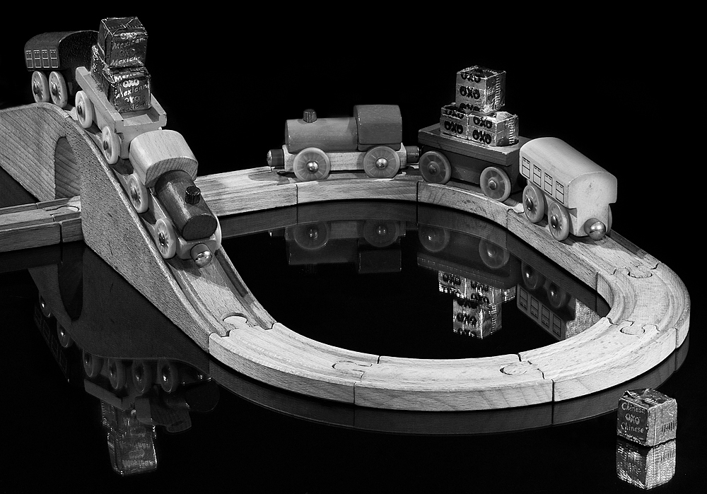
A wooden train set and oxo cubes.....in my warped imagination made for a Gravy Train. Again the composition was too large for the light box so great care was taken with the lighting especially as the Oxo cubes were very shiny. Several test shots were taken and time was spent setting the scene and ensuring the reflections were correctly postioned. At one stage a completely processed final image was reviewed and being not happy with at all deleted it and reshot with a slightly different layout. The direction of the train was altered to coming down the hill rather than going up, which took your eye out of the frame with nothing to lead it back in, extra track was added which I felt assisted with the overall set up and leading lines.
Quite a few Black and White Adjustment layers were used to process this image as the trains and carriages were of several different colours and shades. A contrast layer brought out the reflections and the detail in the train track. This was further brought out by using the burn tool. I think this is my favourite image from the whole set.
Conclusion
On reflection I was, on the whole quite pleased with the 6 images finally produced. Having never had to produce a set taken intentionally for conversion it was interesting to see what worked and what didn't. The use of the colour sliders proved invaluable as in all my photographs were very "busy" when in colour but once converted had very similar grey tones. Although this made for extra work in post production I feel it was worth all the adjustment layers it took to provide tonal contrasts and added interest to the final shots. I particularly liked the effect that increasing contrast had, especially to the wood grain on the train set. If I were to shoot a similar theme/subject again I would probably still consider using items of differing colour as it was the shapes/textures, reflections and narrative of the images that were of more importance. Because there is no distraction of colour I concentrated hard on including interesting shapes and textures and making sure that the compositions had movement and leading lines.
I wanted to experiment with different backgrounds and lighting situations and shooting this final set re-iterated that monochrome images are more forgiving when pushing contrast, curves or levels in either direction. When considering the final results I have a definite preference for the low key images with the black backgrounds. I am not sure if this is due to liking the overall artistic feel of the dark images or because the reflections/contrast and detail seemed to be much stronger in these. The higher key images with the white background don't hold my interest as much although I like the ideas and the compositions.
In conclusion I feel the final photographs meet my initial ideas and the brief of the assignment to explore tone, texture, contrast, form and key. I have gained a greater insight into the creation of monochrome images and the elements required to produce a sucessful image. Creating still life images also enabled me to review/alter compostion and lighting effects until I was really satisfied with the end result. The importance of reviewing images and being prepared to scrap an idea if it hasn't worked was also an important lesson learnt.


 for a comparrison here all all three side by side. I think I prefer the second rework of just the small piece of track removed. Although a piece of track does lead the eye out of the frame to the lefthand side it does "join" up with the reflection of the bridge which should lead the eye back in.