Tuesday, 12 November 2013

Assignment 5 - Coverage of an Event Practice 2 & 3 Kew Gardens & Eagle Heights

These were really personal projects/days out where I thought I could once more practice skills I need for the actual assignment and get used to what equipment does what how and when. Think about composition and close ups. I still treated it like an assignment, checking full battery, empty cards, clean lens, thinking ahead about what shots I wanted and if I could market the images. I also found out information that would be useful for captioning the images.

With both of the venues you have to gain permission for photography hence this is why I was not planning on using either as my actual assignment piece.

Kew

It was interesting to note that you can if well organised etc get access to certain areas:-

Photography at the Royal Botanic Gardens, Kew

Non-commercial photography that is deemed to benefit Kew Gardens - i.e. by publicising its scientific work, its festivals, or its status as a visitor attraction - is handled free of charge by the Press Office. The following guidelines outline the service provided by the Press Office and what is required from applicants in return.
  • A detailed itinerary must be submitted before any photography in the Gardens is agreed. Location, plant or interview specifics and an accurate estimate of timing must be included. This allows us to arrange access to the required areas and make sure that everything is in place.
  • Due to the size and diversity of the site and volume of information that can be found at Kew we strongly recommend that you do a recce before submitting your itinerary.
  • A location release must be signed by us at the stage of a recce. A copy of your insurance agreement must also be supplied.
  • Once your proposal has been accepted by the Press Office it must be adhered to. Additional time may be offered at our discretion but please bear in mind that we receive numerous ad hoc photography requests throughout the year.
  • On the agreed day please arrive at Cambridge Cottage Offices, 37 Kew Green and ring the marketing bell unless otherwise agreed.
  • No vehicles are allowed into the Gardens. We therefore advise that you bring a trolley to transport your equipment around the Gardens.
  • It is Kew’s policy that press photographers are accompanied at all times whilst in the Gardens. Your filming is dependent upon staff being available.
  • It is your responsibility to supply personal/parental release forms and obtain signatures prior to photography. If prior consent is not gained in the form of a signed document, no photography will be possible.
  • Kew is a major visitor attraction and our visitors expect a quiet and peaceful environment. We ask that you respect this and discourage interaction with the public. It is essential that you consult us if you intend to interact with the public, and if we give prior agreement that personal/parental permission is gained.
I couldn't find an obvious link with regards to commercial photography but it seems implied that for this there would be a charge, therefore not something I am in position to do at the moment!

Eagle Heights

Photography is permitted inside the park for personal use only. Photos taken on our land or of our animals may not be used commercially without written permission from the Directors. Please email office@eagleheights.co.uk to gain the relevant permissions

Again if this was something I wished to pursue there is a way to gain permission.

Kew IncrEdibles Images


The problem with commercial photography for Kew is that it is a very well known and established UNESCO world heritage site and the competition must be huge, also not very original but it gave we a wonderful opportunity to play. As my luck seems to run at the moment it rained this day, When it wasn't raining it was very overcast and grey. However I did my best, upped my ISO used larger aperture or used my tripod and snapped away. 


A bit of an "obvious" opening shot of a display all about pumpkins, Farley Hill Place Gardens supplied the pumpkins on display and owners Tony and Margaret Finch were there to talk about pumpkins sell pumpkins and carve pumpkins! But taking the photo gave me details of the gardens.


Over 75 types were on display in and around the Waterlily House completed in 1852, and at that time the widest single-span glasshouse in the world.


The Pumpkin Pyramid inside Kew's Waterlily House. It rises 4 metres up out of the central pond. 75 different types of pumpkin, including the fairytale-titled Cinderella, Munchkin and Peter Pan varieties, were used in the installation.


A closer shot from a different angle which shows the corner display "portraying ingredients and recipes from around the world (each corner representing one of the four corners of the globe). there are signs describing the species found in that part of the world along with mouth-watering recipes, from Pumpkin Tempura to Pumpkin Pie."


Leading into the Waterlily house many of the pumpkins were painted with designs that echoed their names, Turks Turban, Cinderella, Harlequin, Ghostrider etc.


Outside children could sit with pumpkin scarecrows for a photo opportunity, gaze at grinning pumpkin faces or watch them being carved.


Moving away from the pumpkins (of which I have MANY more images) I discovered The Seven Slate Towers. It has been there a while and in all my visits to Kew I have NEVER come across it! Wider scene establishing shot.


Designed by Dan Harvey, with assistance from Heather Ackroyd, Dan Knight and Paul Wilkins.
Commissioned by Sir Robert and Lisa Sainsbury for the Secluded Garden at the Royal Botanical Gardens in Kew. The fountain forms the central feature of the Secluded Garden at the Royal Botanical Gardens at Kew.

The towers are constructed from hundreds of slates, each layer specifically cut, and placed to create a spiralling tower. The top of each tower is finished with a bronze bowl cast from copper sulphate crystal forms. Water is pumped up the towers filling the bowls slowly, and then trickles back down to the pool below. Originally created without a surrounding fence but due to fears of potential danger the piece was fenced off against the artist's wishes.


Closer shots showing details and using different shutter speeds to capture the trickling water. A lovely piece to explore. All three could be cropped if needed.


Many wild and domestic birds can be spotted at Kew including the quite tame peacocks, well tame enough that you can get quite close for photos. Only issue I had was it kept moving, so out of the many shots I took quite a few were blurry, vain enough to pose, cheeky enough to not allow me to capture the beauty! Wide establishing shot.


Closer in and also chance to play with cropping.


Closer in still.


Capturing people unaware near the Sackler Crossing.


Experimenting with extreme depth of field to create an impressionist effect of autumnal colours.


Lots more images were taken, some of Tom Hare's new willow sculptures of fungi but failing light and rain clouds conspired against me so think I will just have to go back at some point. I also wanted to get shots of children running around them but despite being half term not many were about, think the rain made people stay away :o/


Eagle Heights Images

Eagle Heights is one of the UK's largest Bird of Prey Centres, currently we have a collection of approximately 150 raptors. This includes over 50 species, many of which are now breeding at the centre or can be seen flying in our daily demonstrations. We're also an expanding Wildlife Park for many different species of animals, including cheetahs, meerkats, snakes, lizards and much more!

Eagle Heights is situated in the stunning Village of Eynsford overlooking the idyllic views of the valley and the rolling hills of the countryside. These beautiful views can be seen from the Tearooms where you can admire them with a warm pot of Tea!

We are fully accessible to the disabled and welcome all group types and sizes. We offer Falconry Experience Days, Animals Experiences Days, Animal Adoption etc! All of which make fantastic gifts! Please see the Experiences section for full details!


As mentioned earlier in the post if I wanted to use any shots commercially I would have to gain permission however there could be a possibility they might want to use them directly in their website, any promotional literature/leaflets. They do offer Experience Days and have images on these etc. Unlike my day at Kew on this occasion I had the opposite problem of a lovely bright sunny day offering dark shadows, contrasts and only being able to photograph in one direction when outside....


There are 2 different playgrounds which cater for different ages. Although my wide shots for the birds flying display were all pants for a variety of reasons the playground shots were in the shade with lovely diffused lighting and came out fairly well.


Likewise I was quite happy with some of the "action" shots where the various birds flew down into teh crowds and I could capture some reactions.


At one point in the afternoon you could also meet and greet two out of the 25 huskies kept at Eagle Heights.


Striated Caracara


Iguana in a glass "cage" gave challenges of dirty fingerprints and glare, same with the bearded dragons below. Light was also fairly low.


Bearded Dragons


Sea Eagle
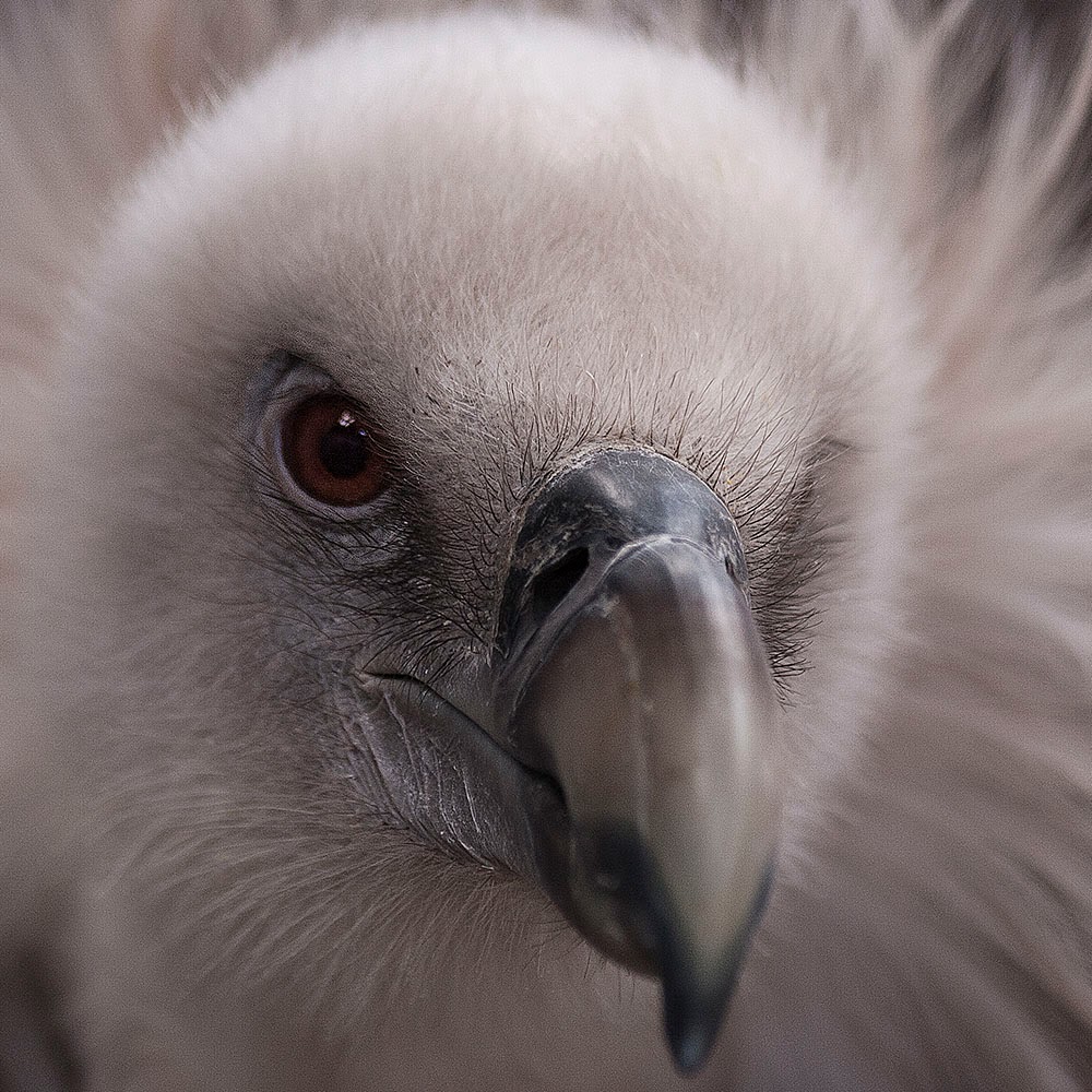

Harry the Vulture... I was after a really good close up of his eye which I got, I had hoped more beak would be in focus but not to be...


Sakir Falcon


Kayla the Bald Eagle, she is Crystal Palace FC's mascot and has also been used for the Kings of Leon album Only By the Night.


Magic the barn owl used at weddings to carry wedding rings.


Meerkats.........


A good day to experiment with different lenses, testing the limitations of my 17-55 for capturing the animals from a distance but the limitations of the 70-300 for anything closer and not being able to go so such a small aperture.


Two good days out and what did I learn? That research beforehand is always a good thing, find out what time displays/events are going to occur, take different lenses if you have them for different photo opportunities. Don't just focus on the animals/event, look at crowd reactions. Portrait shots don't just have to be of people! Most importantly with these two venues was the permissions, allow time for gaining permission and think about who would want to use the images, are you going to be in a larger field of competition?

Thursday, 7 November 2013

Assignment 5 - Coverage of an Event Practice 1 Cheddington Food Fayre

I haven't really been doing much photography, what with one thing and another, and doing theory so needed to get back in touch with my camera, how it felt to be out and about and up close to the general public. In talking to my cousin who lives in Cheddington, she mentioned that her village had an annual food fayre which could possibly be something I could cover as a practice run and if all went well even use it as my assignment.

There were a few downsides to photographing this event, firstly it was on a Friday night a good few miles away from where I live and there was a study day in London the next day, also there was no way I could do a site reconnaissance.  Despite these misgivings I decided to give it a go so I could get back into the swing of things.

Asking myself the following questions in my planning:


  • Was it feasible - just about
  • Permissions and access - being a local event and my cousin being an active member of the community she asked the questions and explained the situation. The organiser agreed I could go, some of the stall holders agreed in advance and I was to ask on the night if others had objections- I took along release forms just in-case anyone wanted to be official about any of it
  • Site reconnaissance - not possible
  • Provisional shot list - if possible stallholders setting up, stalls/stall holders portraits. Products for sale, wide shots and close ups. When open customers buying things, sampling things, wide shot of bustling church hall...would there be any key moments?
Marketing my work. Who would want to buy the images- if any good? Who would likely clients be? The parish magazine always do an article about the food fayre as does the local paper. The organizer of the fayre also sets up a website which he likes to use images to advertise each year. Normally he uses stock images and was interested if I could do something for him. Various local "things to do" websites also carry images of the fayre from time to time. One vendor in particular has shown an interest in me producing some still life images to promote their goods on their website but more of that later as it will be a personal project. As far as pricing my work is concerned, although we had the arrangement that the parish magazine might be interested likewise the promotional website, as this was purely exploratory and I had no chance to do a site reconnaissance it was more a verbal agreement that I was coming to take images for my course and not a serious commission.

On completing research there are a few websites that give advice on rates:

Rates for jobs can vary from sector to sector and from job to job. One of the main things to understand about a photographer's income is that it is usually derived from two parts, from commissioned work and from selling stock photos. Most successful photographers will have built up a healthy stock library of their own images and these can be used to generate a steady income. It is extremely important that copyright laws are observed so make sure you read all about copyright for photographers in our Legal section.

The National Union of Journalists have produced an excellent fees guide for freelance workers including photographers. As well as pay information there are also lots of useful hints and tips about protecting your work, what should be in your work agreement etc - a valuable resource. Have a look at the suggested rates here:


and I looked at some photographers sites that give their rates/expenses or just tips to consider

http://jonathanpow.com/
http://www.aetherweb.co.uk/products-and-services/freelance-photography.html
http://www.aaphotographic.com/photography-services/
http://www.comms2point0.co.uk/comms2point0/2012/4/18/10-tips-to-commission-a-freelance-photographer-and-five-thin.html

you can even buy books about the subject...
http://www.amazon.co.uk/Freelance-Photographers-Market-Handbook-2013/dp/090729765X

or get a membership...
http://www.thebfp.com/

So basically there seems to be a lot of information out there but don't undercharge or overcharge, be prepared to negotiate, sometimes you will get a commission other times you may just sell a single image to a given publication.

Rightly or wrongly I don't feel my photographic skills are high enough  but I intend to practice and approach the final event I do undertake with the attitude towards it being fit for purpose - ie publication for a general readership.

I did some research into the Cheddington Food Fayre finding out who some of the vendors would be, looked at their webpages to see the kind of images they had already and looked at the facebook page and local up-and-coming event pages. A few examples are below:

http://www.vale-life.co.uk/cheddington-food-fayre/
http://www.cheddington.org.uk/events/
http://www.cheddington.org.uk/media/2/files/Newsletter%20-%20October%202013.pdf
http://www.britevents.com/whats-on/bedfordshire/cheddington/cheddington-food-fayre/396622/
https://www.facebook.com/pages/Cheddington-Food-Fayre-2013/698130466867603
http://www.beechwoodfinefoods.com/events/
http://www.jimandjules.co.uk/

As to the Food Fayre, I have to laugh, quite a few things went wrong which I shall explain but it was a great learning curve which I shall outline in my final conclusion.

Firstly I work as a learning support assistant and also provide lesson cover in a teacher's absence. Typically on this Friday I was given cover for the last period which meant not being able to get out bang on time, this meant a delay in getting home, a delay in leaving and getting caught going through the Dartford tunnel.

Added to this the weather was absolutely horrendous, there was heavy rain, which gave off a lot of spray, there were a few prangs on the M25 which meant I arrived a lot later than anticipated and missed the setting up shots. The event was in full swing by the time I arrived and calmed down.

The food fayre was being held in the local church hall and the background of each stall was really cluttered with empty boxes, bags, coats, radiators, stacked chairs etc which made for really cluttered shots. The light was very low and I don't like to use flash so had to compromise with ISO/Aperture and shutter speed. This meant a lot of grainy soft shots which I personally dont like. Don't mind other people's images if they produce them that way but I like mine to avoid grain as much as possible. From the outset I then knew I wasn't going to get what I wanted but snapped away regardless as it was all good practice for me. Below are a selection of shots which attempt to be be action shots, portrait shots, product shots, scene setting etc etc.

Some I feel worked well as far as composition was concerned, the shallower DoF was also more successful with some than others. On the whole I think I ended up with too many product shots and not enough of the venue or group shots. Images appear to only work either as landscape or portrait with not enough scope to offer different crops if this was required by a magazine article. As I say I think some are too soft for my liking but may still work as small online images.


I should have turned the information towards me....


bit boring I thought, nowt unusual although I think the people in the background show it was a well attended event.


Too many of my "group" shots had too many people in, no central focal point, and a lot of boring backs.....


Better I felt, but bit blurry/soft.


I wish my timing had been better not to have cropped the hand at the top of this shot.


I quite liked the "cheese" shots, I actually had a good vantage point, there was a gap between 2 stalls and a lot of people tasting which shows how important positioning yourself can be.


Could have been a good image but messed up with the DoF so the word Food isn't in sharp focus! Also a bit too close a crop at the bottom...hey ho.....


Some random children asked to have their photo taken, I said run and ask your mum and she said no problems snap away...their choice of pose lolol.


Two where the DoF worked as far as I am concerned.

I like the hand in the background picking up the product and the diagonals of the leaflets in the background and the long serving spoon.


My cousin acted as an assistant, picking up business cards from each vendor and asking if they minded my taking photographs, this was handy but also proved to be another hiccough  waiting to happen lol. Photographed out, there were too many people walking across me and other barriers that I haven't learnt to get around yet so we decided to leave. I picked up a few products that I will use and also thought I could practice still life with and possibly produce something, as a personal project, for promoting the fayre next year, images to follow when I get round to sorting them!

Back to her home, a very late dinner and falling into bed before getting up at some silly time in the morning for the drive back home to catch a train to be in London for the 11am study day! It was then I discovered that I had forgotten my overnight bag, had no night clothes, toothbrush or clean clothes for the morning...life!

The morning was a quick splash, I'd shower at home, make sure everything was put in my car, picked up the folder of paperwork with leaflets etc in and drove home. My son's friend had stayed overnight and was in the shower! Bang went my shower...then found out that my cousin had put larger leaflets in the folder but all the business cards in her purse, she still had them but promised to post them....after a few days they hadn't arrived, she confirmed she had posted them but had put the wrong postcode on the envelope....weeks later the post office still has them SOMEWHERE!

So what did I learn?

Make sure you only agree to photograph an event if you can make it on time or you feel really rushed.
Make sure you are organised and take everything you need, not just photographic equipment.
Really try hard to complete a site reconnaissance.
Talking to people isn't as scary as it may first seem.
Take lots and lots of shots to make sure you have enough for first and second select images.
A good vantage point is important.
Be prepared to work with the conditions that present themselves on the day, lighting, crowds etc
Don't lose gathered information that will help with captioning or allow you to contact potential clients.
Be prepared to laugh at yourself when it all goes tits up!!!!

Do I think I could market these as something different with my own individuality stamped on them LOLOLOLOL ermmmm my epic failure could be a kinda approach I guess......

Tuesday, 5 November 2013

Assignment Four - Critical Review - Essay Re-work

I have now received and am reviewing the feedback from my tutor. I was really pleased by the positive comments on my tutor report and annotations on my returned essay, all of which are recorded on my posting here:

http://janfairburnoca.blogspot.co.uk/2013/10/assignment-four-critical-essay.html

There were several suggestions to look at various other artists or comments made which could supplement my argument so am researching them to possibly include in my essay or just note down for future reference. The text in italics are excerpts from my essay where the annotations were made, followed by the annotation itself and my response to these:

1).... John Szarkowski in the introduction to The Photographers Eye comments on the difference between paintings and art being a basic one: paintings were made but photographs were taken (2003)......  

Have a look also at the comments Paul Delaroche (French portrait painter) made on first sight of a Daguerreotype in 1839 ... 'From this day, painting is dead!'

 http://www.answers.com/topic/painting-and-photography Carries the above quote.

Basically photography came along at a point in the history of European painting when Romanticism "was widely admired and commercially successful" and realism "was beginning to coalesce into an oppositional movement". Some painters didn't see photography as a threat however and instead "quickly embraced it as a means of referencing such details." Edgar Degas, Pierre Bonnard, Edvard Munch, and Ernst Ludwig Kirchner, even became accomplished photographers. It was then painter Paul Delaroche (1797-1856), supposedly said, ‘From today, painting is dead.’  This stemmed from understanding "painting's purpose within a fairly narrow concept of visual representation." I thought it interesting to note from this article that a number of the photographers who achieved prominence in photography's first decades were trained in Delaroche's studio for example Gustave Le Gray, Henri Le Secq, Roger Fenton and Charles Nègre.  Apparently "the painting-photography relationship eventually emerged as the paradigmatic instance of the broader reciprocal one between art and technology."

note to self

The adjective paradigmatic is a fancy word for describing something that is an ideal or standard. Monet's paintings are paradigmatic of impressionism — they are a typical example of that style of art.
Use paradigmatic when you're talking about things that are archetypal or representative of some category and you want to sound impressive. You'll come across it if you study the subject of linguistics, where "paradigmatic analysis" is one way of analyzing a text, by examining patterns within it. The Greek word for "pattern," paradeigma, is the root of paradigmatic.


The article then goes on to tell us that some forms of painting did vanish ie miniature portraits, with some going on to become photographers others retouchers "More complex and far reaching in its implications was the declining prestige of the ambitious, sometimes outsize representations of past events or recent news known as history painting. Photography can only partly explain the shift in interest from large, complex images drawing on biblical, mythological, or historical sources, to traditionally ‘lesser’, more immediately accessible modes such as genre, still life, and landscape. But the possibility of seeing a photograph, rather than a painting of, say, the queen of England, the Parthenon, or Niagara Falls, even if in engraved reproduction, inevitably undermined painting's claim to historical and documentary authority."


2) ....specifically exploring the new age of digital/electronic reproducibility.....

Have you already read Walter Benjamin's 1936 essay - 'The work of art in the age of mechanical reproduction'

Yes, a few years ago I was advised to have a look at this interesting piece, it was shortly before I signed up to the OCA. I re-read it in view of citing him in my essay but thought many people probably do so went for other references instead. I forgot to add him to my bibliography which I shall now do!

3) .....Entertainingly, sometimes creepily, combining appropriated images he confesses to being a vandal and a thief and likens himself to a foster parent to these adopted images, but one who inflicts abuse due to the slicing and cutting he employs to create his work (Stezaker, 2011)....

Have a look at Charles Merewether also - He states 'the archive functions as the means by which historical knowledge and forms of remembrance are accumulated, stored and recovered.'

Dr. Charles Merewether is an art historian, writer and curator who has worked in Australia, Europe and the Americas. He worked as collections curator at the Getty Center in Los Angeles from 1994-2004. Between 2004 and 2006, he was artistic director and curator of the 2006 Biennale of Sydney and senior research fellow at the Centre for Cross Cultural Research, Australian National University. In October 2007, he was appointed deputy director of the Cultural District for the Tourist Development and Investment Company, Abu Dhabi. Since March 2010 he is Director at Institute of Contemporary Arts Singapore.

Dr. Charles Merewether has taught at the University of Sydney, Universitat Autònoma in Barcelona, the Ibero-Americana in Mexico City and the University of Southern California, and has lectured at the Beijing Academy of Art, Lingnan University in Hong Kong and the Asia Research Center at the National University of Singapore.

http://www.globalartmuseum.de/site/person/225

Interesting writer to remember for future reading and reference.

"One of the defining characteristics of the modern era has been the increasing significance given to the archive and the means by which historical knowledge and forms of remembrance are accumulated, stored and recovered. Created as much by individuals and groups, the archive, as distinct from a collection or library constitutes a repository or ordered system of documents and records, both verbal and visual, that is the foundation from which history is written." - Merewether, Charles. “Introduction: Art and the Archive.” The Archive.Ed. Iwona Blazwick.London, Cambridge: Whitechapel Gallery & MIT Press, 2006: 10-17. Print.

http://www.academia.edu/3228792/The_Archive_The_Creative_Process_of_Abstract_Painter_Thomas_Nozkowski


4) ...Despite the discomfort of some with regards to the use of borrowed images, which is a well-established technique in terms of fine art, and the almost complete appropriation of Brecht’s book, this is an extremely clever body of work which tells its narrative well, sets new boundaries for the displaying of photography and has opened a healthy debate on the direction that some areas of contemporary photography are headed....

Agreed look at the work of Joachim Schmid - Very Miscellaneous.

Very Miscellaneous (1996) is a variable cluster consisting of 70 b/w photographs.
Six portraits and six texts are available as diptychs (one portrait and one text in any combination; b/w prints, 36 x 24 cm each, edition of 3).Very Miscellaneous was commissioned by PhotoWorks as part of the Country Life series, curated by Val Williams and made in conjunction with the George Garland Archive at the West Sussex Records Office.

http://schmid.wordpress.com/works/1996-very-miscellaneous/
http://www.telegraph.co.uk/culture/3675573/Joachim-Schmid.html?image=4
http://digitalphotographyblog.wordpress.com/category/joachim-schmid/

German artist Joachim Schmid combined portraits by George Garland with fragments of newspaper articles drawn from the West Sussex Records Office.

"Schmid famously declared: “No new photographs until the old ones have been used up!” And he has rarely deviated from this avowal (made, incidentally, in 1989, on the 150th anniversary of photography’s invention) instead showing found photographs that he has grouped and titled."

http://www.culture24.org.uk/places-to-go/london/art47047

I found his work really interesting and echoed work seen by other artists such as Stezaker!

5) ... Barthes (1968) believed the author was dead but so too may be the single photograph; more and more it is becoming apparent that the single image no longer has the potency that it did, multidimensional bodies of work are coming to the fore, experimenting with mixed and multi-media....

I'm not sure about this, single images of conflict for example still hold power.  Look at the shot of Kim Phuc taken by Nick Ut in Vietnam in 1972 - This event was also filmed, but the footage doesn't hold anywhere near as much power as the single frame.

As with most people I know this image well. I agree that some photographs such as this and many other are amazing at conveying a given point in time. I think I may have to reword this section of my essay as I know what I meant to say and don't think it came over as intended. What I was trying to say is that more and more photographers are creating bodies of work that are reliant on being displays as a whole and that single images don't always have the same impact when taken out of context......hmm food for thought as to how to reword this carefully!

Thanks once again to my tutor for positive feedback and introducing me to more academic and photographic work that will broaden my knowledge and is interesting to boot!

As for reworking my essay I feel there is little to amend beyond adding to my bibliography and altering my comment at the end to reflect more of what I actually wanted to convey, may bung in the reference here to the image mentioned in my feedback and my own experience with Christina De Middel on seeing only a few of her images at the Sony World Photography Awards.  Paul Delaroche may also get a mention here alongside Barthes...who knows.....

*Update: Essay has been tweaked with reference added re Paul Delaroche, Joachim Schmid and the image by Nick Ut, also added Walter Benjamin to the Bibliography.

Saturday, 2 November 2013

Taylor Wessing Photographic Portrait Prize 2012

I came, I saw, it conquered. Out of the "historical" reviews this is my last, I have 2 personal visits that I undertook, a Robert Capa and just last week Only in England, still to do but my target for the week was to complete the OCA study days. YES, this one is IT!

Really, really briefly, for the past 3/4 years I have been to this exhibition, I always ask myself why, I don't like portraits, I don't want to take portraits, I can never understand how some get nominated and why the winners win. I always answer myself with, it's a day out, it's photographs, you can learn to appreciate portraits, discover why some leave you cold, why some are more interesting that others so that on the odd occasion when you need to take them you have a point of reference (sounds good in theory doesn't it!)

So in my opinion what makes a good portrait... something that is different from the norm, is insightful to the subjects character or occupation, possibly amusing, is possibly  part of a body of work that is telling a narrative but can stand on it's own merit.

Looking at the online reviews to jog my memory I thought ahhhhhhhhhh yes I remember that one, with added thoughts of I still don't know why it won/didn't win. Bored of portraits already ( I find I spend hours making attractive people look ugly) and bored of writing reviews I am not going to comment individually on any of them, I guess only the photographers and judges know why they chose to include the usual mix of children, pets, famous people, nudes (was it last year the woman was dressed in her dead horses gear?!?!?!) so for your delectation and delight I close with the following links:

http://www.taylorwessing.com/news-insights/details/shortlist-announced-taylor-wessing-photographic-portrait-prize-2012-2012-09-06.html

http://www.telegraph.co.uk/culture/culturepicturegalleries/9656485/Taylor-Wessing-Prize-2012-in-pictures.html

http://www.theguardian.com/artanddesign/2012/sep/07/taylor-wessing-photographic-portrait-prize

I note that the 2013 exhibition starts in November, maybe I need to get Robert to take me round and enthuse so I realise what I am missing.....

Perspectives on Collage Laura Letinsky et al at The Photographers Gallery

Do I have to keep playing Mum? I guess I do, this one may be brief, I thought some of the others would be but once I get going I like to have my say. Added to the work of Broomberg and Chanarin and John Stezaker I can see how all these fit in together in how various bodies of work are being made and moving forward. The Photographers’ Gallery certainly threw down the gauntlet when it decided to curate these three exhibitions to the medium: Perspectives on Collage and Laura Letinsky – Ill Form and Void Full, Geraldo de Barros – What Remains.While Perspectives in Collage is a group show, Laura Letinsky and Brazilian Geraldo de Barros’ work stood on their own.

Perspectives on collage

(side note I can't believe this stupid web page dictionary does not recognise the word collage?)

This was a group show featuring 8 differing approaches to photo collage to "broaden ideas around the practice into areas including sculpture and installation." Promising myself to not write too much I won't go into great detail, some I didn't like, some I did but as ever the premise of coming to an exhibition isn't to "like" everything you look at but to see if you can learn different ways to present your work or tell a narrative.

Work was on display from:

Jan Svoboda, Peggy Franck, Nicole Wermers (seen previously at Saatchi Out of Focus) Batia Suter,  Anna Parkina, C K Rajan, Roy Arden and Clunie Reid.

Very briefly and with thanks to the Photographers Gallery exhibition booklet for the words to paraphrase or just nick... :-

Jan Svoboda used torn up and folded remnants of his own work in simple arrangements. - I couldn't work out what message if anything he was trying to send?


Peggy Franck creates assemblages from everyday materials in her studio - interesting to look at but what is the underlying message? Is there one?


Nicole Wermers borrows motifs from the world of design, fashion advertising and architecture magazines and makes abstractions. I enjoyed these, liked her work previously. I can see how the ideas of seduction in advertising play out in her visually seductive pieces.


Batia Suter used a diverse selection of books in her floor piece Wave to "suggest poetic connections within encyclopaedic knowledge." Ok if you say so? Looks like a tidier version of my floor when doing research for my essays.....


Anna Parkina works in sculpture,painting,photography and performance. Apparently the Russian avant-garde echoes through her work. I can read into these how Russian society is altering, old statues and snippets of propaganda are there, society is as fragmented as her pieces. That may be her message it may not be, but at least I could read something into them and more effort had gone into creating it rather than  oh lets say, skimming thru a lot of books to find images of boats then plopping them on the floor?


C K Rajan overlays two contrasting newspaper or magazine images, surreal works responding..."tangentially to...economic modernisation...social and cultural contradictions." One of my favourites I think, images cleverly put together showing the contrasts of old and new, poverty and big business and the juxtaposition they have in developing countries.


Roy Arden works across media including painting, sculpture, photography and video. I wasn't quite sure with his, think I need to research more. Very bright, very busy, image below is Rich Tapestry of Life and I get that, but still not convinced.....


Clunie Reid used marker pen, slickers holographic paper and sticky tape, borrowed from advertising, the internet and the internet to "throw our image worlds into sharp critical light." Messy, childlike scribbles, too pink for my taste, random and jumbled but I guess that may be the message about what our visual world today  is? Overloaded, messy, poor quality with no coherence?


The exhibition aimed to "highlight the enduring relevance of collage across a range of creative practice" in that I think it was really successful. Am laughing to myself because at the time when walking around I was scratching my head for a lot of it thinking the usual "why is it here, what am I looking at, that is rubbish" but when you have the time to reflect, think about what the images are saying more than the image itself then you understand them more. A kind of light bulb moment, this is where I need to tie in what I am trying to achieve with what I do achieve. Sometimes its more about the message, the image does not need to be technically brilliant, although that would be nice as long as the message gets across you've done what you set out to do. Also successful as it starts to spark ideas of how you can present your own photography.

Laura Letinsky – Ill Form and Void Full

The first thing to comment upon is how this exhibit was curated, with Letinsky deliberately choosing not to place her work under glass. Quite ironic because of her statement below :

"Everything gets spoiled. Nothing remains pure, unsullied. The whites are always sullied, they're wrinkled, they’re stained, there’s marks on the wall, or else they're blindingly white so you almost can't look at them and you can't see anything in them. The white is sort of this play on our expectations or desire for perfection and the impossibility of that."

There was debate over one image that had dirty splats on, was it part of the image? A lot argued it was, however I asked one of the members of staff who told me nope, a visitor had splashed his drink and they were now being more conscious of telling the audience to step back, not get so close and don't touch ...so anyone wondering I've cleared that mystery up.

A really interesting video is here which makes so much sense, and isn't full of a photographer giving lots of what I term psychobabble, about why something was made or a deeper meaning behind an image. Robert Enoch was our tutor that day and he was full of enthusiasm for this work which made sure I looked at it deeply and didn't just dismiss it out of hand.

http://player.vimeo.com/video/57683797

http://www.5280.com/blogs/2013/03/14/meet-artist-laura-letinsky

http://www.aperture.org/blog/interview-with-laura-letinsky/

When I started to think about my critical essay these 3 exhibitions were in the back of my mind although none of the artists got mentioned in the end but the thought processing were there over is photography made or taken.

My initial response when looking at her work was to wonder how it was created, what shadows were real, what were part of the cut out. I noted that she likes working with natural light, so do I but in this country and with my rooms it isn't always easy or possible :o/ Then I started to try and "read" what was going on within the work. Without going into this too much, I could write reams, about the inclusion of tape, her exquisite sense of colour etc I found her work really interesting,  complex with a lot of underlying messages, the video and interview links will go into the detail I don't have time to comment on here. Well worth seeing.


 Geraldo de Barros – What Remains

A key figure in Brazilian art and design he at first experimented with multiple exposures, rotations, over-painting and scratching negatives. He put photography aside and revisited the medium late in life after having a series of strokes. In the last 2 years of his life he made Sobras - Remains. Over 250 collages which incorporated some of his Fotoformas series.The exhibition traced subtle connections across the two series. (blurb re-hashed from the exhibition leaflet)

To be honest I don't remember much about his work, but we had taken in two exhibitions this day (Light from the Middle East) and saw so much it doesn't surprise me. Googling his work I found quite a bit to enjoy and it showed another way of producing and using your work, changing direction out of necessity etc.

As I don't remember his work I don't feel qualified to review it from images online or just re-quoting secondhand information I'll paste a few links that sum his work up for those who want to know more.


http://www.dazeddigital.com/photography/article/15393/1/geraldo-de-barros-what-remains

http://centrefortheaestheticrevolution.blogspot.co.uk/2013/03/geraldo-de-barros-what-remains-curated.html


All in all a good day out and with lots to think about and possibly experiment with incorporating into my own work at some stage. Thanks once again to the OCA for organising these visits which are always worthwhile!

Friday, 1 November 2013

Sebastião Salgado: Genesis NHM 2013

::::Jumps up and down in excitement:::: I am getting there...at last I am getting there.. I have been putting this one on the backburner as I don't know where to start and what to say first. How can you love and hate an exhibition at the same time?

To paraphrase Shakespeare, Sebastião, Sebastião, where for art thou Sebastião?

He was there and yet again he wasn't.

Sighs, lets start at the beginning and work my way through my thoughts as best I can. I have read several reviews online and most vary from sycophantic dribbling which failed to recognise some of the obvious flaws of this body of work to others which are highly critical and don't seem to recognise any of its beauty or worth, quibbling over the use of words such as "unspoilt". I missed the OCA study visit and it would have been great to walk around with others to bounce my ideas off but never mind. It's odd that even months later I am still having difficulties in putting down what I want to.

Genesis is the culmination of 8 years work, journeying through 32 countries, capturing mountains, deserts and oceans, animals and people. The majority of photographers will throw their hat into the ring of one genre or another, Salgado does not. He captures landscape, wildlife, portraiture and mixes it altogether in the guise of the documentary.

Over 200 of Sebastião Salgado’s black-and-white documentary photographs were on show and although it was brilliant to go to an exhibition that had so much work from one artist I think this is the first failing I shall mention. There were too many of the same kind of shot, how many marching penguins can you look at when one just one or two stunning shots would have sufficed?

Sebastião Salgado Genesis - Penguins


The second issue which I'd bring up before I get onto discussing the photography itself is the sponsorship by an apparently dubious company, Vale Mining. I am sure there are others who can be more eloquent about the politics and the rights and wrongs of them putting up the funds so will not go there. Although I agree it may taint your opinion of the photographer's morals and in some instances it maybe that in some circumstances there might be political gerrymandering behind such funding I don't think this was the case here and should not impact on a critical review of the images on display.

http://www.vale.com/brasil/EN/aboutvale/news/Pages/sebastiao-salgado-inaugura-mostra-no-brasil.aspx

And there's the rub, to critically review the images...composition, drama, content, tonality, contrasts. While I loved some of that list OMG!! Sebastião , why didn't someone tell you to put down the dodge and burn and step away? With some of the images it was like walking through an HDR nightmare. What were you thinking? Who removed the word subtle from your lexicon? What had that poor sea-lion done to you? Are your assistants too enamoured of you to take you to one side and whisper "erm boss don't you think you've overcooked it a tad?"

Sebastião Salgado Genesis - Sea-lion

 Sebastião Salgado Genesis - Albatrosses 

Salgado wanted to show an untouched world, shame he didn't give his prints the same consideration! I'd love to see what the "real" images look like. Go on Seb, you know you want to, put down the contrast slider and show us what they're really made of.

All of which made me feel really sad, it was unnecessary and spoilt some truly remarkable photography. This leads onto another criticism aimed at his work, that he makes the world look beautiful, he romanticises it, makes it too aesthetically pleasing, something thrown at Burtynsky too but so what? There are enough people out there doing gritty realism it's a relief to just step back and look at some of the wonders of this planet. You don't hear many people yelling "stop making it all look lovely" at David Attenborough, do you? I have secret crushes on all 3 lol.

It is hard to strip away the overproduction and look just at the composition, depth of field and the detail in these images but when you do you can't help but realise this is a master at work even if you don't like the finished article. Not all are so contrasty, there is quality to the work on show and despite the obvious "ick" bits (can't you tell I am fed up with proper photography critique vocabulary) I really enjoyed most of this exhibition. which was a master class in the use of light, shapes and form.

 Sebastião Salgado Genesis - Elephant
 Sebastião Salgado Genesis - Zebras


 Sebastião Salgado Genesis - AYali man in the Jayawij
What did I take away from this exhibition? That I still like Salgado despite the wrong turn he may have taken with his digital manipulation, that while digital manipulation is acceptable to get the best out of your RAW image don't, just don't over do it! Some may say that he hasn't moved on, that his work is too old fashioned, I don't care. Some photographers try out new things and I prefer their older stuff. They can't win whatever they do. Am hoping that someone buys me his book for my birthday!


http://www.disphotic.lewisbush.com/2013/06/06/review-sebastiao-salgados-genesis-at-natural-history-museum/

http://www.weareoca.com/photography/cant-make-up-my-mind/

Deutsche Borse Photography Prize 2013 Photographers Gallery

I am slowly but surely catching up with my reviews, I must admit to feeling a bit reviewed out but it's something I need to do, want to do and seeing as I went to another exhibition yesterday and have another study day coming up soon, if I don't get a wriggle on I'll be back to where I started!

The Deutsche Börse Photography Prize is an exhibition that I have visited several times in the past and I'm always surprised at what gets included and why. What makes the judges think that the nominees have make a "significant contribution?" Most of the time I can see why the work is worthy of an exhibition but not always why it is thought to have "significantly" contributed. This time around I didn't have that problem, I may not have been in love with all of the work, or wondered about the level of appropriation but I could see why the bodies of work were being discussed, how they opened up new avenues of creativity and in that respect contributed to photography as a whole.

As ever the objectives of the study were to gain a personal perspective on the work of the short-listed photographers, reflect on the experience of seeing photography in a gallery and the nature of photography competitions and network with other OCA students.

The tutors accompanying us on the visit were Sharon Boothroyd and Simon Barber; both were enthusiastic and prompted us to think deeply about the work, how had the photographers set about achieving their goals, were they worthy of a place in the competition and had the boundaries of  competitions changed? As a photography prize did it matter that two of the entrants hadn't actually taken any of the images? How was the prize being interpreted?

So onto the four finalists with details from The Photographers Gallery webpage:

Adam Broomberg and Oliver Chanarin

Adam Broomberg (b. 1970, South Africa) and Oliver Chanarin (b. 1971, UK) are nominated for their publication War Primer 2 (MACK, 2012).

War Primer 2 is a limited edition book that physically inhabits the pages of Bertolt Brecht’s remarkable 1955 publication War Primer. Brecht’s photo-essay comprises 85 images, photographic fragments or collected newspaper clippings, that were placed next to a four-line poem, called ‘photo-epigrams’. Broomberg and Chanarin layered Google search results for the poems over Brecht’s originals.

Mishka Henner

Mishka Henner (b. 1976, UK) is nominated for his exhibition No Man’s Land at Fotografia Festival Internazionale di Roma, Museum of Contemporary Art, Rome (20 September – 28 October 2012).

No Man's Land represents isolated women occupying the margins of southern European environments. Shot entirely with Google Street View, Henner's method of online intelligence-gathering results in an unsettling reflection on surveillance, voyeurism and the contemporary landscape.

Chris Killip

Chris Killip (b. 1946, UK) is nominated for his exhibition What Happened – Great Britain 1970 –1990 at LE BAL, Paris (12 May – 19 August 2012).

British born Killip has been taking photographs for nearly five decades. What Happened – Great Britain comprises black and white images of working people in the north of England, taken by Killip in the 1970s and 1980s. After spending months immersed in several communities, Killip documented the disintegration of the industrial past with a poetic and highly personal point of view.

Cristina De Middel

Cristina De Middel (b.1975, Spain) is nominated for her publication The Afronauts (self-published, 2011).

In her first book, The Afronauts, De Middel engages with myths and truths, reality and fiction. In 1964, after gaining independence, Zambia started a space programme in order to send the first African astronaut to the moon.

De Middel sequences her beautiful colour photography with manipulated documents, drawings and reproductions of letters, presenting them as almost folkloric inlays alongside fashion illustrations and technical sketches.

What struck me straight away was the amount of research undertaken by each entrant, no matter how different the style or interpretation of contemporary documentary, the background research was amazing. All emphasising that if you want to document a topic KNOW IT! If you don't know it, do the research, if you do know it more research will never be a waste of time.

War Primer 2 - Adam Broomberg and Oliver Chanarin

First of all I have to admit to not knowing much about Bertolt Brecht, or even having heard of War Primer. If that makes me neanderthal so be it, therefore at first I was unsure of what I was looking at and the significance of the title, but it was a study day, we are here to learn so I had to read, listen, ask questions and gradually found out what it was all about. I won't repeat the information above but will add that when they say inhabit his book it is literally true. With a team of volunteer interns Broomberg and Chanarin carefully took apart 100 original copies of War Primer, found suitable "matching" imagery via Google, silkscreened them over the original newspaper clippings found by Brecht and re-assembled them.

However it didn't stop there, a "primer" is an educational book and Broomberg and Chanarin picked up this message of teaching and ran with it. They display each book open on a different page in separate glass vitrines the size and dimension of a small school desk. These cases were then laid out as if in a classroom environment. The information about each image on display was projected onto the wall, reminiscent of the type of smart boards found today in educational establishments.

The work is in the permanent collection of the Museum of Modern Art, available as a limited edition book, and a free download via an app.  There are advantages and disadvantages to all these means of communication; an eBook can reach a much wider non-specialised audience, a book has the physicality that a mobile device lacks, whilst the book is limited to the message on the page. However in this instance the book has the scope to spread beyond the frame, become an installation piece and press home the play on words of the book being a primer and the educational set up of the exhibition. With such a range of distribution Broomberg and Chanarin have rehabilitated/introduced Brecht to more spectators; as a body of work and installation piece War Primer 2 has been both taken and made.

In this day and age not everyone has the time or funds to jet around the world taking photographs of everything they want to document, other areas may be too risky or difficult to visit. Does this mean you should be unable to document it, have a say about how it is presented? I think Broomberg and Chanarin have come up with a novel approach to have their own say on the war on terror.

Despite the discomfort of some with regards to the use of borrowed images, which is a well-established technique in terms of fine art, and the almost complete appropriation of Brecht’s book, this is an extremely clever body of work which tells its narrative well, sets new boundaries for the displaying of photography and has opened a healthy debate on the direction that some areas of contemporary photography are headed. I loved it for that alone and thought it a worthy winner. It also helped me write my essay on contemporary photography for which it gets my eternal thanks.

No Man's Land - Mishka Henner

In some respects this is exactly what Mishka Henner has done. If you don't live in southern Europe but want to document "surveillance, voyeurism and the contemporary landscape" what do you do? Answer? Go online, delve into the seamier side of chat rooms and forums, discover where the sex workers are to be found - via satnav coordinates - and obtain your images via Google Street view.

However where I found B&C's work interesting this I found a bit bland and lazy, I can't tell if Henner has used the original downloaded image or if it has been cropped or manipulated to give a better composition. Not that this ultimately matters but compared to the research and physical work involved to produce WP2 this paled by comparison. There was a slight nod to mixed media with a soundtrack of birdsong to emulate the backdrop the images were set against and a video loop was running from the perspective of the GSV van, here I am going to be lazy because I can't be bothered to paraphrase this other reviewer who put into words some of what I felt, so a huge lump of copy paste...

Whether one accepts the documentary validity of the photo project (and Henner argues back), the most viscerally troubling, and technologically innovative, component for me was the video installation. Henner uses GSV to make what basically amounts to time-lapse videos of driving down these stretches of barren country road or crumbling industrial highway, but as the Google car approaches the woman, Henner starts to shift over to the side cameras and then to the back cameras. The effect for the audience is to inhabit the perspective of a driver who turns his head to look at the woman as he passes and then looks behind him as she recedes into the distance. Sometimes the woman as still, but in some cases, she bends over or turns. Basically, Henner inserts us into the point of view of the John cruising for sex—the only thing giving away the illusion is the occasional shadow of the GSV camera tower on top of the car and the blurring of the women’s faces. If Henner is exploiting the women by turning them into prostitutes, then he is equally exploiting his audience by making us complicit in the trade. Technology is a double-edge sword (or perhaps a two-way street?). And therein is the poignancy of the exhibition.

acknowledgement to Aaron Scott:

http://www.portlandmonthlymag.com/arts-and-entertainment/culturephile-portland-arts/articles/review-mishka-henners-blue-sky-may-2012

Again Henner is using appropriated images to tell a narrative, he is embracing new technologies and whether or not I actually liked the visuals on display I have to agree he has contributed to photography, or more to the idea of what you can achieve with photography, and deserved a place, but rightly, in my opinion, not to win.

What Happened – Great Britain 1970 –1990 - Chris Killip

Looking at these I felt that sense of  ahhhhhhhhhhhhh now this is what I call photography. A genuine photographer, excellent craftsman immersed himself into the community and took the photographs that mattered, that showed the reality, no fancy stuff just straight forward documentary records. As written in my post about Don McCullin he cites him as an influence for his Homecoming series. One of Killip's influences was Paul Strand, whose first teacher was Lewis Hine and mentor was Alfred Stieglitz. Talk about a who's who of photography.

They may look a little dated in their approach in comparison to the rest of this exhibition, but I don't think you can beat a bit of  powerful black and white documentary photography (Yesterday I went to see the Tony Ray Jones/ Martin Parr exhibition.... but more of that later) and much of the imagery resonated with me, I grew up (not in the North)during this time- a time of political unrest. I remember the 3 day week, power cuts, the IRA H blocks and hunger strikes, the breaking up of our infrastructure and state owned industries.

His exhibition may have been a retrospective but the pictures still have an eloquence, a narrative and a lesson on knowing your subject. It indicates another way of working is just as valid as the newer approaches being undertaken today and therefore definitely deserves to be here.

The Afronauts - Cristina de Middel

I first saw a selection of this work at the Sony World Photography Award and it went totally over my head, I didn't get it and the immense overload of imagery that you get at this type of exhibition meant I unfairly dismissed it. Another example of why it pays to keep an open mind and sometimes revisit new photographers or old bodies of work. You come from a different place, you may have learnt something new in the ensuing months or you just have time to study it more.

Part of the problem I think is that at the time there were only a few of her images on display and it really needs to be seen in it's entirety. Seeing it again I found it amusing, heartwarming, informative and mostly fun. Despite the light hearted approach there is a grain of truth behind the fabricated narrative and an underlying message. As a photojournalist she found that a lot of what she was taking on behalf of the papers was a lie. Whilst undertaking research she found a file listing the 10 craziest experiments in history. Topping this list was the Zambian space mission. Apparently, shortly after Zambia’s independence in 1964, Edward Makuka Nkoloso, the founder and sole member of Zambia’s National Academy of Science, Space Research and Philosophy, initiated a mission to send the first African astronauts to Mars. A secret HQ near Lusaka was set up, where he and his team "studied the stars through telescopes and underwent gravity training by rolling down hills in oil drums." Newspaper's  reported, Nkoloso claimed that Zambia’s first rocket would contain 'specially trained spacegirl Matha Mwamba, two cats and a missionary’.

Wondering if it could possibly be true, the story sparked De Middel's creativity. More research unearthed letters and other documentation, she made costumes, props,  found locations and even self-printed her book. The body of work includes letters, newspaper clippings, straight photography and manipulation/constructed imagery.

A story about the hopeless optimism of a country that we would never assume to have the ability to have a space program says much about our attitudes to third world countries, it is also a comment upon the truth of what we read in newspapers. The drawings, and documents that we saw purporting to be archival documents leave you in doubt. Are they genuine or part of her clever manipulations with reality? On the face of it a fun piece - poking gentle fun at Zambia's failed space mission- this work actually has complex layers of meaning, with more serious undertones and sends its message in a novel way; documentary fiction- itself an oxymoron- telling us a story to make us realise some truths.

I loved it, not only was her approach novel I liked the way she incorporated different elements of documentation and photography to get her point across. Yes, she deserved to be here.

A brilliant write up with a short interview here:
http://www.telegraph.co.uk/culture/photography/9943033/Final-frontier-the-photographs-of-Cristina-De-Middel.html

All in all I found this a fascinating exhibition and it has given me much to contemplate, especially if I choose to do Documentary as my next module. So in conclusion, had the final four made a significant contribution to photography? Yes. Did they deserve to be here? Yes. Did I think that all the imagery on display was quality photography? No. But that isn't what the prize is about is it.......?


http://thephotographersgallery.org.uk/deutsche-bo-rse-photography-prize-2013

http://www.portlandmonthlymag.com/arts-and-entertainment/culturephile-portland-arts/articles/review-mishka-henners-blue-sky-may-2012

http://www.telegraph.co.uk/culture/photography/9943033/Final-frontier-the-photographs-of-Cristina-De-Middel.html