Thursday, 18 July 2013

Assignment Three: A Photographic Commission

Research into Crossness

http://www.crossness.org.uk/

The Crossness Pumping Station was built by Sir Joseph Bazalgette as part of Victorian London's urgently needed main sewerage system. It was officially opened by the Prince of Wales in April 1865.

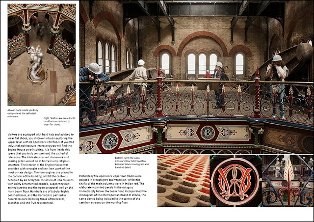
The Beam Engine House is a Grade 1 Listed Industrial Building constructed in the Romanesque style and features some of the most spectacular ornamental Victorian cast ironwork to be found today. It also contains the four original pumping engines (although the cylinders were upgraded in 1901), which are possibly the largest remaining rotative beam engines in the world, with 52 ton flywheels and 47 ton beams. Although modern diesel engines were subsequently introduced, the old beam engines remained in service until work on a new sewerage treatment plant commenced in 1956. Following abandonment in the mid 1950's, the engine house and engines were systematically vandalised and left to decay, which greatly impeded the Trust's restoration/conservation programme.

The Crossness Engines Trust, a registered charity, was set up in 1987 to restore the installation which represents a unique part of Britain's industrial heritage and an outstanding example of Victorian engineering. A large part of the restoration work so far carried out has been done entirely by an unpaid volunteer workforce

http://www.bexley.gov.uk/index.aspx?articleid=3209

https://www.youtube.com/watch?v=1ORy9JAMTlI

http://www.vediator.com/watch-latszJCxCSg

http://en.wikipedia.org/wiki/Crossness_Pumping_Station

http://www.bbc.co.uk/london/content/articles/2008/11/12/great_stink_feature.shtml

https://en-gb.facebook.com/TheCrossnessEnginesTrust?ref=stream&viewer_id=0&filter=1

http://www.bbc.co.uk/history/historic_figures/bazalgette_joseph.shtml

I also have a copy of their guidebook which helps.

Yes...this is where I am at and have photos, just need to do the layout.......

Update 23/7/2013

I really must admit to struggling with this whole module, some in part to personal stuff, some in part to feedback I was getting from my tutor making feel like I wanted to just throw everything out of the window and could I be doing so many things wrong after trying so hard? Added to what was going on with my Mum I couldn't face it so downed tools as commented on in previous posts.

Then the usual doubts set in, looking at everything photographed , even personal projects, going to Cologne last year with my daughter, Paris at half term, jaunt into London, there seemed to be nothing original or of good quality, my camera itself seemed alien and everything I had learnt vanished. Picking up again and looking at other OCA student blogs it has reassured me that others feel the same. Only thing is I look at their shots and think why are they worrying, when I look at mine again I still don't feel re-assured!

Trying to choose a photographic commission, a subject that interested me, that would provide photographs to support an editorial feature, stumped me. I couldn't think of anything that interested me at all. I received notification of a new tutor, introduced myself, got a reply and then still had block....confidence at rock bottom. Eventually after exchanging a few emails with a very patient Keith, I chose to photograph Crossness Pumping Station, about which you will hopefully discover more through my photo-story.

Possibly I bit off more than I could chew because the Pumping Station is only open 4 times this year. It does usually have limited opening but due to major renovations is only open four times this year, which curtailed my ability to go back and re-shoot if I decided I didn't have the images I wanted. I think that has been the case but I can always re-visit after feedback. If I become a member for £14.99 p.a. I can visit when the volunteers are there, in the evening, during the week. Also there is another open day in Sept, I am away for the next one at the end of July.

Having previously visited I knew that I would need to take a tripod, due to low lighting, and for the first time used a gorilla pod with a ball head as well as my standard tripod. This proved really useful. Day trip completed, again I had placed myself under pressure with the time frame as my son had been away camping with his Explorer group so I had to leave before closing time to go and collect him. My life at the moment seems to be filled with other deadlines to meet and places to be all impacting on everything!

Proofed my shots, disgusted by lack of variety (in my opinion) I sat on them....email chasing from Keith...but very gently...my reply of OMG I still hate everything I am shooting.....his response, don't worry just send me what you have and we will deal with it, that is what I am here for, to give you feedback and help you sort out what is going wrong....(or words to that effect)

So here goes....my first attempt at Assignment 3

The brief for this assignment does not call for you to actually create the editorial feature but I thought it would help me to order which images could be used for the opening, main body and closing of the article. Also assist with deciding which images to cull/keep not because they are necessarily the best images but because they work to tell the narrative. However, we are encouraged to think about what kind of layout we would use, there is no limit given on the number of page spreads and we are reminded that usually the photographer would not have control of said layout. I eventually ended up with 4 double page spreads. Due to a layout not being produced Per Se, information that would have been printed as a caption had to be entered on the metadata. This metadata should include, as a bare minimum, the creator, headline and description in the IPTC fields. I usually have a basic template set up and upload images via Bridge. Recently a new PC and newer version of CS6 meant setting up a new one so this wasn't an issue, anything not added at the time of upload can be included later.

Three shoots were done eventually, the initial one for inside the building, a second in London to capture the statue of Sir Joseph Bazalgette and the third when the weather was better, to shoot the outside of the building. Fortunately the day I had set aside for the outside shoot dawned bright and sunny, even luckier when I went along workmen were in the grounds repairing a brick wall, a brief conversation with the foreman saw me gain access to the site so I did not have to shoot through the iron railings.

Approximately 150 images were taken in the first shoot, Adobe Bridge was used to upload, add metadata and select pictures - using the star ratings/filtering system. The out of focus, poorly framed, duplicates, and images I thought would not convey anything, were excluded. The initial select whittled my options to 18; images selected were then examined more closely and edited, for chromatic aberration, white balance, clarity etc in RAW. 4 were chosen from the final 2 shoots giving me a final choice of 22 to choose from for the assignment. I re-calibrated my monitor, being a new PC I needed to make sure it was done. The profile once loaded looks very blue but am trusting it. If there is a problem I expect I'll be informed.Having done these edits I realised there weren't as many portrait shots as I would have liked, some of those taken were out of focus or not really ideal for the opening images. This has emphasised even more that I should have taken a check list with me when I went to do the shoots. My head wasn't where it should have been still and I wasn't taking the correct approach for an editorial still. Hopefully if feedback suggests the images need working on I can go back and re-shoot at some point.

More editing was completed in Photoshop, checking for dust spots,  adding a curves layer cropping or cloning out distracting elements and finally sharpening. I was then ready to choose the final set of images based on size, shape and the ability to narrate the editorial. Research was completed to fill out the gaps in my knowledge with regards to the pumping station for the article and captions.

The brief calls for images for an editorial feature, not just a photo story so I've included text on a few of the pages. I think the rhythm and flow of the images work.  I experimented with aperture and time values, size and shapes, wide angle and close up framing. Feedback will again suggest alternatives that work better.

An A3 layout was used in Photoshop to create the double page spreads, guides and grid-lines were used for positioning.

Assignment Three
A Photographic Commission
The brief 

The concept was to take enough images to support an editorial feature concerning the Crossness Pumping Station and its restoration. The images should show a variety of size, shape, focal length and contrast, capturing the atmosphere of the Pumping Station whilst providing an interesting visual narrative.
Equipment taken/used:

Canon 400D
17-55 f2.8 IS USM lens 70-300 IS ISM lens
Compact Flash memory cards
Tripod
Gorilla pod with ball head
Shutter release cable

Preparation

I liaised with my tutor to decide upon a suitable topic to cover. The conceptual approach was to show the continued restoration of a Grade 1 listed building and its contents; the world’s largest existing beam engines and to present it in the style of a magazine layout.

Technical specification and delivery method were to be via email, file sizes no larger than .5MB with a word document PDF.

Had this been an actual commission for a real client there are a variety of ways the images could have been sent; larger jpeg or original/tif files could be posted on a disc, images could be uploaded to a website, with a password if there were privacy concerns. Suggested magazine layouts could also be submitted as PDF files either by email or website.  Dropbox could be used but the uploading process can be slow.

Research

A local landmark previously visited I knew that the lighting was poor and I would need to take a tripod. I had been given a Gorilla pod with a swivel head and I took this along as I thought I would use it upstairs where there is an open ironwork floor and setting a standard tripod can be difficult. Also due to visitor numbers increasing during the day I did not want to cause trip hazards. I looked at the website for up and coming open days and for historical information about the site, I noted things I wanted to shoot: the unrestored and restored engines, the outside architecture, close up images of rusted/vandalised items, detail of the ironwork different angles, focal lengths and aperture values.


The shoot
The weather was inclement so I was unable to take the outside shots I needed. Inside shots were taken to the total of approximately 150. I thought I had sufficient portrait style images but this proved to be incorrect when selecting and editing shots. Both tripods were used along with the shutter release cable. Tripods were required due to low level lighting and I prefer not to use a flash. I used my 17-55 f2.8 is usm lens for several reasons. Firstly as it is fairly new and I wanted to get the feel of it, at f2.8 I could obtain more light if needed and also experiment with shallow depth of field. Where possible I used lower ISO as I prefer not to have grain, where necessary I used a tripod.
The time spent on location was shortened by having to collect my son but I know there are 2 more open days this year plus if you ring and speak nicely to the volunteers they occasionally allow people to come along in the evenings when they are working on site. This is more likely to happen if you become a member, which is not expensive and probably worthwhile.
I returned for a second shoot on a better day to obtain the outside architectural shoots and was able to access the grounds.
A third shoot took place on Victoria Embankment to capture the memorial for Sir Joseph Bazalgette. The sun was in the wrong place and was creating harsh angled shadows, I tried using a fill in flash which didn’t work so I waited for a while until the sun moved around and was lower in the sky to obtain the shot I wanted.

Selection and editing
Images were uploaded and selected using Adobe Bridge.


Proof sheets were created using filters 


 This was done for all three shoots  


Metadata and descriptions were added to all images either via template on upload or additional information added later via Photoshop File>file information 


Final images chosen
Opening images –


 18mm f8 ISO 100 1/160 - handheld


 24mm f14 ISO 200 3.2 secs - tripod


28mm f11 ISO 400 0.5secs – gorilla pod

Main body of images -
Spread 2


21mm f11 ISO 200  0.4 secs -  gorilla pod


 17mm f8 ISO 100 6.00 secs -  gorilla pod


 31mm f5 ISO 400 1/25 - handheld


 21mm f2.8 ISO 400 1/25 - handheld 


 23mm f2.8 ISO 200 1/50 - handheld
  
Main body of images – spread 3


 43mm f2.8 ISO 800 1/80 - tripod 


 55mm f2.8 ISO 400 1/40 - handheld


 42mm f8 ISO 200 2.5 secs - tripod


 46mm f5 ISO 400 1/25 - handheld


 28mm f3.2 ISO 400 1/40 - handheld


 20mm f11 ISO 200 0.8 secs – gorilla pod

Closing images – spread 4


 17mm f5.6 ISO 200 1/5 - tripod


140mm f8 ISO 400 1/50 - handheld


17mm f5 ISO 400 1/13 – gorilla pod

Manipulation

With the final set of images there was a little manipulation with some, cloning out distracting elements, cropping, converting to black and white and on the outside shots 2 exposures were taken and layers were used to get the correct exposure/colour of the sky. My 17-55mm is new and as yet I haven’t bought a polarizing filter for it.
However for the image below I used several shots to achieve the final result.

I deliberately used a slow shutter speed to get the ghosting effect however it took several attempts to get the desired effect of people going down the stair. Unfortunately I also had distracting “ghosts” to the side therefore I combined several images and used layers/layer masks to hide/remove them.

Conclusion

In conclusion I don’t think I did as badly as I felt I had.  On reflection there were enough images to complete the assignment although I do believe I could have had more portrait style. In the end there were enough shots with contrast and variety of size, shape, colour, depth of field and focal length to provide interest and complete 4 double-page spreads for an editorial feature. I know I took far too long in completing this assignment and had it been a real commission I would have missed the deadline! A mixture of other demands on my time and mainly lacking in confidence were to blame.


If I were to do this shoot again I would make sure I had a check list of not only images I wanted to shoot but as a reminder to take more portrait shots. I’d remember to set my camera to take 3 shots using exposure compensation to help with getting the correct exposure rather than having to complete adjustments in Photoshop after, although using the in-built camera meter worked most of the time. This new lens seems to suffer less with chromatic aberration than the standard kit lens but on a very bright day there was still a little so I need to re-do the exercise to discover at what point it starts to appear.

Below are the final double page spreads.

Spread 1


Spread 2


Spread 3


Spread 4


Now finished I am happier with the images than I was at the start. I still think I need a decent portrait shot for a possible opening shot because if an image was required for the front page of a booklet or magazine I don't have one.

*update feedback Here
*update reworking Here

Project: A Story in Pictures

This section deals with how although we tend to be concerned about a single image, pictures are more often than not used editorially in combination to tell a story. The course material again has a useful quote, this time from Harold Evans of The Times and Sunday Times, "The picture story is the ultimate expression in photojournalism. It documents as well as dramatises. It can be looked at gain and again and when its message impresses it is passed on to other people."

To do this successfully you need to have visual variety Evans also wrote you need "changes of scale, sequence, proportion, perspective...different lenses..viewpoints...shapes...."

A balance needs to be struck between similarity and contrast. The course material asks you to look through your archive again, take between 5 and ten images on a single subject or theme and turn them into a picture story.

I need to choose layouts either from examples given or layouts seen and admired in other publications, as starting points. There should be a heading, short introductory text and a caption for each image. I felt this was going to be tricky as when taking images historically I tended (and still do tend) towards thinking about individual shots, not a variety to make up a photo story/editorial. Several hours were spent trawling about looking for good examples. Again emphasis on pre-planning a variety of shots and maybe having a check list of what you are after would be a plan!

However I finally decided upon a set of images taken in Kew Gardens back in 2009 of the wicker Seed Walk made by sculptor Tom Hare. Some of the images may not have been as technically brilliant nor were there that many variations of depth of field of lens changing or close up images. However this was partly why I chose it. Also there were enough images that would hang together on one theme. As initially thought it really did show up my failings for taking a variety of shots within a set!

Then came the layouts, I had a look at many in books and magazines and found the most helpful in this instance to be a Kew magazine- it helps to be a member sometimes! They had a recent article on David Nash (I missed his exhibition on wood carvings and - am so gutted - I had initially thought to do my assignment 3 based on that but life gets in the way eh?)

Start with a blank A3 sheet, grids and guide lines were set marking margins and gutters, I read a lot about leaving extra mm's for bleed and printing on various websites but as most of that went WOOSH so I just stuck to plain A3. Fonts were chosen,simple and to a minimum. For the title page I used Times New Roman, both standard and italic, photography credit was Calibri. For the article text I stuck with sans serif as this seems to be the industry standard and personally it is easier to read, an odd size of 15.75 pt as it fitted the text box and page layout I wanted, until printed who knows if it truly works but things can always be juggled and adjusted. The captions were also Calibri 10 pt and placed in hopefully a logical place, next to or close to the actual image. Information was kept short and hopefully added extra interesting information. Another reason for choosing these shots was because amazingly I did note what they were at the time and had tagged some of them on my flickr page. The first page I took advantage of the grass to overlay the text. White was chosen as it it complements the temple whilst standing out against the grass, however as it was not that dark, in order to help the writing stand out a little more I created another layer below with an autumnal colour. I also used a slight Gaussian blur in the selected area.

The photography credit is fairly subtle but that was my intention, it is important that the photographer is credited but the article is not about me.

I noted that with many articles the initial letter in larger and sometimes coloured, I followed this idea and the "T" is the same colour as the heading "shadow" not sure that it is totally obvious so a different tone/shade of the same colour may have been a better idea. On the final page some weblinks are given and to make them stand out I used green. I felt this tied in with the tones and colours of the images and the overall garden/nature theme.

The Kew magazine was a good starting point but an odd size it didn't reflect the A3 layout I was working on so it wasn't strictly adhered to, which to be honest wasn't the aim of this task anyway. Juggling the images and the captions wasn't as easy as I thought it would be and took many hours, very annoying when you suddenly realise you have been lining all the images and text boxes against the wrong guide LOLOL!

Here are the final drafts for this exercise. Pleased with them as they stand I am sure things could be altered or added I need to walk away and possibly come back with fresh eyes, other feedback would be handy. I have a random B&W image on page 4. Not sure it works but wanted to do something with a contrast, did try both smaller images B&W but the second didn't look so good in monochrome. A total of 8 images were used over four pages.


Project Picture Captions

From the course material - "The purpose of a caption in a picture story is two-fold: to explain what is not obvious from the image itself, and to provide a link between images - a sequence of captions is other words."

Hints and tips:
  • Captions should be right next to the image
  • In one story keep the captions the same length
  • best kept short - about two or three lines
  • Explain what needs explaining
  • Who,What,Where,When,Why
  • Be succinct
  • Avoid too much detail, don't spell out the obvious.
Suggested research from The Washington Post, New York Times, Guardian, Smithsonian Magazine.

Looking at 3 of the publications they all seem to follow the above rules these were some of my observations:


  • Caption content invariably include most but not all tends to be some but not all of the 5 W's.
  • Caption length, between 1 and 3 lines.
  • Position online tends to be text tends to be underneath the image.
  • Justification varies being left or right hardly ever centre. Captions tends to be left justified with credits sometimes a continuation sometimes justified to the right.
  • Credits seem to be for the photographers and/or agencies.
  • Majority of typeface, tends to be a sans-serif.

The Guardian


New York Times


The Washington Post


Exercise: Practise writing captions.

Research done as mentioned all seem to follow the tips and hints given. Looking through Art & Music the Saatchi gallery magazine it was fascinating to note that many of the images were not captioned at all, but then if a picture of a book or film poster I guess the information was all there. Some paintings just had the artists name but no date or titles. In printed publications there seems to be more variety as to where the caption is placed, sometimes above or to the side of the image.

For this exercise I have to choose 6 images, extend the canvas (in white) and place the caption underneath. Thinking of the audience I need to give them more information without being too literal of what the images are about. A fine black border has been added only so that the edges are clear on my blog.

For the first two images I chose to justify to the left for the caption keeping the copyright to the right. The text I kept sans serif and used Calibri.


Next, justify right.


Then I chose a more generic image to caption and changed copyright to a credit for the photograph.


Followed by a still life piece.


I didn't find this exercise as hard as anticipated. I think this was made easier by the fact that on looking at my archived images I knew where most of them were taken and why. The 5 W's were on the whole covered. However it has made me aware that when out shooting an event it is probably going to be a good idea to take a pen and paper with me to jot down locations, or items, names or fine details that might be needed for caption information. Also if taking images for an editorial you need to know who the audience will be, will the information be expected to be technical, amusing, general or specific. All things needing thinking about if wanting to publish professionally in papers or magazines I guess.

On having experimented with the different justify left or right I am still not decided which I prefer. I started off not liking the justify right at all, and in some publications it looks messy. However I do think it depends on the amount of text, sentence length and how the sentence is split.

Having asked for opinions most came back favourable, the captions were informative without stating the obvious and people were split over the justify option. That seems to be down to personal tatse and the preferences of editors!

Research links

http://www.washingtonpost.com/
http://www.nytimes.com/
http://www.guardian.co.uk/
http://www.smithsonianmag.com/

Project Page Layout

Leading up to assignment three it is really important to complete these exercises:

Exercise: Research published layouts

The aim of this exercise is familiarise myself with the differing layouts and approaches to publishing a photo-story. The course materials point out how online versions differ from physical publications and how online magazines are uploaded as web pages. My own research proved this to be correct, especially when looking at free "magazines". Not in a financial position to subscribe to as many of the supplements as I would have wished I did make an effort to flick through magazines and newspapers where available.
F11 magazine was interesting although their style of layout wasn't really suited to what I had in mind.

http://www.f11magazine.com/site/

Digital Photography School had a few good tips and hints

http://digital-photography-school.com/telling-stories-with-photos

and some online blogs were informative too

http://zinio.wordpress.com/2011/04/05/the-things-that-matter-in-telling-a-story-that-matters/

http://talent.adweek.com/gallery/Newspaper-photo-essays-and-layouts/3848853

http://www.tpub.com/journalist/75.htm

Other research has been done, I got a few books out of the library and one featured photographers and how they set out there books. I also looked at Kew magazine which features several photo stories, one was of David Nash at Kew which I found very useful. These have been stuck into my learning log and I will upload images at a later date.

Exercise: Two images on the same page

Playing about with the book cover design and the page layouts it became obvious that a great deal needs to be taken into consideration when placing images on a page, not only size and shape but how the images interact with each other and the message they send. The aim of this exercise is to select 2 images from my archive and experiment with placing them on the same horizontal page.

Initial page size I chose was A4 with a white background and I set guides to give me a 1cm border. I think the most problems I had with this exercise wasn't choosing positions on the page but which images to select that told a narrative and complimented each other; look like they should be on the same page. Although the task does not call for text I found it helped me think about how and where images should be placed especially when using different sizes.

Layout 1


The second column of text is probably too close to the picture on the left-hand side but as this is experimentation I am not being too fussy with the layout of text versus image, just getting the feel of what would possibly work. I haven't worried about captions but this would obviously impact on spacing and arrangement. I've also found that although I did lots of work in PS ages ago due to not using it it is all VERY rusty!

This layout works ok, I deliberately chose landscape and portrait with the differing sizes, there is a contrast in the bright colours of the red coat and the monotone bronze of the statue. The red poppy ties the images together as does the subject matter. It could possibly work better another way round with the landscape image on the left-hand side with the little girl looking down from the right. This seems to help with taking your eye across the page and down to the text (if I had included it second time around)


Layout 2


If being created for a large feature spread this layout also seems to work, the grey sky enables you to place text in the negative space in the image. One being of the landscape and the other of flora found in one of the hot houses the images would tell a narrative and the positioning on the page leads the readers eye across the article. Again the image orientation being landscape and other portrait gels on the page.

Layout 3


Although both portraits, the feel of the images is different, the main photograph has the subject full frame with a direct gaze, engaging the audience while the smaller image is of an intimate moment where we feel like onlookers. The colours are similar in both so while there is no contrast in shape or tones the different sizes of the images makes me feel this layout works. Being across a double page spread and using guides I think the fold line would not interfere with the main image but this is something that would have to be test printed to make sure. With practice I guess you'd have a better feel for that. This layout proves that the images do not have to be different shapes to work together.

Layout 4


For layout four I chose to not have text, just captions and have 2 large images. This exercise has made me realise that when taking photographs for an editorial not only have you got to think about creating a decent single image you really need to think about how the set will work as whole. Going through my archives of this shoot of the band I had loads where everyone was looking to the left but not many to the right. Having both subjects facing in provides a much better balance than when facing in the same direction. The images are similar in subject matter and orientation but I don't think that it makes for a less interesting layout. I may change my mind on reflection but for an initial idea it seems ok.

Layout 5


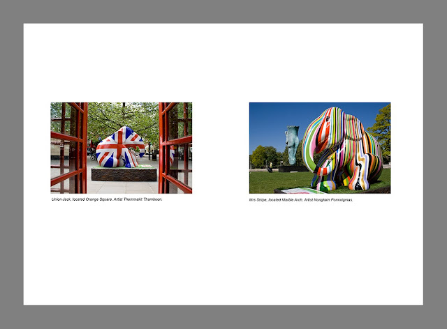
This time I chose to use images of the same size and shape but explore negative space on the page. The images are from the London Elephant Parade 2010 and I felt that the captions explain all you need to know.When placing the images on the page at first they were dead centre but for my liking I preferred there to be more negative space at the bottom. It is only a slight margin but for me was more aesthetically pleasing.

Layout 6


Chosen with the sole reason of experimenting with different subjects, colour, size, shape, time of day etc. this also appears to work. The images show a different face of Milton Keynes so link together which if at first not obvious from the images would be from reading the captions. This has helped me realise the importance of the next exercise of working with picture captions.

Conclusion

In conclusion I decided that you could experiment with layouts and combinations until the cows come home. Whilst there seems to be no obvious rules as to which images can go together in respect of size and shape, there positioning on the page and the content of each picture will have a huge impact on if the layout works or not.

Asked to rank them in order as to how they work.....initial thoughts are :


  1. Layout 3 
  2. Layout 4
  3. Layout 6
  4. Layout 2
  5. Layout 5
  6. Layout 1 V2
This may change on reflection. Interesting exercise to do and I have learnt that different shapes and sizes make for a more dynamic layout, that the images don't have to be radically different to work, contrasting pictures do work, same size images have their place but most of all that the direction/content of the final image will have a huge impact on if the spread works or not.

found this which could come in handy for reference
http://inspirationhut.net/inspiration/42-excellent-examples-of-magazine-layout-design-for-your-inspiration/

http://www.magazinedesigning.com/magazine-spreads-good-bad-practices/

This is good example of text flow. Text and images have their own place and importance. Flow is natural and reader will have no problem following it.

Gray areas represent the most visible areas of the spread. Darker shaded area is more visible than the lighter shades. Readers eye is drawn to the upper parts that’s why those areas have the most impact.