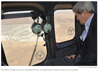
Hints and tips:
- Captions should be right next to the image
- In one story keep the captions the same length
- best kept short - about two or three lines
- Explain what needs explaining
- Who,What,Where,When,Why
- Be succinct
- Avoid too much detail, don't spell out the obvious.
Suggested research from The Washington Post, New York Times, Guardian, Smithsonian Magazine.
Looking at 3 of the publications they all seem to follow the above rules these were some of my observations:
- Caption content invariably include most but not all tends to be some but not all of the 5 W's.
- Caption length, between 1 and 3 lines.
- Position online tends to be text tends to be underneath the image.
- Justification varies being left or right hardly ever centre. Captions tends to be left justified with credits sometimes a continuation sometimes justified to the right.
- Credits seem to be for the photographers and/or agencies.
- Majority of typeface, tends to be a sans-serif.
The Guardian
New York Times
The Washington Post
Exercise: Practise writing captions.
Research done as mentioned all seem to follow the tips and hints given. Looking through Art & Music the Saatchi gallery magazine it was fascinating to note that many of the images were not captioned at all, but then if a picture of a book or film poster I guess the information was all there. Some paintings just had the artists name but no date or titles. In printed publications there seems to be more variety as to where the caption is placed, sometimes above or to the side of the image.
For this exercise I have to choose 6 images, extend the canvas (in white) and place the caption underneath. Thinking of the audience I need to give them more information without being too literal of what the images are about. A fine black border has been added only so that the edges are clear on my blog.
For the first two images I chose to justify to the left for the caption keeping the copyright to the right. The text I kept sans serif and used Calibri.
Next, justify right.
Followed by a still life piece.
I didn't find this exercise as hard as anticipated. I think this was made easier by the fact that on looking at my archived images I knew where most of them were taken and why. The 5 W's were on the whole covered. However it has made me aware that when out shooting an event it is probably going to be a good idea to take a pen and paper with me to jot down locations, or items, names or fine details that might be needed for caption information. Also if taking images for an editorial you need to know who the audience will be, will the information be expected to be technical, amusing, general or specific. All things needing thinking about if wanting to publish professionally in papers or magazines I guess.
On having experimented with the different justify left or right I am still not decided which I prefer. I started off not liking the justify right at all, and in some publications it looks messy. However I do think it depends on the amount of text, sentence length and how the sentence is split.
Having asked for opinions most came back favourable, the captions were informative without stating the obvious and people were split over the justify option. That seems to be down to personal tatse and the preferences of editors!
Research links
http://www.washingtonpost.com/
http://www.nytimes.com/
http://www.guardian.co.uk/
http://www.smithsonianmag.com/
For this exercise I have to choose 6 images, extend the canvas (in white) and place the caption underneath. Thinking of the audience I need to give them more information without being too literal of what the images are about. A fine black border has been added only so that the edges are clear on my blog.
For the first two images I chose to justify to the left for the caption keeping the copyright to the right. The text I kept sans serif and used Calibri.
Next, justify right.
Then I chose a more generic image to caption and changed copyright to a credit for the photograph.
Followed by a still life piece.
I didn't find this exercise as hard as anticipated. I think this was made easier by the fact that on looking at my archived images I knew where most of them were taken and why. The 5 W's were on the whole covered. However it has made me aware that when out shooting an event it is probably going to be a good idea to take a pen and paper with me to jot down locations, or items, names or fine details that might be needed for caption information. Also if taking images for an editorial you need to know who the audience will be, will the information be expected to be technical, amusing, general or specific. All things needing thinking about if wanting to publish professionally in papers or magazines I guess.
On having experimented with the different justify left or right I am still not decided which I prefer. I started off not liking the justify right at all, and in some publications it looks messy. However I do think it depends on the amount of text, sentence length and how the sentence is split.
Having asked for opinions most came back favourable, the captions were informative without stating the obvious and people were split over the justify option. That seems to be down to personal tatse and the preferences of editors!
Research links
http://www.washingtonpost.com/
http://www.nytimes.com/
http://www.guardian.co.uk/
http://www.smithsonianmag.com/


No comments:
Post a Comment