Saturday, 11 December 2010

Exercise 16: Strength of interpretation

There is an interesting effect on processing and reproduction quality when you remove the element of colour. So much more can be done with the interpretation of the tonal range. More aggressive changes can be done with brightness and contrast than would be expected with colour.

For exercise 16 I needed to choose two photographs that best suited the following adjustments:

  • A strong increase in contrast that will include clipping in at least the shadow areas. A pronounced S-curve is the standard method.
  • Low key or high key treatment, in which the entire brightness range is shifted down or up the scale. Curves or levels are equally useful in creating this effect.

I had to create these effects, one for each image but in two versions; one in colour the other in black and white.

High Key

The original image was taken in a local cemetery mid afternoon, providing deep blue skies, rich colours and long shadows. This image has not been processed in any way.


Original

Shifting the entire brightness range to the end of the scale created a totally unusable image. After adjusting the levels slider to create a high key, slightly over exposed image the scene has a colder feel with the light having a bright early morning look. The scroll on the headstone no longer has the impact it did in the original image. Experimenting further with curves/levels  making the photograph a lot brighter, the scene lost detail and noise was introduced in the shadows and in the trees.
High Key Treatment
Creating a high key black and white image the emphasis remains on the scroll, the lack of colour in the leaves gives more attention to their detail and texture than in either of the first two photographs. The B&W image could take the same amount of adjustment whilst retaining a realistic look. It illustrates that tonal range can be just as important and in some instances even more so when considering which images will translate into a black and white scene.


Black and White Conversion
Contrast

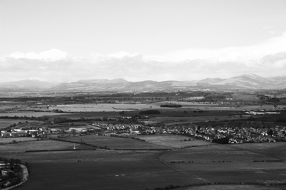
This image is of a view of Scotland, the lighting was fairly flat and the colours subdued. Again this image has not been processed before conversion.


A very pronounced curve rendered the image unusable and also when converting to B&W with such a pronounced curve, areas were too dark with loss of detail. Introducing  a strong contrast using an S-curve strengthened the colours but lightened the sky. Clipping became apparent in the darker areas such as the trees and whilst the mountains in the background have improved their appearance the colours in the foreground have become unnatural.


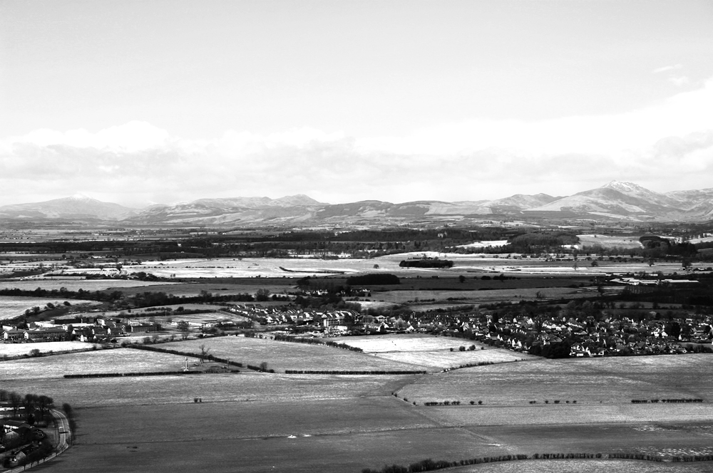
Converting the image to B&W and applying the same level of adjustment presents a more acceptable scene, even if the foreground is a little dark, once more it is the tones, shape and field patterns that you notice.
Experimenting with the green and yellow channels afterwards, to lighten the foreground, has given an interesting interpretation with the scene appearing to be a snowy winters day.

Although theoretically a simple exercise I found this quite tricky. Some of the images I initially selected thinking they would respond well to high key or high contrast treatment failed terribly. Some which fared well with the initial treatments did not translate at all into black and white. I discovered that you can push the boundaries at either end of the scale more in black and white than you can in colour. Not only do unnatural colours "disappear" but digital noise/grain can be more acceptable. This exercise has again emphasised the need for taking into consideration tones, shape, volume, framing and exposure when considering subjects/scenes for black and white conversion.

Exercise 15: Black and White

For this exercise I needed to choose a subject, lighting condition or photographic situation that I thought may look better in black and white. The image had to be shot in colour with the black and white version created during processing. In shooting I needed to ignore the colour element.

From NCFE Level 2
Composing and exposure for the black and white version meant I had to pay close attention to other details such as form, pattern and texture.The previous tasks have experimented with the degrading of colour saturation and this exercise moves on to full monochrome conversion. This was interesting for me to undertake. In my previous portfolio I was concentrating on the subject and matching colours/tones where possible.


From NCFE Level 2


In choosing the subject for this exercise I experimented with several images and ideas. Some I thought would make for a good conversion others I was not sure. I looked at some of the photographs I already had and wondered what one of my landscape shots would look like after conversion.

I thought it worked fairly well with the textures and shapes, however this wasn't taken intentionally for conversion. There were several different colours within this image and I was curious to see the result. Although I have seen very effective black and white landscape scenes (obviously Ansell Adams) admiring the work and being able to produce it are entirely different!

Due to the weather being snowy outside the house was scoured for inspiration and  eventually  a series of shots of my bathroom shelf were taken. Quite pleased with the conversion I liked the contrasty/high key effect achieved due to the bright lighting conditions and after during the post processing. However I do have mixed feelings as to if this was almost monochrome from the outset? There were no real strong colour stimuli to ignore but the choice of subject was made because of the form, shapes and pattern. I loved the way the vase refracted the venetian blind, the reflections and shadows in the image as a whole. The colours were not important, despite the fact all the products were from a set and of similar colour, it was the difference in opacity, materials and shapes of the packaging/items that I thought would make an interesting scene.

Due to the bright background and dark foreground, despite using a reflector, I had to make local adjustments to the exposure, this introduces a little noise on the tiled windowsill but the effect is minimised due to monochrome conversion.

My final conversion was of a decoration on my Christmas tree this time taking into consideration the different texture between the prickly tree and the smooth shiny decoration. The pattern of the needles reflecting in the metal angel added interest.

The default conversion was made using a black and white adjustment layer with adjustments made to the colour sliders , manipulating the RGB channels.

Thinking about taking an image specifically for conversion to black and white definitely made me concentrate more on the shapes, textures, form and patterns created by the subjects. I think that the framing and compositional techniques used were not that different from that had I been shooting for a final colour print. The colours could be disregarded. The first image taken in the bathroom was brightly back lit and I used a large piece of white cardboard to reflect some light back onto the bottles and soap box. The Christmas decoration was taken in very low light, with and a fairly long exposure. I could increase or decrease the exposure more as Black and White conversion is more forgiving with the extremes and any introduction of noise/digital artifacts has little or no effect on the final image.

Creative vision for shooting B&W takes a little training and this exercise has helped to show what can be achieved when concentrating on the aspects of contrast, key, geometry, volume and texture.

The course notes mention Cristoforo Landino, a 15th century writer/translator and poet who commented on many famous pieces of Renaissance art/literature, he introduced several terms to describe art and individual artists work which can help artists and photographers alike to view subjects as separate elements of composition, linear design and colour.

- imparting a sense of relief, or the illusion of three dimensions to a two dimensional rendering by virtue of tonality (Cristoforo Landino’s term).
rilievo

On reflection I rather like B&W conversion ;o)

disegno- judicious use of line (as opposed to tone) to circumscribe forms (emphasis on contour and outline) (Cristoforo Landino’s term).
 http://faculty.unlv.edu/mcrae/monument_lists/art_261_monument_list_04.pdf

In 1481, the scholar Cristoforo Landino in the Preface to his Italian commentary on Dante's Divine Comedy, adapts Latin terms such as those used by Rinuccini to the vernacular so that they read ornato and artificioso. But he also uses terms which were perhaps more familiar to his Florentine audience such as prompto and divoto to characterize the individual styles of different artists

ingentaconnect GIOVANNI RUCELLAI'S COMMENTS ON ART AND ARCHITECTURE

Sunday, 28 November 2010

Exercise 14: Interpretative processing

With this exercise I had to chose an image that was open to creative interpretation. Using the different adjustment controls available in Photoshop I had to give a different look or feel to the image and make three different versions. As per the recommendation an image with a fairly low dynamaic range was selected.

The original image was taken in the Limehouse Basin on a rather cold and overcast day at the end of September. Not a terribly inspiring photograph but it was ideal for this exploration of interpretative processing.


Original
 

For the first adjustment I attempted conversion to a night scene, playing with so many different layers and processes even though I wrote some of them down I lost track of what effects were eventually used to complete the final image. I created layer adjustments and layer masks so that the original image was not destroyed during the process but in my experimentation the tiff was flattened and saved without saving with layers intact, which is a something that I never usually forget to do! The main effects used were; Exposure reduced and a cooling filter with the density increased added. Saturation was slightly decreased and the burn tool was applied to the lighter areas that remained a little too light. Using the black and white adjustment brushes on the layer masks or adjustment layers fine tweaks were made to local areas. I was rather pleased with the end result and believe the final photograph represents a late evening/ night shot well.


Night


The choice for my second conversion was to create an image that would not look out of place in an old photograph album depicting a historic scene. Once more layers were employed. To create a sepia tone I used variations in the Image menu, in order to use this option the image had to be converted to 8 bits. In variations I moved the fine/coarse slider down a notch and selected more yellow once and more red once. I played with the opacity until I was happy with the colour. Noise was added and using the erase tool with a dry media brush faded/distressed the edges. A few scratches were added for effect and the burn tool was used in an attempt to make the edges look grubby. I was pleased with the final image,the sepia tone is realistic but the distressed edges could be slightly more subtle. If I was to undertake this exercise again I'd possibly use different brushes to make it look less uniform and also experiment with the eraser opacity.


Aged
 
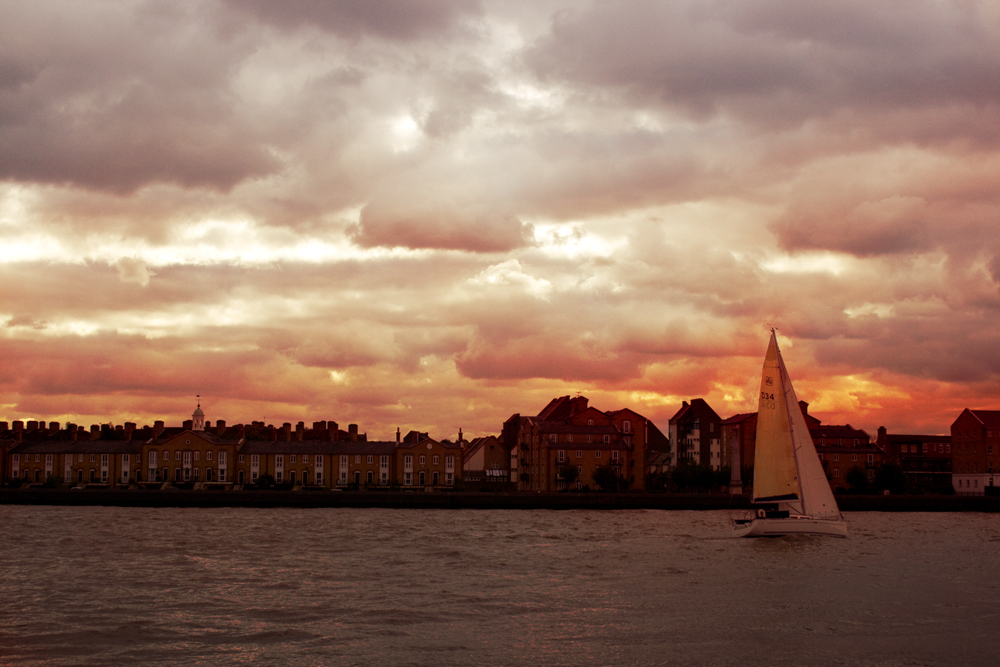
For the final change I wanted to create a sunset. To make this I used a New Adjustment Layer/gradient map. On the gradient editor a red was chosen for the dark areas and yellow for the light. The blend mode was changed to overlay and the layer opcaity reduced. Once again the erase tool or adjustment brushes were used on local areas. I am particularly pleased with the warm glow showing thru the yachts sails and the "sun" behind the clouds. The warmth that has been added to the building and water are effective, especially with the glints on the ripples. Having uploaded the image I think I could have toned down the orange on some of the clouds but for the aim of this excercise it proves that images can have different interpretations.


Sunset


I enjoyed the creative/artistic side of this task, it shows that the feel atmposphere and therefore effect of an image can be amended within photographic software. This means the original intention/interpretation of a shot can be altered. Even though on reflection some of the alterations on the sunset could have been toned down a little all images are completely different to the original and I feel I have been successful with the creative interpretation. I would probably use this technique if creating an image that I considered to me more a piece of "art work" rather than straight photography.

Exercise 13: Managing colour

For this exercise I needed to find 2 or 3 images that had a significant colour cast and to correct it, taking care to retain a reasonable colour and colours that would be expected ie a grey surface would remain grey. I needed to make sure that at least one of these images contained a known grey surface ie concrete, steel, aluminium , asphalt, thick clouds and shadows on white.

As I had shot these images in JPEG+RAW I could experiment with adjusting colour cast with both. The first thing I noticed was that the colour cast was more obvious with the original jpegs.

The first image I chose has a yellow cast, although admittedly it isn't that strong a cast but enough that the skin tones are rather sallow and the blue sky appears a rather washed out murky colour. This was also an ideal image to choose as it has several surfaces that I could select as my grey point.


Original Jpeg file

Original raw file
When working with the JPEG image the white balance control was not available so I chose to use the grey dropper available through the Curves window. The steel handrail gave the best results when using the dropper but even so this made the image shift a little too far.


I then used different techniques, different layers, changing the opacity and experimenting with the targeted adjustment tool, to obtain a satisfactory result.


Adjusted Jpeg
Working with the RAW file gave me access to finer control of the white balance. I experimented with the presets but found none really matched the result I was looking for so I adjusted the white balance slider using a Custom setting. I then altered the hue and saturation very slightly.


Adjusted RAW file
 Looking at the end results they are pretty close together and any differences could be due to over correction with one of the tools/techniques used. I am happier with the RAW conversion as the white buildings in the background do not appear to be as stark a white. I still need to become more conversant with the adjustment tool in RAW to fine tune any local adjustments. I still prefer to do this via layers in Photoshop.

The second image has a distinctive blue cast. Once gain the colour cast is more obvious in the JPEG file.

Original Jpeg file

Original RAW file
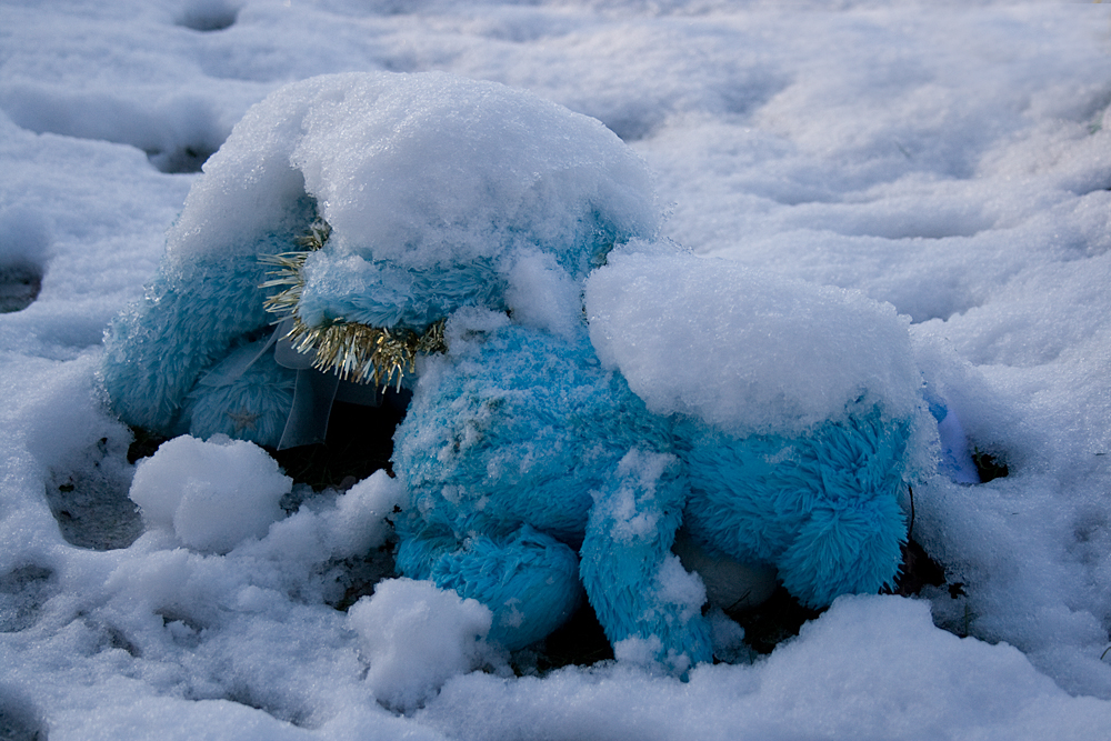
Once again I used the grey dropper tool and layer adjustments/ targeted adjustment tool to correct the image. The image appeared to be ok on my screen but now it has been uploaded I think it could have been brightened a little more as the snow now looks rather grey.


Adjusted Jpeg


Again I chose to adjust the whte balance slider and alter the hue. The difficulty I experienced with this image in RAW was keeping the colour of the bears correct, I tried to do local adjustments in RAW but they were not very successful. In practise I would have then opened the image in Photoshop and completed the adjustment with layers, however as this task was about the comparison of managing colour with either RAW or JPEG I left it as it was.

Adjusted RAW


In conclusion I would still choose to do my main colour cast/white balance adjustments in RAW, once the techniques of all the tools have been mastered it gives more fine-tuned, subtle results than working with jpegs. Having said that at the moment I obtain better results when mixing both RAW, converting to a TIF and doing fine-tuning with layers and layer masks.

Exercise 12: Managing tone

I should take an image with both jpeg and raw so I can practice the procedure on both.

Tiff or jpeg
  • Set the black and white point, close them in until just short of clipping.
  • Assess and if necessary adjust the brightness of the mid-tones, best done by eye
  • Assess and if necessary adjust the contrast
  • If needed make corrections to localised areas
handy hints on setting black and white points

http://pcin.net/update/2007/02/21/set-your-white-and-black-point-digital-photography-tip-of-the-week/
or
http://www.cambridgeincolour.com/tutorials/levels.htm

Raw
  • Set the black and white point but make sure you set the white point first by adjusting the Exposure slider, ensure that the clipping warnings are displayed so they can be adjusted precisely.
  • Assess and if needed adjust the brightness of the midtones. Use either Exposure, Brightness and Tone Curve.
  • Assess and if needed adjust the contrast, experimenting with both Contrast and Tone Curve.
  • If necessary make corrections to localised areas.
another useful video clip

http://www.youtube.com/watch?v=yT44Nd4xnGg

RAW

Original RAW image with clipping warnings displayed.

Original RAW


As per the recommendation the White Point was set first by adjusting the Exposure slider. This done I utilised some of the other sliders to see what effects they had on the mid tones which now needed adjusting. I found a combination of adjustments gave a desired effect including using a Tone Curve.

RAW Sliders Adjustments

RAW Tone Curve


Final RAW Image


The result after making these adjustments in ACR is an image with the correct exposure and tones. Using ACR gives a high amount of control to fine tuning White and Black points and local adjustments can also be made if required.

JPEG

Original Jpeg which needed adjusting but as clipping warnings cannot be made in Photoshop all adjustments are done by eye.


Original Jpeg


The first stage to altering the White and Black points in a jpeg are to use levels, and to slide the right and left hand arrows in without losing any information. I chose to use a levels adjustment layer so any changes could be altered or fine tuned using the brush tool.

Levels Layer


Further fine tuning was made to the mid point and also adding a brightness/contrast adjustment layer.

Contrast Layer

Final Jpeg


The final jpeg also has correct exposure and tones following the adjustments.

In conclusion I have decided that the RAW conversion offers fine tuning to a greater degree, especially as you can enable the clipping warnings. Fine adjustmenst can be made locally but as I am not proficient with thgis yet I would as mentioned in previous exercises combine adjustments in ACR and Photoshop. As this image did not require an awful lot of adjustment and as layer adjustments were used I was please with the final jpeg result. Using RAW also offers all the other benefits or retaining all original information in the file.

Optimising tone and colour

In this section of the course I need to consider very carefully they way I process my images as this will have an impact on the quality. To optimise, in the context of the following exercises, means to improve by using basic adjustments. Hopefully most images taken are spot on but this isn't always the case and on occasion a different setting may give a more pleasing end result.

Before any adjustments to the images are made ideally my monitor should be calibrated. I purchased a Spyder3 Express a while back and make sure I re-calibrate when I get the reminder to do so. When processing my images I make sure that the monitor is not situated in direct light and try to make sure the lighting conditions are always the same, or as close as possible to the same. Since employing the Spyder3 I have noticed that my prints are much closer to my monitor.

When optimising an image I should check the following, contrast range, brightness, unwanted colour cast and that blacks and whites are not tinged with colour.

Exercise 11 : Raw

The purpose of this exercise is to demonstrate the advantages of processing in RAW whilst putting the advantages into perspective. The remit is to shoot three scenes with different lighting conditions, daylight, artificial lighting and high dynamic range, in both RAW and jpeg then open and process each pair of images.

Finally I need to compare the two versions paying particular attention to dynamic range, white balance and colour and local adjustment of any kind.
Do I notice any differences between the raw and jpeg?


High Dynamic Range RAW

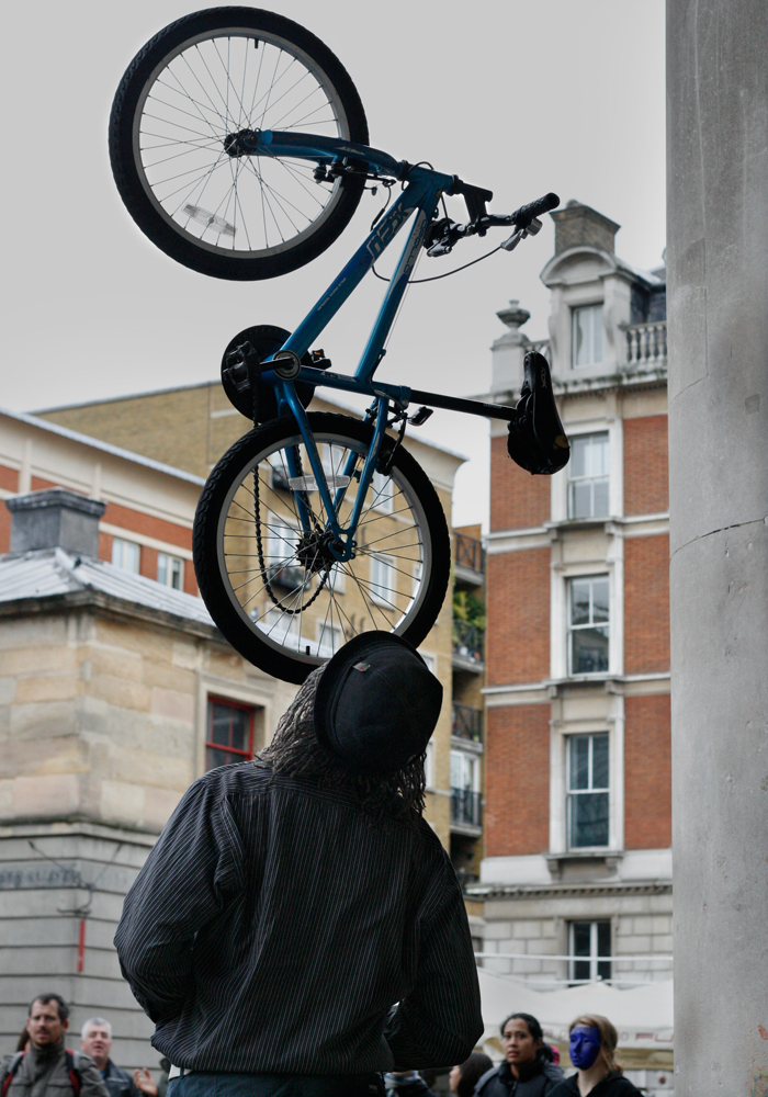
This image was taken in Covent Garden of a street performer "juggling" a bike. The bright sky, stalls and white brickwork and his dark shirt has provided the high contrast needed to experiment with recovering any details.


This is the RAW image before any conversion has taken place. The histogram shows the values stretching across the axis. As it was a very grey day with low light I shot using ISO 800, any increase in exposure in post production would run the risk of introducing digital noise, especially in the darker areas.

I was happy enough with the white balance so left this unchanged. In RAW, using the adjustment brush the exposureof teh sky was lowered and exposure of the performers shirt increased. Other tweaks were done using the fill light, blacks and brightness sliders.
As you can see the histogram now shows a slightly better balanced image with no intense blacks or whites. The details have been brought out in the shirt and hat with no introduction of noise.


High Dynamic Range Jpeg


This is the unedited jpeg image. The histogram is not that different to the RAW and indicates that it has a high dynamic range.
I experimented with different adjustments. Levels and curves had no effect on the blown out sky at all. Using Exposure created a very flat uniform grey sky where adjusting the raw image allowed you to see the slights variations within the cloud cover. I used adjustment layers rather than amending the original image to preserve it as much as possible.


The adjusted histogram once more shows that there are no longer intense whites or blacks. On face value there does not appear to be that much difference in the end result. I found fine tuning in RAW easier as there are more tools available, even though I need to master the adjustment brush a little more. Some of the adjustments are also more subtle and easier to control in RAW. Having said that I do like the flexibility that adjustment layers provide and in reality would possibly combine various techniques to achieve the final result.

This is a comparison of a selected area of both final images. The jpeg is on the left. Where I had altered the blacks in RAW the hat looks a little more blue which in fact it should not something to pay attention to in future, but the main comparison was for coloured artifacts. They are more visible in the jpeg image but I had to increase the magnification to 600% to really see it. You can see the difference more on my screen than you can in the uploaded jpegs, although the effects can be seen in both the hat and the shade in the balcony.


Daylight Raw
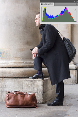
This was also taken in Convent Garden of a bystander watching the juggler. The image appears a little "cold" and was slightly over-exposed on the man's fingers and nose, with a minimal amount of highlight clipping.
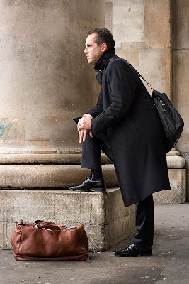
After adjusting the exposure, temperature, tint and vibrance the image is correctly exposed and is much warmer. Possibly now uploaded the columns have a richer hue than in reality but I quite like the effect.
Daylight Jpeg
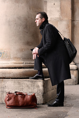
The final adjusted jpeg is also correctly exposed and has a warmer feel, I found some of the adjustments too over powering, channel mixer can be used to correct cast as can photo filter. In this instance I used a curves layer and hue and saturation. This image looks too pink but if I continued to experiment I possibly could have achieved a better result.
Artificial light RAW

For the third required shot, artificial light, I decided to choose an image not only shot in artificial light but which also had quite low lighting as the other two images I had were taken in fairly bright daylight. I wanted to compare how different RAW and JPEG processing would be in lower light conditions.

Once more I could see that the colour cast was more overpowering in the jpeg than the raw before any processing took place; even though I had set the WB to tungsten there was a distinct yellow cast.


RAW original

Several adjustments were made in ACR, exposure was increased slightly, a custom white balance was applied, temperature 2650 to obtain the correct colour of the Christmas decoration, slight sharpening and as there was a hint of lens flare from a Christmas tree light the clone tool was used to remove this and a distracting glint in the top lefthand corner. A tones curve was used to alter some of the shadows. Finally local adjustments were made with the exposure brush to the blue bauble in the background.


Using the Clone Tool


Using some of the tools at the moment is quite tricky. Having never used the clone tool before it took me a few attempts to work out which circle was the target site and which was picking up the source. Moving the circles around was also an interesting experience but I gradually got the hang of it. In this instance the clone tool worked more efficiently than the spot healing tool. Once mastered I can see that it could be more area specific and adjustable than using Photoshop, although the Photoshop clone tool with an adjustment layer is very easy to apply and amend after. Finding I learn through experimentation as much as reading I wish I had checked the Adobe site first this time ;o)

Adobe Photoshop CS4 * Remove spots in Camera Raw

The final processed image is properly exposed with very little clipping in either highlights or shadows. The adjustments made to the white balance and colours has rendered a photograph very close to the actual scene. Local adjustments were easy to make (once I stopped arguing with the adjustment brushes) and made for subtle amendments.


Final RAW


 Artificial Light JPEG

On first inspection the colour cast is more pronounced in the jpeg and the shadows also appear much deeper.
 
Jpeg Original

With Photoshop there are several options available to adjust the image. Using the clone tool I corrected minor problem areas. I found using the Photoshop clone tool much easier but this is probably due to familiarity.


Various layers applied
The first adjustment attempted was with a Levels adjustment layer, I was particularly concerned with recovering the correct colour balance and details from the shadow areas. This was fairly successful in bringing detail out from the bauble although the extent of the adjustment over exposed the bear so the amendment was applied locally. Levels was more successful than a Curves layer which seemed to introduce too much digital noise. The most difficult correction was to the colour. Channel mixer was not subtle enough and the colour balance although better still failed to achieve, in my eyes, the correct result. Therefore another adjustment layer was applied, Hue and Saturation.

Although I was able to recover some of the detail and colour and the final result is fairly accurate I am not as pleased with the jpeg as with the raw file.


Final JPEG


Side by Side for comparison


In conclusion I have found that whilst RAW conversion will take a little getting used to as the tools are not as familiar the results it gives makes it a worth while exercise. The level of control offered and subtley of the results you can achieve compared to the jpeg file is quite impressive especially when trying to correct colour balance and recover highlight/shadow clipping. If the levels of adjustment required is fairly low then a high resolution correctly exposed jpeg file will probably still return high quality results, I started this exercise being in favour of RAW conversion but was prepared to have an open mind as to the level of advantages offered, now I have completed it I am more convinced than ever that RAW is a fantastic tool to have in my photography tool kit.