For exercise 16 I needed to choose two photographs that best suited the following adjustments:
- A strong increase in contrast that will include clipping in at least the shadow areas. A pronounced S-curve is the standard method.
- Low key or high key treatment, in which the entire brightness range is shifted down or up the scale. Curves or levels are equally useful in creating this effect.
I had to create these effects, one for each image but in two versions; one in colour the other in black and white.
High Key
The original image was taken in a local cemetery mid afternoon, providing deep blue skies, rich colours and long shadows. This image has not been processed in any way.
 |
| Original |
Shifting the entire brightness range to the end of the scale created a totally unusable image. After adjusting the levels slider to create a high key, slightly over exposed image the scene has a colder feel with the light having a bright early morning look. The scroll on the headstone no longer has the impact it did in the original image. Experimenting further with curves/levels making the photograph a lot brighter, the scene lost detail and noise was introduced in the shadows and in the trees.
 |
| High Key Treatment |
 |
| Black and White Conversion |
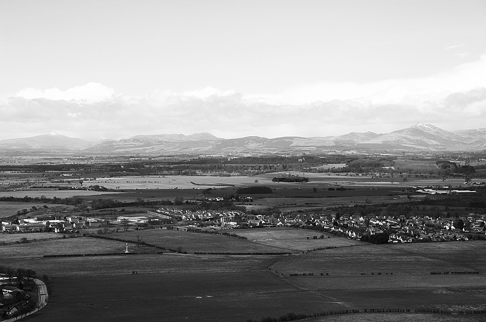
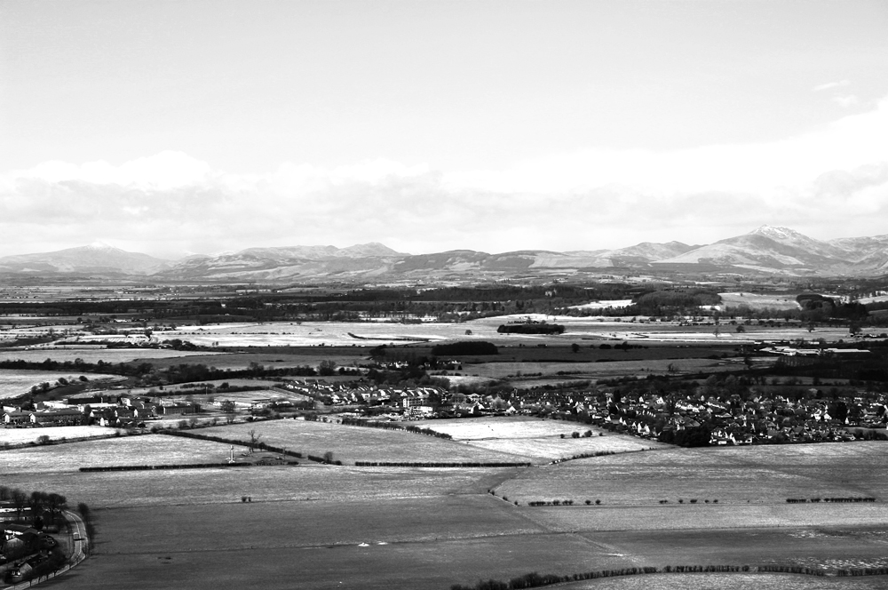
This image is of a view of Scotland, the lighting was fairly flat and the colours subdued. Again this image has not been processed before conversion.

A very pronounced curve rendered the image unusable and also when converting to B&W with such a pronounced curve, areas were too dark with loss of detail. Introducing a strong contrast using an S-curve strengthened the colours but lightened the sky. Clipping became apparent in the darker areas such as the trees and whilst the mountains in the background have improved their appearance the colours in the foreground have become unnatural.

Converting the image to B&W and applying the same level of adjustment presents a more acceptable scene, even if the foreground is a little dark, once more it is the tones, shape and field patterns that you notice.
No comments:
Post a Comment