Aim: to produce a small portfolio of images that express the character of my local neighbourhood, area or locality in which I live. These photographs should convey a strong sense of place, indicate what is unique and what it means to it's residents.
Dismissing obvious choices of the rundown or picturesque I set out to capture my neighbourhood by photographing a mix of the everyday places in Welling that are unique to the area whilst expressing its character.
My initial plan was to be particularly observant while out and about and when a potential location/subject was seen to return later with my camera. Test shots would be taken to see if the initial ideas worked and if they did more images were to be taken or return another time. I planned to incorporate ideas gained from looking at other photographers.
Over the past few months I have examined a few genres and the work of many photographers, with brief descriptions and examples of their work contained in other posts on my blog. Two photographers who examine their immediate location are Tom Hunter and Stephen Gill; both produced bodies of work in and around Hackney. I dismissed using their work as an influence to mine; Tom Hunter's due to the body of work I looked at, Unheralded Stories 2010, retelling stories and myths whilst emulating great painters.Great attention was paid to fragments or details of paintings and my knowledge of classical art isn't that in depth (although it is something to be borne in mind, possible research for anything I may undertake in future) In this and other series, he asked friends to pose for him. I planned for my images to not be posed.

Stephen Gill was dismissed because his images of Hackney Wick (2005) were taken with a cheap film camera, bought for 50p at the market which he was photographing. The images are on occasion blurry, out of kilter and very quirky, this is an approach which I did not want to adopt for this portfolio. His more recent work of Brighton, was produced by introducing rubbish inside his camera and oddly didn't wish to do that. But again, it might be an idea to investigate, how could I achieve similar results without damaging my equipment?

Joel Sternfeld has a great tonality to his work, using similar colours, but there were not many scenes that presented me with the opportunity to explore this way of working.
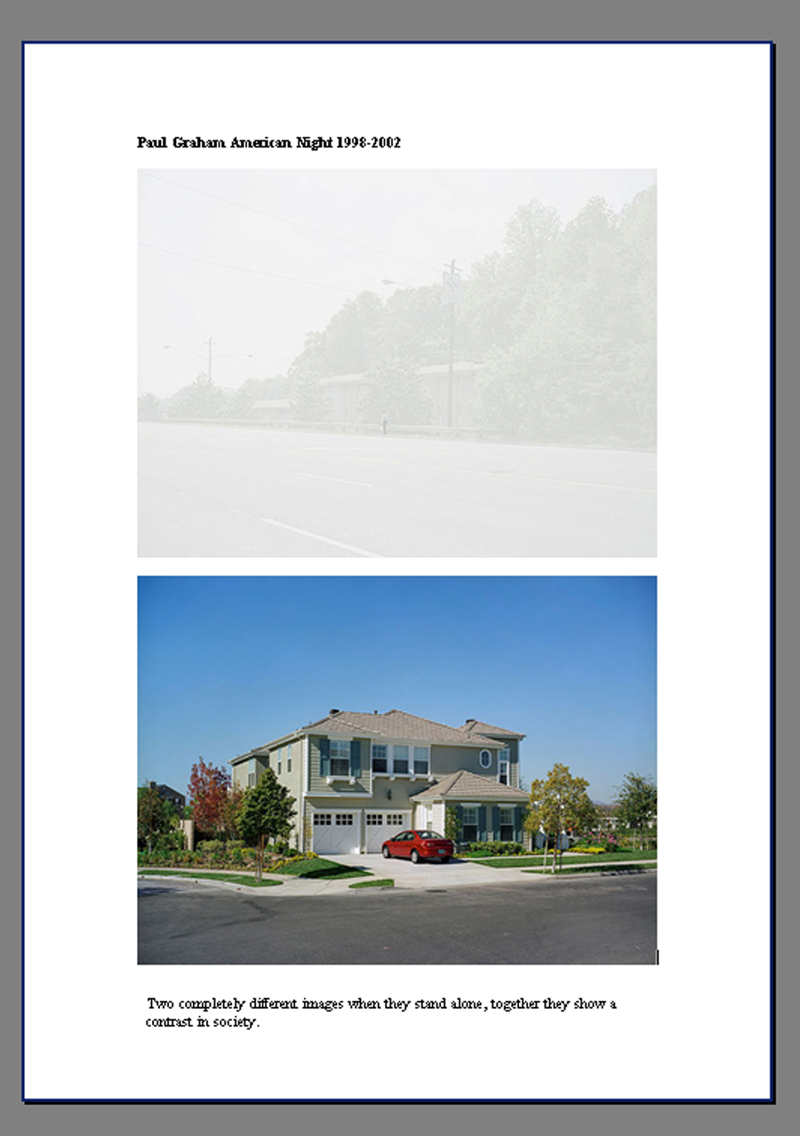
Wanting to include the residents, either by explicitly depicting them as part of the scene or subtlety showing their impact on the environment or community, I planned to use the work of Paul Graham as an inspiration. Having seen his retrospective exhibition at the Whitechapel Gallery, drawing ideas from the bodies of work Troubled Land, 1984-1985 American Night 1998-2002 and A Shimmer of Possibilities 2004-2006, seem a plan. Troubled Land, on the surface looks like a simple landscape series until you start to spot tell tale signs in each image. Some of these signs are posters, others are just paint splats on a road, graffiti or political rallies. There is juxtaposition between the tranquility of the countryside and the political unrest. My intention was not to faithfully replicate his shots but bear in mind the elements and devices he used.
Graham stated he included devices that made 'the landscape act as a reflection on that society.'

Hoping to use signs as my visual link, indicating shared experiences and conveying a sense of place I set out on several photo shoots, over many days and in various locations. Showing the contrast within the area, with images that contained this contrast, or by including images when put together indicated this, was an intention.
Adobe bridge was used to download images and edit, applying ratings to images that I felt had worth.
First exploration with recycling. Chosen as they had the depth of field, lens flare that I wanted to include, or ideas to work on later.

Second Exploration with recycling and ideas of metamorphosis... I loved the random cloud in the sky and the splash of colour the poppy gave.

second exploration of metamorphosis....sign spotted....chosen for sharpness of main subject, similar tones bright blue skies and possible further exploration of the themes.

Exploring local charity event what makes a community....but it rained.....bottoms...later used in Bottoms up OCA comp......loved the colour co-ordination of the purples and pinks....vandalism of the picnic table, unusual adult exercise equipment...possibility for further exploration.

Unique places .....signs....bus stops...rain spots......street furniture.....more contrast coming through......liked the reflections on the bus shelter, bright splash of red of the buses on a cloudy day....Stephen Shore influence of street furniture and shops.

More cemetery exploration..re shot signs .....exploring green spaces...similar colours/tones, possible views, chosen as contrast of green spaces and houses in the background.....weather wasn't so good maybe a return visit...

Community hospice represents the neighbourhood....investigation into can I show its presence in signs? What else is there represented by signs...school with local superstore advert....ruins...decided I don't want to go picturesque....more houses being renovated......sign images too dark but starred as I could go back and try again if the rain held off, work out what time of day would give the landscape some interesting shadows, if any as its pretty flat....

Back to the cemetery, if possible I really wanted to be able to include the thieves sign.....pet signs....football stadium...again chosen for further exploration.

Stephen Shore inspired images......including signs.........clouds interesting texture and detail..urban space....

Looking around searching for urban/green space contrast and places that the community use....all with signs....I liked the juxtaposition of the tower blocks in the background of the stables field...but it didn't have a sign if that was going to be my visual link.....the sun was shining!

Local shops...more signs.....bright splashes of the rainbow shop sign (weather contrast again?) and Danson Festival caught my eye....bus shelter with posters....It's not always sunny so should also represent that...contrast in weather as well as green/urban...or am I playing with too many themes at the same time? Weather is more accident than design but is is a feature :o/ Challenges with how to stay dry, get correct exposure....

Green Chain walk..... route and signs, more urban/green...love the skies....love the red and greens....complementary colours....

Chosen due to showing shops but more for ideas than inclusion....roundabout with bus, blue skies, note* I have this thing about buses.....

Second edits chosen for ideas that I was still exploring or images I liked and wondered if I could incorporate and those which showed other photographers as an influence, included my visual linking theme of signs and urban/green space contrasts, sum up the area.
 |
| Second Edit |
 |
| Third Edit |
 |
| Third Edits discarding some |
After the third edit I went back through some of the discards, swapped some about as I felt the elements or composition was stronger, and selected my final images. They were chosen as they showed other photographers influences, contained the linking visual themes of signs, contrast, complimentary colours, similar colours/tones human activity and conveyed a sense of place.


Graham's series A Shimmer of Possibilities also influenced images I taken. A couple walked past; the man carrying a pot plant and walking to the left of the woman, this struck a chord, it was a similar scenario to an image of Graham's, a man walking down the street, a woman to his right whilst carrying shopping. There were many other similarities within the frame which only came apparent after I had taken the series of shots, not sure how much of this was accidental or subliminal due to studying this work.
Another image which echo's Grahams composition even if the subject is not identical, still pondering if it is on purpose, accidental or subliminal?

Another photographer whose work was examined is Stephen Shore America America


Having seen Hasan and Husain Essop's work, Halaal Art, at the V&A Facts and Fictions exhibition, and later some work by Nick Waplington ( in particular Bethnal Green Road) a technique I considered implementing subtle digital manipulation; adding something or someone to a scene. I had the opportunity to use this technique for the image Untitled (Welcome to Welling) which I felt balanced the scene and the resemblance to the Paul Graham shot became more apparent.
This technique was also employed on the image Untitled (BP & Bus) to make it more balanced and make more of the complementary colours.


It was interesting to note that both Shore and Graham included images which didn't have ideal weather or lighting conditions. This is something that I struggled with throughout this project. It would have been handy to experiment a little more with focal length and viewpoints but when I found something that worked was reluctant to try something else in case the weather turned. Which it did, frequently! After a few days which had sunny spells the following weeks provided nothing but rain and overcast skies.
In some ways this was useful as the overcast skies provided diffused light and therefore no problem with deep shadows, but on the other hand the light was poor. Returning to places to re-shoot became more and more difficult, constant rain preventing me from returning and experimenting with other focal lengths, depth of field or viewpoints. Earlier shots had been taken using my lens at 18mm because I had wanted a wider view; as much as this being a conscious decision at the outset, I was also partly forced to continue due to weather conditions.
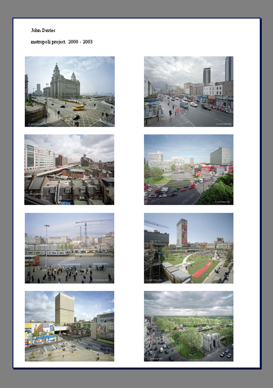
Another reason for adhering to the same focal length and overall similar viewpoint was to provide visual coherence to the set. This was something I noticed when examining other photographers’ portfolios; they usually shoot from the same viewpoint and use the same focal length throughout, for example John Davies with his Metropoli Project 2000-2003. My personal preference is for a portfolio which has the same of similar viewpoint but in hindsight I could have experimented with this more had the weather given me the opportunity to return after examining initial results.
I tried to overcome the weather problem by being ready to zip out whenever the sun shone, no matter what time of day. On dull days I increased my ISO to 400 but did not want to go any higher, as I don't like to introduce too much digital noise. This can start to happen with my camera at 800 ISO.
Initially shooting at f5.6 but preferring a greater depth of field changed to f16. This became an issue with poor light, giving a slow shutter speed and some images coming out slightly under-exposed; on reflection I should have stopped being so stubborn and altered to f11, comparing the results to see if I was happy with that compromise. Not terribly good at working out hyperfocal distance, this is a technique I should practice.
Although able to adjust the images in post processing, it would have made life a lot easier if the exposures had been correct at the outset. With some images bracketing was done, using the AEB setting in my camera. Trying to shoot using manual settings it may have been better to use Aperture Priority. Using AEB in Aperture Priority mode would have enabled me to still control my depth of field the camera to make the variations in shots by varying shutter speed. Alternatively using AEB in shutter priority mode will keep the shutter speed at the speed I select and the camera would vary the exposure by changing the aperture. This could have been useful to experiment with blur.
Another problem I encountered was chromatic aberration, which I had to adjust by using the Lens Corrections tab in ACR. Mental note to take lots of test shots and discover at which point this problem arises.

One of the issues I could have encountered due to slow shutter speed, was camera shake, but being aware of this I made sure I firmly locked my arm and leaned against a solid wall or post. It also meant that in some images moving vehicles/pedestrians had slight motion blur but this was something I wanted to capture, having seen examples of it within the work of Shore.
An option available was to use a tripod but made it very awkward when shooting scenes in the busy street (I didn't want to cause obstruction) and prevented me from achieving the low viewpoints in some of the shots.
On the days it did rain I stayed under bus shelters, shop canopies, juggled an umbrella or when shooting the Abbey ruins stood underneath a wide archway. On several occasions I got rain spots on my lens which, not noticing at the time meant I had to ditch more images. Guess in future I could make a series with that as a feature!
As with all the exercises and final assignments for DPP I followed a strict workflow which worked when I planned my shoots. Impromptu outings proved how you should double check everything before you leave as I did leave home without a memory card one day!
With adaptations to fit the individual photoshoots on the whole, I followed the workflow outlined here . However since this was written at the beginning of level 1 I have fine tuned it a little more, trying to complete more adjustments in RAW. Still getting to grips with the tools in RAW I prefer the flexibility that layers/layer masks afford me. A fuller account of my workflow and processing details will be provided on submission.
This is a map of the area I was shooting in, as you can see it has large areas of both green space and urban areas; I planned to capture this contrast using the devices of contrasting images and, if possible, juxtaposition within single frames. The linking visual themes of my final portfolio are physical signs, depiction of the generations which live in the neighbourhood, the contrast of open space/urban life and finally the consistent focal length and viewpoint.
 |
| Green Chain Walk through Welling and into Abbey Wood |
Image One: Untitled (Welcome to Welling)

Having seen the Paul Graham retrospective when I saw the couple walking away from me, a man carrying the pot plant, it struck a chord with the image in A Shimmer of Possibilities with the couple carrying their shopping home.
I visited this spot about 3 times hoping to get all the required elements in place, good lighting, traffic (I don't know why but I wanted a bus if possible) and pedestrians. As I was not lucky enough with the timing I decided this was an opportunity to make a constructed image, taking inspiration from the Essop twins and Nick Waplington.

F22 1/40 ISO 200 18mm

Image Two: Untitled (Woodlands Farm Trust)
Woodlands Farm Trust is an Inner City Farm and unique to the area. Just over the border in Greenwich, the Farm caters for the community in many ways; open days in Spring where you can watch the lambing, fun days in Summer and, as advertised here, several barn dances throughout the year.

F16 1/15 ISO 400 18mm

Image Three: Untitled (BP & Bus)
Having taken a shot which included the bus I felt the right hand side of the frame empty, however I had taken a series of shots beforehand; one of which included a red car entering the frame. The timing of this shot had been intentional, taken so the car did not obscure the children at the bus stop. On examining this shot there was too much empty space to the left. This presented another opportunity to use the technique of addition, altering the scene slightly, but with it still maintaining an element of truth. Once combined the image is balanced and the complementary colours are more obvious.


F16 1/200 ISO 400 18mm

Image Four: Untitled (Welling High Street)
Welling High street as with many small town shopping areas has suffered from the recession but it still attracts shoppers and pupils travelling home.

F6.3 1/40 ISO 400 18mm

Image 5: Untitled (Danson Festival)
Bexley has many open green spaces which contrast against the urban sprawl of the area. Danson Park is an area which holds many events across the year, encouraging the community to make use of its facilities.

F11 1/30 ISO 400 18mm

Image Six: Untitled (Flea Market)
St Michael's church hall which is the hub of the community in Welling. My children went to the toddler group here and also were christened in the church.

F16 1/160 ISO 200 18mm

Image Seven: Untitled (Stables)
The Mounted Rover Legion own a stables on the outskirts of Welling, which is unique to the area.

F8 1/160 ISO 400 18mm

Image Eight: Untitled (Thieves)
The local cemetery not only serves its purpose as a burial ground/ place of mourning it also is on the Green Chain Walk being crossed by a public footpath. Sadly not all respect the area.

F16 1/640 ISO 400 18mm

Image Nine: Untitled (Closed Shop)
An example of the housing to be found in the area and the small corner shops which try to survive, or not, during the recession.

F16 1/80 ISO 400 18mm

Image Ten: Untitled (Bus Shelter)
Another example of everyday streets and houses in the area revealing human activity.

F16 1/200 ISO 400 18mm

Image Eleven: Untitled (East Wickham Farm)
East Wickham Farm, owned by the parents of Kate Bush who still has a recording studio there.

F16 1/200 ISO 200 18mm

Image Twelve: Untitled (Missing Cat)
A parade of local shops with flats above, a family walks home with their shopping.

F16 1/100 ISO 400 18mm

Image Thirteen: Untitled ( Building & Maintenance)
Unable to move more people choose to improve the homes they own.

F20 1/100 ISO 400 21mm

Image Fourteen: Untitled (Community Hospice)
Green and Bexley Cottage Hospice is build on the edge of Bostall Heath and many of their charity fundraising events are held there.

F20 1/30 ISO 400 18mm

Image Fifteen: Untitled (Lesnes Abbey Ruins)
Lesnes Abbey which was destroyed during the abolition of the monasteries.

F10 1/320 ISO 400 18mm

Conclusion
On reviewing my portfolio the observations pick up smaller details within the larger scene, the people within the frames depicting the generations, compositional elements such as implied triangles, movement, dark clouds giving texture and detail, there are complementary or similar colours and all containing the visual link.
Workflow habits were consolidated when planned shoots were undertaken and as already stated impromptu outings proved how important following workflow preparations are. Editing and making the final edits made me look closely at what made the images work for me, references to the photographers examined,the content, timings, composition techniques and tonality of the shots.
On closer examination some shots did not appear to have many compositional elements, appearing quite simple, but I felt they worked as part of the portfolio.This is a vehicle used by both Graham and Shore. Graham's image below has the visual device he required against a simple backdrop, there are no diagonals, repeat patterns or movement within the frame but within the series Troubled Land it works due to the visual link.

The genre chosen for this body of work was suitable, but on looking closer at Stephen Gill and Tom Hunter acknowledge that I could have tried a different approach. The idea of constructed/layered images does appeal and I could adapt my ideas to include this style. Should I complete this project again I could possibly shoot using my 50mm lens.
Using a prime lens would make me approach shooting in a different way, you cannot zoom in, you have to physically get closer or walk backwards to focus on your subject or position them within the frame; really consider the shot. Having an aperture of f1.8 allows more light into the camera, I could use faster shutter speeds (less blur) and a lower ISO, making better use of available light. The 50mm lens can produce really pleasing effects of bokeh. (the way the lens blurs out of focus areas) Although the 50mm f1.8 allows more light to enter into the camera I find that my lens does if on auto focus it does 'hunt' when the light dips below a certain level. I would have to experiment to find out what point this happens.
Another advantage to using the 50mm lens is the way it renders perspective, it closely matches what is seen by the human eye. The only caveat to that is having a crop sensor; the lens does not achieve the same result as it would on a full frame, according to the information I read it would need a 35mm prime lens to achieve the same result as a 50mm lens on a full frame.
Pleased that I did not allow the inclement weather to halt my shoots it would be interesting to discover the effect different lighting/weather conditions would have had with some of the images. Having said that it makes a change to see photographs without clear blue skies and the blazing sun. The clouds providing texture and detail. Overcast days did allow for diffused lighting which meant I didn't struggle with too much contrast. It can be difficult to control exposure when faced with a scene that contains a large dynamic range.
I have chosen to send the final portfolio images as printed and mounted photographs whilst emailing the original files to my tutor. I felt this would allow him to examine my printing and presentational skills and also note the specification of my digital files. The mounts I ordered allowed me to print images 9x6 but the actual aperture size was 8.5x 5.5. Next time I mount prints a larger size would allow more detail to be seen.
On the whole I was fairly pleased with my final portfolio. Things I was disappointed in were: the bad weather not allowing to me take more photographs and provide a wider choice for selection, again bad weather preventing me from returning to certain locations to re-shoot scenes that could be improved through changing viewpoint or angles, my control of exposure not always as good as hoped, not taking a more adventurous route with my images.
Things I could do next time are: More experimentation with focal length, especially investigate fringing issue, use bracketing more, instead of trying to include a lot of detail within the frame concentrate on a smaller part of the scene, take on board some of the manipulation techniques that are being used more (layering, ephemera etc) try and make the poor weather work for me, although that would have to be investigated to find out how, more inclusion of umbrellas? Experimentation with shutter speed to capture rainfall? Looking for elements within the frame that provide a juxtaposition IE pictures of sunny holidays in travel agents windows, sunflowers beaten down by the rain?
*update feedback Here
*update reworking Here
An interesting collection of images. I do get a sense of where you live. Do you think that you will revisit this subject at some future point, perhaps looking at specific aspects of the area?
ReplyDeleteI am currently doing a mini-project of themed street pictures based around my local area. I had planned to be out just now but the rain has stopped play temporarily. I do intend to go out shooting at some time today though.
A rather less rigorous version of this assignment used to be assignment 3 in TAOP. I was sorry to see that it had gone as it was potentially quite interesting and am glad to see it reappear here.
I think the rain and weather has been the biggest issue for shooting this assignment. I may revisit it. Back in 2009 I did a similar project but concentrating on the High Street but it didn't have much also linking it together. It has been interesting to look for seperate underlying themes within the larger brief. I may revisit depending on time....other exercises we "have" to shoot and all that jazz :o)
ReplyDeleteApparently it's reappearance here was at the insistance of Clive who also didn't like to see it vanish from TAOP.
the Wickham farm is the house of music artist Kate Bush childhood home,..both her parents are passed on , i am sure her Brothers live there now ,..it is ashamed to see the tagging on the famous sign,..i hope it can cleared off ,...
ReplyDeletei hope they can clean up some of the tagging ,..... i love east wickham farm house....
ReplyDelete