During this course we are looking at what defines Art photography, the different genres and example of photographers who are recognised as producing work which falls into this category. The first week was concerned with typology. Typology is where a photographer pursues images of a certain "type" they categorise subjects, classify them according to a general type. Images can then be displayed as individual images within a collection or in some instances with several images contained within the same frame.
August Sander has influenced many photographers after he tried to create a visual record of types found within Germany during the 1920's/30's. His subjects were photographed and labeled as a representative of their class. August Sander (Getty Museum)
There are many photographers/artists who use typology within their work but the examples we explored were Bernd and Hilla Becher, Candida Hofer, Thomas Struth, Thomas Ruff and Andreas Gursky, all successful art photographers. Although their subjects may be different ranging from landscapes, architecture and portrait there are many similarities. All are connected to the Kunstakademie Dusseldorf, all used large format cameras and all initially worked with a series of photographs. There is so much to be written and said about these influential artists but below is a very brief synopsis of each.
Bernd and Hilla Becher
The Bechers once said 'The idea is to make families of objects,' or, on another occasion, 'to create families of motifs.’ This they did with amazing results capturing industrial structures scientifically and objectively. In another quote they state 'Through photography, we try to arrange these shapes and render them comparable. To do so, the objects must be isolated from their context and freed from all association.' which I found really interesting because sometimes as students we are asked to include more of the surroundings or background give the subject context, or allow the photograph to have some form of narrative.
Their approach to photography is committed and systematical, always using the same format; images taken at the same height,full-frontal view, flat lighting condition, lack of people and employing black and white. They also use uniform print quality, size, framing, presentation and a shared function for all the structures in a given series. Interestingly they don't group things together historically or geographically, it is the overall structure and form that is of importance.
Bernd Becher at one point was a professor at the Kunstalademie Dusseldorf and the Brechers' work has in turn influenced many modern Art Photographers.
 |
| Bernd Becher and Hilla Becher Coal Bunkers 1974 Tate. Purchased 1974 |
 |
| Bernd Becher and Hilla Becher Pitheads 1974 Tate. Purchased 1974 |
Candida Hofer
Candida Hofer was born in Germany 1944 and was educated at the Kunstakademie Dusseldorf 1973-1976 and did further photographic study with Bernd and Hilla Becher between 1976-1982. Hofer has had her work exhibited in many galleries with both group and solo exhibitions and her interest seems to lie with documenting public places such as libraries, creating a systematic visual study of the detail within these places. Like the Bechers, Hofer seems to avoid people within her images either shooting while they are not there or by using long exposures which render them as 'ghosts.' The majority of her images capture the repeat patterns of shelves, tables, floor or ceiling tiles. An exhibition of her work in 2006 titled 'Architecture of Absence' cleverly depicted areas which are usually teeming with life, theatres, cafes, a hotel lobby, a train station, it is clear to see that whilst devoid of people each space was meant for human habitation.
 |
| Candida Höfer Narodni knihovna Praha V 2004 |
 |
| Candida Höfer Foyer vor der Aula ETH Zurich 2005 |
Yet another student of the Kunstakademie Dusseldorf Struth does not restrict himself to one particular area, his portfolio encapsulates architecture, portraiture, landscape and flowers.
THOMAS STRUTH - VIRTUAL EXHIBITION TOUR
Unlike Becher and Hofer, Struth does include people, one of his series Museums specifically set out to capture the people who visit museums and historical buildings. Although following the ideals of typology Struth does not like to think of his images as part of a body or series and in an interview stated 'The word “series” is a diminutive attachment. A series is something that pretends as if one picture has no value and you need the series to give it that value..... While each room has a different size, quality, and function, and may be considered independently, all have reference to each other, and an expression and aim as a total.'
I found one of his comments very interesting on the Bechers he said had already made the decision to photograph streets even before I knew the Bechers. But once I did come to know them, and saw the work, my first thought was “Great system. . . wrong subject matter”. Which shows how you can use the work of others to help you produce your own style, copy the system but don't mimic the material.
 |
| Pantheon, Rome, 1990 Thomas Struth |
 |
| Art Institute of Chicago II, Chicago, 1990 Thomas Struth |
Blank, Gill, and Struth Thomas. "The Tower and the View:Gill Blank and Thomas Struth in Conversation", Whitewall, Issue 6 (summer 2007): 104-119.
Thomas Ruff
Born in 1958 Ruff is another photographer who studied photography in the late 1970s under Bernd Becher at the Kunstakademie Dusseldorf. However like Struth, whilst benefiting from their instruction, showed his individuality by delving into colour. His early photography of the interiors of homes, made between 1979 and 1983, followed careful composition rules, with the cropping of each image drawing attention to the geometric patterns, and texture. You can see their influence with some of his architectural and industrial shots.
Ruff likes his audience to be aware of his images in two ways, firstly recognising that they are observing the image itself and then the reflection, or the thought behind the photography itself. Fascinated by this idea and the compression of digital images with the Internet/digital boom he even produced a series of work called jpegs which deliberately uses highly compressed low-res images blown to oversize dimensions. Ruff approaches portraiture in the same meticulous fashion, somehow remaining removed from his subjects their bland expressions betraying no emotion yet the odd element giving a clue to distinct personalities be it bright red lipstick, fashion earrings or their braces.
Looking at various images on the web by Ruff he certainly likes to push the medium of photography to its limits and explores porn to cul-de-sacs viewed through night vision goggles. Interesting............ (insert arched eyebrow here)
http://www.davidzwirner.com/artists/18/available_works.htm
 |
| Thomas Ruff Blue Eyes M.V./B.E; Blue Eyes M.B./B.E.; Blue Eyes L.C./B.E.; Blue Eyes C.F./B.E. 1991 |
Andreas Gursky
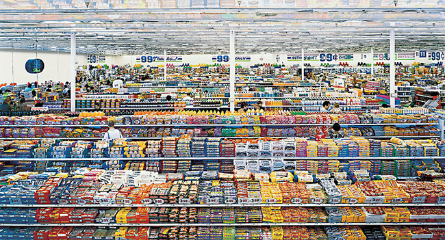
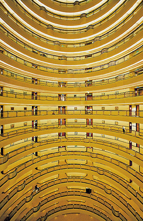
Another product of the Bechers and the Kunstakademie Dusseldorf, Gursky found his own voice and broke the fetters of his early photography when he decided to examine and portray elements of capitalism and huge land or city scapes where the anonymous individual is but one among many. His images truly represent the effect of globalisation on our contemporary lives, I guess depending on which side of the financial divide you sit on you can read them either as a criticism or a celebration of capitalism ;o) I find Edward Burtynsky's work has a more obvious critical view of the damage man is inflicting on the environment. Pursuing this idea took him all over the world to capture the Olympics, a cross-country marathon involving hundreds of skiers, trading floors of international traders and shelves of goods in a 99c store.
 |
| 99 Cent. 1999 Andreas Gursky |
 |
| Shanghai 2000 Andreas Gursky |
August Sander
Sander's project Man of the Twentieth Century was to document the people of his native Westerwald, near Cologne. He believed that "...that people are formed by the light and air, by their inherited traits, and their actions. We can tell from appearance the work someone does or does not do; we can read in his face whether he is happy or troubled." During this project Sander was to photograph over six hundred German people, subjects from all walks of life creating the typological catalogue which has inspired many future generations of artists and photographers. Sander ran the gauntlet of the Nazi party, continuing to make photographs despite the subjects not conforming to their Aryan race ideals.
references
Artists [n/d] Candida Hofer [photographs] [online] Rena Bransten Gallery Website. Available from:
http://www.renabranstengallery.com/hofer.html [Accessed 29 May 2011]
Blank, G. (2007) Gil Blank and Thomas Struth in conversation [online] Originally published in Whitewall magazine, Volume 6, 2007. Gil Blank Website. Available from: http://www.gilblank.com/texts/intvws/struthintvw.html [Accessed 29 May 2011]
Burtynsky, E. [n/d]Edward Burtynsky photographic works [online]. Edward Burtynsky Website. Available from: http://www.edwardburtynsky.com/index.html [Accessed 29 May 2011]
Exhibitions (2001) Andreas Gursky images and biography [online] The Museum of Modern Art Website. Available from: http://www.moma.org/interactives/exhibitions/2001/gursky/ [Accessed 29 May 2011]
Explore Art [n/d] August Sander [online]. The J.Paul Getty Museum Website. Available from: http://www.getty.edu/art/gettyguide/artMakerDetails?maker=1786 [Accessed 29 May 2011]
Lane, G. (2009) Thomas Ruff interview [online] foto8 Website. Available from: http://www.foto8.com/new/online/blog/1014-thomas-ruff-interview [Accessed 29 May 2011]
Special Exhibitions [n/d] Thomas Struth [photographs] [online] The Metropolitan Museum of Art Website. Available from: http://www.metmuseum.org/special/Thomas_Struth/struth_images.htm [Accessed 29 May 2011]
Stimson, B. (2004) The Photographic Comportment of Bernd and Hilla Becher [online]. Tate Website. Avaiable from: http://www.tate.org.uk/research/tateresearch/tatepapers/04spring/stimson_paper.htm
[Accessed 29 May 2011]
Struth, T. [n/d] Thomas Struth - Virtual Exhibition Tour [online]. Thomas Struth Website. Available from: http://thomasstruth25.com/all/html/800_architecture.htm [Accessed 29 May 2011]
Zwirner, D. [n/d] Thomas Ruff [photographs] [online]. David Zwirner Website. Available from: http://www.davidzwirner.com/artists/18/available_works.htm [Accessed 29 May 2011]
Typology Homework
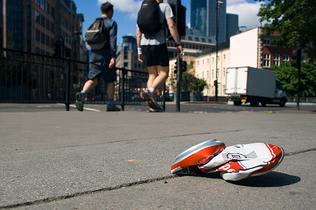
We also get set homework ;o) The first assignment was create our own series of images that illustrated the idea of a typology. After viewing Paul Graham and some of the entries for the Sony WP) Awards I thought I'd try a contemporary approach to the idea. Whilst out at the Paul Graham study day I took my camera hoping for some inspiration along the way. I had a few ideas in mind but they all seemed to be "the usual" I could do the mugs in my kitchen, flowers in the garden, different bead/cottons/craft materials or sweets.... Instead I picked up and ran with the idea of shooting things that we feel passionate about, either intense likes or dislikes. The idea of shooting rubbish was born...hence why some fellow students on the day may have seen me grovelling on the floor or arriving a little dustier than is usual for a study day!
I seem to be developing a tendency towards employing a wider angle, not sure if this will continue and be my "style" but for the subjects I am choosing and the effects I want to achieve at the moment it seems to work. Also wanting to get away from the standard "this is my subject" and it being slap bang in the middle of the frame I tried to make all the main subjects to the right, similarly lit with an overall theme of litter concerned with drinking and cigarettes appearing..... here are the results..poor in comparison to the above but hey I only had a week ;o)


No comments:
Post a Comment