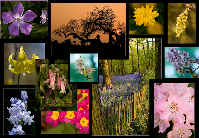
The main aim was to familiarise myself with the analysis of colours and the identification of those to which I respond the most.
To choose the 20 colours for the grid I decided to look closely at the images produced for my final DPP assignment also some shots of Spring flowers recently taken. It was really interesting to discover that although I hadn't set out to include similar colours/hues throughout the set, when put together and sampled the same colours kept repeating. Is this due to my taste, subliminal or otherwise, or just what nature provided? Below is a montage of the final 10 images for DPP, these being reflected in the first two rows of my colour chart. I can see now how the image colours link, with blues, greens, reds, the creams and blacks. There seems to be a reasonable balance between hot and cold colours in the first two rows.
 |
| Colour chart squares 1-10 |
The bottom two rows are colours picked from photographs of spring flowers taken over the past few weeks. As anticipated most of these are subtle pastel shades; muted greens, yellows and lilacs. There were a few vibrant reds/yellows and these were similar to the shades in my first set.
 |
| Colour chart squares 11-20 |
 |
| Personal colour chart |
Printed out this chart will help with obtain accurate colour capture/representation in future images.
Memory Colours
Colour is an important aspect in our lives, we make not realise it but people seem to remember and associate familiar objects by their colour – a red bus, a green apple, the blue sky.... It appears that colour images are more vivid and easier to remember. Colours and tones can be used to create a style or feel in an image, but some tones have to be "correct" for the audience to connect with it, for example if a skin tone is not acceptable we will automatically query it, but skin tone is just one of many "memory colours". We know the sky is blue and grass green; simply put memory colours are colours which people find are inseparable from certain common objects or events.
Scientific experiments (Cambridge Research Systems - Research Topics) have shown that colour seems to help people process and store images as well as remembering them. This memory of colour probably harks back to human development when it importantly helped people to find food, such as ripe fruit and remember what is dangerous, such as poisonous berries and stinging insects.
The most familiar are the most important i.e. skin tone and neutrals followed by vegetation and sky tones, by eye we can usually say whether these are right or wrong.
The next part of this section made me look at the colours with more precision, measuring the colours of the charts and on some of my own photographs. If there is a colour cast the Black, White and Grey squares will not have RGB values which are identical, if they are all the same they are described as being "neutral" therefore this is a good way to check for colour cast. Cameras and monitors measure colour solely in RGB however, the human eye perceives colour also in terms of Hue, Saturation and Brightness. Hue being measured in degrees starting with Red at the top at 0°(I never knew that red was always at the top in a spectrum circle!) while Saturation and Brightness are measured in percentages. If I can improve my estimation of the HSB colours that I capture it will assist with my colour correction and colour accuracy of my final images. Practise makes perfect?
It was interesting to discover that my tastes are quite conservative, I don't have that many bold or brash colours and I do like the odd dash of red. That is my favourite colour! I have never heard of memory colours before but can fully appreciate how they work in the "real" world as well as photography and recognise even more how important it is to obtain correct colours. Not only due to the fact that as photographers we like to create true representations but also it could affect the way our audience perceives the images we make.
No comments:
Post a Comment